Operations Dashboard in Google Sheets is a ready-to-use template that helps you monitor costs, delays, SLA performance and monthly trends. Update your data in the Data sheet and refresh to update the dashboard views.
Introduction
This Operations Dashboard in Google Sheets is designed for operations teams and managers who need a quick, visual summary of performance. The dashboard is pre-built with multiple sheet tabs and chart types so you can start analyzing immediately. You can update your data in the “Data” sheet and refresh to apply changes across the dashboard.
Key Features of Operations Dashboard in Google Sheets
- Ready-to-use template: Add data to the Data sheet and refresh to update visuals.
- Interactive filtering: Multiple slicers let you filter by department, region, shift, manager, and type.
- Multi-tab analytics: Overview, Department, Region, Operation Type, Monthly Trends, Search and Data sheets.
- Varied visualizations: Column, bar, line, donut and pie charts for different KPIs.
- High-level KPI cards: Quick view of top metrics such as average planned duration, delays and costs.
Dashboard Pages Explanation
Click to Buy Operations Dashboard in Google Sheets
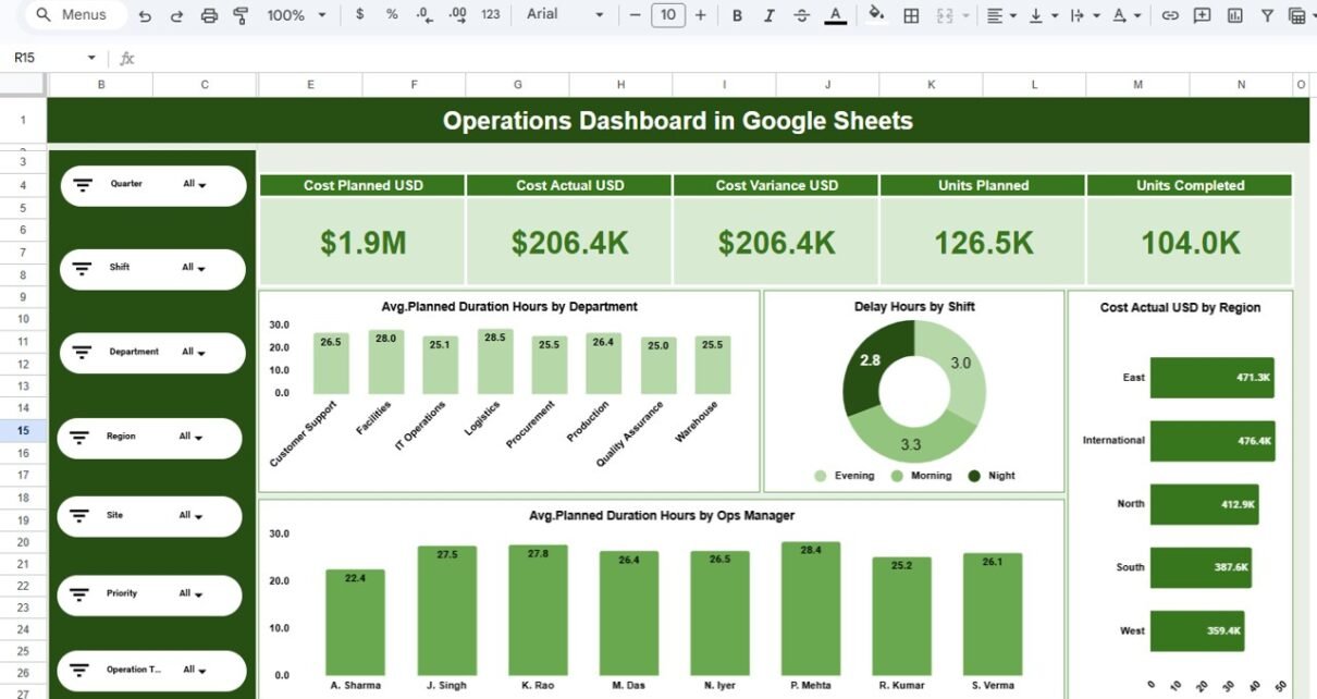
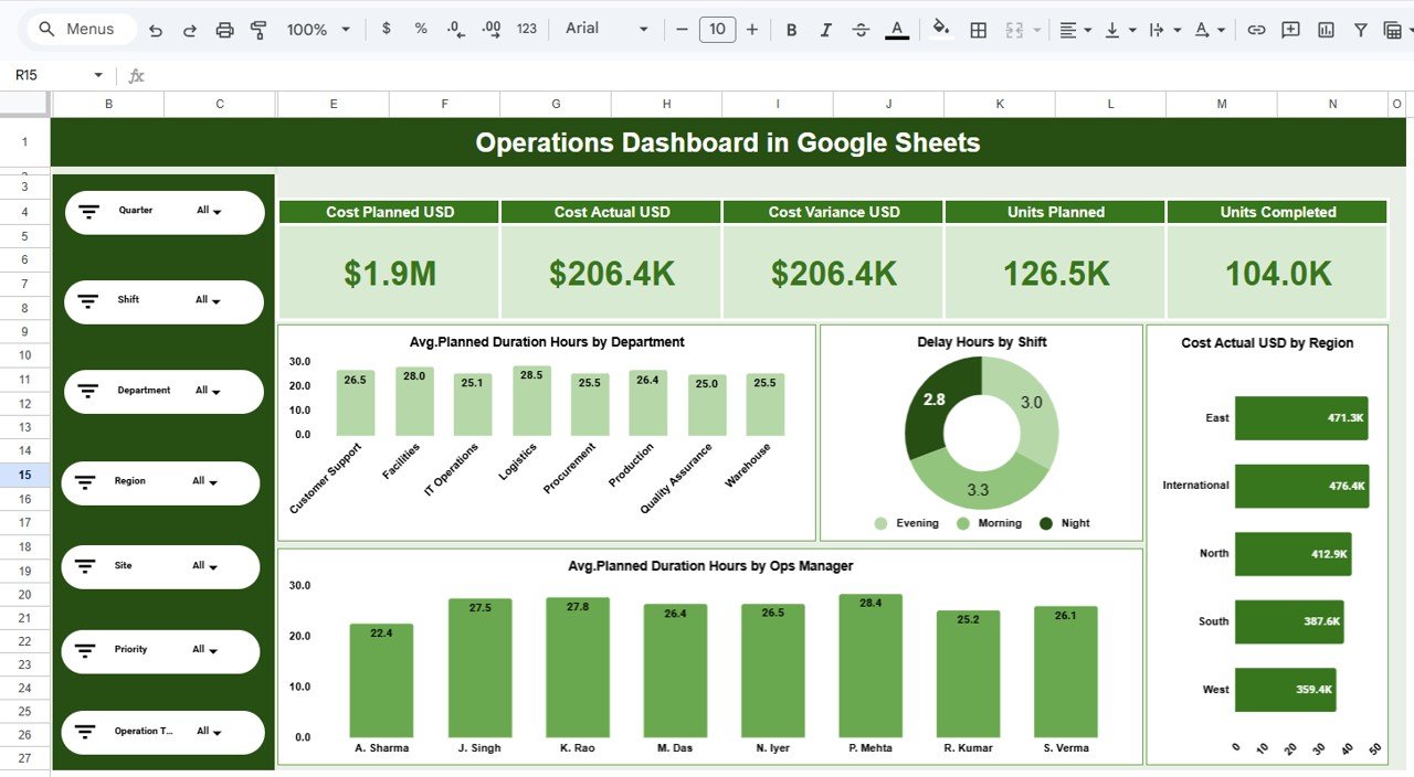
Overview (Operations Dashboard in Google Sheets)
The Overview tab provides a high-level snapshot. It contains KPI cards, summary charts and slicers for quick filtering so you can get the overall health of operations at a glance.
- Avg. Planned Duration Hours by Department — column chart
- Delay Hours by Shift — donut chart
- Cost Actual USD by Region — bar chart
- Avg. Planned Duration Hours by Ops Manager — column or bar chart
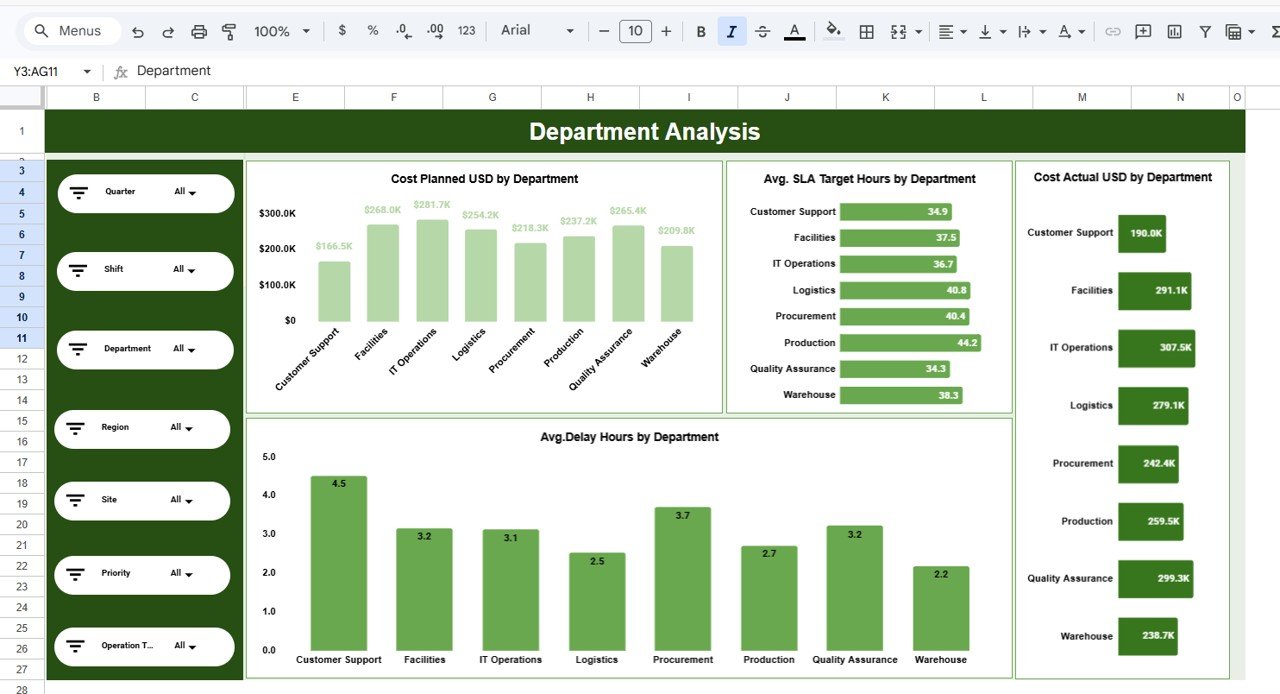
Department Analysis (Operations Dashboard in Google Sheets)
This sheet focuses on department-level KPIs and comparisons to help you spot which teams are driving costs or experiencing delays.
- Cost Planned USD by Department — column chart
- Avg. SLA Target Hours by Department — bar chart
- Avg. Delay Hours by Department — column chart
- Cost Actual USD by Department — bar chart
Click to Buy Operations Dashboard in Google Sheets
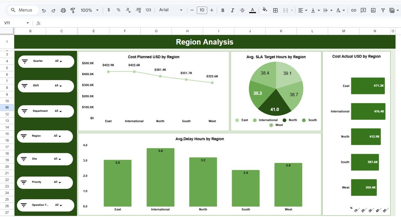
Region Analysis (Operations Dashboard in Google Sheets)
Use the Region Analysis tab to compare regions on cost, SLA and delay metrics.
- Cost Planned USD by Region — line chart
- Avg. SLA Target Hours by Region — pie chart
- Avg. Delay Hours by Region — column chart
- Cost Actual USD by Region — bar chart
Click to Buy Operations Dashboard in Google Sheets
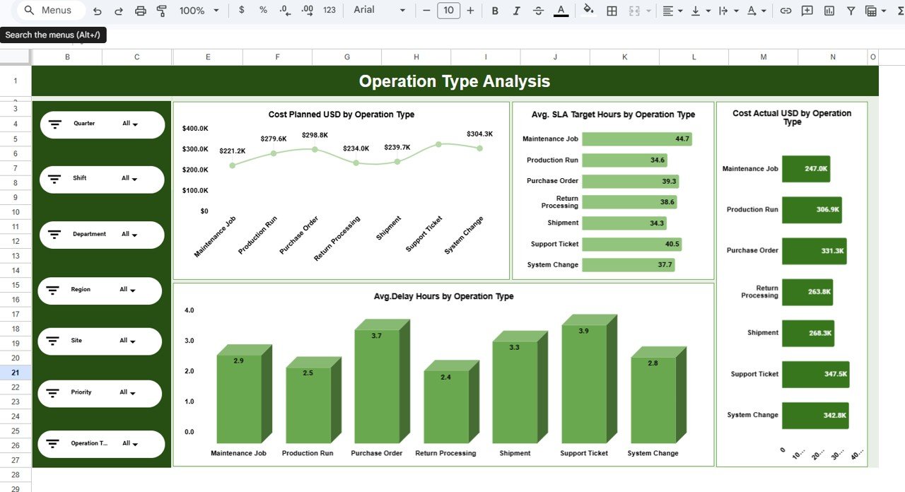
Operation Type Analysis (Operations Dashboard in Google Sheets)
This tab breaks down performance by operation type so you can optimize processes or resource allocation.
- Cost Planned USD by Operation Type — line chart
- Avg. SLA Target Hours by Operation Type — bar chart
- Avg. Delay Hours by Operation Type — column chart
- Cost Actual USD by Operation Type — bar chart
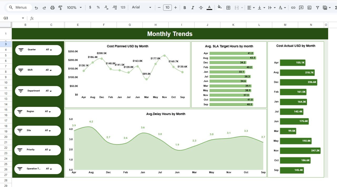
Monthly Trends (Operations Dashboard in Google Sheets)
The Monthly Trends page provides time-series views to track performance and seasonality.
- Cost Planned USD by Month — line chart
- Avg. SLA Target Hours by Month — bar chart
- Avg. Delay Hours by Month — column chart
- Cost Actual USD by Month — bar chart
Click to Buy Operations Dashboard in Google Sheets
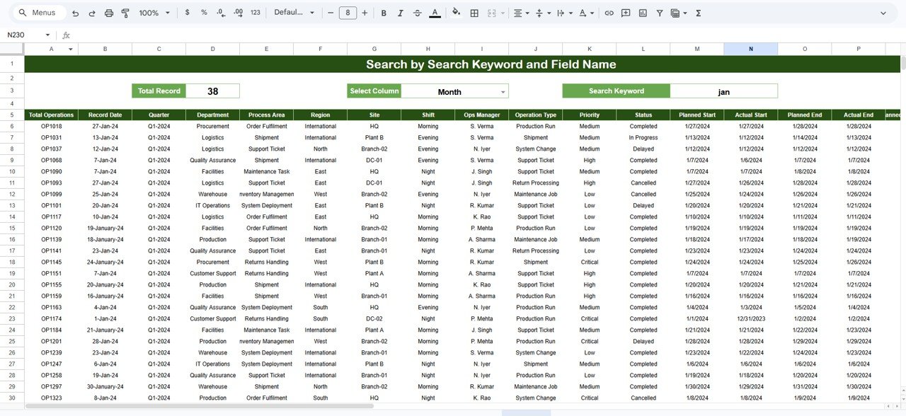
Search Sheet tab
The Search sheet lets you query records by a chosen column and keyword—great for investigating specific tickets or orders.
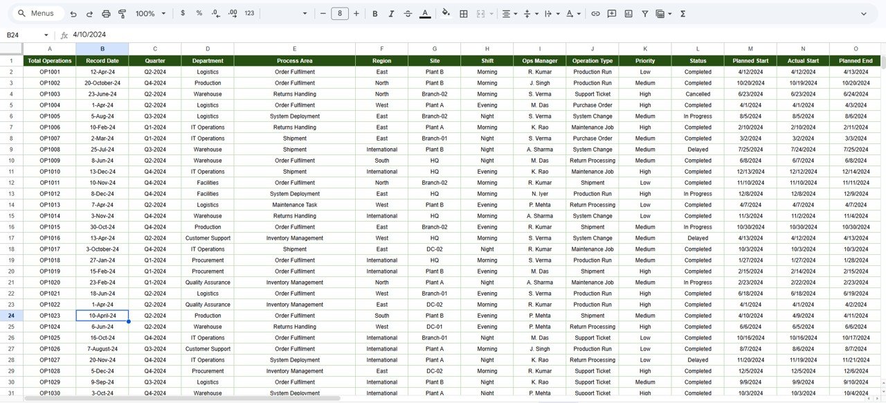
Data Sheet tab
The Data sheet is the single source of truth. Enter or paste your raw data here in the same column format to ensure charts and slicers update correctly.
Click to Buy Operations Dashboard in Google Sheets
Advantages of Operations Dashboard in Google Sheets
- Fast setup — ready templates save hours of design and formula work.
- Low cost — runs in Google Sheets with no extra licensing for viewers.
- Collaborative — multiple users can view and comment in real time.
- Flexible visualizations — several chart types to support different analyses.
Opportunities for Improvement
- Add automation: integrate with Apps Script or Zapier to auto-refresh from external sources.
- Enhance accessibility: add color-blind friendly palettes and clear labels for screen readers.
- Scalability: migrate to BigQuery or Google Data Studio (Looker Studio) for very large datasets.
Best Practices
Click to Buy Operations Dashboard in Google Sheets
- Keep raw data tidy: maintain consistent column headers and data types in the Data sheet.
- Use slicers effectively: pre-configure slicers for the most useful filters (department, region, month).
- Document assumptions: maintain a small instructions section in the Data sheet describing units and calculation logic.
- Backup periodically: copy the file before major changes or automate versioning in Google Drive.
FAQs
Click to Buy Operations Dashboard in Google Sheets
How do I refresh the dashboard after updating the Data sheet?
Update the Data sheet and then refresh or re-open the file; charts and pivot tables in Google Sheets will update automatically. If you use Excel, use the Data tab refresh options as noted in the template.
Can I customize the charts and colors?
Yes. All charts are editable—click the chart, choose the three-dot menu and select Edit chart to change type, series, colors and axis options.
Is this dashboard suitable for large datasets?
For small-to-medium datasets it works well in Google Sheets. For very large datasets consider linking the sheet to BigQuery or visualizing in Looker Studio (Google Data Studio).
Conclusion
Operations Dashboard in Google Sheets is a practical starting point for teams that need quick, actionable insights into operations. With clearly organized tabs, multiple chart types and intuitive slicers, it accelerates decision-making and makes performance tracking simple.
External Resources
Visit our YouTube channel to watch the demo. Youtube.com/@NextGenTemplates
Watch the step-by-step video tutorial: