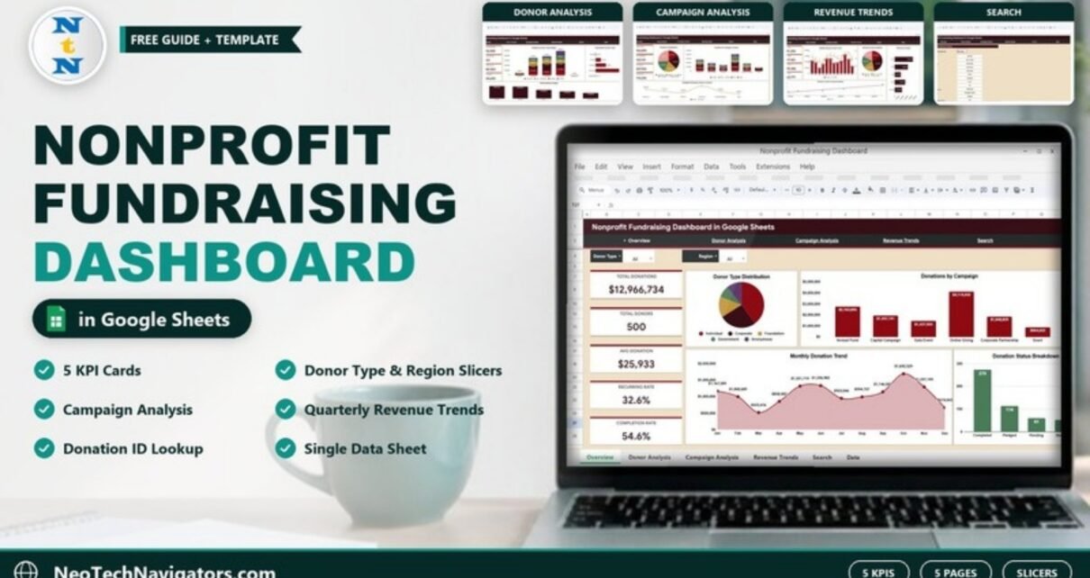
Most nonprofits keep donation records in a spreadsheet, but very few turn that spreadsheet into answers. The Nonprofit Fundraising Dashboard in Google Sheets does exactly that: it reads one data sheet of donation records and shows total giving, donor mix, campaign results, channel and payment trends, and the full detail of any single gift.
It is built for development directors, fundraising coordinators, finance staff and board treasurers at small and mid-sized organisations who want clear reporting without buying a CRM analytics add-on. Inside you get five dashboard pages (Overview, Donor Analysis, Campaign Analysis, Revenue Trends and Search) plus a Data sheet, all linked by a navigation bar at the top of every page.
🎥 Watch the Video Tutorial
Get the Nonprofit Fundraising Dashboard
What Problem Does This Fundraising Dashboard Solve?
Fundraising questions usually arrive at the worst time: the board meeting is tomorrow and someone asks which campaign raised the most, how much came from foundations, or whether a particular gift was acknowledged. Answering from a raw list of hundreds of rows means filters, pivot tables and copy-paste. This dashboard answers those questions in advance and keeps the answers current every time you add records.
The 5 KPIs on the Overview Page
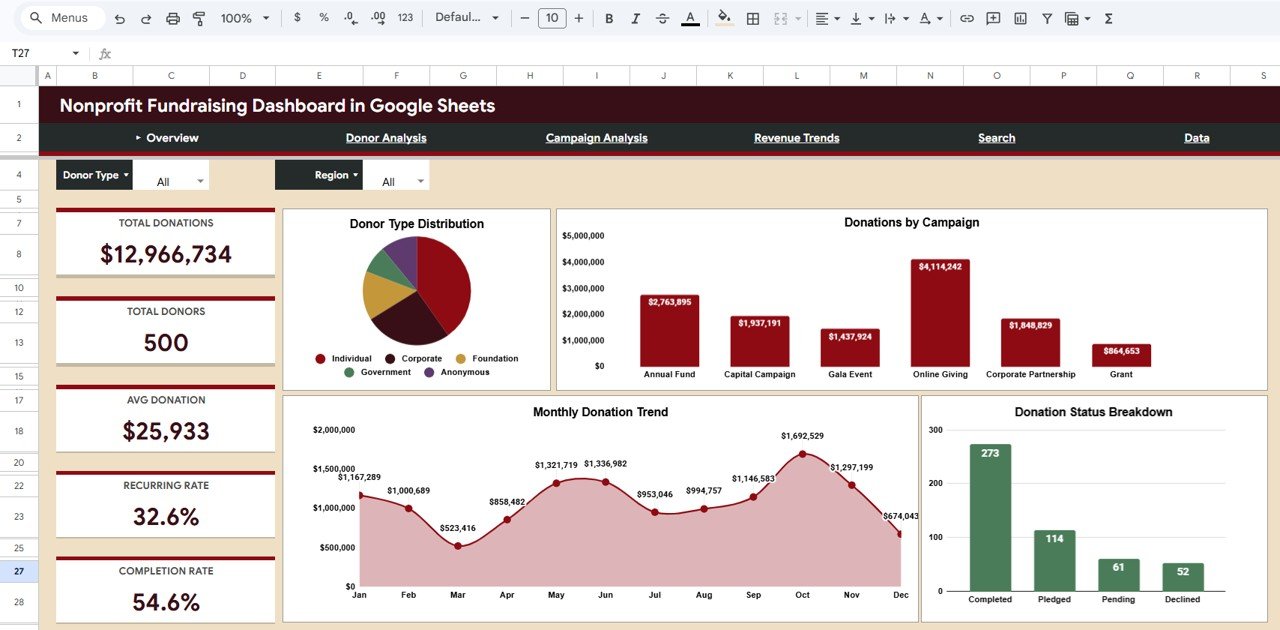
The sample file contains 500 donation records. The table below explains each KPI card and shows how the sample numbers fit together.
| KPI | What it measures | How it is calculated | Sample value | Better when |
|---|---|---|---|---|
| Total Donations | Total amount given in the filtered records | Sum of the Amount column | $12,966,734 | Higher |
| Total Donors | Number of donors counted in the filtered records | Count of donor records | 500 | Higher |
| Avg Donation | Typical size of a gift | Total Donations ÷ Total Donors ($12,966,734 ÷ 500) | $25,933 | Higher |
| Recurring Rate | Share of donations marked as recurring | Donations with Recurring = Yes ÷ all donations | 32.6% | Higher |
| Completion Rate | Share of donations with status Completed | Completed ÷ all donations (273 ÷ 500) | 54.6% | Higher |
Inside the Dashboard: Page by Page
1. Overview
The Overview page has two slicers at the top, Donor Type and Region, the five KPI cards on the left and four charts:
- Donor Type Distribution – a pie of Individual, Corporate, Foundation, Government and Anonymous giving.
- Donations by Campaign – totals for Annual Fund, Capital Campaign, Gala Event, Online Giving, Corporate Partnership and Grant. Online Giving leads the sample at $4,114,242.
- Monthly Donation Trend – January to December, peaking in October at $1,692,529 in the sample.
- Donation Status Breakdown – counts of Completed (273), Pledged (114), Pending (61) and Declined (52).
2. Donor Analysis
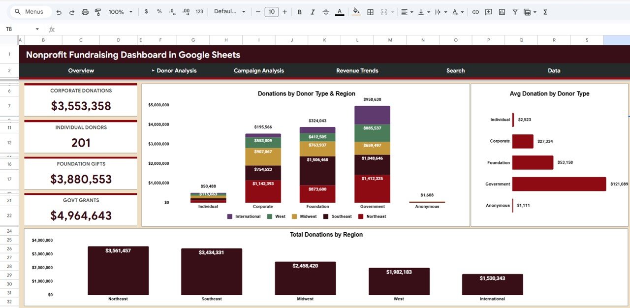
This page answers “who gives and where”. Four cards show Corporate Donations ($3,553,358), Individual Donors (201), Foundation Gifts ($3,880,553) and Govt Grants ($4,964,643). The charts are:
- Donations by Donor Type & Region – stacked bars splitting each donor type across Northeast, Southeast, Midwest, West and International.
- Avg Donation by Donor Type – Government gifts average $121,089 in the sample, while Individual gifts average $2,523.
- Total Donations by Region – Northeast leads at $3,561,457, followed by Southeast at $3,434,331.
The contrast between 201 individual donors and their small average gift is a typical insight: individuals provide breadth, while institutional funders provide most of the dollars.
3. Campaign Analysis
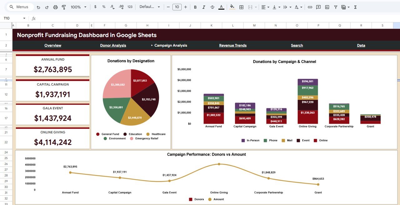
Cards at the left show the totals for Annual Fund ($2,763,895), Capital Campaign ($1,937,191), Gala Event ($1,437,924) and Online Giving ($4,114,242). The charts are:
- Donations by Designation – General Fund, Education, Healthcare, Environment and Emergency Relief. Emergency Relief is the largest slice in the sample at $3,300,582.
- Donations by Campaign & Channel – each campaign split by In-Person, Phone, Mail, Event and Online.
- Campaign Performance: Donors vs Amount – compares the amount raised per campaign with its donor count.
4. Revenue Trends
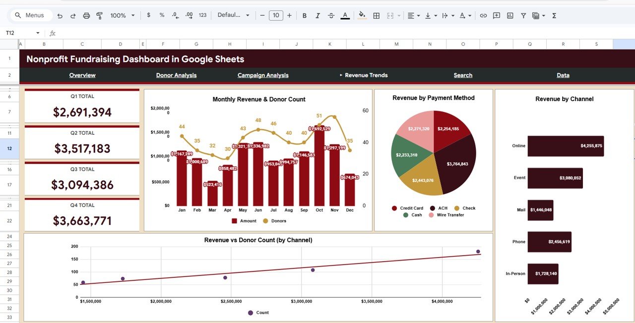
Quarterly cards show Q1 Total ($2,691,394), Q2 Total ($3,517,183), Q3 Total ($3,094,386) and Q4 Total ($3,663,771). Together they add up to the $12,966,734 on the Overview page. The charts are:
- Monthly Revenue & Donor Count – amount as bars and donors as a line on a second axis.
- Revenue by Payment Method – Credit Card, ACH, Check, Cash and Wire Transfer.
- Revenue by Channel – Online is highest in the sample at $4,255,875, followed by Event at $3,080,052.
- Revenue vs Donor Count (by Channel) – a scatter with a trend line showing whether channels with more donors also raise more money.
5. Search (Donation Record Lookup)
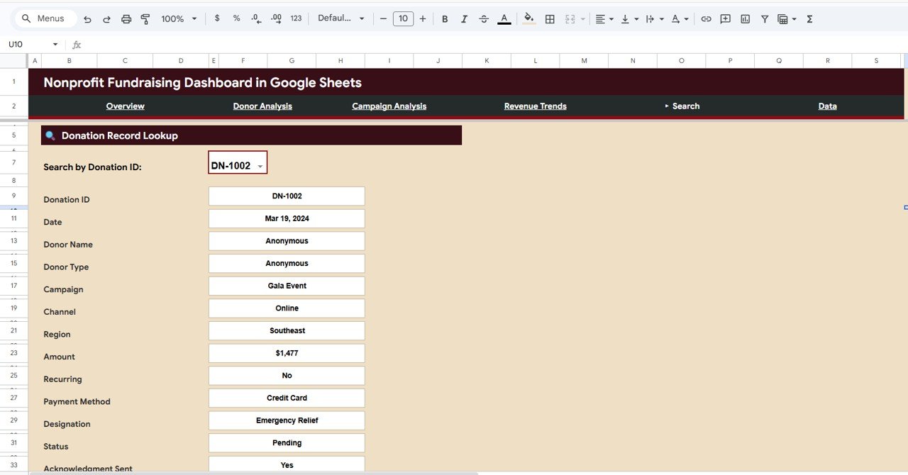
Pick a value in Search by Donation ID (IDs look like DN-1002) and the page shows every field of that record: Donation ID, Date, Donor Name, Donor Type, Campaign, Channel, Region, Amount, Recurring, Payment Method, Designation, Status and Acknowledgment Sent. It is the fastest way to answer a donor’s question or check whether a thank-you letter went out.
6. Data Sheet
Every page reads from the Data sheet. Each row is one donation, using the same fields shown on the Search page. The file ships with sample records so you can see the expected format before replacing them with your own.
How to Use It With Your Own Data
- Open the Google Sheets copy link from the PDF guide and save the file to your own Drive.
- Export donations from your donation platform or CRM as CSV.
- Line up your columns with the Data sheet fields (Donation ID, Date, Donor Name, Donor Type, Campaign, Channel, Region, Amount, Recurring, Payment Method, Designation, Status, Acknowledgment Sent).
- Clear the sample rows and paste your records, keeping the same column order.
- Use the same spelling for repeat values such as campaign and region names so charts group them correctly.
- Open the Overview page, set the Donor Type and Region slicers, and review the KPIs.
- Add new donations weekly, and the KPI cards and charts will update automatically.
Real-World Use Cases
- Board reporting: a treasurer shares a view-only link before each meeting, and the Revenue Trends quarter cards replace a manually built slide.
- Campaign review: after a gala, the development team compares Gala Event income and its channel mix with Online Giving to decide where next year’s effort goes.
- Stewardship check: a coordinator uses the Search page to confirm Acknowledgment Sent before calling a major donor.
Best Practices
- Keep statuses current. Moving Pledged and Pending gifts to Completed when funds arrive keeps the Completion Rate meaningful.
- Use one value per category. “Online” and “Online Giving” are different labels to a spreadsheet.
- Review monthly, report quarterly. Use the Overview each month and the quarter cards for board updates.
- Share view-only. Give stakeholders view access so the formulas and data stay intact.
- Archive each fiscal year. Save a copy at year-end before loading the new year’s data.
Limitations: Who Should Not Use It
- It is a reporting dashboard, not a donor CRM. It does not store contact histories, send receipts or process payments.
- The slicers on the Overview page are Donor Type and Region. If you need to slice by many other fields at once, a pivot-based or Power BI version may suit you better.
- There is no goal or budget-vs-actual page, so targets need to be tracked separately.
- Very large datasets (tens of thousands of rows) will slow down any Google Sheets dashboard.
Related Guides and Templates
To manage the day-to-day donation workflow that feeds this dashboard, see the Donation Management Tracker in Google Sheets. For KPI-style monitoring, read about the Charity Fundraising KPI Dashboard in Google Sheets, and plan your events with the Fundraising Event Calendar in Google Sheets. If you prefer a browser-based version, there is also the Nonprofit Fundraising Dashboard in HTML.
The same dashboard is available for other tools: Nonprofit Fundraising Dashboard in Excel and Nonprofit Fundraising Dashboard in Power BI. If you want to learn how dashboards like this are built, the pivot tables and dashboards course on NextGenTemplates Academy teaches the method step by step.
Frequently Asked Questions
What KPIs does the Nonprofit Fundraising Dashboard track?
Five: Total Donations, Total Donors, Avg Donation, Recurring Rate and Completion Rate, shown as cards on the Overview page.
Which donation statuses does it use?
The sample data uses Completed, Pledged, Pending and Declined. Completion Rate is the share of Completed donations.
Can I filter the dashboard?
Yes. The Overview page has Donor Type and Region slicers, so you can view, for example, only Foundation giving in the Northeast.
How do I find one specific donation?
Open the Search page and choose the Donation ID from the dropdown. All fields for that gift appear, including Acknowledgment Sent.
Can I import data from my CRM?
Yes. Export your donations as CSV, match the columns to the Data sheet and paste them in.
Do I need formula skills?
No. You only maintain the Data sheet. The KPI cards and charts are already built.
Wrapping Up
Good fundraising decisions depend on seeing the whole picture: who gives, through which campaign and channel, and how much is actually completed. The Nonprofit Fundraising Dashboard in Google Sheets puts that picture on five clear pages fed by a single data sheet. Load your donations, check the Overview each month, and use the quarter cards and campaign views for your next board report.
Get the Nonprofit Fundraising Dashboard for Google Sheets
📅 Last updated: October 2026