The Employee Experience and Insights Dashboard in Google Sheets tracks 5 core KPIs across 6 interactive pages, with 20+ pre-built charts and slicer-based filters. According to Google’s Sheets documentation, built-in charting and filter views make Google Sheets a strong candidate for lightweight business dashboards — and this template leverages that capability to deliver engagement, satisfaction, training, recognition, and project analytics in one unified view.Employee Experience and Insights Dashboard in Google Sheets
Whether you manage HR for a 20-person startup or a 500-person mid-market company, this dashboard replaces manual spreadsheets and costly engagement platforms with a one-time $9.99 download that sets up in under 10 minutes.Employee Experience and Insights Dashboard in Google Sheets
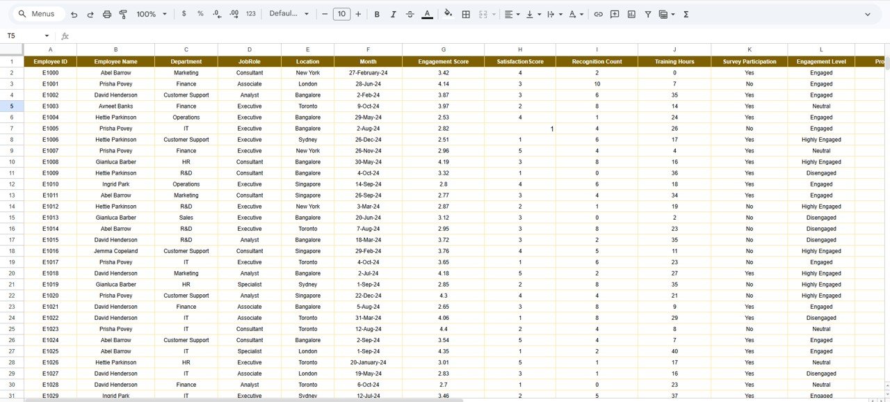
 Employee Experience and Insights Dashboard in Google Sheets
Key Features of Employee Experience and Insights Dashboard in Google Sheets
This dashboard consolidates the most critical employee experience metrics into a single, auto-updating Google Sheets file. Here are the standout features:
- 5 KPI Cards — The overview page displays # of Employees, Avg. Engagement Score, Total Training Hours, Recognition Count, and Avg. Satisfaction Score. Each card recalculates automatically when you update the data sheet.
- 20+ Interactive Charts — Charts cover satisfaction by employee, recognition by survey participation, projects by employee, training hours by employee, and engagement by employee on the overview page alone. Additional analysis pages add location, department, job role, and monthly trend breakdowns.Employee Experience and Insights Dashboard in Google Sheets
- Slicer-Based Filtering — Multiple slicers on the overview page let you filter all charts simultaneously by department, location, job role, or any combination.
- 4 Dedicated Analysis Pages — Location Analysis, Department Analysis, Job Role Analysis, and Monthly Trend each present 4 consistent charts for easy cross-dimensional comparison.
- Structured Data Sheet — A clean data entry tab with pre-defined columns ensures consistent data formatting and seamless dashboard updates.Employee Experience and Insights Dashboard in Google Sheets
The Employee Experience and Insights Dashboard in Google Sheets tracks engagement, satisfaction, training, recognition, and projects across every organizational dimension — making it a single source of truth for HR teams. Related templates like the Workforce Engagement Dashboard in Google Sheets and the HR Engagement Insights Dashboard in Google Sheets cover adjacent analytics areas.
Dashboard Pages Explanation
Click here to Purchase the Employee Experience and Insights Dashboard in Google Sheets
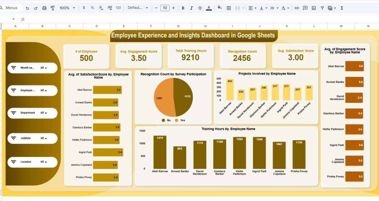
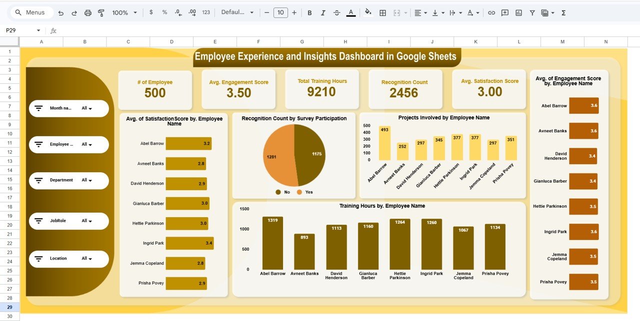
1. Overview Page
The overview page is the main landing view. It features 5 KPI cards at the top showing # of Employees, Avg. Engagement Score, Total Training Hours, Recognition Count, and Avg. Satisfaction Score. Below the cards, 5 analytical charts display Avg. Satisfaction Score by Employee Name, Recognition Count by Survey Participation, Projects Involved by Employee Name, Training Hours by Employee Name, and Avg. Engagement Score by Employee Name. Multiple slicers allow you to filter the entire page instantly.
2. Location Analysis
This tab breaks down four key metrics by office location: Avg. Satisfaction Score by Location, Projects Involved by Location, Training Hours by Location, and Avg. Engagement Score by Location. Use this page to identify which locations have the strongest engagement and where HR intervention may be needed.
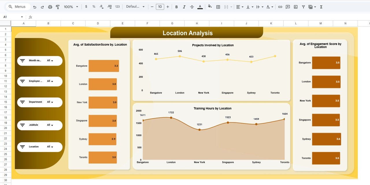 Location Analysis
3. Department Analysis
Charts for Avg. Satisfaction Score by Department, Projects Involved by Department, Training Hours by Department, and Avg. Engagement Score by Department. This page helps HR leaders spot departmental trends, compare training investments, and allocate resources to departments with lower engagement.
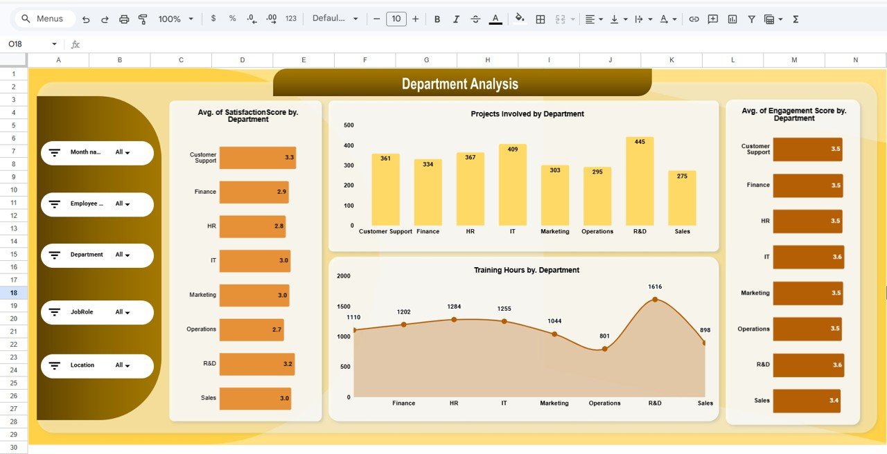 Department Analysis
4. Job Role Analysis
Visualizes Avg. Satisfaction Score by Job Role, Projects Involved by Job Role, Training Hours by Job Role, and Avg. Engagement Score by Job Role. Understand which roles report the highest satisfaction and which roles may need additional support, mentoring, or workload adjustments.
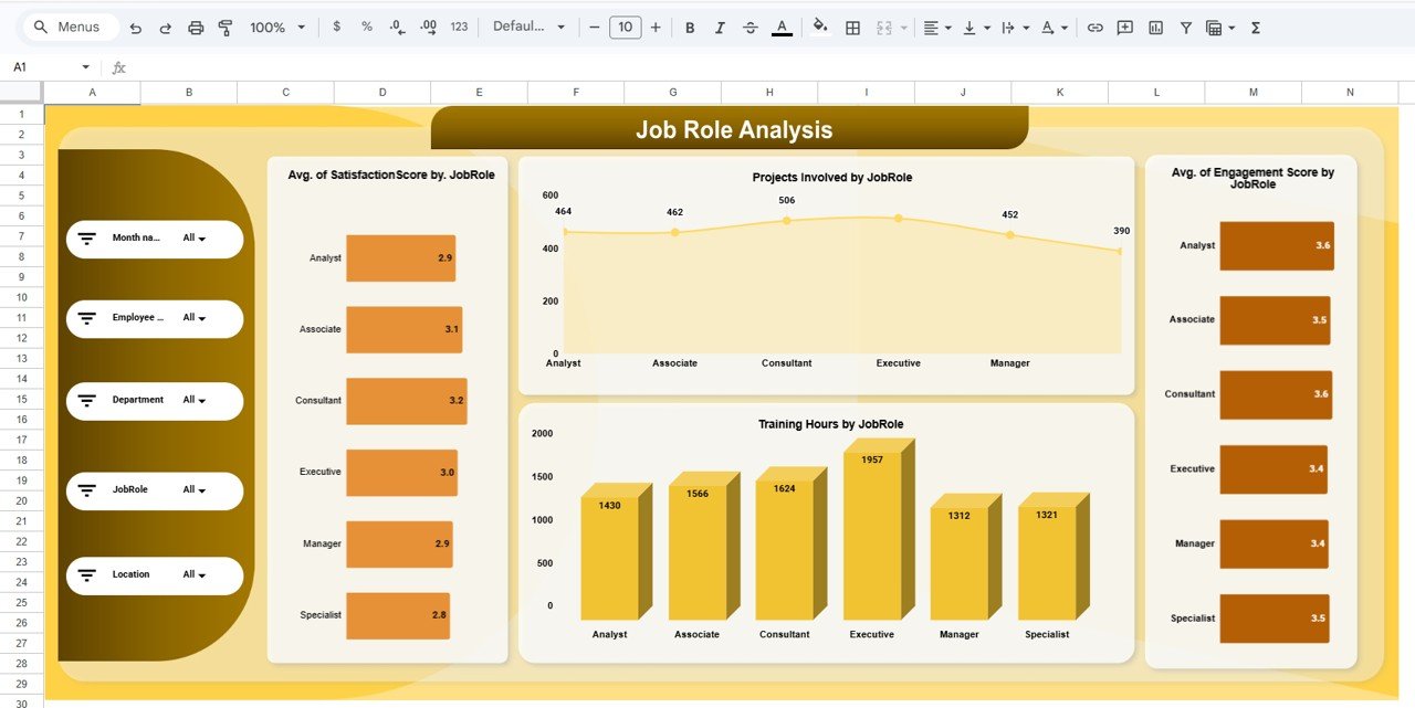 Job Role Analysis
5. Monthly Trend
Tracks Avg. Satisfaction Score by Month, Projects Involved by Month, Training Hours by Month, and Avg. Engagement Score by Month. Monitor seasonal patterns, measure the impact of HR initiatives over time, and present trend data in leadership reviews.
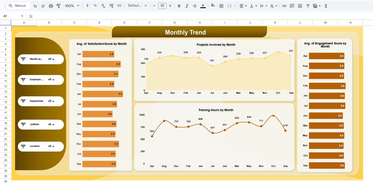 Monthly Trend
6. Data Sheet
The raw data entry sheet where you add employee records. Fields include employee name, department, location, job role, engagement score, satisfaction score, training hours, recognition count, projects involved, and survey participation. Replace the sample data with your own and every dashboard page updates automatically.
Who Should Use This Template
Perfect for:
- HR managers at 10-500 person companies tracking engagement and satisfaction trends across departments and locations
- People Operations leads who need to present visual workforce analytics to leadership without enterprise software
- Small business owners monitoring training investment, recognition programs, and overall employee sentiment
- HR consultants delivering workforce analytics reports to multiple clients using a reusable template
Not a fit if:
- You need SOC 2 compliance, SSO, and automated pulse survey distribution (look at dedicated HRIS platforms)
- You require real-time API integration with survey tools like SurveyMonkey or Qualtrics
- You need payroll processing, benefits administration, or applicant tracking in the same tool. Employee Experience and Insights Dashboard in Google Sheets
Real-World Use Cases
Click here to Purchase the Employee Experience and Insights Dashboard in Google Sheets
Priya manages HR at a 120-person IT services firm in Bangalore. She uses the Employee Experience and Insights Dashboard to track engagement scores across 4 office locations, identify which departments have the lowest satisfaction ratings, and present monthly trend reports to the leadership team — replacing a $960/year Culture Amp subscription with a $9.99 one-time template.
Marcus runs People Operations at a 45-person marketing agency in Chicago. He replaced a manual Excel spreadsheet with this dashboard to monitor training hours by job role, track recognition counts, and compare engagement trends month over month. The slicer-based filtering saves him 3 hours per week on ad-hoc reporting.
Elena consults for 6 mid-size manufacturing clients across Europe. She duplicates this template for each client, customizes the data fields, and delivers branded workforce analytics reports — turning a $9.99 template into a recurring consulting deliverable.
Advantages of Employee Experience and Insights Dashboard in Google Sheets
- Zero software cost beyond the template — Google Sheets is free; the entire dashboard runs in a browser with no installs needed.
- Real-time collaboration — Share the dashboard link and your HR team can view, comment, or edit simultaneously from any device.
- Multi-dimensional analysis — Four dedicated analysis pages (location, department, job role, monthly) provide drill-down insights that most manual spreadsheets lack.
- Slicer-based filtering — Filter all overview charts by department, location, or job role in one click, reducing report preparation time.
- Scalable — Add as many employees, departments, or locations as you need. The charts and slicers adapt automatically.Employee Experience and Insights Dashboard in Google Sheets
Opportunities for Improvement
- Manual data entry — This dashboard requires you to paste or type employee data into the Data Sheet tab. There is no automatic integration with survey tools like SurveyMonkey, Qualtrics, or Google Forms.
- No automated alerts — If an engagement score drops below a threshold, the dashboard won’t send a notification. You need to review the charts manually or add conditional formatting rules.
- Chart customization limits — Google Sheets charts offer fewer visualization options than Power BI or Tableau. If you need advanced drill-throughs or custom visuals, consider the Employee Engagement Dashboard in Power BI.
Best Practices
Click here to Purchase the Employee Experience and Insights Dashboard in Google Sheets
- Update data monthly — Refresh employee records in the Data Sheet at least once per month to keep trend analysis accurate and meaningful.
- Use consistent naming — Keep department names, location names, and job role titles consistent across entries to avoid split categories in charts.
- Protect the dashboard tabs — Use Google Sheets’ “Protect Sheet” feature on the analysis pages to prevent accidental edits while keeping the Data Sheet editable.
- Duplicate for archiving — Make a copy of the dashboard at the end of each quarter so you have snapshot records for year-over-year comparison.
- Combine with the Workforce Analytics Dashboard — Use the Employee Experience dashboard for engagement-focused analysis and the Workforce Analytics dashboard for headcount, attrition, and diversity metrics.Employee Experience and Insights Dashboard in Google Sheets
Explore Relevant Templates
- Workforce Engagement Dashboard in Google Sheets — Track workforce engagement metrics with drill-down analysis by team and department.
- HR Engagement Insights Dashboard in Google Sheets — Dedicated HR engagement analytics with survey response tracking and trend charts.
- Workforce Analytics Dashboard in Google Sheets — Broader workforce analytics covering headcount, attrition, diversity, and performance metrics.
- Employee Engagement Dashboard in Google Sheets — Focused engagement tracking with sentiment analysis charts.
- Employee Engagement Dashboard in Power BI — Need Power BI? This version delivers the same insights with advanced visualization capabilities.
Browse all HR & Payroll Templates on NextGenTemplates.
Frequently Asked Questions
Click here to Purchase the Employee Experience and Insights Dashboard in Google Sheets
What KPIs does the Employee Experience and Insights Dashboard track?
The Employee Experience and Insights Dashboard tracks 5 core KPIs: number of employees, average engagement score, total training hours, recognition count, and average satisfaction score. All metrics update automatically when you replace the sample data with your own.Employee Experience and Insights Dashboard in Google Sheets
Can I filter the dashboard by department or location?
Yes. The overview page includes multiple slicers that let you filter by department, location, job role, or any combination. All charts on the page update simultaneously when a filter is applied.
How does this compare to BambooHR or Culture Amp?
The Employee Experience Dashboard costs $9.99 one-time versus $6-12 per user per month for BambooHR or Culture Amp. It covers the same engagement and satisfaction analytics without ongoing subscription costs or lengthy onboarding.
How long does setup take?
Setup takes under 10 minutes. Open the PDF guide, click the Google Sheets copy link, replace the sample data with your own employee records, and every chart and KPI card updates automatically.
Can I add more employees or departments?
Yes. The data sheet is fully editable. Add as many rows as you need and new departments, locations, or job roles appear automatically in the analysis pages and slicer filters.Employee Experience and Insights Dashboard in Google Sheets
Does the dashboard work on mobile?
Yes. Google Sheets works on any device through the Google Sheets mobile app or browser. You can view, filter, and share the dashboard from your phone or tablet.
Can I customize the charts or add new analysis pages?
Yes. Since it is a standard Google Sheets file, you can add new tabs, create additional charts, modify existing visualizations, or connect to Google Forms for automated data collection.Employee Experience and Insights Dashboard in Google Sheets
About the Author
Built by PK — Microsoft Certified Professional with 15+ years of Excel, Google Sheets, and Power BI experience. Founder of NextGenTemplates, reaching 300K+ subscribers across YouTube channels. Every template is hand-built and tested before release.Employee Experience and Insights Dashboard in Google Sheets
Conclusion
The Employee Experience and Insights Dashboard in Google Sheets gives HR teams a clear, visual way to track engagement, satisfaction, training, recognition, and project involvement across every organizational dimension. With 5 KPI cards, 20+ charts, slicer-based filtering, and 4 dedicated analysis pages, it replaces manual spreadsheets and costly SaaS subscriptions with a single, collaborative Google Sheets file.
Click here to Purchase the Employee Experience and Insights Dashboard in Google Sheets
Instant download · One-time payment · No subscription · Lifetime access
Visit our YouTube channel for step-by-step tutorials: YouTube.com/@NeoTechNavigators