Startup Burn Rate Dashboard in Google Sheets is a ready-to-use, professionally designed interactive dashboard template that helps startup founders, CFOs, financial analysts, and early-stage investors track, analyze, and visualize their company’s cash burn, expenses, revenue streams, and financial runway — all within Google Sheets. Managing a startup’s finances involves monitoring dozens of metrics across multiple departments, expense categories, vendors, and funding rounds. Without a centralized financial dashboard, founders often struggle to answer critical questions: How fast are we burning cash? Which department is spending the most? Are we on track to hit our revenue targets? How many months of runway do we have left?
This Google Sheets Dashboard Template solves these challenges by consolidating all your startup’s financial data into 5 interactive dashboard pages with dynamic charts, real-time KPI cards, multiple slicers for instant filtering, and a smart transaction search system. Whether you are preparing for a board meeting, creating an investor update, or simply keeping a pulse on your burn rate, this dashboard delivers the insights you need in a clean, professional format. If you are also looking for SaaS-specific financial tracking, explore the SaaS Financial Model Dashboard in Google Sheets.
Key Features of Startup Burn Rate Dashboard in Google Sheets
👉 Click here to Purchase Startup Burn Rate Dashboard in Google Sheets
The Startup Burn Rate Dashboard in Google Sheets is packed with powerful features designed to give startup teams complete visibility into their financial health. Here is what makes this template stand out:
- 5 Interactive Dashboard Pages — Overview, Expense Analysis, Revenue and Runway, Search Transaction Records, and Data Sheet provide a comprehensive financial tracking experience.
- 5 Real-Time KPI Cards — Total Burn, Total Revenue, Net Burn, Avg Monthly Burn, and Total Transactions update automatically as you enter your data.
- 11+ Dynamic Charts — Visualize your startup’s financial data through bar charts, pie charts, trend lines, and comparative analysis across all 5 pages.
- Multiple Slicers and Filters — Filter the entire dashboard by department, expense category, payment method, transaction status, and time period for focused analysis.
- Smart Transaction Search — Look up any individual transaction by Record ID with 13 data fields displayed instantly.
- Zero Coding Required — Built entirely with native Google Sheets formulas and charts. No add-ons, macros, or scripting needed.
- Investor-Ready Design — Clean, professional layout that is perfect for board presentations, fundraising decks, and investor updates.
Dashboard Pages Explained
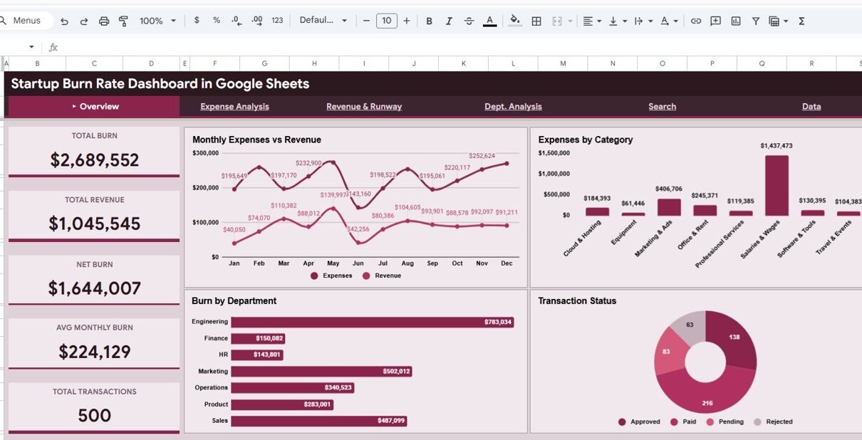
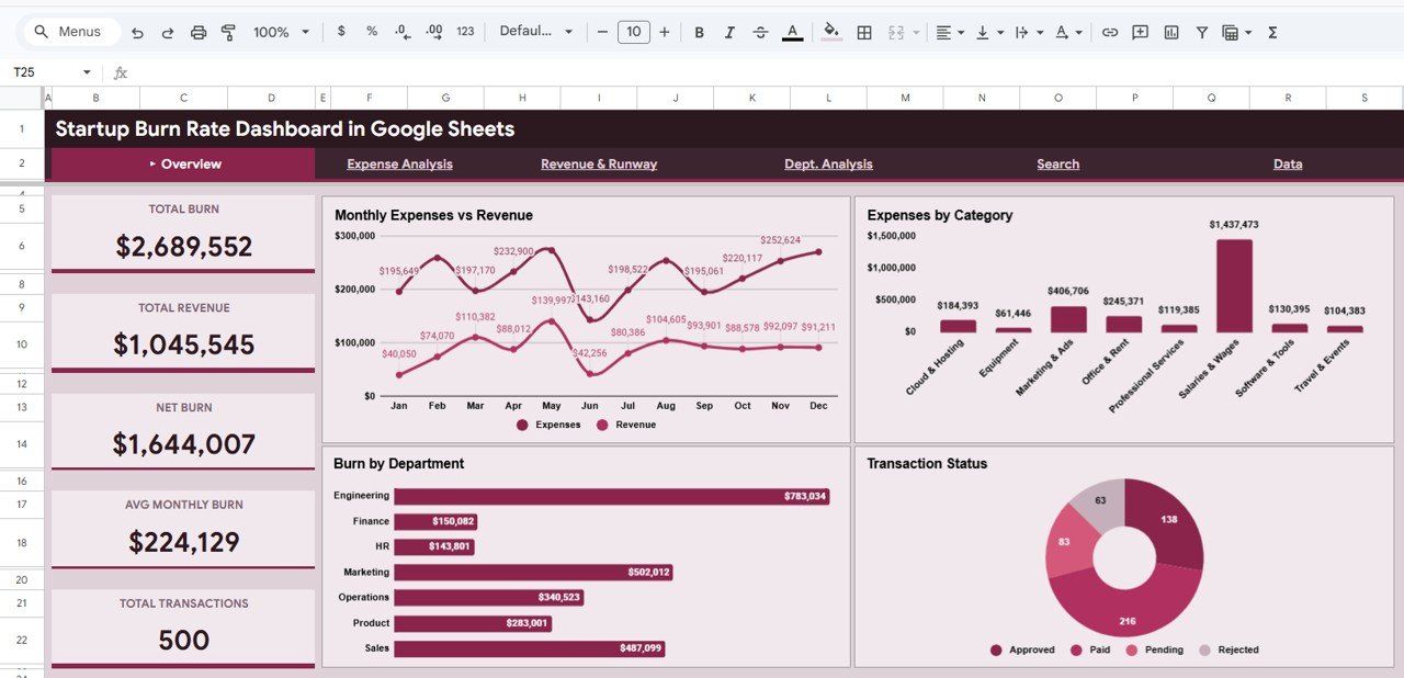
1. Overview Page
The Overview page is the command center of the Startup Burn Rate Dashboard. At the top, you will find 5 high-level KPI cards that provide instant visibility into your startup’s financial health: Total Burn shows the total amount spent across all departments and categories, Total Revenue displays income generated over the tracked period, Net Burn calculates the difference between expenses and revenue, Avg Monthly Burn reveals your average monthly spending rate, and Total Transactions counts all financial records in your dataset.
Below the KPI cards, 4 dynamic charts deliver visual insights: Monthly Expenses vs Revenue compares your spending against income month over month to reveal trends. Expenses by Category breaks down where your money is going across categories like salaries, marketing, infrastructure, and operations. Burn by Department shows which teams are consuming the most resources. Transaction Status visualizes the distribution of completed, pending, and other transaction statuses. Multiple slicers let you filter the entire page instantly.
Startup Burn Rate Dashboard in Google Sheets
2. Expense Analysis
The Expense Analysis page dives deeper into your startup’s spending patterns with 4 focused analytical charts. Monthly Expenses by Type categorizes spending into fixed vs variable expenses over time, helping you identify cost structure trends. Payment Method Distribution reveals how payments are being made — whether through bank transfers, credit cards, digital wallets, or other methods. Top 10 Vendor Spend ranks your biggest vendors by total expenditure, making it easy to spot concentration risks or renegotiation opportunities. Category Expense Breakdown provides a granular view of spending across all expense categories so you can pinpoint areas for cost optimization.
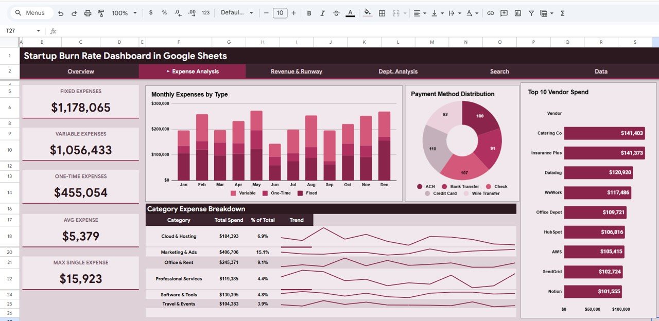
Expense Analysis
3. Revenue and Runway
The Revenue and Runway page is where strategic financial planning happens. Expenses vs Revenue Monthly overlays your spending and income on a single chart so you can see whether the gap is narrowing or widening. Cumulative Net Burn tracks how your total net burn accumulates over time — this is your financial runway indicator. A steadily rising cumulative net burn signals that you are spending faster than you are earning, while a flattening curve suggests you are approaching break-even. Revenue vs Expenses by Department compares income generation against costs at the department level, helping you identify which teams are revenue-positive and which are cost centers. For more cash flow tracking tools, check out the Cash Flow KPI Dashboard in Google Sheets.

Revenue and Runway
4. Search Transaction Records
The Search Transaction Records page provides a powerful lookup system where you can search any individual transaction by its Record ID. Once you enter a Record ID, the page instantly displays all associated details including Date, Department, Expense Category, Expense Type, Description, Amount, Revenue, Net Burn, Status, Payment Method, Vendor, and Funding Round. This is essential for financial audits, expense verification, and detailed transaction-level analysis. Whether your accountant needs to verify a specific payment or you want to trace a particular vendor charge, this search page delivers immediate answers.
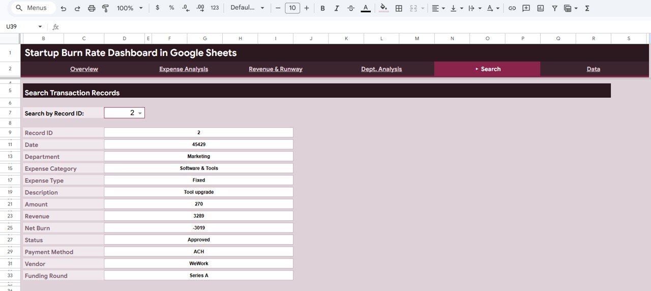
Search Sheet tab
5. Data Sheet
The Data Sheet is the backbone of the entire dashboard. It contains pre-structured columns with sample data that you simply replace with your own startup’s financial records. The columns include Record ID, Date, Department, Expense Category, Expense Type, Description, Amount, Revenue, Net Burn, Status, Payment Method, Vendor, and Funding Round. Simply paste your data in the same format and all 4 dashboard pages — Overview, Expense Analysis, Revenue and Runway, and Search Transaction Records — update automatically.
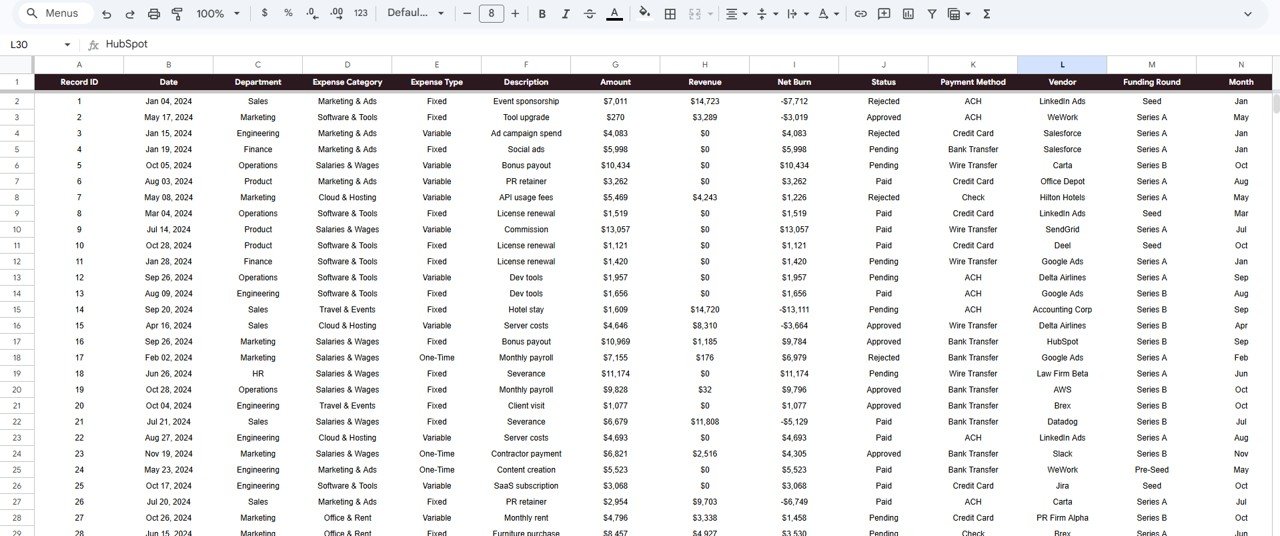
Data Sheet tab
Advantages of Startup Burn Rate Dashboard in Google Sheets
- Cloud-Based Access — Being in Google Sheets means you can access your burn rate dashboard from any device with an internet connection — desktop, laptop, tablet, or mobile.
- Real-Time Collaboration — Share the dashboard with co-founders, CFOs, board members, or investors and everyone sees the same live data simultaneously.
- No Software Costs — Google Sheets is free to use. You do not need expensive BI tools like Power BI or Tableau to get professional financial analytics.
- Instant Updates — All charts, KPIs, and analysis pages recalculate automatically when you update the Data Sheet. Zero manual refreshing required.
- Customizable — Add new columns, modify chart types, adjust filters, or extend the data range to match your startup’s specific needs.
Opportunities for Improvement
👉 Click here to Purchase Startup Burn Rate Dashboard in Google Sheets
- Forecasting Module — Adding a predictive runway calculation page that estimates months until cash runs out based on current burn rate trends would make the dashboard even more powerful for fundraising planning.
- Budget vs Actual — A dedicated budget comparison page showing planned vs actual spending by department and category would help teams stay within financial targets.
- Multi-Currency Support — Startups with international operations could benefit from built-in currency conversion for cross-border expense tracking.
- Automated Data Import — Integration with banking APIs or accounting tools like QuickBooks or Xero could automate data entry and reduce manual effort.
Best Practices for Using This Dashboard
- Update Weekly — Enter new transactions at least once a week to keep your burn rate calculations current and your KPIs accurate.
- Use Consistent Categories — Stick to a standardized list of expense categories and departments so your charts remain clean and comparable over time.
- Review Monthly — Schedule a monthly financial review using the Overview and Revenue and Runway pages to spot trends early and make data-driven decisions.
- Share with Stakeholders — Use Google Sheets sharing to give view-only access to investors and board members so they can see your financial health in real time.
- Backup Regularly — Make periodic copies of your dashboard to preserve historical snapshots before major data updates.
Explore Relevant Templates
If you found this Startup Burn Rate Dashboard useful, here are some related templates from NextGenTemplates that you might also want to explore:
- Startup Burn Rate Dashboard in Power BI — The same burn rate analytics powered by Power BI for advanced data modeling and enterprise-scale reporting.
- Startup Burn Rate Dashboard in Excel — Prefer Microsoft Excel? Get the same 5-page dashboard experience in Excel format.
- SaaS Financial Model Dashboard in Google Sheets — Track MRR, ARR, churn, CAC, and LTV with this SaaS-specific financial dashboard.
- Small Business CFO Dashboard in Google Sheets — A comprehensive CFO-level dashboard for small businesses covering profit and loss, cash flow, and budget tracking.
- Small Business CFO Dashboard Blog Post — Read the detailed walkthrough of the Small Business CFO Dashboard features and pages.
Frequently Asked Questions
👉 Click here to Purchase Startup Burn Rate Dashboard in Google Sheets
What is the best Google Sheets template for tracking startup burn rate?
The Startup Burn Rate Dashboard in Google Sheets from NextGenTemplates is the best ready-to-use template for tracking startup cash burn. It includes 5 interactive dashboard pages with real-time KPI cards, 11+ dynamic charts, multiple slicers, and a smart transaction search system — all built with native Google Sheets formulas requiring zero coding.
How do I calculate my startup’s burn rate using this dashboard?
Simply enter your monthly expenses and revenue data in the Data Sheet. The dashboard automatically calculates Total Burn, Net Burn (total expenses minus total revenue), and Avg Monthly Burn. The Revenue and Runway page shows your cumulative net burn trend over time so you can project your financial runway.
Can I filter the dashboard by department or expense category?
Yes. The Overview page includes multiple slicers that let you filter the entire dashboard by department, expense category, payment method, transaction status, and time period. This makes it easy to isolate spending patterns for specific teams or cost categories.
Do I need advanced Google Sheets skills to use this template?
No. The dashboard is completely pre-built with all formulas, charts, and formatting already in place. Simply replace the sample data in the Data Sheet with your own financial records and all pages update automatically. No formulas to write, no coding required.
Can I share this dashboard with my investors or board members?
Absolutely. Since it is built in Google Sheets, you can share a view-only link with investors, board members, or advisors. They will see live, up-to-date financial data without being able to modify your records. The professional design makes it ideal for board presentations and investor updates.
What data fields are tracked in the Data Sheet?
The Data Sheet tracks 13 fields per transaction: Record ID, Date, Department, Expense Category, Expense Type, Description, Amount, Revenue, Net Burn, Status, Payment Method, Vendor, and Funding Round. This comprehensive structure supports detailed financial analysis across all dashboard pages.
Conclusion
The Startup Burn Rate Dashboard in Google Sheets is an essential financial tool for any startup that wants to track expenses, monitor revenue, and understand its cash runway — all in one place. With 5 interactive pages, 5 real-time KPI cards, 11+ dynamic charts, and a smart search system, this dashboard gives founders and finance teams the visibility they need to make informed decisions. Whether you are a seed-stage startup managing your first budget or a Series A company reporting to your board, this template delivers professional-grade financial analytics without requiring any coding or expensive BI tools.
👉 Click here to Purchase Startup Burn Rate Dashboard in Google Sheets
For more Google Sheets dashboard templates and tutorials, visit our YouTube channel:
👉 Youtube.com/@NeoTechNavigators