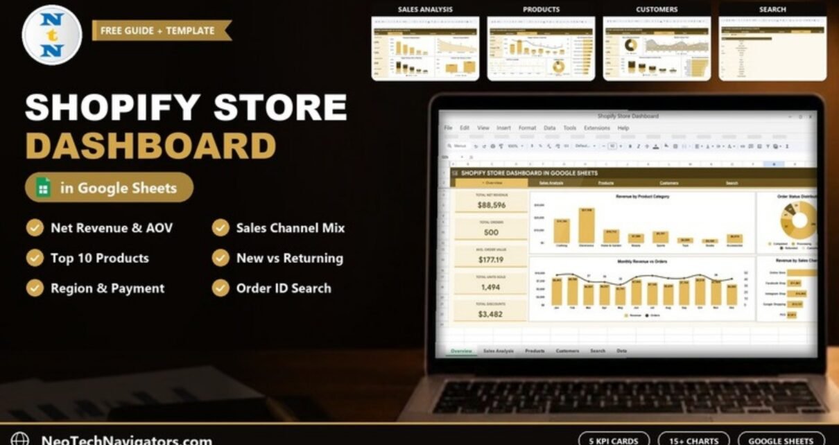
The Shopify Store Dashboard in Google Sheets turns a Shopify order export into a clear report on revenue, orders, discounts, products, customers and sales channels. It is made for store owners, e-commerce managers and freelancers who want answers such as “which channel brings the most revenue?” or “who are my top ten customers?” without paying for another analytics app.
The workbook has six tabs: Overview, Sales Analysis, Products, Customers, Search and Data. Sixteen KPI cards and sixteen charts read from the same order data, and an Order ID lookup on the Search tab shows the full details of any order.
This guide walks through each tab, explains how the main e-commerce KPIs are calculated, shows how to load your own Shopify export and covers the template’s limits honestly.
🎥 Watch the Video Tutorial
Get the Shopify Store Dashboard
What Problem Does This Shopify Dashboard Solve?
Shopify’s built-in analytics are good for a quick look, but deeper questions often need a higher plan or a paid app, and the numbers are hard to share with an accountant or a partner who does not have store access. Many owners end up exporting orders to a spreadsheet and building pivot tables every month.
This template does that work once. You paste the order export into the Data tab and the dashboard summarises it by product category, sales channel, shipping region, payment method, customer type and fulfillment status. Because it lives in Google Sheets, you can share it with your team or bookkeeper with normal Google Drive permissions.
It suits:
- Small and growing Shopify stores that want monthly reporting without an extra subscription.
- Agencies and freelancers who prepare performance reports for Shopify clients.
- Owners who sell through several channels (Online Store, POS, Instagram Shop, Facebook Shop or Google Shopping) and want to compare them.
Dashboard Tabs Explained
1. Overview
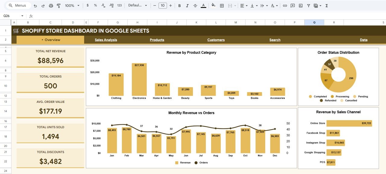
The Overview tab shows five KPI cards: Total Net Revenue ($88,596 in the sample), Total Orders (500), Avg. Order Value ($177.19), Total Units Sold (1,494) and Total Discounts ($3,482). Next to them are Revenue by Product Category (Clothing, Electronics, Home & Garden, Beauty, Sports, Toys, Books and Accessories), Order Status Distribution (Completed, Processing, Pending, Refunded and Cancelled), Monthly Revenue vs Orders and Revenue by Sales Channel. Watching Total Discounts next to revenue is useful: rising revenue paired with much faster rising discounts can mean you are buying sales rather than earning them.
2. Sales Analysis
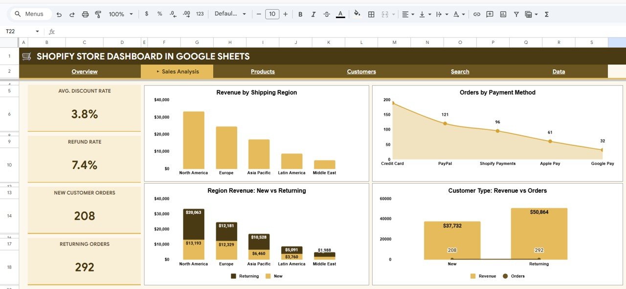
This tab looks at where and how customers buy. Its four KPI cards are Avg. Discount Rate (3.8%), Refund Rate (7.4%), New Customer Orders (208) and Returning Orders (292). The charts are Revenue by Shipping Region (North America, Europe, Asia Pacific, Latin America and Middle East), Orders by Payment Method (Credit Card, PayPal, Shopify Payments, Apple Pay and Google Pay), Region Revenue: New vs Returning and Customer Type: Revenue vs Orders. It helps you decide where to focus shipping offers and which payment options matter most.
3. Products
The Products tab has three KPI cards: Top Category (Electronics), Top Product (Portable Charger 20K) and Avg. Unit Price ($61.52). The charts are Category: Revenue vs Units Sold, Top 10 Products by Revenue, Unit Price vs Quantity and Fulfillment Status (Fulfilled, Unfulfilled, Partially Fulfilled and Returned). A category that sells many units but little revenue is a pricing or bundling question; a top product with many unfulfilled orders is a stock question.

4. Customers
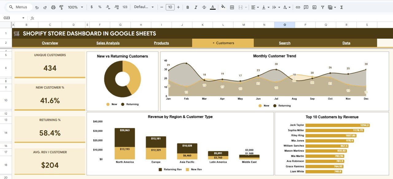
The Customers tab shows four KPI cards: Unique Customers (434), New Customer % (41.6%), Returning % (58.4%) and Avg. Rev / Customer ($204). Its charts are New vs Returning Customers, Monthly Customer Trend, Revenue by Region & Customer Type and Top 10 Customers by Revenue. The top-customer list is a ready-made starting point for a VIP email or a thank-you discount.
5. Search
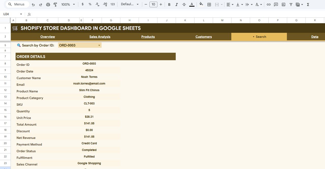
Select an Order ID from the Search by Order ID dropdown and the Order Details panel shows the Order Date, Customer Name, Email, Product Name, Product Category, SKU, Quantity, Unit Price, Total Amount, Discount, Net Revenue, Payment Method, Order Status, Fulfillment and Sales Channel. The product page describes the lookup as powered by Google Apps Script, so Google may ask you to authorise the script the first time you use it in your copy.
6. Data
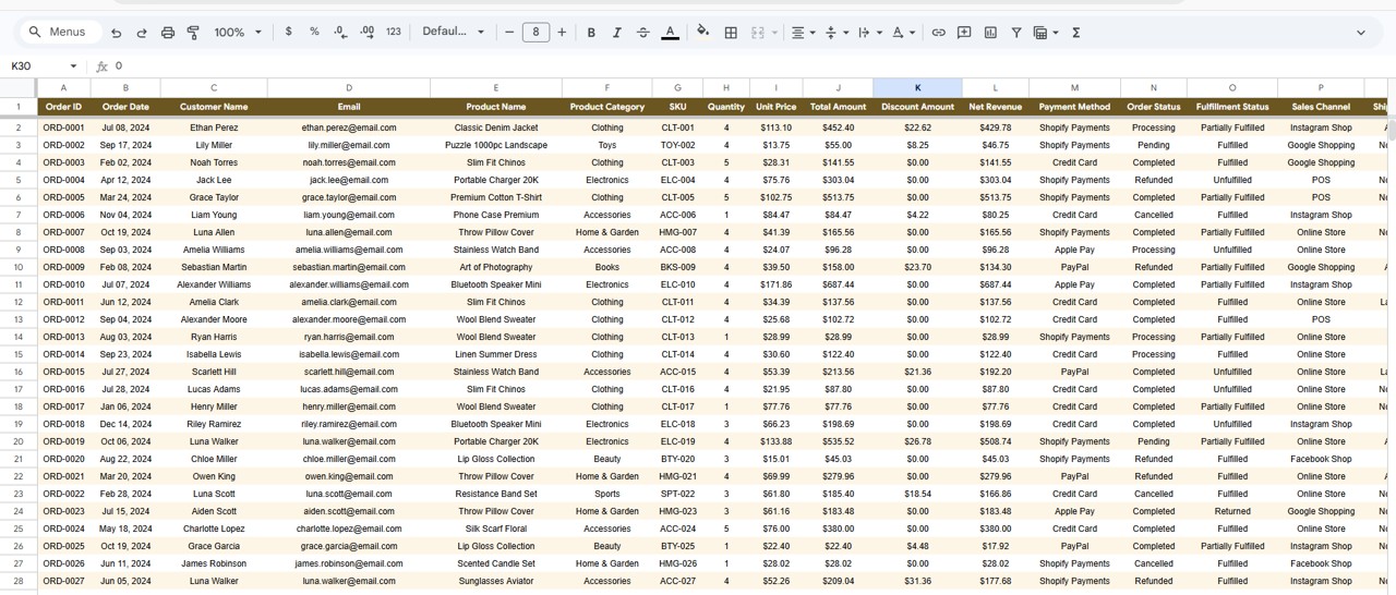
The Data tab holds one row per order, with the columns Order ID, Order Date, Customer Name, Email, Product Name, Product Category, SKU, Quantity, Unit Price, Total Amount, Discount Amount, Net Revenue, Payment Method, Order Status, Fulfillment Status and Sales Channel, followed by shipping and customer fields. The 500 sample rows show the expected format.
Key Shopify KPIs and How They Are Calculated
| KPI | What it measures | Formula | Better when |
|---|---|---|---|
| Total Net Revenue | Sales after discounts | Sum of Net Revenue (Total Amount − Discount Amount) | Higher |
| Total Orders | Number of orders in the data | Count of Order IDs | Higher |
| Avg. Order Value | Net revenue earned per order | Total Net Revenue ÷ Total Orders | Higher |
| Total Units Sold | Volume of items sold | Sum of Quantity | Higher |
| Total Discounts | Revenue given away through codes and offers | Sum of Discount Amount | Lower (relative to revenue) |
| Avg. Discount Rate | Discounts as a share of gross sales | Total Discounts ÷ Total Amount | Lower |
| Refund Rate | Share of orders refunded | Refunded orders ÷ Total Orders | Lower |
| Avg. Rev / Customer | Net revenue per unique customer | Total Net Revenue ÷ Unique Customers | Higher |
Worked example with the sample data: Total Net Revenue is $88,596 from 500 orders, so Avg. Order Value is 88,596 ÷ 500 = $177.19. Discounts of $3,482 against gross sales of about $92,078 (88,596 + 3,482) give an Avg. Discount Rate of about 3.8%. The 37 refunded orders out of 500 give a Refund Rate of 7.4%, and 88,596 ÷ 434 unique customers gives about $204 of revenue per customer. To check the same numbers in any sheet:
Net revenue:     =SUM(TotalAmount)-SUM(DiscountAmount)
Avg order value: =(SUM(TotalAmount)-SUM(DiscountAmount))/COUNTA(OrderID)
Discount rate:   =SUM(DiscountAmount)/SUM(TotalAmount)
Refund rate:     =COUNTIF(OrderStatus,"Refunded")/COUNTA(OrderID)
How to Use It with Your Own Shopify Data
- Open the PDF guide from your purchase and use the link to Make a copy in your Google Drive.
- In Shopify admin, go to Orders → Export and export the orders for the period you want as CSV.
- Rearrange or rename the export columns to match the Data tab headers.
- Paste your rows over the sample data, keeping the header row as it is.
- Open the Overview tab; the cards and charts pick up your data.
- On the Search tab, pick an Order ID and approve the Google authorisation prompt if one appears in your copy.
- Each month, append the new export below the existing rows.
Real-World Use Cases
- Monthly owner review: compare Revenue by Sales Channel with the previous month and decide where to spend next month’s ad budget.
- Discount check: look at Total Discounts and Avg. Discount Rate after a sale event to see whether the promotion paid off.
- Customer care: a support team member uses the Search tab to confirm an order’s status, fulfillment and payment method while answering an email.
Best Practices
- Export the same date range format every time so monthly trends are comparable.
- Keep category and channel names consistent; Shopify exports can change labels when you rename collections.
- Exclude test orders before pasting, or they will inflate orders and lower AOV.
- Use the filters for different audiences: marketing looks at channels, finance at regions and payment methods.
- Do not insert columns in the Data tab; add extra notes in a separate sheet instead.
Limitations and Who Should Not Use It
- There is no live connection to Shopify; data is updated by export and paste.
- The data layout has no product cost column, so it reports revenue, not profit margin.
- Website traffic and conversion rate are not part of the data. For that, see the Ecommerce Conversion Rate KPI Dashboard.
- Stores with very high order volumes may find Google Sheets slow; the Power BI version handles larger data better.
Which Version Should You Choose?
| Version | Best for | Trade-off |
|---|---|---|
| Google Sheets | Sharing with a team, bookkeeper or client in the browser | Slower with very large exports |
| Excel | Desktop users comfortable with pivot tables | Needs Microsoft Excel |
| Power BI | Large catalogues and drill-down analysis | Steeper learning curve |
Prefer a single file that opens in the browser? Read our guide to the Shopify Store Dashboard in HTML. If you also sell on marketplaces, the Amazon FBA Seller Dashboard, the Etsy Seller Analytics Dashboard and the Online Marketplaces Dashboard in Google Sheets use the same approach. For target-based tracking, see the E-commerce KPI Dashboard in Google Sheets.
If you want to learn to build summaries and dashboards like this yourself, the Excel Pivot Tables & Dashboards course on NextGenTemplates Academy covers the techniques step by step.
Frequently Asked Questions
Can I connect the dashboard directly to my Shopify store?
No. Export your orders from Shopify admin (Orders → Export) and paste them into the Data tab. All tabs update once the rows are in place.
Which KPIs does the dashboard show?
Sixteen KPI cards: Total Net Revenue, Total Orders, Avg. Order Value, Total Units Sold and Total Discounts on the Overview; Avg. Discount Rate, Refund Rate, New Customer Orders and Returning Orders on Sales Analysis; Top Category, Top Product and Avg. Unit Price on Products; and Unique Customers, New Customer %, Returning % and Avg. Rev / Customer on Customers.
Why might the Search tab ask for permission?
The product page describes the Order ID lookup as using Google Apps Script. Google asks every user to authorise a script the first time it runs in their own copy of a file.
Can I combine more than one Shopify store?
The template is laid out for one store. The simplest approach is a separate copy per store, so each store’s revenue, customers and channels stay clean.
Does it calculate profit?
No. The data has no product cost column, so it reports net revenue after discounts rather than profit.
Can I use it for WooCommerce or another platform?
Yes, if you map your export to the same columns. The charts depend on the column structure, not on Shopify itself.
Wrapping Up
The Shopify Store Dashboard in Google Sheets gives you a shareable monthly view of revenue, discounts, products, channels and customers from a standard order export. Export last month’s orders, paste them in, and start with the Overview and Customers tabs: they usually show the quickest wins.
Get the Shopify Store Dashboard in Google Sheets
📅 Last updated: October 2026