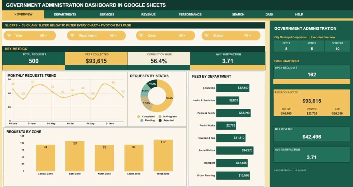
Government Administration Dashboard in Google Sheets is built for teams that need a practical way to review public-service requests, department performance, fee collection, processing cost, zones, officers, and citizen satisfaction without moving into a large paid system. The template includes 7 dashboard pages, 9 top-level KPI cards, 16 chart views, multiple slicers, a Request ID search sheet, and a structured data sheet so teams can replace sample records with their own administration data.Government Administration Dashboard in Google Sheets
For local offices, municipal departments, service desks, and public administration teams, the biggest reporting problem is usually not a lack of data. It is that request records are scattered, hard to summarize, and slow to explain in meetings. This Google Sheets dashboard gives those records a cleaner reporting layer so users can check high-level workload, compare departments, review service channels, and look up a specific request quickly.
The dashboard also uses slicers for quick filtering. Google’s Sheets help documentation explains that slicers can filter tables, charts, and pivot tables, which makes them useful for operational dashboards where users need fast filtered views.
View the product: Government Administration Dashboard in Google Sheets.
Key Features of Government Administration Dashboard in Google Sheets
- 7 working pages: Overview, Department Analysis, Service Analysis, Revenue Analysis, Performance Analysis, Search Sheet, and Data Sheet.
- 9 KPI cards: Total Requests, Fees Collected, Completion Rate, Avg Satisfaction, Depts, Zones, Officers, Open Requests, and Net Revenue.
- 16 chart views: Review request volume, status, fees, costs, service types, zones, officers, processing days, channels, and satisfaction.
- Multiple slicers: Filter the dashboard quickly by the available fields and review filtered views without rebuilding reports.
- Department reporting: Compare fees, processing costs, average processing days, satisfaction, and monthly request volume by zone.
- Service reporting: Analyze service type demand, fee contribution, priority movement, and request channels.
- Revenue reporting: Review fees and processing costs by month, zone, and channel.
- Performance tracking: Track turnaround time, officer request volume, priority-level processing days, and satisfaction trends.
- Request ID lookup: Select one Request ID and instantly view the matching details in a clean search sheet.
- Editable source data: Add new rows in the same format to keep charts, cards, and lookup views connected.
Dashboard Pages Explanation
1. Overview Page
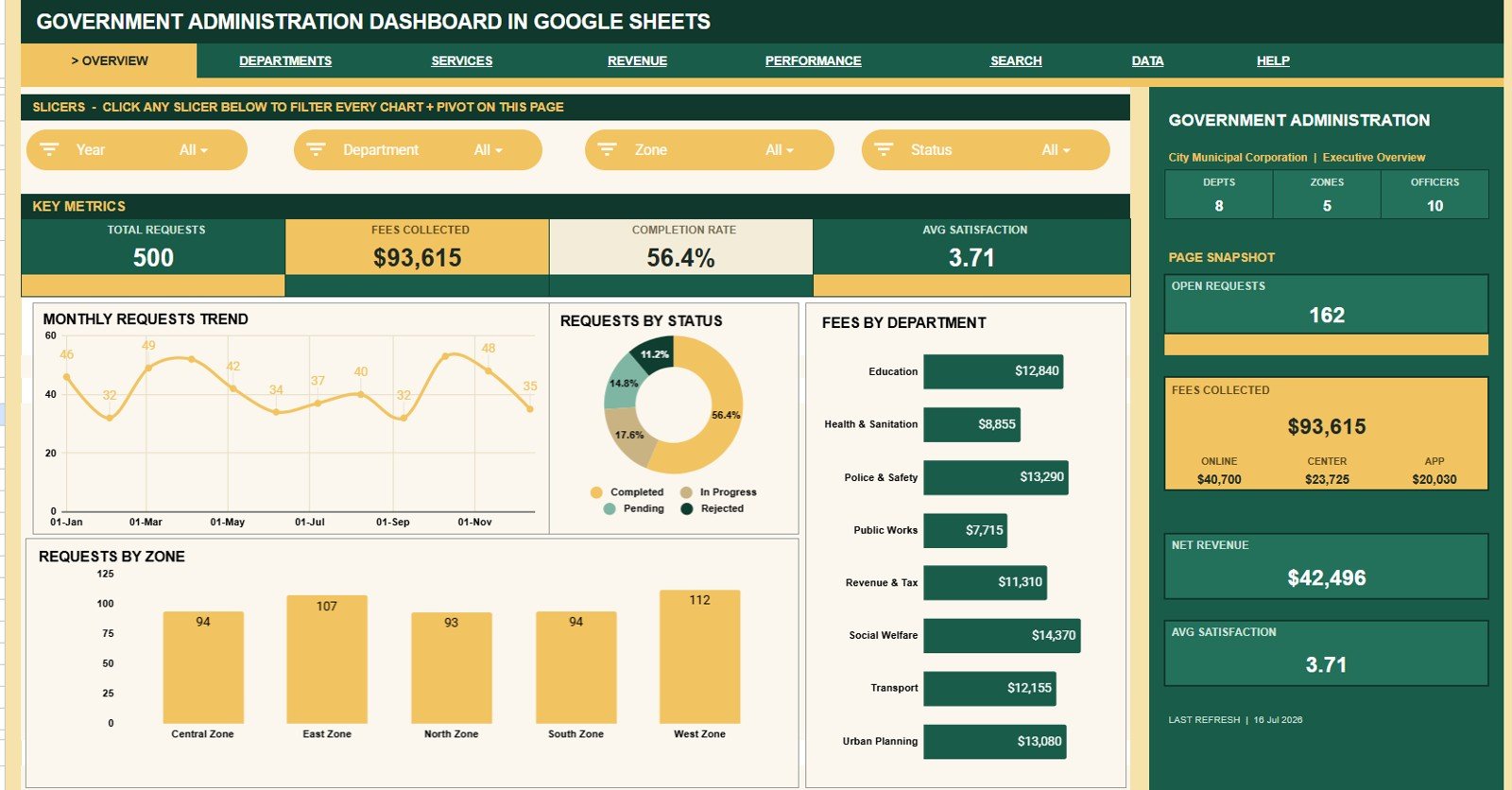
The Overview Page is the main control room for the dashboard. At the top of the sheet, the KPI cards summarize Total Requests, Fees Collected, Completion Rate, Avg Satisfaction, Depts, Zones, Officers, Open Requests, and Net Revenue.Government Administration Dashboard in Google Sheets
These cards help administrators see request volume, money collected, work completion, public satisfaction, team coverage, and unresolved requests before opening deeper analysis tabs. The page also includes slicers, so users can filter the dashboard quickly and review a specific department, zone, status, channel, officer, or priority view.
Requests by Month: This chart shows request volume across months, making demand patterns easier to spot. Teams can use it to identify busy periods, seasonal pressure, or months where intake needs closer review.Government Administration Dashboard in Google Sheets
Requests by Status: This chart breaks request records into status groups such as open, completed, pending, rejected, or similar workflow stages. It helps managers understand how much work is still active and how much has been closed.Government Administration Dashboard in Google Sheets
Fees by Department: This chart compares fee collection across departments. It helps finance and administration teams see which departments contribute the most fee revenue and which need additional review.Government Administration Dashboard in Google Sheets
Requests by Zone: This chart shows request distribution across zones. It helps zone managers compare workload, spot high-demand locations, and plan follow-up action.
2. Department Analysis
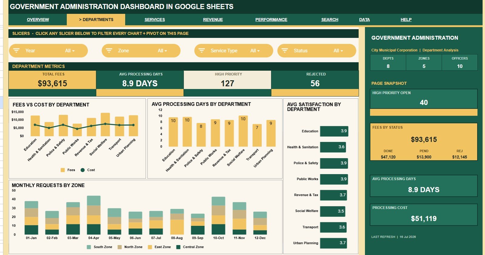
The Department Analysis tab is designed for managers who need to compare performance by department. It helps answer questions such as which department collects more fees, which department has higher processing costs, and where processing days or satisfaction need attention.
Fees and Cost by Department: This chart compares collected fees with processing cost by department. It helps users see where revenue and operational cost are balanced, high, or out of line.
Average Processing Days by Department: This chart shows how long departments take to process requests on average. It helps identify departments that may need workflow review, staffing support, or process improvement.
Average Satisfaction by Department: This chart compares satisfaction scores across departments. It helps leaders see where service quality is strong and where citizen experience may need attention.
Monthly Requests by Zone: This chart shows request movement by zone across months. It helps teams understand whether specific zones are gaining workload over time or only showing temporary spikes.
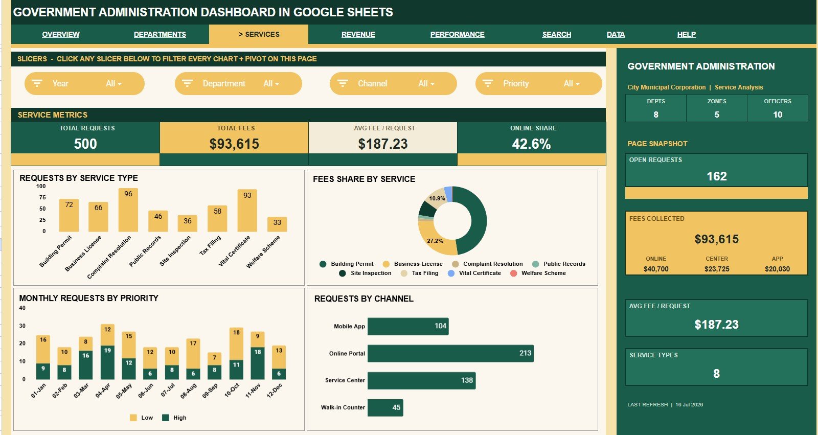
3. Service Analysis
The Service Analysis tab focuses on the types of requests citizens or internal users submit. It helps public administration teams understand which services drive demand, which services generate fees, and which channels citizens use most often.
Requests by Service Type: This chart shows which service types receive the highest number of requests. It helps teams prioritize capacity, training, and documentation around the most common services.
Fees by Service Type: This chart compares fee collection by service category. It helps finance teams understand which services contribute the most collections and whether fee patterns align with request volume.
Requests by Month and Priority: This chart combines time and urgency so users can see how request priority changes by month. It helps leaders watch for growth in high-priority requests and plan response capacity.
Requests by Channel: This chart shows whether requests arrive through online, walk-in, phone, email, or other channels. It helps teams understand user behavior and improve the channels that citizens rely on most.
4. Revenue Analysis
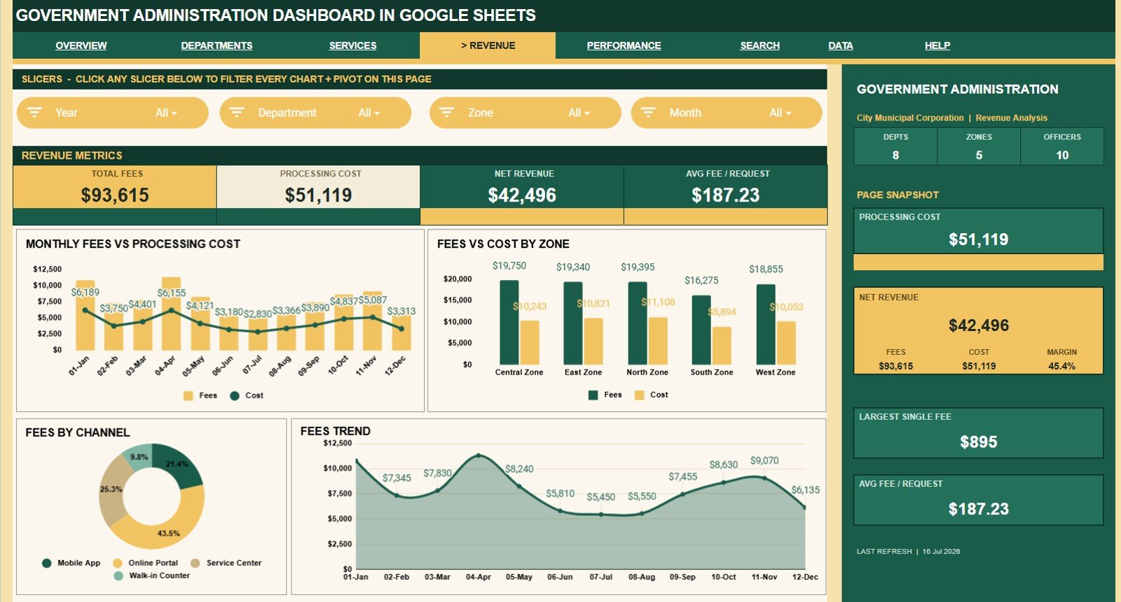
The Revenue Analysis tab is built for fee, cost, and net revenue review. It gives finance and administration teams a simple way to compare collections with processing cost across time, zones, and service channels.Government Administration Dashboard in Google Sheets
Fees and Processing Cost by Month: This chart compares monthly fees with monthly processing cost. It helps users see whether higher collections are also bringing higher cost, or whether net revenue is improving.
Fees and Cost by Zone: This chart compares fee collection and processing cost across zones. It helps identify zones with strong revenue contribution and zones where cost may need review.
Fees by Channel: This chart shows which request channels produce the most fee collection. It helps leaders understand the financial value of online, walk-in, phone, email, or other intake paths.
Fees by Month: This chart gives a clear monthly fee trend. It is useful for monthly reporting, budget conversations, and identifying changes in public-service activity.
5. Performance Analysis
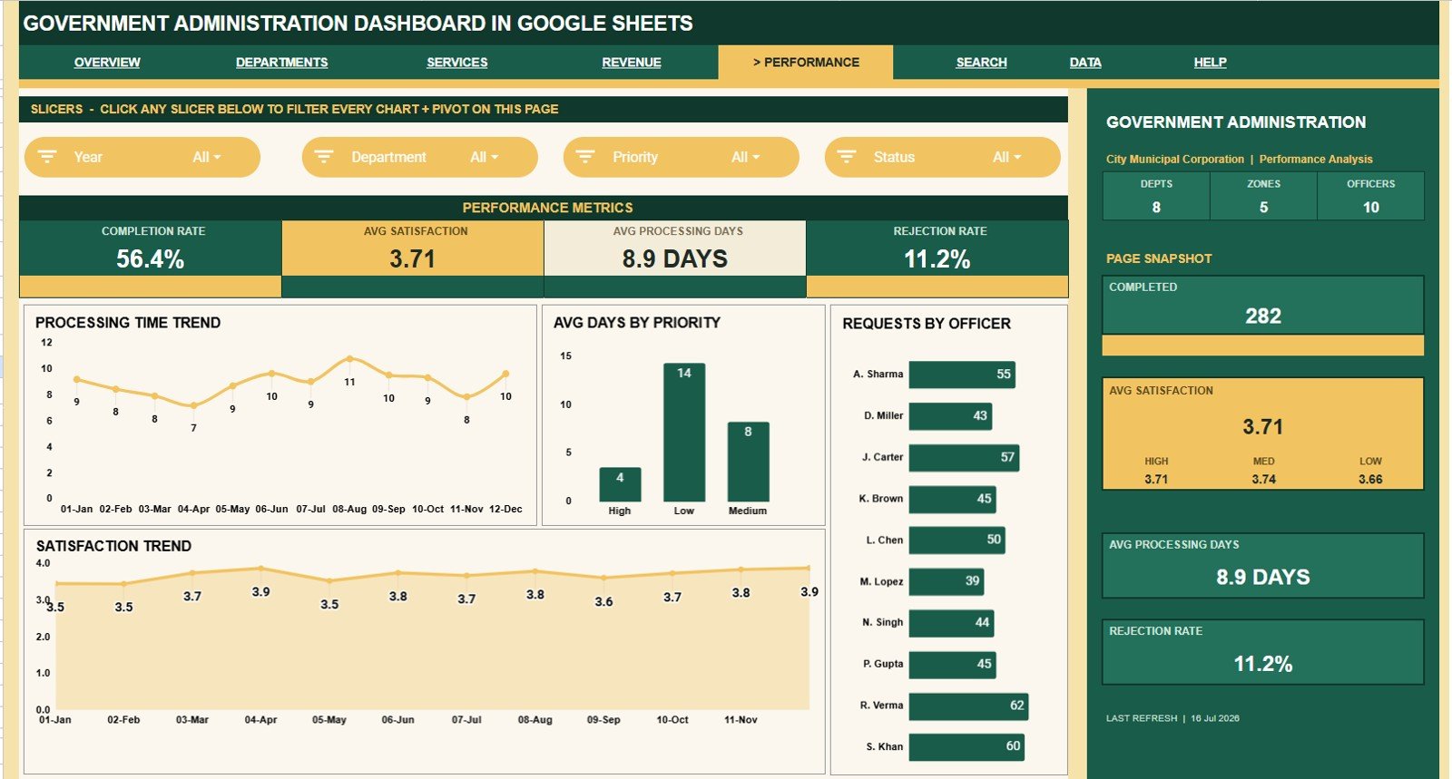
The Performance Analysis tab helps teams monitor turnaround time, officer workload, priority handling, and satisfaction. It is useful when leadership wants to know whether services are becoming faster, slower, more balanced, or more citizen-friendly.
Processing Time by Month: This chart shows how average processing time changes across months. It helps managers see whether process improvements are working or whether delays are increasing.Government Administration Dashboard in Google Sheets
Average Processing Days by Priority: This chart compares average processing days for different priority levels. It helps confirm whether urgent requests are actually moving faster than lower-priority work.Government Administration Dashboard in Google Sheets
Requests by Officer: This chart shows request count by officer. It helps supervisors review workload balance and identify whether request assignments are concentrated with only a few people.Government Administration Dashboard in Google Sheets
Satisfaction by Month: This chart tracks satisfaction over time. It helps users see whether service experience is improving, declining, or staying stable as request volume changes.
6. Search Sheet
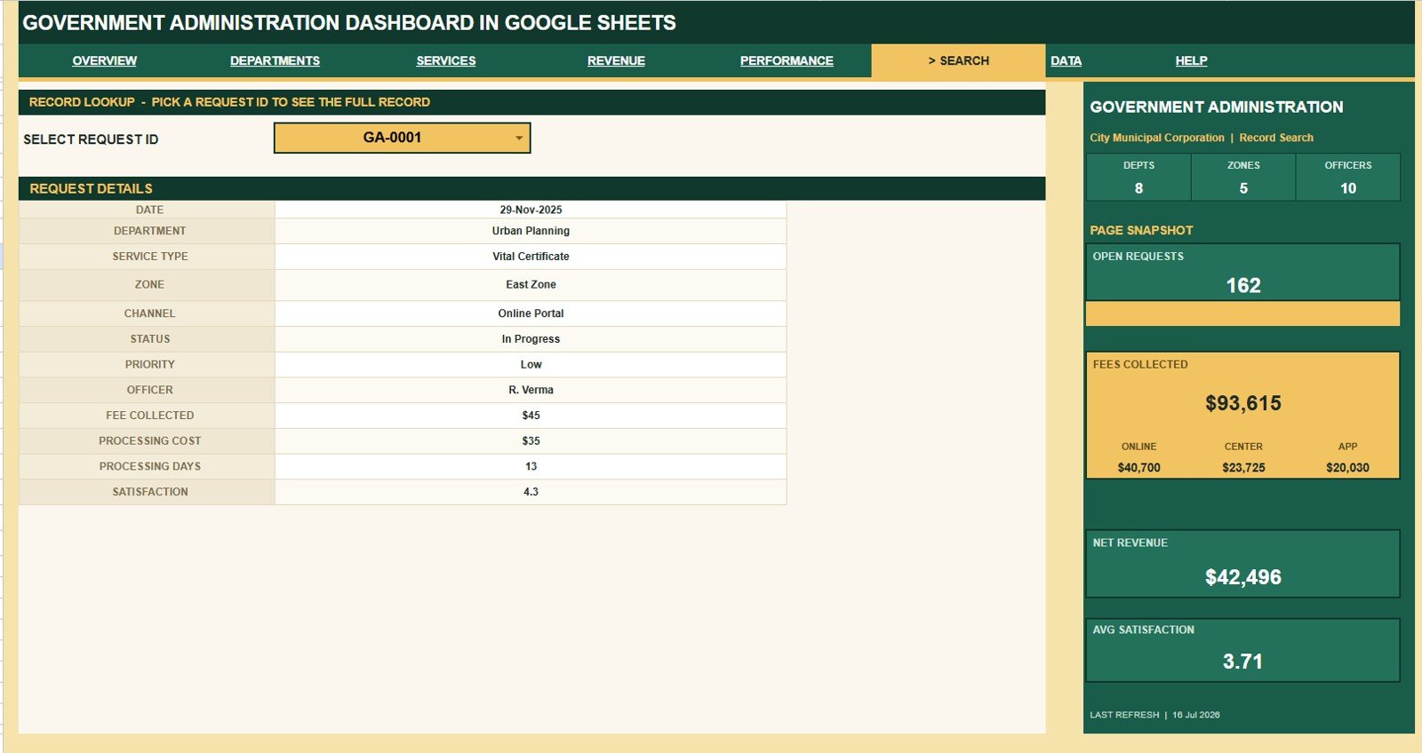
The Search Sheet lets users select a Request ID and instantly view the matching Date, Department, Service Type, Zone, Channel, Status, Priority, Officer, Fee Collected, Processing Cost, Processing Days, and Satisfaction details.
This tab is useful for record-level questions. Instead of scrolling through rows, a supervisor can select the request and review the full details in one place.
Government Administration Dashboard in Google Sheets
7. Data Sheet Tab
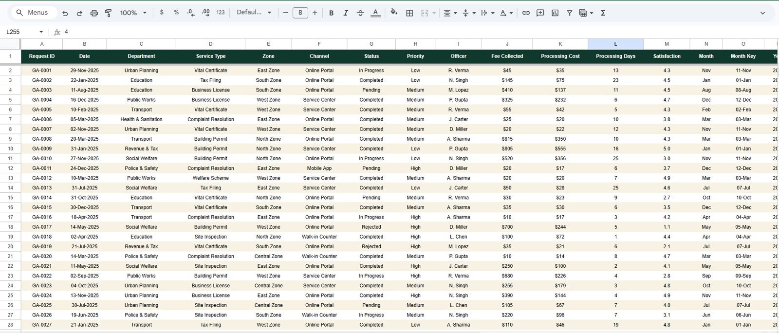
The Data Sheet is the foundation of the dashboard. Users add records in the same format so the dashboard pages, cards, charts, slicers, and Search Sheet continue to work correctly.
For best results, keep the column structure consistent and update new records carefully. The dashboard works best when each request has complete department, service type, zone, status, priority, officer, financial, processing, and satisfaction fields.
Government Administration Dashboard in Google Sheets vs. Microsoft Excel Dashboard vs. Paid Government SaaS – Feature Comparison
| Feature | Government Administration Dashboard in Google Sheets | Microsoft Excel Dashboard | Paid Government SaaS |
|---|---|---|---|
| Cost model | One-time template purchase | Template or workbook cost plus license needs | Recurring subscription, contract, or implementation cost |
| Setup speed | Copy the sheet and replace sample data | Open workbook and replace sample data | Usually requires configuration and onboarding |
| Collaboration | Google Drive sharing and live editing | Cloud sharing depends on setup | Role-based access depends on plan |
| Dashboard filtering | Slicers inside Google Sheets | Slicers or filters in Excel | Vendor-specific filters |
| Customization | Editable formulas, charts, and sheet structure | Editable formulas, charts, and workbook structure | Limited by vendor configuration |
| Request ID lookup | Included Search Sheet | Possible with formulas | Usually included as a record view |
| Best fit | Spreadsheet-first government reporting teams | Teams standardized on Excel | Teams needing workflow automation, portals, and compliance controls |
Who Should Use This Template
Government Administration Dashboard in Google Sheets
- Municipal administration teams tracking public-service requests.
- Government departments that need a simple monthly dashboard.
- Service desk supervisors reviewing open requests and completion rates.
- Zone managers comparing request volume and processing trends.
- Finance teams reviewing fees, processing cost, and net revenue.
- Officers or analysts who already maintain request records in spreadsheets.
- Small public-sector teams that need reporting before they invest in a full SaaS platform.
Real-World Use Cases
Weekly administration review: A department head opens the Overview Page to check Total Requests, Open Requests, Completion Rate, and Avg Satisfaction before the weekly meeting.
Monthly revenue discussion: A finance officer uses Revenue Analysis to compare fees and processing costs by month, zone, and channel.
Department performance check: A manager uses Department Analysis to find departments with longer processing days or lower satisfaction scores.
Citizen request lookup: A service desk user selects a Request ID in the Search Sheet to retrieve the full request record quickly.
Zone workload planning: A zone manager reviews Requests by Zone and Monthly Requests by Zone to plan support for high-demand areas.
Advantages of Government Administration Dashboard in Google Sheets
- Low barrier to entry: Teams familiar with spreadsheets can begin using the template quickly.
- Clear page structure: Separate tabs keep overview, department, service, revenue, performance, lookup, and data entry work organized.
- Fast filtering: Slicers make it easier to inspect filtered dashboard views during meetings.
- Record-level lookup: The Search Sheet reduces time spent scrolling through raw data.
- Flexible reporting: Users can adapt labels, fields, formulas, or charts if their process requires customization.
- Team sharing: Google Sheets works naturally with Google Drive permissions for viewing and editing.
Opportunities for Improvement
Government Administration Dashboard in Google Sheets
This dashboard is a reporting template, not a full government operations platform. Teams that need citizen portals, automated ticket routing, audit logs, payment processing, approvals, document storage, or complex role permissions may eventually need a dedicated SaaS system or a custom app.
The template also depends on consistent data entry. If records are missing status, zone, department, officer, fee, cost, or satisfaction values, the dashboard will be less reliable. A simple internal data-entry rule can help teams keep the reporting clean.
Best Practices
- Keep one consistent row format in the Data Sheet.
- Use standard names for departments, zones, service types, channels, statuses, priorities, and officers.
- Update request records on a fixed schedule, such as daily or weekly.
- Review open requests before public meetings or internal performance reviews.
- Use slicers to compare filtered views before changing formulas or charts.
- Protect formula areas if multiple users will edit the file.
- Create a backup copy before major customization.
Explore Relevant Templates
If you work with government, compliance, administration, or operational reporting, these related templates may also help:
- Government Administration Dashboard in Power BI
- Government Administration KPI Dashboard in Excel
- Audit Operations Management Dashboard in Google Sheets
- Budget Request & Approval Tracker in Google Sheets
You can also browse more Google Sheets templates and Google Sheets dashboard templates.
Frequently Asked Questions
Government Administration Dashboard in Google Sheets
What is the Government Administration Dashboard in Google Sheets?
It is a Google Sheets dashboard template for tracking public administration request data, including departments, services, zones, channels, statuses, priorities, officers, fees, costs, processing days, satisfaction, and net revenue.
How many dashboard pages are included?
The template includes seven main pages: Overview, Department Analysis, Service Analysis, Revenue Analysis, Performance Analysis, Search Sheet, and Data Sheet.
What KPI cards are shown on the Overview Page?
The Overview Page includes Total Requests, Fees Collected, Completion Rate, Avg Satisfaction, Depts, Zones, Officers, Open Requests, and Net Revenue.
Can I filter the dashboard?
Yes. The dashboard includes slicers so users can filter the reporting views quickly based on the available fields in the file.
Does the Search Sheet show one request record?
Yes. The Search Sheet lets users select a Request ID and review the matching request details, including date, department, service type, zone, status, officer, fees, costs, processing days, and satisfaction.
Is this a full case-management system?
No. It is a Google Sheets reporting dashboard. It does not replace a citizen portal, workflow approval system, payment system, or official case-management platform.
Can I customize the template?
Yes. Because it is built in Google Sheets, users can edit formulas, charts, labels, and layout after creating their own copy. Make a backup before major changes.
About the Author
This content is prepared by NeoTechNavigators, with dashboard templates created by PK, a Microsoft Certified Professional with 15+ years of Excel, Google Sheets, and Power BI experience. PK’s tutorials and templates help spreadsheet users build practical dashboards for business, operations, finance, HR, sales, and administration reporting.
Conclusion
The Government Administration Dashboard in Google Sheets is a useful option for public administration teams that want structured request reporting, financial visibility, performance tracking, and quick lookup inside a familiar spreadsheet environment. With seven tabs, nine KPI cards, 16 chart views, slicers, and a clean data sheet, it gives teams a practical way to turn raw request records into meeting-ready insights.
For more spreadsheet and dashboard tutorials, visit https://youtube.com/@NeotechNavigators.
Last updated: July 16, 2026.