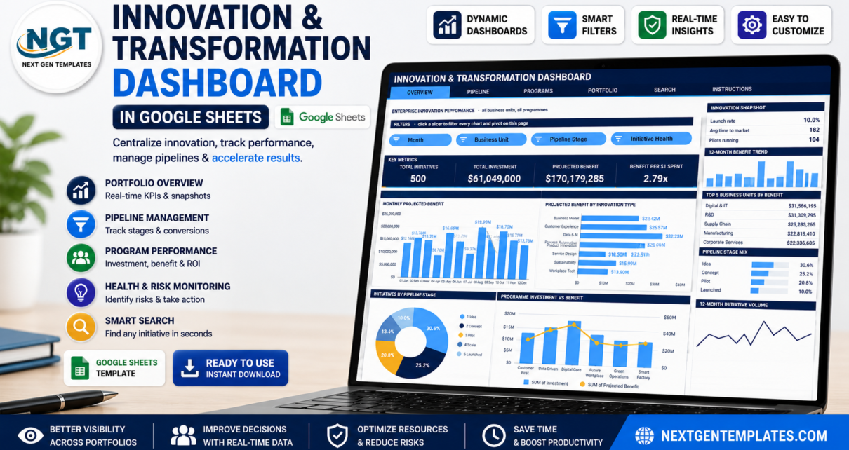
Most innovation portfolios are tracked in a spreadsheet that nobody trusts. Ideas get logged, pilots get funded, and six months later nobody can say what the programme returned. The Innovation & Transformation Dashboard in Google Sheets is built to answer that question on one screen: it ships with 500 sample initiatives carrying $61,049,000 of investment against $170,179,285 of projected benefit – a 2.79x return – spread over 8 business units, 6 transformation programmes and a five-stage pipeline running Idea, Concept, Pilot, Scale, Launched. Average time to market is 182 days and 104 pilots are running at any moment in the sample data.Innovation & Transformation Dashboard in Google Sheets
Get the Innovation & Transformation Dashboard in Google Sheets
What makes this build different from most spreadsheet dashboards is the architecture. Every chart reads a native Google Sheets pivot table parked to the right of its page, and every pivot is driven by slicers. There are no SUMPRODUCT chains or QUERY formulas hiding behind the visuals, which is why the file stays fast as the initiative register grows.
Key Features of the Innovation & Transformation Dashboard in Google Sheets
- Six tabs – Overview, Pipeline, Programs, Portfolio, Search and Instructions.
- 16 slicer-aware charts – four on each of the four analysis pages.
- 16 KPI cards – four per analysis page, covering volume, money and return.
- Four slicers per page – Month, Business Unit, Pipeline Stage, Initiative Health, Innovation Type, Innovation Horizon, Programme, Executive Sponsor and Funding Source, matched to each page’s subject.Innovation & Transformation Dashboard in Google Sheets
- A snapshot rail on the right of every analysis page: three headline stats, a 12-month benefit trend, a Top 5 table, a share-of-mix bar list, an At a Glance summary and a 12-month initiative volume sparkline.Innovation & Transformation Dashboard in Google Sheets
- Initiative lookup – the Search tab returns all 16 fields for any Initiative ID.
- 1,000-row headroom – pivots, slicers and formulas already reach row 1001.
- 16 data fields – Initiative ID, Submitted Date, Business Unit, Innovation Type, Pipeline Stage, Initiative Lead, Transformation Programme, Projected Benefit, Investment, Time to Market (Days), Executive Sponsor, Funding Source, Initiative Health, Innovation Horizon, Month and Quarter.Innovation & Transformation Dashboard in Google Sheets
Dashboard Pages Explanation
Overview – enterprise innovation performance
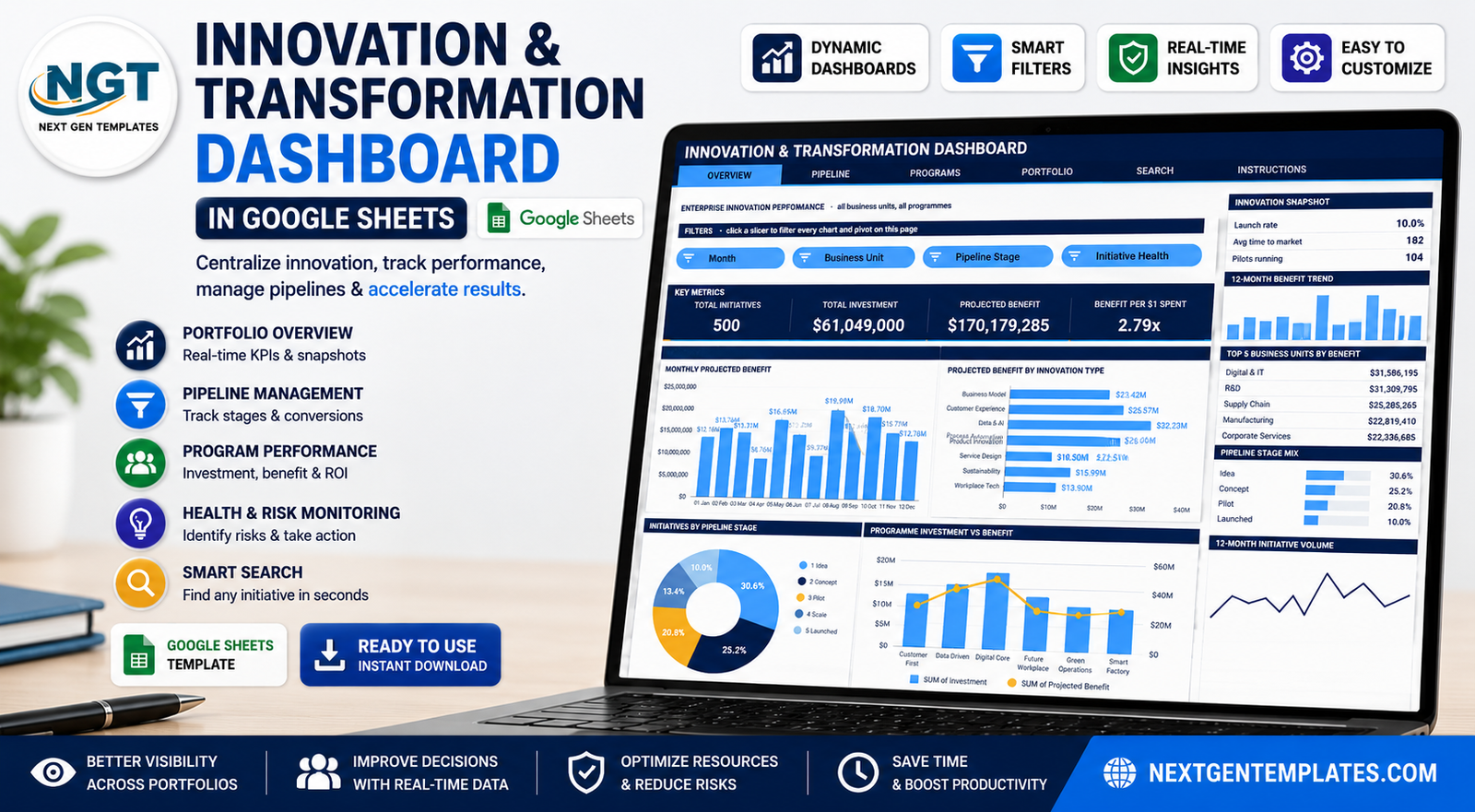
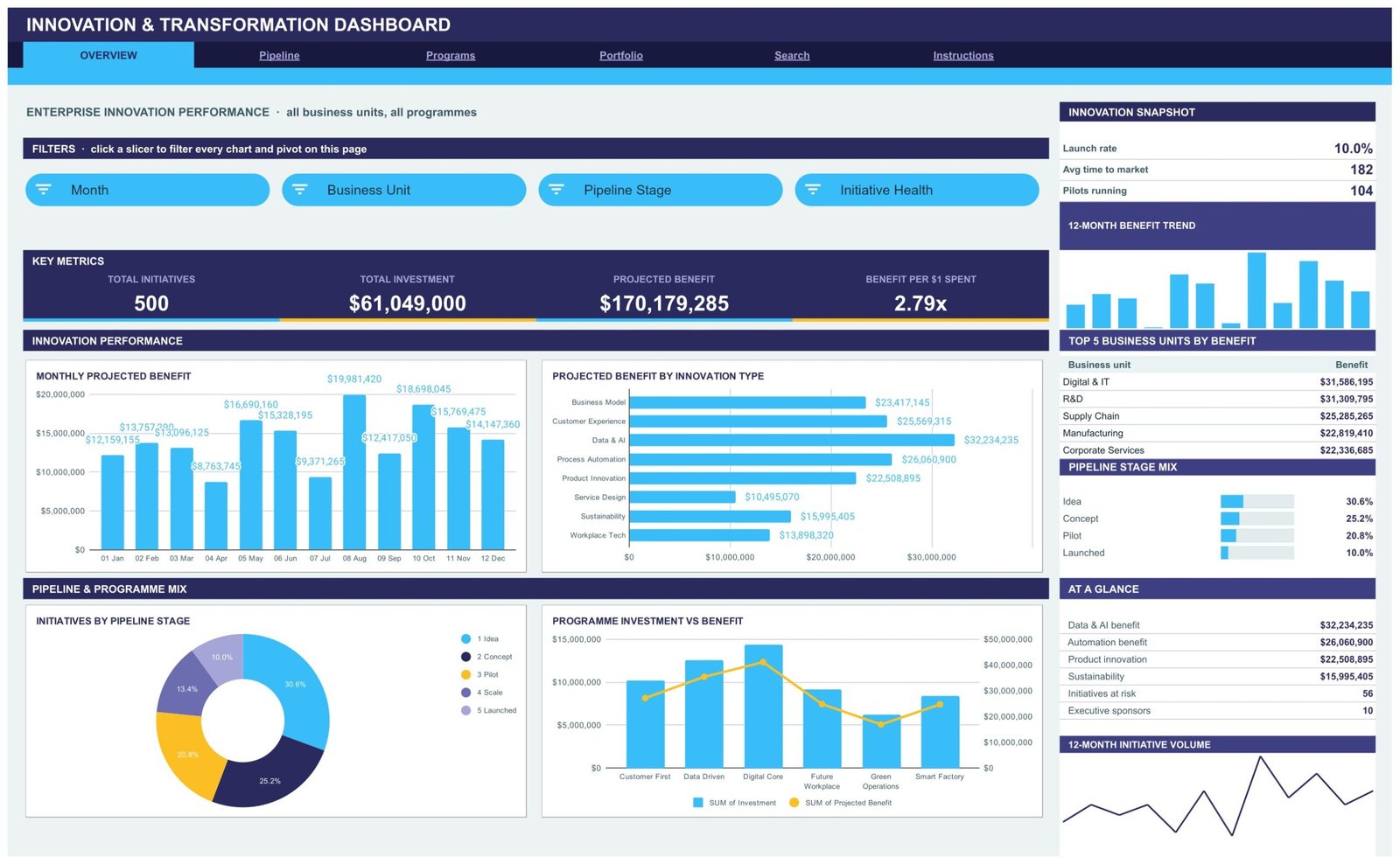
The landing page carries the four numbers an executive asks for first: Total Initiatives 500, Total Investment $61,049,000, Projected Benefit $170,179,285 and Benefit per $1 Spent 2.79x. Four charts sit under them. Monthly Projected Benefit is a column chart running 01 Jan to 12 Dec, peaking at $19,981,420 in August. Projected Benefit by Innovation Type ranks the eight types, with Data & AI leading at $32,234,235 ahead of Process Automation at $26,060,900. Initiatives by Pipeline Stage is a donut showing 30.6% at Idea, 25.2% Concept, 20.8% Pilot and 10.0% Launched. Programme Investment vs Benefit pairs investment columns with a benefit line across the six programmes.Innovation & Transformation Dashboard in Google Sheets
Down the right, the Innovation Snapshot reports a 10.0% launch rate, 182-day average time to market and 104 pilots running, with a Top 5 Business Units by Benefit table led by Digital & IT at $31,586,195 and R&D at $31,309,795.
Pipeline – the idea funnel
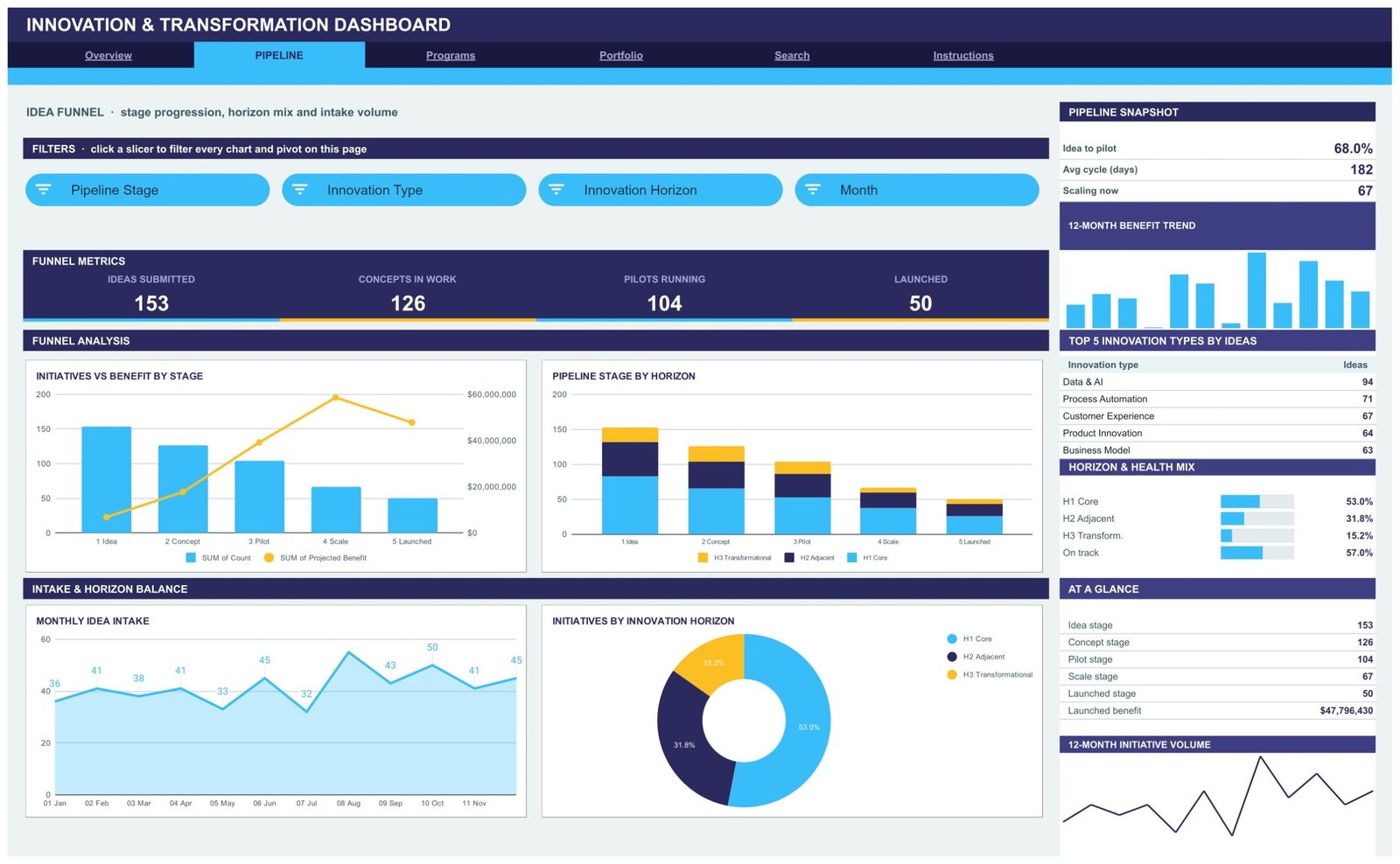
This page answers whether ideas are actually converting. The funnel metrics read 153 ideas submitted, 126 concepts in work, 104 pilots running and 50 launched. Initiatives vs Benefit by Stage plots initiative count as columns against projected benefit as a line, so you can see where volume drops but value concentrates. Pipeline Stage by Horizon stacks H1 Core, H2 Adjacent and H3 Transformational inside every stage. Monthly Idea Intake is a filled area chart tracking submissions between 32 and 50 a month. Initiatives by Innovation Horizon shows the 53.0% / 31.8% / 15.2% split.Innovation & Transformation Dashboard in Google Sheets
The snapshot rail adds the two conversion figures worth watching: a 68.0% idea-to-pilot rate and a 182-day average cycle, plus a Top 5 Innovation Types by Ideas table led by Data & AI with 94 ideas.Innovation & Transformation Dashboard in Google Sheets
Programs – sponsors, funding and delivery health
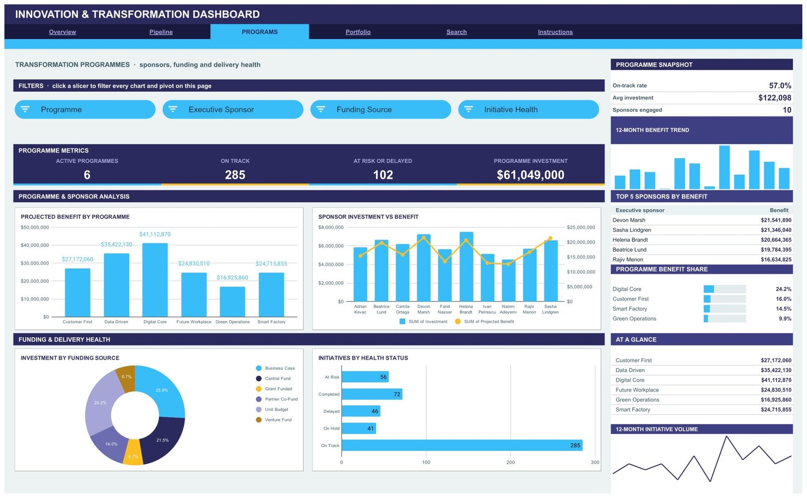
Six transformation programmes – Customer First, Data Driven, Digital Core, Future Workplace, Green Operations and Smart Factory – are measured on Projected Benefit by Programme, where Digital Core leads at $41,112,870. Sponsor Investment vs Benefit compares 10 executive sponsors, with Devon Marsh at $21,541,890 of benefit. Investment by Funding Source splits Business Case 25.9%, Partner Co-Fund 25.2%, Central Fund 21.5%, Unit Budget 14.0%, and Grant Funded and Venture Fund at 6.7% each. Initiatives by Health Status counts 285 on track against 56 at risk, 46 delayed, 41 on hold and 72 completed.Innovation & Transformation Dashboard in Google Sheets
Portfolio – investment, return and time to market
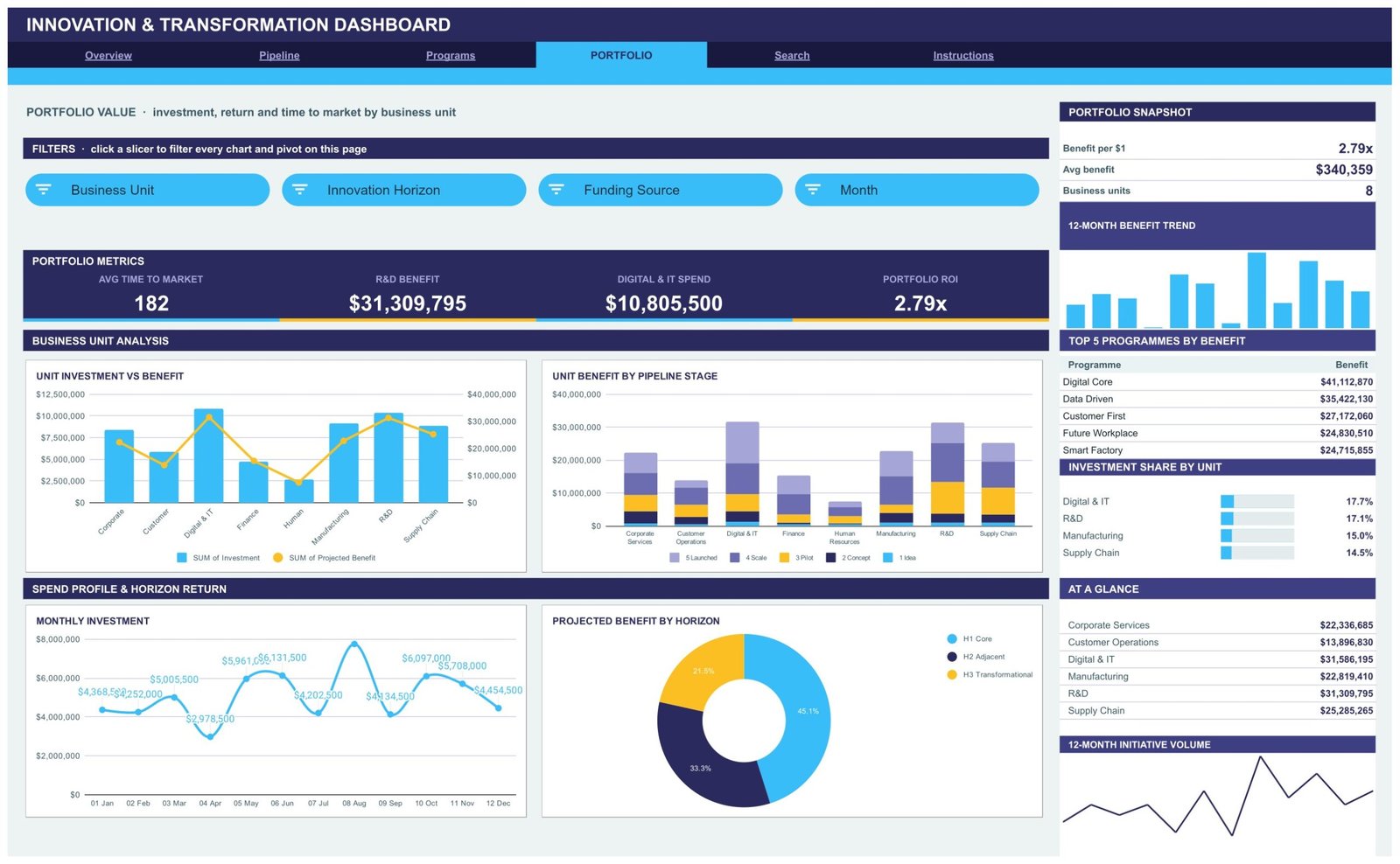
Eight business units are compared on Unit Investment vs Benefit and Unit Benefit by Pipeline Stage, with Monthly Investment as a smooth line and Projected Benefit by Horizon as a donut (45.1% H1 Core, 33.3% H2 Adjacent, 21.5% H3 Transformational). Headline metrics are avg time to market 182 days, R&D benefit $31,309,795, Digital & IT spend $10,805,500 and portfolio ROI 2.79x. The Investment Share by Unit list shows Digital & IT at 17.7% and R&D at 17.1% of total spend.Innovation & Transformation Dashboard in Google Sheets
Search – one initiative at a time
Pick an Initiative ID such as INV-0001 and the page returns the whole record: submitted date, business unit, innovation type, pipeline stage, initiative lead, transformation programme, projected benefit, investment, time to market in days, executive sponsor, funding source, initiative health, innovation horizon, month and quarter. It is the page you open when somebody in the steering meeting asks about one line item.Innovation & Transformation Dashboard in Google Sheets
Innovation & Transformation Dashboard in Google Sheets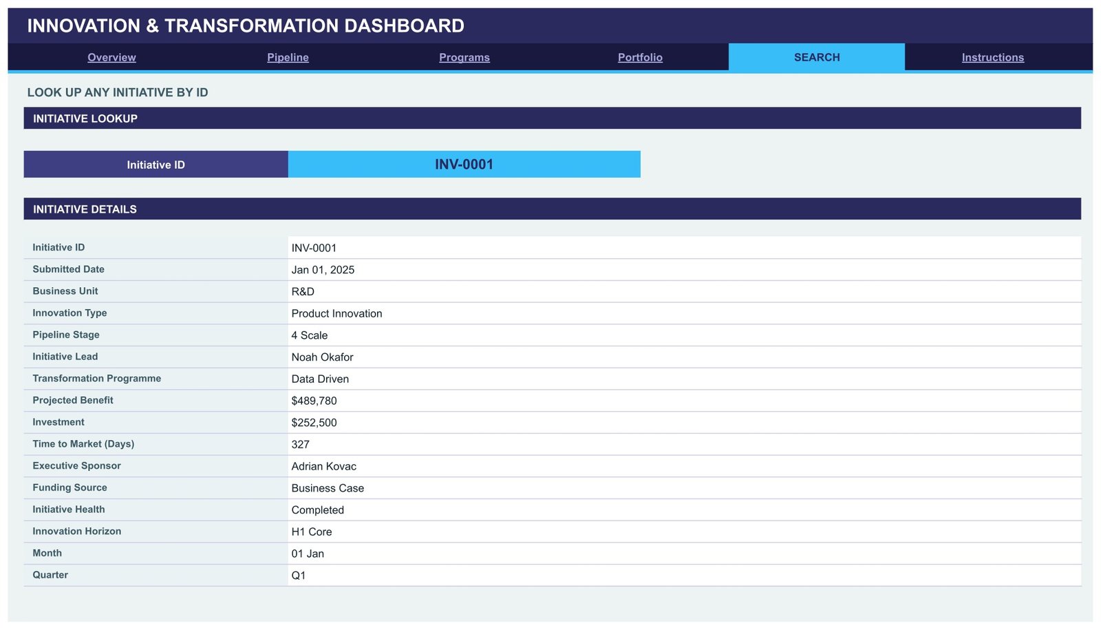
Instructions – how the build works
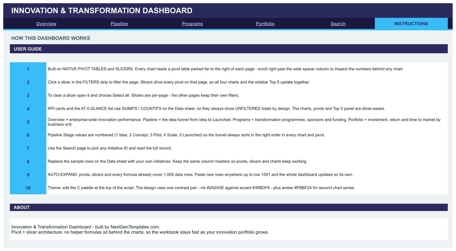
Ten numbered steps explain the architecture: where the pivots live, how slicers drive every pivot on a page, why the KPI cards use SUMIFS and COUNTIFS and therefore stay unfiltered by design, why pipeline stages are numbered so the funnel always sorts correctly, and how to swap the theme palette (ink #2A2A5E, accent #38BDF8, amber #FBBF24).Innovation & Transformation Dashboard in Google Sheets
Innovation & Transformation Dashboard vs. Microsoft Excel vs. Paid Innovation SaaS – Feature Comparison
| Item | This Google Sheets dashboard | Excel dashboard build | Paid innovation SaaS |
|---|---|---|---|
| Cost | $9.99 once | $20-$30 once, plus Office | $30-$90 per user per month |
| Platform | Google Sheets, browser only | Desktop Excel | Vendor cloud |
| Setup time | Under 5 minutes | 15-30 minutes | 2-6 weeks of onboarding |
| Real-time team collaboration | Yes, native | Only via OneDrive co-authoring | Yes |
| Mobile access | Yes, Sheets app | Limited | Yes |
| Customisable fields | Edit any column on the Data sheet | Yes | Admin-controlled, often paid tier |
| Share with link | Yes | File send or cloud link | Yes, seat required |
| Year-1 cost at 5 users | $9.99 | About $25 | $1,800-$5,400 |
| Slicer-driven pivot charts | 16, all native | Yes | Fixed vendor visuals |
| Stage-gate workflow and approvals | No | No | Yes |
Who Should Use This Template
Innovation managers who report a portfolio to a steering committee every month. Transformation office leads who need to show which programmes are on track and which are drifting. PMO analysts who already run delivery reporting and want the front half of the funnel covered too. R&D coordinators tracking concepts through to launch. Strategy consultants who want a client-ready portfolio view they can hand over at the end of an engagement.
It suits organisations running tens to hundreds of initiatives. If you are running five, a list is enough; if you are running ten thousand, you need a database.
Real-World Use Cases
Manufacturing innovation portfolio. Priya filters the Overview page to Manufacturing and the Pilot stage before her monthly steering call and drops Programme Investment vs Benefit straight into the pack. The rebuild work that used to take an afternoon is now two slicer clicks.
Transformation office reporting. Daniel works from the Programs tab, filtering by Executive Sponsor to see whose slice of the portfolio is slipping. The 285 on track against 102 at risk or delayed is the first number his committee asks for.
Consulting engagement. Amelia loads a client’s initiative register, uses the Portfolio tab to show where the 2.79x return actually comes from by business unit, then leaves the sheet in the client’s own Drive when the engagement ends.
Advantages of the Innovation & Transformation Dashboard
- Pivot-and-slicer architecture. No helper formulas behind the charts, so the file stays responsive as the register grows.
- Auditable numbers. Scroll right past the spacer column on any page and you can read the pivot table feeding each chart.
- Nothing to install. It runs in the browser, and sharing is Google’s normal link sharing.
- Stage ordering solved. Pipeline stages are numbered 1 to 5, so the funnel never sorts alphabetically.
- One-time cost. No seats, no renewals, and read-only stakeholders cost nothing.
- Genuinely editable. Add columns, change the palette, delete a chart you do not need.
Opportunities for Improvement
Being honest about the edges matters more than a feature list. The KPI cards and the At a Glance panel use SUMIFS and COUNTIFS against the Data sheet, so they show unfiltered enterprise totals and do not respond to slicers. That is a deliberate design choice – a fixed reference while the charts move – but it surprises people the first time, so it is worth explaining in your team.
Beyond that: the ranges cover 1,000 rows, and going further means dragging the pivot sources down yourself. There is no workflow layer, so idea submission, approvals and stage-gate sign-off still happen wherever they happen today. And the data arrives by paste, not by connection – if your register lives in Jira or ServiceNow, you will be exporting on a schedule.
Best Practices
- Keep the Data sheet headers exactly as shipped. The pivots reference them by name, so a rename breaks every chart on that page.
- Add new columns to the right of the existing ones rather than inserting them in the middle.
- Refresh on a fixed cadence – monthly works well, since time to market is measured in months.
- Clear slicers with Select all before sharing a screenshot, or say in the caption what the filter was.
- Keep the horizon mix honest. If H3 Transformational falls well below the 15% in the sample data, that is a portfolio conversation, not a spreadsheet problem.
- Use the Search tab in meetings instead of scrolling the Data sheet.
- If you want to learn the mechanics behind it, the official Google Sheets slicer documentation covers how slicers bind to pivot ranges.
Explore Relevant Templates
- Digital Transformation KPI Dashboard in Google Sheets – the KPI-scorecard companion to this portfolio view.
- Cloud Migration KPI Dashboard in Google Sheets – for the technology half of a transformation programme.
- Project Management Office (PMO) Dashboard in Google Sheets – delivery tracking once initiatives leave the pipeline.
- Knowledge Management Dashboard in Google Sheets – captures what the programmes learn.
- Engineering Dashboard in Google Sheets – the engineering delivery view alongside R&D innovation.
Related reading: Digital Transformation KPI Dashboard in Google Sheets and Cloud Migration KPI Dashboard in Google Sheets.
To learn how portfolio dashboards like this are put together, try the Excel Pivot Tables & Dashboards course on NextGenTemplates Academy, which comes with practice files.
Frequently Asked Questions
What do I actually download?
A PDF containing the Make a copy link for the Google Sheets file. Click it, choose Make a copy, and the dashboard lands in your own Google Drive as an editable file.
Do I need to understand pivot tables?
No. Every pivot is already built and parked to the right of its page. You interact with the slicers in the FILTERS strip.
How many initiatives can it hold?
1,000 out of the box – ranges, pivots and slicers already reach row 1001. Going beyond that means extending the pivot source ranges.
Why don’t the KPI cards change when I filter?
By design. The KPI cards and the At a Glance list use SUMIFS and COUNTIFS on the Data sheet so they always show the unfiltered total. The charts, pivots and Top 5 panels are the slicer-aware parts.
Can I change the colours?
Yes. The design uses one contrast pair – ink #2A2A5E with accent #38BDF8 – plus amber #FBBF24 for second chart series. Edit the palette at the top of the sheet’s script or recolour charts individually.
Does it work on mobile?
It opens in the Google Sheets app, but a dashboard this wide is really built for a desktop browser.Innovation & Transformation Dashboard in Google Sheets
Is it a one-time purchase?
Yes. Pay once, keep the file, use it on as many portfolios as you like.
About the Author
Built by PK – Microsoft Certified Professional with 15+ years of Excel, Google Sheets, and Power BI experience. Founder of NextGenTemplates, reaching 300K+ subscribers across YouTube channels. Every template is hand-built and tested before release.Innovation & Transformation Dashboard in Google Sheets
Conclusion
An innovation portfolio only earns its budget when somebody can show the return. This dashboard puts 500 initiatives, six programmes and a five-stage funnel into four readable pages, keeps the numbers auditable in the pivots behind each chart, and costs less than an hour of the analyst time it replaces. Where it stops – approvals, live connections, workflow – it stops honestly.Innovation & Transformation Dashboard in Google Sheets
Get the Innovation & Transformation Dashboard in Google Sheets
Regular price $16.99, now $9.99 – have your initiative portfolio on screen in under five minutes.