Hospital Patient Flow Dashboard in Google Sheets is a powerful, ready-to-use analytics template built for hospital administrators, healthcare analysts, clinical quality teams, and operations managers who need to monitor patient flow, treatment costs, wait times, satisfaction scores, and readmission rates across departments from a single interactive Google Sheets dashboard. This comprehensive template transforms raw hospital patient data into meaningful visual insights that support faster, smarter decision-making across every level of your healthcare organization.
Whether you manage a small community hospital or a large multi-department medical center, this dashboard delivers premium analytics covering 6 dedicated sheet tabs with 5 high-level KPIs, interactive charts, slicer-based filtering, patient search functionality, and a structured data sheet. No software installation is needed — just open the Google Sheets link, paste your data, and start analyzing your hospital’s patient flow metrics instantly.
Click here to Purchase the Hospital Patient Flow Dashboard in Google Sheets
Key Features of the Hospital Patient Flow Dashboard in Google Sheets
Click here to Purchase the Hospital Patient Flow Dashboard in Google Sheets
This Hospital Patient Flow Dashboard in Google Sheets comes packed with features designed for real-world hospital analytics. The dashboard offers multi-page interactive analytics across 6 sheet tabs that cover practice overview, patient flow analysis, department performance, wait time breakdowns, patient record search, and raw data management.
At the top of the Overview page, 5 dynamic KPI cards display Total Patients, Avg Wait Time (min), Avg Length of Stay, Avg Treatment Cost, and Avg Satisfaction — giving you an instant operational snapshot of your entire hospital. The dashboard includes global slicers that allow you to filter the entire dashboard by department, admission type, priority, status, gender, insurance type, and other dimensions for focused analysis.
Interactive chart visualizations including bar charts, line trends, donut charts, and comparison analyses update dynamically based on your filter selections. The Google Sheets platform enables real-time collaboration, so multiple team members can view and analyze data simultaneously from any device. For a related Excel-based solution, explore the Hospital Patient Flow Dashboard in Excel.
Dashboard Pages Explained
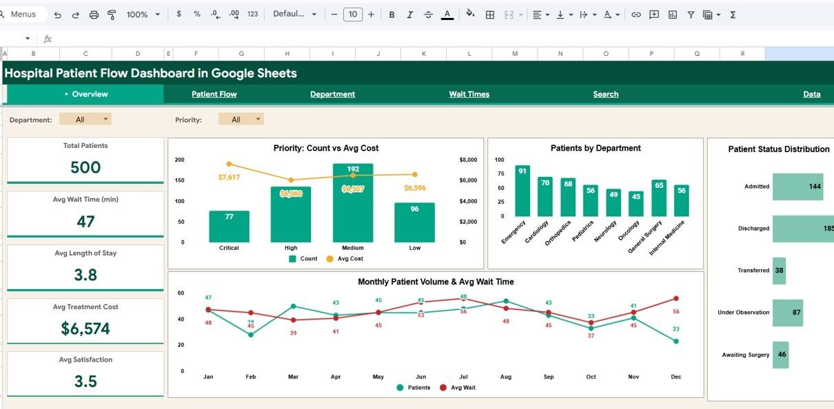
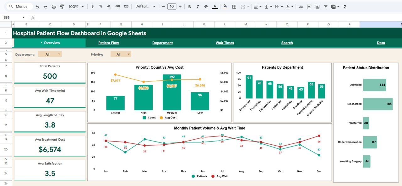
1. Overview Page
The Overview page serves as your command center for hospital patient flow operations. At the top, five high-level KPI cards display Total Patients, Avg Wait Time (min), Avg Length of Stay, Avg Treatment Cost, and Avg Satisfaction. These cards provide an immediate snapshot of your entire hospital’s health and performance status.
Below the KPI cards, you will find a rich collection of interactive charts. Priority Count vs Avg Cost compares the number of patients across different priority levels alongside the average treatment cost for each priority category, enabling cost-impact analysis. Patients by Department breaks down patient volume across different clinical departments to identify high-traffic areas. Patient Status Distribution visualizes the breakdown of patients across different status categories such as admitted, discharged, transferred, and under observation. Monthly Patient Volume & Avg Wait Time tracks admission trends alongside wait time performance over time, helping you spot seasonal patterns and operational bottlenecks. Multiple slicers are available to apply filters and see the filtered dashboard quickly.
Hospital Patient Flow Dashboard in Google Sheets
2. Patient Flow
The Patient Flow page dives deep into understanding admission patterns, readmission behavior, and bed utilization across your hospital. Four high-level metric cards display Emergency Admits, Scheduled Admits, Readmission Rate, and Avg Satisfaction to provide an instant overview of patient intake dynamics.
Patient Outcome Distribution breaks down patient outcomes across categories such as recovered, referred, deceased, and ongoing to help quality teams monitor clinical effectiveness. Dept x Admission Type cross-references departments with admission types (emergency, scheduled, urgent, transfer) to reveal department-level admission patterns. Bed Type Occupancy & Avg Cost compares bed utilization rates and average costs across general, ICU, semi-private, and private bed categories — essential for capacity planning. Admission Type Volume & Avg LOS tracks admission volume alongside average length of stay for each admission category, supporting discharge planning and resource allocation.
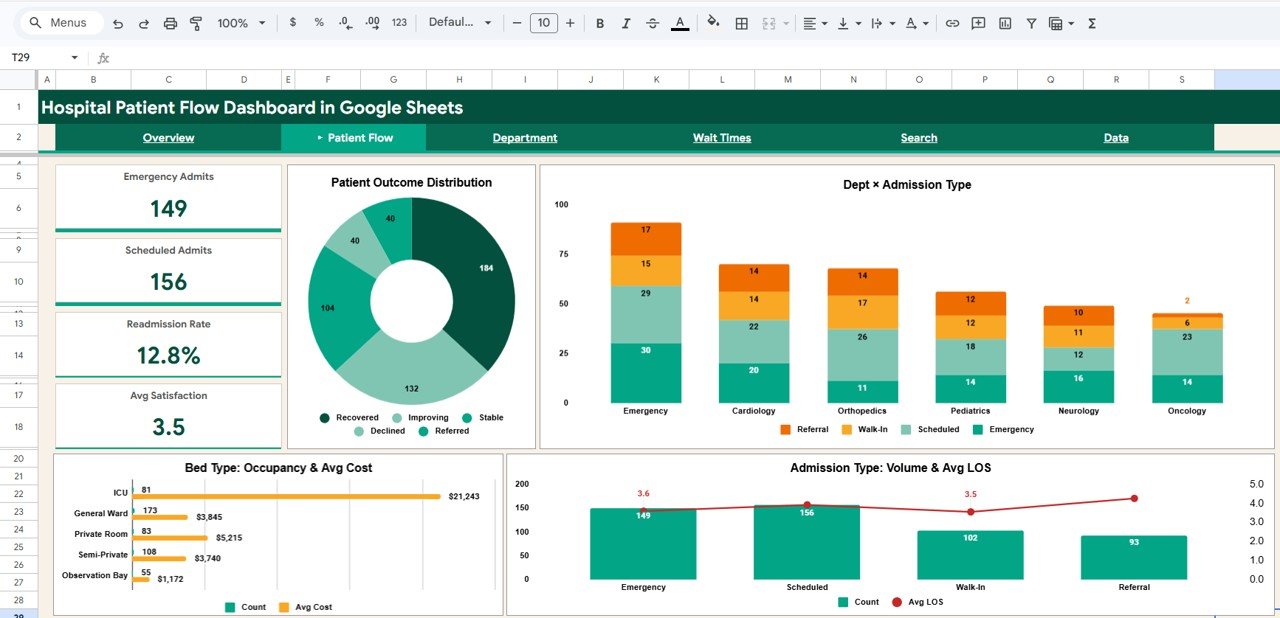
Patient Flow
Click here to Purchase the Hospital Patient Flow Dashboard in Google Sheets
3. Department
The Department page evaluates each hospital department’s performance across multiple key dimensions. Four metric cards display Dept Patients, Dept Avg Cost, Dept Avg Wait, and Dept Readmit % for the selected department, enabling focused departmental analysis.
Insurance Type Distribution shows how patients in each department are distributed across insurance providers — valuable for revenue forecasting and payer mix optimization. Gender Distribution reveals the male-female patient split across departments. Dept Satisfaction vs Wait Time plots the relationship between patient satisfaction scores and average wait times for each department, helping administrators identify units where wait times may be impacting patient experience. Monthly Patient Volume & Revenue tracks the monthly trend of patient admissions alongside revenue generation per department. For KPI-focused tracking with targets and year-over-year trends, explore the Hospital Operations KPI Scorecard in Google Sheets.
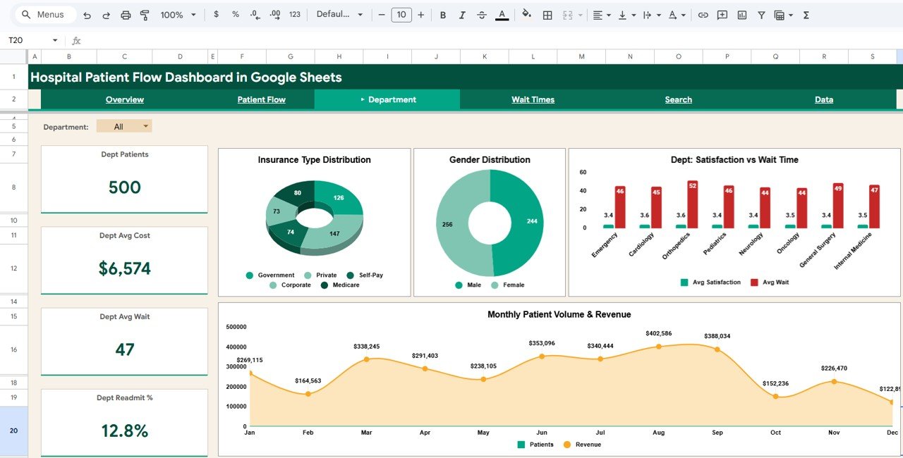
Department
4. Wait Times
The Wait Times page is essential for hospital operational efficiency and patient experience management. Four metric cards display Min Wait (min), Max Wait (min), Median Wait, and Critical Avg Wait — providing an immediate summary of hospital-wide wait time performance.
Wait Time by Priority (Avg & Max) compares average and maximum wait times across different patient priority levels (critical, high, medium, low), essential for ensuring emergency patients receive timely care. Monthly Avg Wait Time Trend reveals how wait times have changed over time, helping operations teams track the impact of process improvements. Avg Wait Time by Department identifies which clinical departments have the longest wait times, enabling targeted efficiency interventions. Wait Time by Admission Type compares wait experiences across emergency, scheduled, and other admission pathways.
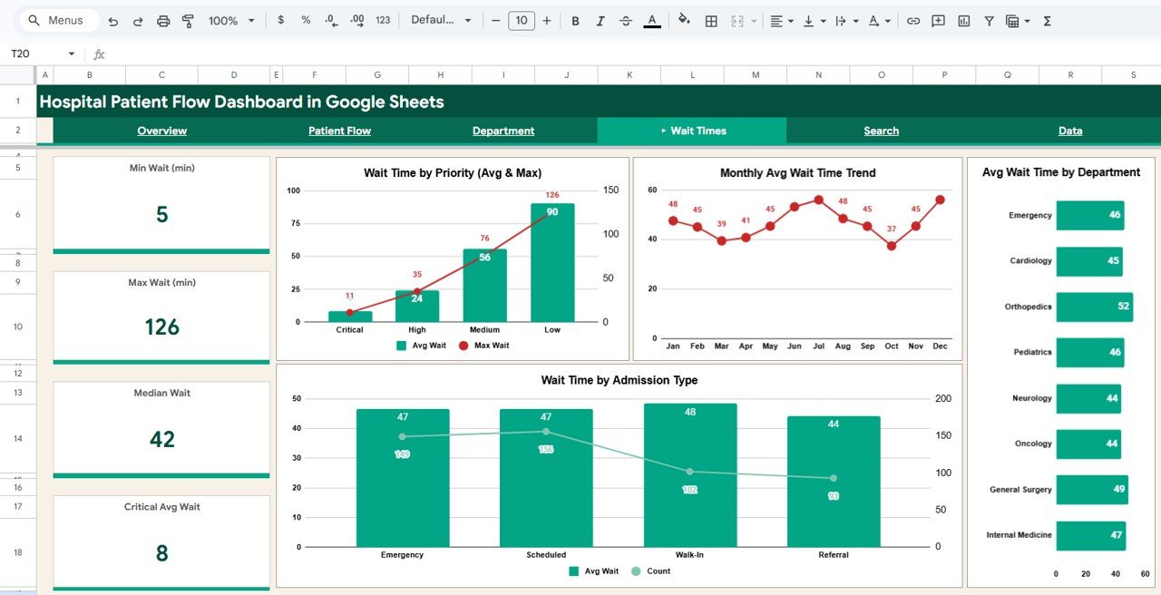
Wait Times
Click here to Purchase the Hospital Patient Flow Dashboard in Google Sheets
5. Search
The Search page provides a powerful patient record lookup feature. You can search by Patient ID and instantly view the complete patient details including Admission Date, Department, Admission Type, Priority, Status, Gender, Age, Insurance Type, Bed Type, Wait Time (min), and Length of Stay (days). This is invaluable for front-desk staff, billing teams, and clinical managers who need to quickly access individual patient information without scrolling through hundreds of records. For browser-based hospital analytics with similar search capabilities, see the Hospital Patient Flow Dashboard in HTML.
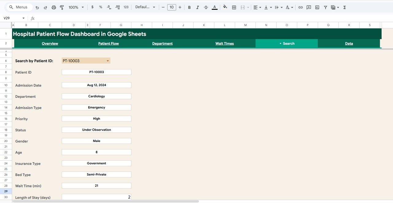
Search
6. Data Sheet
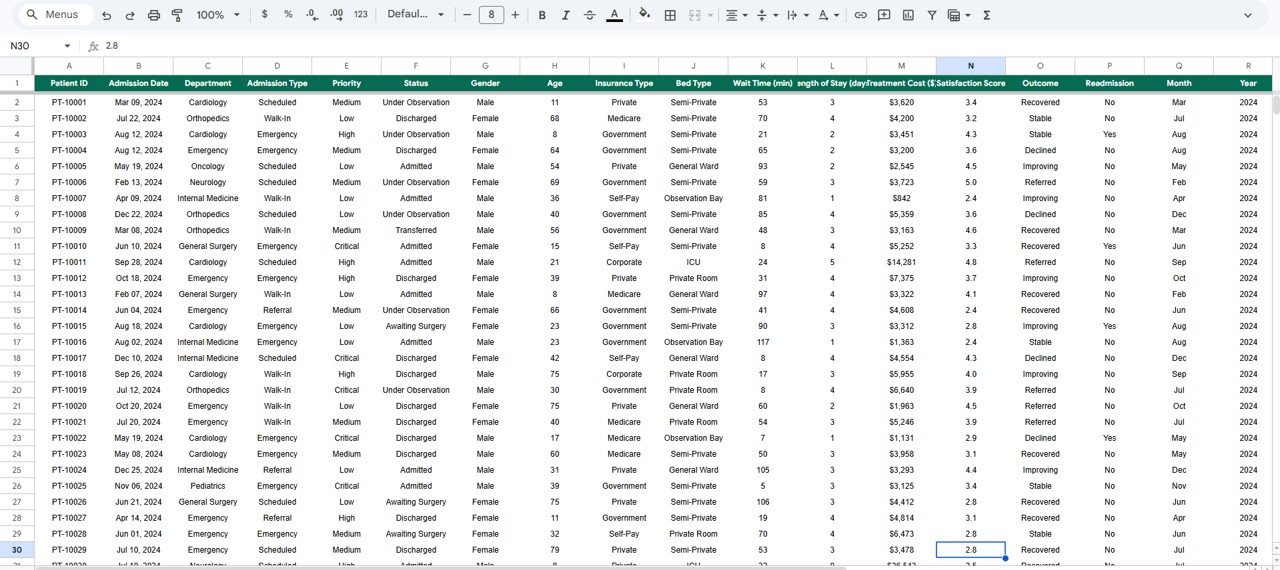
The Data Sheet is the structured data entry page where all hospital patient records are stored. It comes pre-loaded with 500 sample records in a standardized format with columns for Patient ID, Admission Date, Department, Admission Type, Priority, Status, Gender, Age, Insurance Type, Bed Type, Wait Time, Length of Stay, Treatment Cost, Satisfaction Score, Readmission, and Outcome. Simply replace the sample data with your own hospital data in the same format, and the entire dashboard updates automatically across all pages.
Data Sheet Tab
Advantages of the Hospital Patient Flow Dashboard in Google Sheets
This dashboard offers several significant advantages for healthcare professionals. First, it requires zero software installation — simply open the Google Sheets link from the PDF guide and create your own editable copy in Google Drive. This makes it ideal for hospital teams that need quick access to analytics without IT overhead or licensing costs.
The multi-page structure with dedicated analysis pages for overview metrics, patient flow patterns, department performance, wait time intelligence, and individual patient search ensures that different stakeholders can find the insights most relevant to their role. The global slicer system means that a single selection cascades across all charts and metrics, saving time and ensuring consistency in analysis.
The cloud-based Google Sheets platform enables real-time collaboration, so hospital administrators, department heads, and quality teams can all view and work with the same data simultaneously. The structured data sheet format makes monthly data updates straightforward — simply add new records and the dashboard recalculates everything automatically.
Opportunities for Improvement
Click here to Purchase the Hospital Patient Flow Dashboard in Google Sheets
While this dashboard provides excellent coverage of hospital patient flow analytics, there are areas where users might consider enhancements. Adding predictive analytics or forecasting models for admission volumes and bed occupancy could help with long-term capacity planning. Integration with electronic health record (EHR) systems through Google Apps Script could enable automated data imports rather than manual entry.
A dedicated staff performance page tracking physician workload, treatment success rates, and patient satisfaction per doctor would add an operational dimension to the analytics. Additionally, implementing a financial analysis page with treatment cost versus insurance reimbursement breakdowns would benefit hospitals focused on revenue cycle optimization.
Best Practices for Using the Hospital Patient Flow Dashboard
Click here to Purchase the Hospital Patient Flow Dashboard in Google Sheets
To get the most out of this Hospital Patient Flow Dashboard in Google Sheets, follow these recommended practices. Update your data regularly — monthly or weekly uploads ensure that your KPIs and trend analyses reflect current operational reality. Use the global slicers strategically to isolate specific departments, admission types, or priority levels when investigating performance patterns.
Start each analysis session on the Overview page to get a high-level pulse check, then drill into the specific analysis page that addresses your current question. Leverage the Department page for quarterly performance reviews and quality improvement meetings. Use the Wait Times page to prepare evidence-based proposals for process improvement initiatives. Use the Search page for quick patient lookups during billing disputes or clinical follow-ups.
Share the dashboard with your team via Google Drive sharing — since it is a cloud-based Google Sheets file, anyone with access can open and explore the data independently from any device. For additional guidance on Google Sheets functionality, check the official Google Sheets Help Center for tips on using pivot tables and charts.
Explore Relevant Templates
If you found this Hospital Patient Flow Dashboard useful, you may also be interested in these related templates from our collection:
- Hospital Patient Flow Dashboard in Excel — The Excel version with pivot tables, charts, and automated formulas for patient flow tracking.
- Hospital Patient Flow Dashboard in Power BI — Interactive Power BI version with 5 pages and dynamic slicers for advanced analytics.
- Hospital Patient Flow Dashboard in HTML — Browser-based healthcare dashboard tracking patient flow, treatment costs, and satisfaction.
- Hospital Operations KPI Scorecard in Google Sheets — Monitor hospital KPIs with targets, trends, and visual performance indicators.
- Dental Practice Dashboard in Google Sheets — Comprehensive dental clinic analytics covering revenue, patients, and treatment mix.
Frequently Asked Questions
Click here to Purchase the Hospital Patient Flow Dashboard in Google Sheets
What KPIs does the Hospital Patient Flow Dashboard in Google Sheets track?
The Hospital Patient Flow Dashboard in Google Sheets tracks 5 key performance indicators including Total Patients, Average Wait Time, Average Length of Stay, Average Treatment Cost, and Average Satisfaction Score. It also provides detailed analysis across 6 interactive sheet tabs covering patient flow patterns, department metrics, wait time breakdowns, and individual patient search.
Do I need any special software to use this Google Sheets dashboard?
No special software or installation is required. Simply open the Google Sheets copy link from the included PDF guide and the dashboard opens in your browser via Google Drive. It works on any device with internet access including desktops, laptops, tablets, and mobile phones.
Can I filter the dashboard by specific department or admission type?
Yes. The dashboard includes multiple interactive slicers on the Overview page that let you filter all charts and KPIs by department, admission type, priority, status, gender, insurance type, and more. When you apply a filter, all visualizations across the dashboard update instantly.
Is this dashboard suitable for multi-department hospitals?
Absolutely. The dashboard includes a dedicated Department page with four metric cards and four analytical charts that compare department-level patients, costs, wait times, readmission rates, insurance distribution, and satisfaction scores. You can filter and compare individual department performance across all dimensions.
Can I search for individual patient records in this dashboard?
Yes. The dedicated Search page lets you look up any Patient ID to instantly view 12 detail fields including Admission Date, Department, Admission Type, Priority, Status, Gender, Age, Insurance Type, Bed Type, Wait Time, and Length of Stay — all without scrolling through the data sheet.
How many records can this dashboard handle?
The template comes with 500 sample records and can scale to handle thousands of records in Google Sheets. Simply add your data rows in the Data Sheet tab and the entire dashboard recalculates and updates automatically across all 6 pages.
Conclusion
The Hospital Patient Flow Dashboard in Google Sheets is a powerful, ready-to-use analytics tool that brings clarity to complex hospital operations. With six dedicated analysis pages covering patient flow overview, admission patterns, department performance, wait time intelligence, patient record search, and structured data management, this dashboard equips healthcare professionals with the insights they need to optimize patient care, reduce wait times, control treatment costs, and make data-driven operational decisions.
Whether you are a hospital administrator tracking patient volumes, a quality improvement officer monitoring readmission rates, or an operations analyst benchmarking departmental performance, this Google Sheets dashboard delivers professional-grade analytics with zero installation and maximum flexibility.
Click here to Purchase the Hospital Patient Flow Dashboard in Google Sheets
Visit our YouTube channel for step-by-step video tutorials and dashboard walkthroughs:
Youtube.com/@NeoTechNavigators