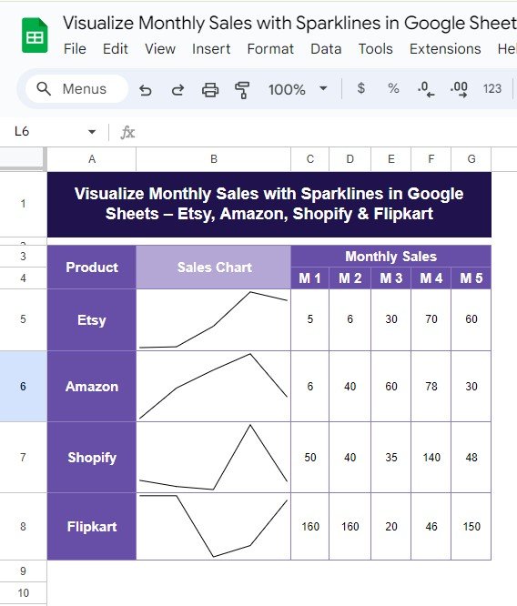
Managing sales data across multiple platforms can be tricky, but Google Sheets offers a fantastic solution: Sparklines! In this blog post, we’ll show you exactly how to create a simple and effective Monthly Sales with Sparklines in Google Sheets for platforms like Etsy, Amazon, Shopify, and Flipkart. By the end, you’ll have a clear visual of how each platform is performing over time, using a few simple steps.
Why Use Sparklines for Sales Data?
Sparklines are a great way to visualize data trends at a glance without taking up too much space. Unlike traditional charts, sparklines fit inside a single cell and give you a quick, graphical representation of your data. This is perfect when you’re working with Monthly Sales with Sparklines in Google Sheets across different platforms like Etsy, Amazon, Shopify, and Flipkart.
In just a few clicks, you can create a mini line chart inside your Google Sheet that tells the story of your sales performance over time.
Sample Data for This Example
Before we jump into the formula, here’s the sample sales data that we’ll be working with. It contains the monthly sales figures for four Commerce platforms:
We’ll visualize these monthly sales using the SPARKLINE function in Google Sheets.
How to Create a Sparkline in Google Sheets
Now, let’s get to the exciting part! Follow the steps below to visualize your monthly sales data with sparklines.
Step 1: Set Up Your Data in Google Sheets
First, make sure your sales data is properly laid out in your Google Sheet. The data should be structured like the table we shared earlier, where each product’s sales numbers are listed in rows.
Step 2: Use the SPARKLINE Formula
Next, you’ll use the SPARKLINE formula to create the chart. To insert a sparkline chart for Etsy’s sales, use the following formula in the cell next to Etsy’s sales row:
=SPARKLINE(C5:G5,{" charttype ","line"})
Let’s break down this formula to help you understand it better:
- =SPARKLINE: This is the function that creates the chart.
- C5: This defines the range of cells for the sales data (from Month 1 to Month 5 for Etsy).
- {“charttype”,”line”}: This option specifies that the chart should be a line chart. You can also create other types of sparklines like bar charts by changing “line” to “bar”.
Step 3: Apply the Formula to Other Rows
Once you’ve inserted the formula for Etsy, you can drag it down to apply it to the other products (Amazon, Shopify, Flipkart). Google Sheets will automatically adjust the cell references for each row, making it super easy to create sparklines for all platforms.
The Output: A Visual Overview of Your Monthly Sales
After you apply the sparkline formula to all the products, your Google Sheet will display a mini line chart for each platform, allowing you to see the sales trends for Etsy, Amazon, Shopify, and Flipkart. Here’s how the output will look:
These simple, in-cell charts allow you to visualize sales trends quickly without taking up too much space on your sheet.
Why This Sparkline Solution Is So Effective
The beauty of sparklines lies in their simplicity. Here are a few reasons why using sparklines in Google Sheets can be a game-changer for your sales tracking:
- 📊 Quick Insights
Sparklines provide an instant visual overview of your data trends, helping you spot upward or downward movements quickly.
- ⚙️ Easy Setup
With just a simple formula, you can create powerful visualizations without the need for complex charting tools.
- 📝 Space-Saving
Since sparklines fit inside individual cells, you save space while still getting a full picture of your data. Monthly Sales with Sparklines in Google Sheets
Visit our YouTube channel to learn step-by-step video tutorials
Youtube.com/@NeotechNavigators

