Public Safety Dashboard in Google Sheets
The Public Safety Dashboard in Google Sheets helps public safety teams convert incident records into a readable dashboard for operations reviews. NENA estimates that 240 million 911 calls are made in the U.S. each year, while NFPA reports 42,687,000 fire department calls in 2024. Even a small slice of that activity can create thousands of records, so teams need a fast way to review incident volume, resolved rate, response time, personnel deployment, cost, severity, and safety performance.
This Google Sheets template is designed for teams that want practical reporting without starting from a blank spreadsheet or paying for a full public safety software suite. It includes seven sheet tabs: Overview, Unit Performance, Incident Analysis, Response & Cost, Safety Performance, Search, and Data. Each tab focuses on a different part of the public safety workflow, from high-level KPI cards to detailed Incident ID lookup.
Click here to purchase the Public Safety Dashboard in Google Sheets
Key Features of Public Safety Dashboard in Google Sheets
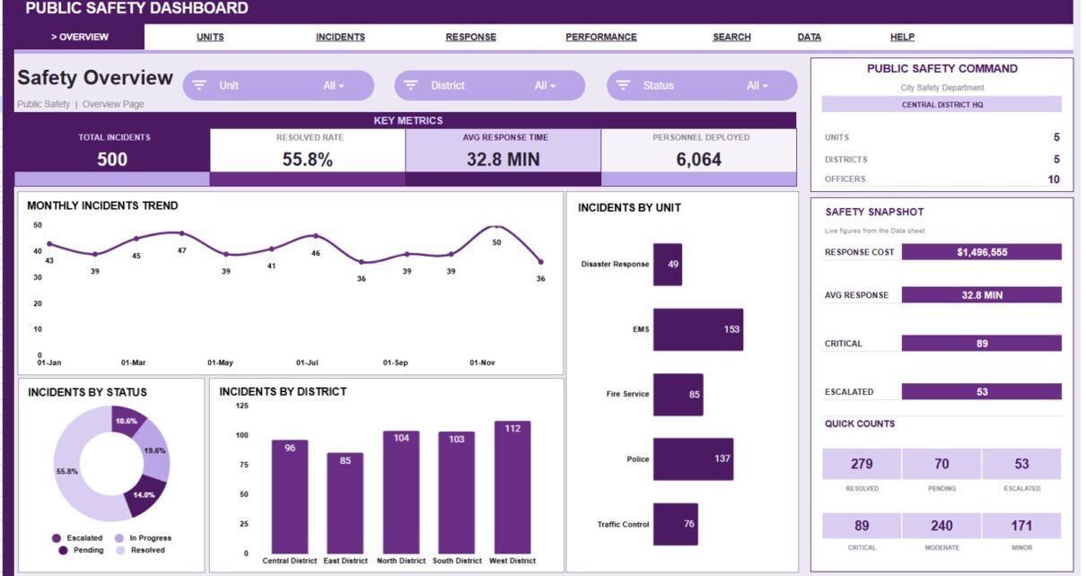
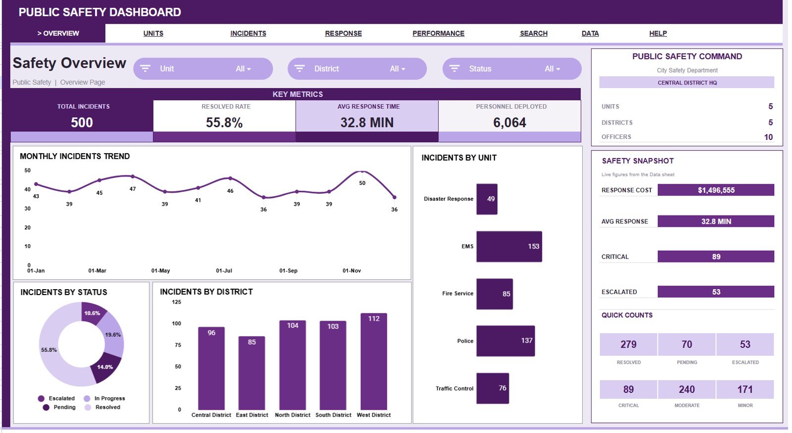
- Overview dashboard: Shows Total Incidents, Resolved Rate, Avg Response Time, and Personnel Deployed in headline cards.
- Multiple slicers: Filter dashboard pages quickly during weekly, monthly, or incident-review meetings.
- Unit performance analysis: Compare response cost, safety score, response time, and district activity by unit.
- Incident analysis: Review incident type, cost share, channel, and severity trends.
- Response and cost analysis: Track response time and cost by month, district, and communication channel.
- Safety performance page: Monitor safety score, response time by severity, personnel deployment, and officer activity.
- Search sheet: Select an Incident ID and instantly see the full record details.
- Data sheet: Replace the sample records with your own public safety data in the same format.
Dashboard Pages Explanation
1 – Overview Page
The Overview Page gives a leadership-friendly view of the public safety dataset. At the top, the dashboard shows cards for Total Incidents, Resolved Rate, Avg Response Time, and Personnel Deployed.
Incidents by Month: This chart shows how incident volume changes across the year. It helps teams identify peak months, seasonal patterns, and periods that may require additional staffing or review.
Incidents by Unit: This chart compares how many incidents each unit handled. It helps supervisors see workload concentration and understand which teams are carrying the heaviest activity.
Incidents by Status: This chart separates records by status such as resolved, pending, active, or other workflow stages. It helps managers monitor closure progress and spot open-record pressure.
Incidents by District: This chart groups incidents by district or area. It helps compare demand across zones, neighborhoods, campuses, or service regions.
2 – Unit Performance
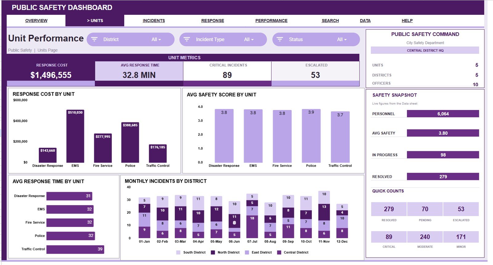
This sheet tab focuses on how public safety units are performing across cost, safety, response time, and district-level activity.
Response Cost by Unit: This chart compares total response cost across units. It helps leaders see whether one unit is driving a larger share of operational cost.
Avg Safety Score by Unit: This chart compares average safety score by unit. It helps identify teams with strong safety outcomes and teams that may need extra review or support.
Avg Response Time by Unit: This chart shows average response time for each unit. It helps managers review whether certain units are slower because of workload, distance, staffing, or process issues.
Monthly Incidents by District: This chart combines time and district analysis. It helps show whether district-level demand is stable, increasing, or clustered in specific months.
3 – Incident Analysis
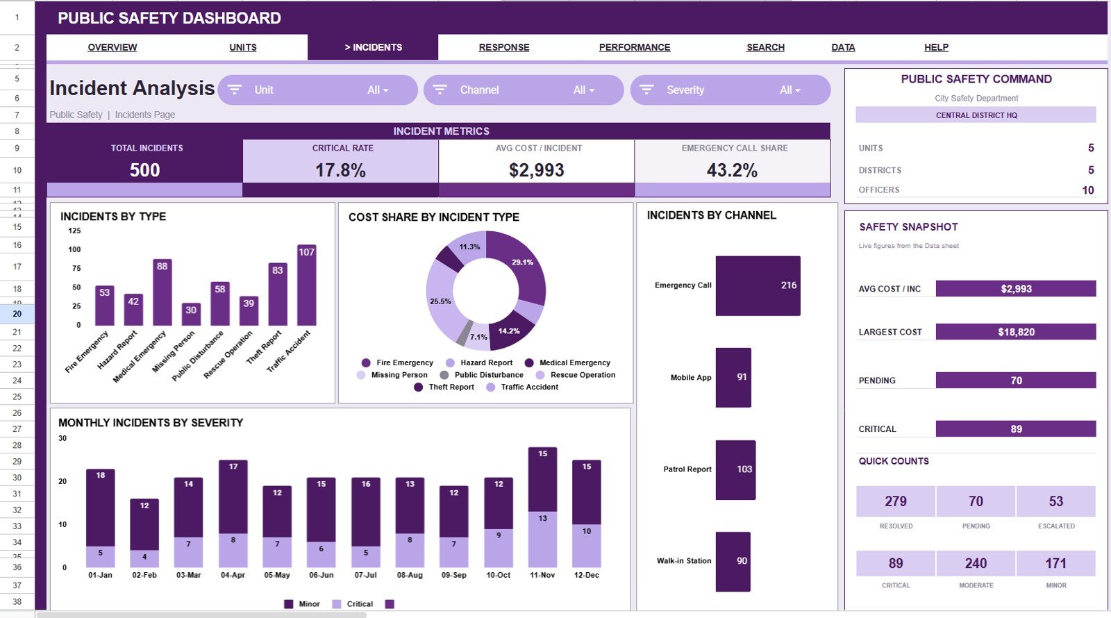
This sheet explains the nature of incidents, how they arrive, how cost is distributed, and how severity changes month by month.
Incidents by Type: This chart counts records by incident type. It helps teams see whether the workload is driven by alarms, disturbances, accidents, medical events, patrol issues, or other categories.
Cost Share by Incident Type: This chart shows how response cost is distributed across incident types. It helps separate high-volume incident categories from high-cost incident categories.
Incidents by Channel: This chart groups records by the channel used to receive or log the incident. It helps compare activity from phone, online, field, radio, walk-in, or other intake paths.
Monthly Incidents by Severity: This chart shows severity movement across months. It helps teams see whether high-severity records are rising, falling, or concentrated in specific periods.
4 – Response & Cost
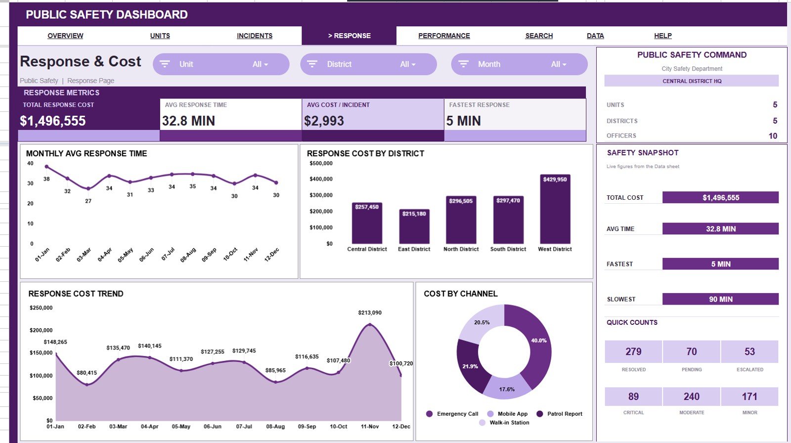
This sheet connects response speed and cost so teams can review whether public safety work is becoming faster, slower, cheaper, or more expensive.
Avg Response Time by Month: This chart shows response-time movement over time. It helps identify months where response time improved or slipped.
Response Cost by District: This chart compares response cost across districts. It helps managers understand whether one district requires more resources than others.
Response Cost by Month: This chart tracks cost trend month by month. It helps teams review budget pressure, overtime patterns, and seasonal workload changes.
Cost by Channel: This chart compares cost by reporting or response channel. It helps reveal whether certain intake paths create more expensive records.
5 – Safety Performance
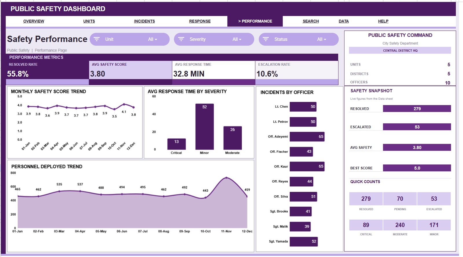
This sheet helps teams connect safety score, severity, personnel usage, and officer-level activity.
Safety Score by Month: This chart shows whether the safety score is improving or declining over time. It helps leaders spot periods that require deeper review.
Avg Response Time by Severity: This chart compares response time across severity levels. It helps confirm whether high-severity records are receiving faster attention.
Personnel Deployed by Month: This chart shows staffing deployment over time. It helps review whether personnel usage matches incident volume and severity.
Incidents by Officer: This chart compares incident counts by officer. It helps supervisors review workload distribution and identify unusually high or low assignment patterns.
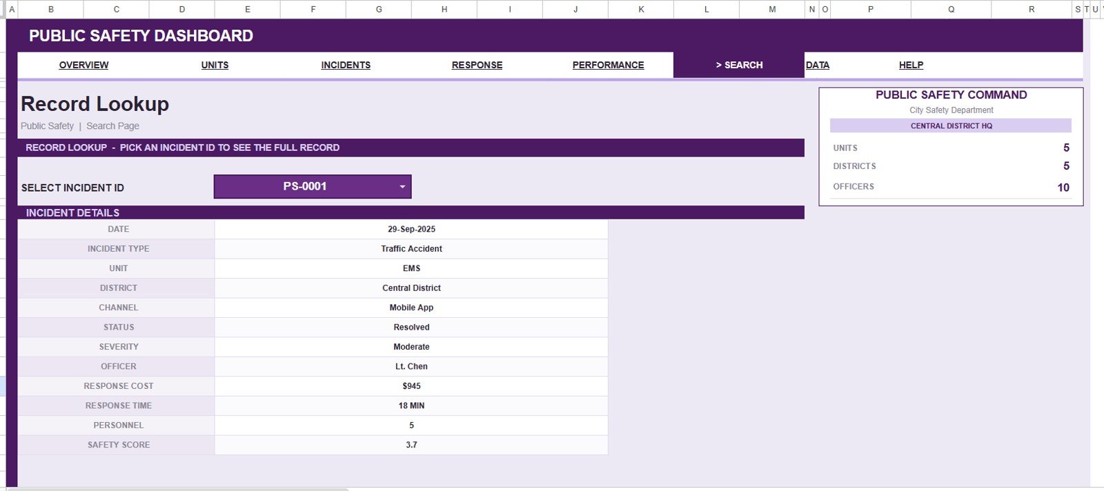
6 – Search Sheet Tab
The Search sheet is built for quick record lookup. Select an Incident ID and the sheet displays the full public safety record details, including date, incident type, unit, district, channel, status, severity, officer, response cost, response time, personnel, and safety score.
7 – Data Sheet Tab
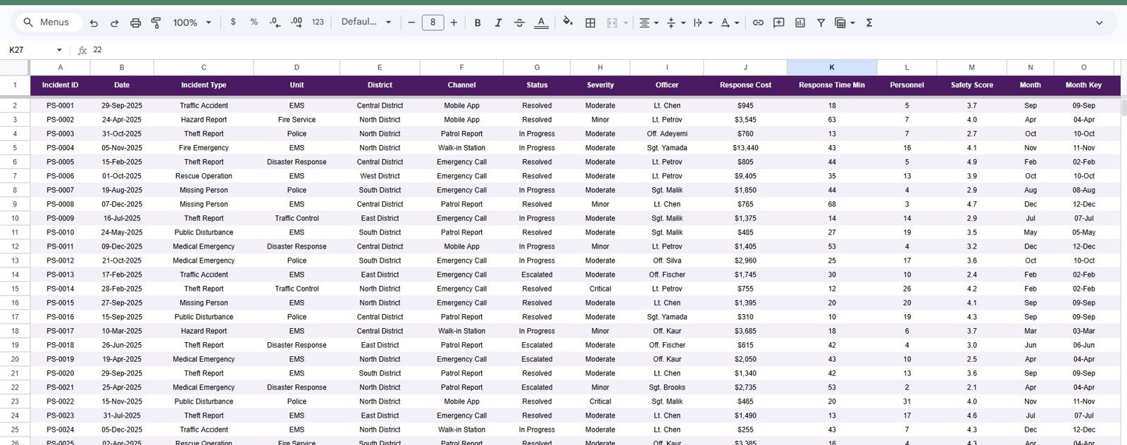
The Data sheet is where you add the records in the same format as the sample data. Keep the column structure consistent so the cards, slicers, charts, and search output continue to update correctly.
Public Safety Dashboard in Google Sheets vs. Microsoft Excel Dashboard vs. Paid Public Safety SaaS – Feature Comparison
| Feature | Public Safety Dashboard in Google Sheets | Microsoft Excel dashboard | Paid public safety SaaS |
|---|---|---|---|
| Cost | $9.99 sale price, one-time | Template cost plus Microsoft licensing | Usually monthly or annual |
| Platform | Google Sheets in Drive | Excel desktop or web | Vendor-hosted system |
| Setup time | Copy file and replace sample data | Open workbook and customize | Requires onboarding and configuration |
| Real-time team collaboration | Built into Google Sheets sharing | Available through Microsoft sharing tools | Usually role-based |
| Mobile access | Google Sheets app or browser | Excel app or browser | Usually included |
| Customizable fields | Editable sheet structure | Editable workbook structure | Depends on vendor controls |
| Share with link | Yes, through Google Drive | Yes, through OneDrive or SharePoint | Usually invite-based |
| Year-1 cost at 5 users | $9.99 before Google Workspace costs | Template plus license costs | Can increase with users and modules |
| Incident ID search | Included | Must be built or customized | Usually included |
| Dispatch/RMS features | Not included | Not included | Core system capability |
Who Should Use This Template
This template is useful for local government teams, campus safety teams, public safety analysts, emergency response coordinators, operations managers, and security teams that already have incident records and want a spreadsheet-based dashboard for analysis.
It is also helpful for training, internal reporting, budget conversations, district comparison, and monthly operating reviews. If your team needs a lightweight reporting layer before investing in a larger system, the Public Safety Dashboard in Google Sheets is a practical place to start.
This is not the right tool for live dispatch, evidence chain-of-custody, legal records management, regulated case handling, or emergency alerting. Use dedicated public safety software for those workflows.
Real-World Use Cases
City operations analyst: A city analyst uses the Overview Page to brief leaders on monthly incident volume, resolved rate, response time, and personnel deployment before a public safety review meeting.
Emergency response coordinator: A coordinator compares response time, safety score, and cost by unit to identify where support, training, or resource planning may be needed.
Campus security manager: A campus manager uses the Search sheet to look up one incident record quickly during an internal review without scrolling through the full data table.
Advantages of Public Safety Dashboard in Google Sheets
Public Safety Dashboard in Google Sheets
The biggest advantage is speed. Instead of building charts, slicers, lookup formulas, and dashboard pages from scratch, you can copy the template, replace the sample data, and start reviewing public safety records quickly.
The second advantage is collaboration. Google Sheets lets teams review the same file from different devices, and Google provides official guidance on sharing files from Google Drive, Docs, Sheets, and Slides. That makes it easier to give leaders view access while limiting edit access to the people maintaining the data.
The third advantage is practical coverage. The dashboard does not look at only one metric. It covers incident volume, status, district, unit, channel, severity, response cost, response time, personnel deployment, officer workload, and safety score.
Opportunities for Improvement
The template uses manual data entry or paste-in data. If your team wants automatic dispatch-system integration, you would need a separate workflow to export data and update the sheet.
The dashboard does not include live maps, GIS layers, automated alerts, or regulated evidence handling. Those workflows belong in dedicated public safety software, not a general-purpose spreadsheet.
Teams handling sensitive data should review internal privacy, security, and retention rules before entering real incident details. For many organizations, the best approach is to use anonymized or summarized records in the dashboard.
Best Practices
Keep one consistent Incident ID format. The Search sheet depends on clean IDs, so avoid duplicate IDs and avoid changing the ID format halfway through the dataset.
Standardize dropdown values before importing records. For example, decide whether a status should be written as Resolved, Closed, or Complete, then use one version consistently.
Review outliers each month. High response cost, unusually long response time, very low safety score, or heavy incident concentration in one district should trigger a second look.
Protect the Data sheet. Give edit access only to the people responsible for maintaining the records, and use view access for stakeholders who only need to review dashboards.
Explore Relevant Templates
- Government Administration Dashboard in Google Sheets for broader public-sector operations reporting.
- Municipal Services KPI Scorecard in Google Sheets for local government KPI tracking.
- Emergency Rescue Services Dashboard in Excel for rescue service analysis.
- Emergency Rescue Services Dashboard in Power BI for BI-style rescue service reporting.
- Public Safety Dashboard in Excel for teams using Microsoft Excel.
Frequently Asked Questions
Public Safety Dashboard in Google Sheets
What is included in the Public Safety Dashboard in Google Sheets?
It includes Overview, Unit Performance, Incident Analysis, Response & Cost, Safety Performance, Search, and Data sheet tabs.
What KPI cards are shown on the Overview Page?
The Overview Page shows Total Incidents, Resolved Rate, Avg Response Time, and Personnel Deployed.
Can I use slicers to filter the dashboard?
Yes. The dashboard includes slicers so you can filter the charts and cards quickly during analysis.
Does the template include an incident lookup page?
Yes. The Search sheet lets you select an Incident ID and view the complete public safety record details.
Can I customize the public safety fields?
Yes. The template is editable in Google Sheets, but keep the core column structure consistent if you want the dashboard to update correctly.
Is this a replacement for dispatch or RMS software?
No. It is a reporting dashboard for structured records. It does not replace dispatch, RMS, evidence management, or legal case systems.
About the Author
Built by PK – Microsoft Certified Professional with 15+ years of Excel, Google Sheets, and Power BI experience. Founder of NextGenTemplates, reaching 300K+ subscribers across YouTube channels. Every template is hand-built and tested before release.
Conclusion
The Public Safety Dashboard in Google Sheets gives teams a structured way to review incident volume, response time, cost, unit performance, district activity, severity, personnel deployment, and safety score in one editable workbook. It is best for practical reporting, internal reviews, and operational visibility when a full public safety SaaS platform is more than the team needs.
Visit our YouTube channel for step-by-step tutorials: Youtube.com/@NeoTechNavigators