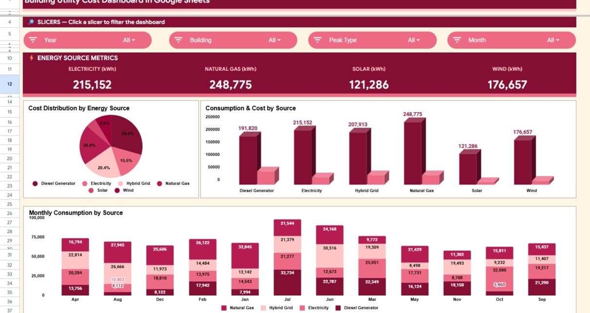
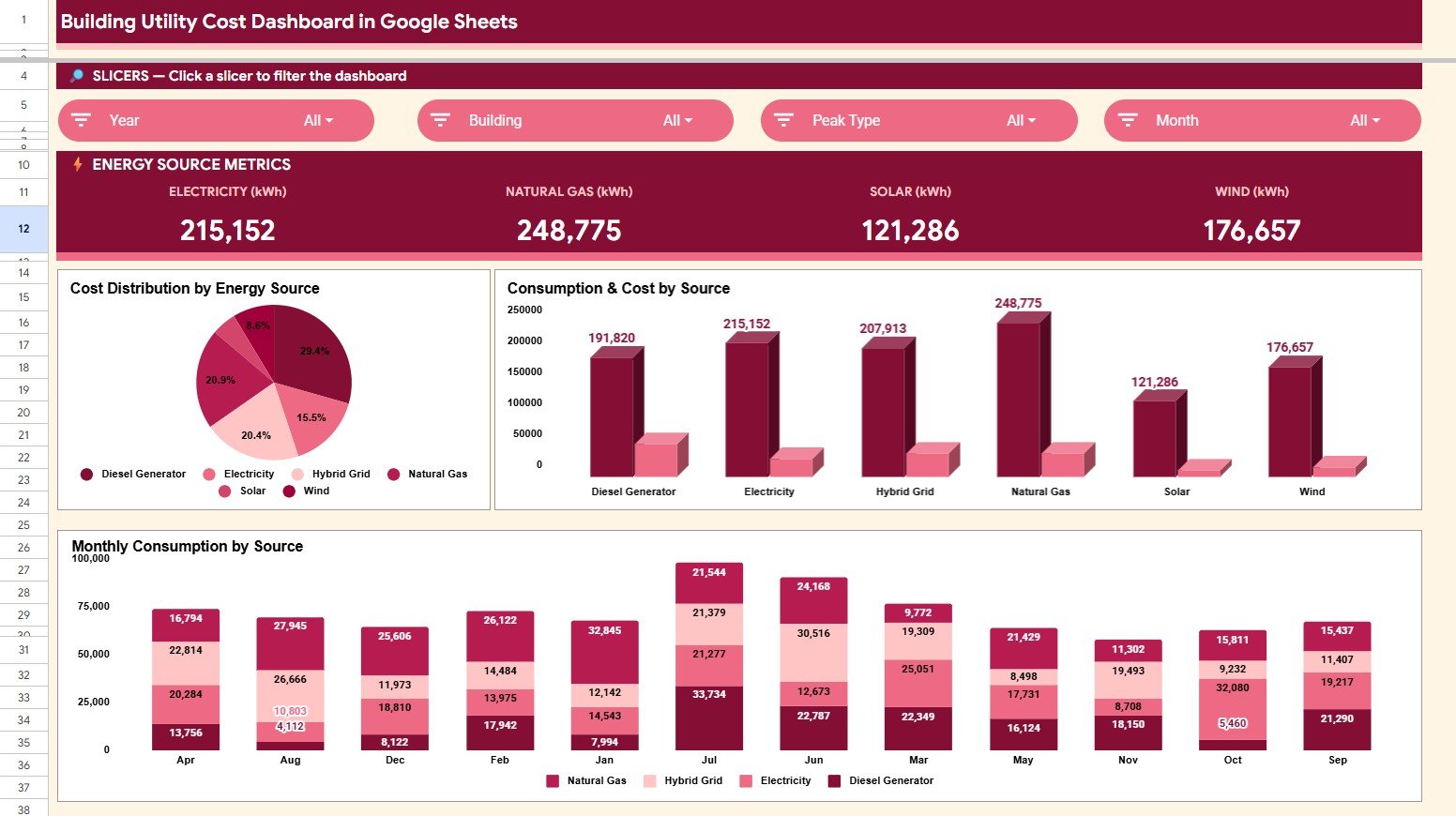
The Building Utility Cost Dashboard in Google Sheets gives facility, property, sustainability, and finance teams a ready reporting workbook with 6 sheet tabs, 4 utility source cards, 11 chart views, multiple slicers, one Search Sheet, and one structured Data Sheet. Instead of maintaining separate bill trackers for electricity, natural gas, solar, and wind, teams can enter records once and review building-level cost, source-level consumption, monthly trends, and individual record details in one shareable Google Sheets file.Building Utility Cost Dashboard in Google Sheets
This template is designed for teams that want a fast reporting layer without committing to an energy management SaaS subscription. Google Sheets also supports browser access, team sharing, charts, and spreadsheet collaboration; you can review Google’s own documentation for charts in Google Sheets if you want to understand the native chart foundation behind this type of dashboard. The product is available as a one-time template purchase here: Building Utility Cost Dashboard in Google Sheets.
Click here to purchase the Building Utility Cost Dashboard in Google Sheets.
Key Features of Building Utility Cost Dashboard in Google Sheets
The dashboard is built around practical utility cost monitoring. At the top level, it tracks Electricity (kWh), Natural Gas (kWh), Solar (kWh), and Wind (kWh), giving users a clean view of mixed energy sources without splitting the work into separate files.
Multiple slicers help users filter the dashboard quickly. A facility manager can review one building, a finance analyst can isolate one department, and a sustainability analyst can compare renewable and non-renewable sources from the same dataset.Building Utility Cost Dashboard in Google Sheets
The Search Sheet is especially useful for record-level verification. Enter a Record ID and the sheet returns the full utility record, including date, building, energy source, department, meter, consumption, cost, rate, peak status, and record status. This makes the dashboard useful not only for summary reporting but also for quick audit questions.Building Utility Cost Dashboard in Google Sheets
Dashboard Pages Explanation
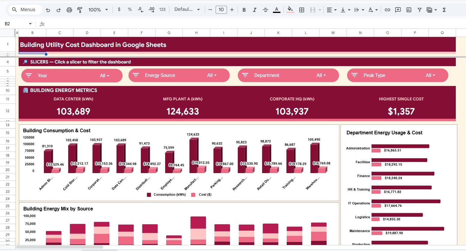
1. Overview Page
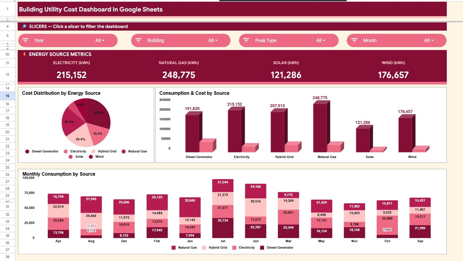
The Overview Page gives a high-level view of utility performance. The card section shows Electricity (kWh), Natural Gas (kWh), Solar (kWh), and Wind (kWh), helping users understand the source mix before moving into deeper charts.
Cost Distribution by Energy Source: This chart shows how total cost is divided across electricity, natural gas, solar, and wind. It helps identify which source is responsible for the highest spend and where cost control conversations should start.Building Utility Cost Dashboard in Google Sheets
Consumption and Cost by Energy Source: This chart compares consumption and cost side by side by source. It helps users find mismatches where a source may have moderate usage but high cost impact.Building Utility Cost Dashboard in Google Sheets
Monthly Consumption by Energy Source: This view tracks each source across months. It helps teams spot seasonality, unusual spikes, and changes in renewable contribution over time.Building Utility Cost Dashboard in Google Sheets
2. Building Energy Analysis
This sheet tab focuses on building and department performance. It is useful when the team needs to compare offices, manufacturing sites, warehouses, data centers, or other facilities.
Consumption and Cost by Building: This chart compares building-level kWh and cost. It helps managers see which locations need closer review for operating budgets or efficiency projects.Building Utility Cost Dashboard in Google Sheets
Energy Cost by Department: This chart breaks down utility cost by department. It helps finance and operations teams connect spend to the teams or functions using the most energy.Building Utility Cost Dashboard in Google Sheets
Energy Mix by Building: This chart shows how energy sources vary by building. It helps sustainability teams understand whether some locations rely more heavily on renewable or non-renewable sources.Building Utility Cost Dashboard in Google Sheets
Click here to purchase the Building Utility Cost Dashboard in Google Sheets.
3. Energy Source Analysis
The Energy Source Analysis tab provides a focused look at the four source categories: electricity, natural gas, solar, and wind. It repeats the most important source-level views so users can review energy cost and consumption without distraction from building-specific visuals.
Cost Distribution by Energy Source: This chart explains cost share by source. It supports quick decisions about which energy source deserves rate review or procurement analysis.
Consumption and Cost by Energy Source: This comparison shows whether consumption and cost move together. It is helpful for identifying costly sources, unusually high rates, or efficiency opportunities.
Monthly Consumption by Energy Source: This chart shows source-level consumption by month. It helps users compare recurring usage patterns across electricity, gas, solar, and wind.
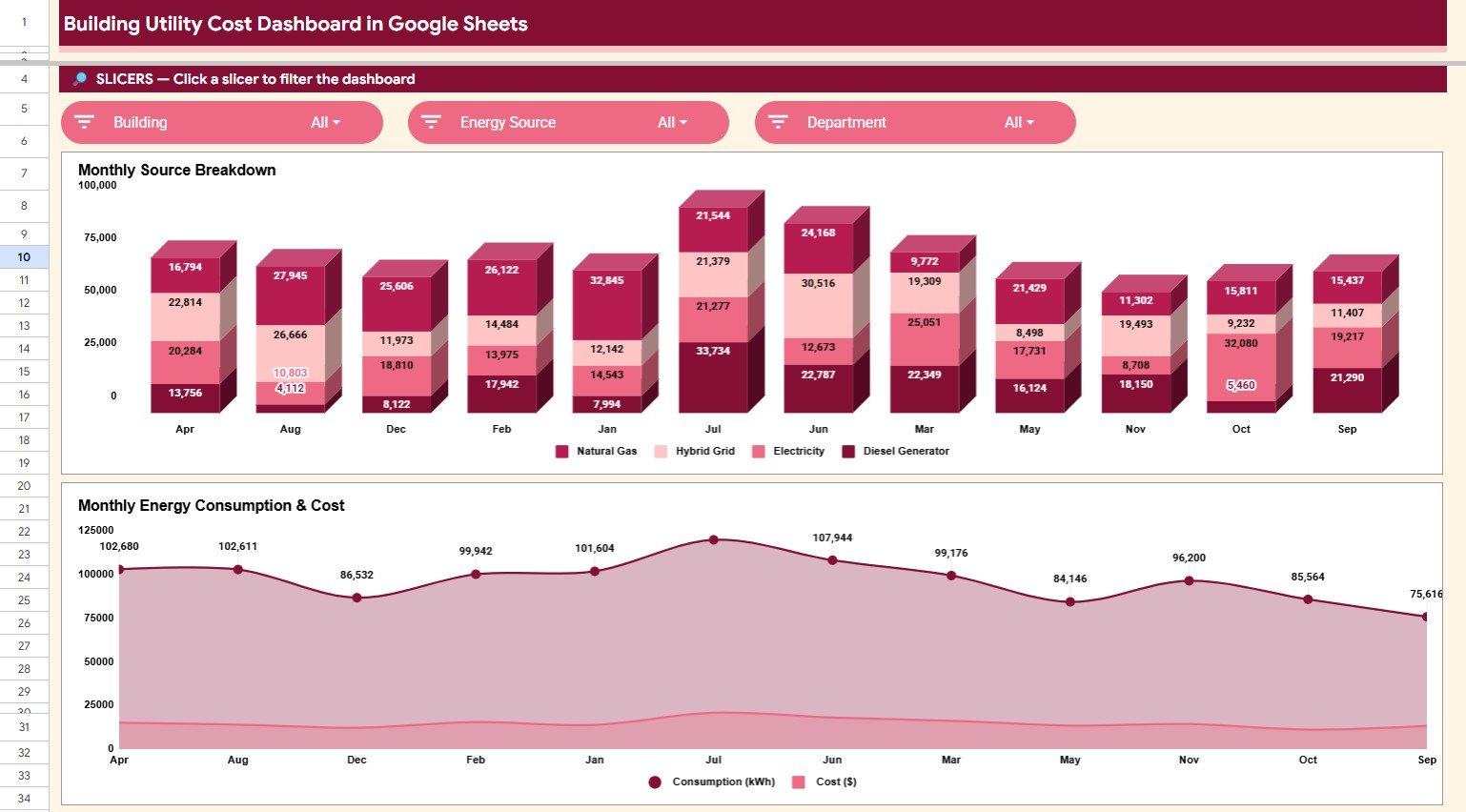
4. Monthly Trends Analysis
The Monthly Trends Analysis page is built for recurring reviews. It helps teams see whether cost and consumption are stable, seasonal, or moving in a direction that needs attention.
Monthly Consumption by Energy Source: This chart compares monthly source consumption. It helps users see whether electricity, gas, solar, or wind changes more sharply across the reporting period.
Consumption and Cost by Month: This chart places monthly consumption and cost together. It helps identify months where cost rose faster than usage or where efficiency improvements reduced cost impact.
Click here to purchase the Building Utility Cost Dashboard in Google Sheets.
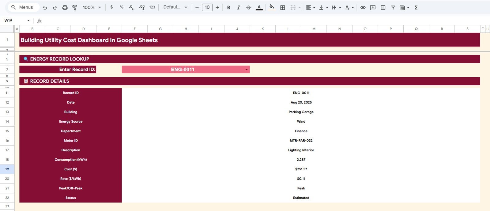
5. Search Sheet
The Search Sheet lets you enter a Record ID and instantly display the full details of that utility record. The lookup includes date, building, energy source, department, meter, consumption, cost, rate, peak status, and record status.
This is helpful when someone asks about one bill line, one meter entry, or one unusual month. Instead of scrolling through the Data Sheet, you can retrieve the record directly.
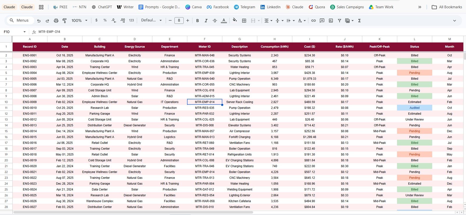
6. Data Sheet Tab
The Data Sheet is the input table for the whole dashboard. Users add utility records in the same format, and the dashboard pages use that structure to power cards, charts, filters, and the search lookup.
For best results, keep the same column headings and data types when replacing the sample records. This preserves the logic already built into the template.
Building Utility Cost Dashboard in Google Sheets vs. Microsoft Excel vs. Paid Energy SaaS – Feature Comparison
| Feature | This Google Sheets Dashboard | Microsoft Excel Dashboard | Paid Energy SaaS |
|---|---|---|---|
| Cost | $9.99 one-time | Template cost plus Microsoft access | Monthly or annual subscription |
| Platform | Google Sheets in browser | Microsoft Excel desktop or web | Vendor cloud platform |
| Setup time | Copy the file and replace data | Open workbook and refresh data | Implementation and setup required |
| Real-time team collaboration | Native Google Drive sharing | Possible through OneDrive | Usually available by paid seat |
| Mobile access | Google Sheets app | Excel app | Vendor app |
| Customizable fields | Editable spreadsheet columns | Editable workbook fields | Limited by vendor settings |
| Share with link | Built into Google Drive | Available through Microsoft 365 | Login controlled |
| Year-1 cost at 5 users | $9.99 total | Template cost plus licenses | Often hundreds to thousands |
| Record lookup | Included through Search Sheet | Depends on workbook design | Depends on plan |
Who Should Use This Template
This template is ideal for facility managers, property managers, building owners, sustainability analysts, finance analysts, operations managers, and energy consultants who need a practical way to review building utility cost without a large implementation project.
It is not meant to replace live smart-meter infrastructure, utility billing APIs, carbon accounting systems, OCR-based bill ingestion, or enterprise-grade energy management software. It is best when your utility data is already available in a table or can be pasted into one.
Real-World Use Cases
Click here to purchase the Building Utility Cost Dashboard in Google Sheets.
Priya, a facility manager, uses the Overview and Building Energy Analysis tabs before monthly meetings to compare which buildings have the highest cost and which departments need follow-up.
Daniel, a sustainability analyst, uses the Energy Source Analysis and Monthly Trends pages to track the balance between electricity, gas, solar, and wind over time.
Aisha, a finance analyst, uses the Search Sheet when department heads ask about a specific utility record, meter, rate, or peak/off-peak status.
Advantages of Building Utility Cost Dashboard in Google Sheets
The main advantage is speed. A buyer can copy the Google Sheet, replace sample records, and begin reviewing utility data without designing charts or dashboards manually.
The second advantage is collaboration. Because the file runs in Google Sheets, teams can share it through Google Drive and work from one version instead of sending copies through email.
The third advantage is transparency. Users can see the Data Sheet, chart pages, and record lookup logic in one workbook, which makes it easier to explain numbers during reviews.
Opportunities for Improvement
The dashboard does not automatically connect to utility providers, smart meters, or invoice systems. Users need to prepare and paste their data into the Data Sheet.
Teams with strict audit trails, automated emissions calculations, or real-time monitoring requirements may need a dedicated energy management platform. This template is best used as a flexible reporting layer for structured utility records.
Best Practices
Update the Data Sheet on a consistent monthly schedule. Keep building names, department names, energy source names, and record statuses consistent so slicers stay clean.
Review the Overview page first, then move into Building Energy Analysis and Energy Source Analysis when you need more detail. Use the Search Sheet for individual record validation before leadership or finance conversations.
Explore Relevant Templates
- Energy Consumption Analysis Dashboard in Google Sheets
- Energy Consumption Analysis Dashboard in HTML
- Building Automation Dashboard in Excel
- Solar Energy Dashboard in Power BI
- Browse Google Sheets Dashboard Templates
Frequently Asked Questions
Click here to purchase the Building Utility Cost Dashboard in Google Sheets.
What does the Building Utility Cost Dashboard in Google Sheets track?
It tracks building utility consumption and cost by electricity, natural gas, solar, wind, building, department, month, meter, peak status, and record status.
Can I replace the sample data?
Yes. Replace the sample rows in the Data Sheet while keeping the same columns and format so the dashboard pages continue updating correctly.
Does the dashboard include a lookup page?
Yes. The Search Sheet lets you enter a Record ID and view all details for that record instantly.
Can multiple people use the dashboard?
Yes. Since it is built in Google Sheets, you can share the copied file through Google Drive and control viewer or editor access.
Does it automatically pull utility bills?
No. The template does not connect to utility providers or parse invoices automatically. Users enter or paste prepared records into the Data Sheet.
Is this better than paid energy SaaS?
It is better for teams that need a low-cost reporting template. It is not better for teams that require real-time meter integrations, compliance audit trails, or advanced automation.
About the Author
Built by PK – Microsoft Certified Professional with 15+ years of Excel, Google Sheets, and Power BI experience. Founder of NextGenTemplates, reaching 300K+ subscribers across YouTube channels. Every template is hand-built and tested before release.
Conclusion
The Building Utility Cost Dashboard in Google Sheets gives teams a practical way to turn utility records into usable reporting. With overview cards, building analysis, source analysis, monthly trends, a Search Sheet, and a Data Sheet, it covers the main views that facility and finance teams need for recurring utility reviews.
Click here to purchase the Building Utility Cost Dashboard in Google Sheets.
Visit our YouTube channel for step-by-step spreadsheet and dashboard tutorials:
Youtube.com/@NeoTechNavigators.