Introduction
The Debt-to-Equity Ratio KPI Dashboard in Google Sheets is a powerful and ready-to-use tool designed to help businesses and financial analysts monitor and analyze the debt-to-equity ratio effectively. This intuitive dashboard consolidates key financial metrics into one accessible platform, offering a comprehensive view of your organization’s leverage position over different periods. Whether you’re tracking monthly results or year-to-date performance, this dashboard provides actionable insights to support smarter decision-making.
Key Features of Debt-to-Equity Ratio KPI Dashboard in Google Sheets
- Fully interactive and dynamic dashboard with month selection dropdown.
- Comparison of Month-to-Date (MTD) and Year-to-Date (YTD) actuals against targets and previous year data.
- Conditional formatting with up/down arrows to easily visualize performance trends.
- Six dedicated worksheets covering dashboard, KPI trends, data inputs, targets, previous year numbers, and KPI definitions.
- Detailed trend charts showing actual, target, and previous year values for deeper analysis.
- User-friendly input sheets allowing quick data updates.
- Clear KPI definitions including formula, units, and performance type (Lower the Better or Upper the Better).
Dashboard Pages Explanation
Click to Buy Debt-to-Equity Ratio KPI Dashboard in Google Sheets
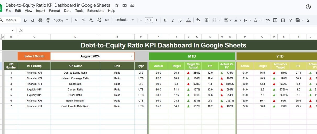
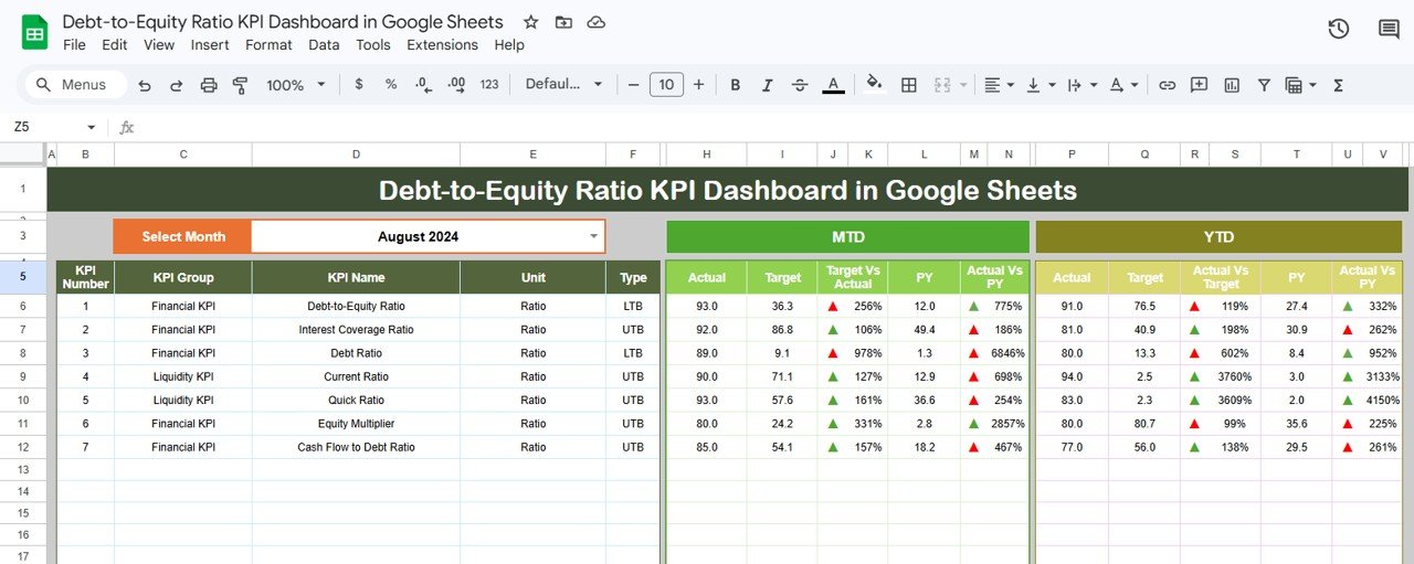
1. Dashboard Sheet Tab
This is the central sheet where all key information about the KPIs is displayed. You can select the month from the dropdown in cell D3, and the entire dashboard will dynamically update to reflect data for the selected month. The dashboard showcases the Month-to-Date (MTD) and Year-to-Date (YTD) actuals, targets, and previous year data. Additionally, comparisons such as Target vs Actual and Previous Year vs Actual are visually represented with conditional formatting arrows for quick insights.
Click to Buy Debt-to-Equity Ratio KPI Dashboard in Google Sheets
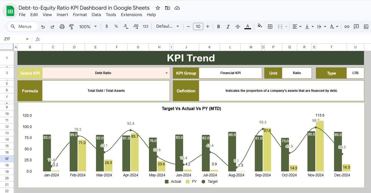
2. KPI Trend Sheet Tab
This sheet provides a deep dive into the trends of different KPIs. Select your KPI of interest from the dropdown in cell C3. The sheet then displays pertinent information such as KPI Group, Unit, KPI Type (whether Lower the Better or Upper the Better), the KPI formula, and its definition. MTD and YTD trend charts for Actual, Target, and Previous Year data help visualize performance changes over time.
Click to Buy Debt-to-Equity Ratio KPI Dashboard in Google Sheets
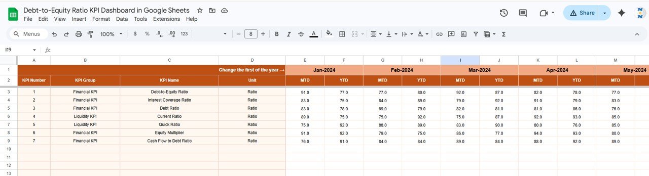
3. Actual Numbers Input Sheet
This sheet is the data entry point for your actual numbers for MTD and YTD for a given month. You can easily adjust the year’s starting month by changing the cell E1. This flexibility supports rolling data entry without manual reconfiguration.
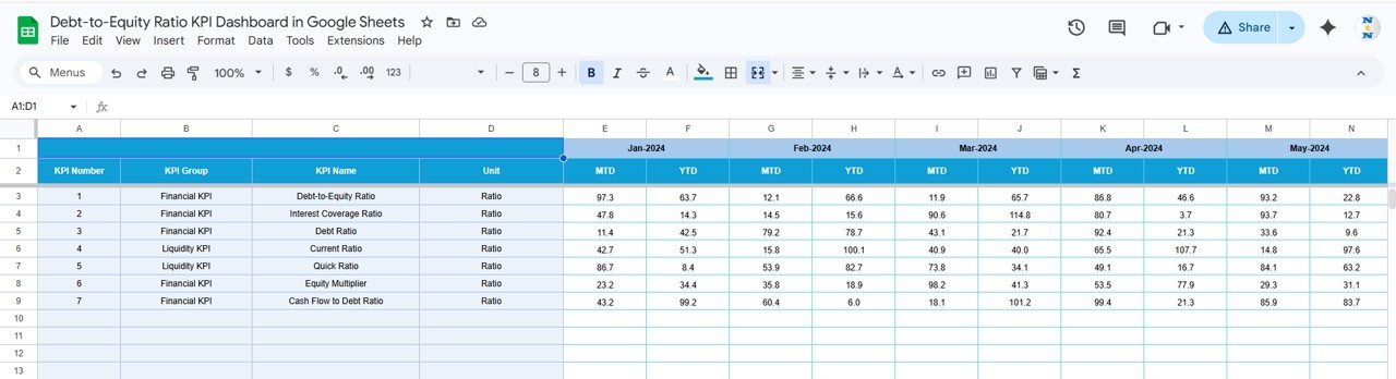
4. Target Number Input Sheet
This tab lets you set target numbers for each KPI on a monthly basis, both for Month-to-Date and Year-to-Date. Maintaining realistic and updated targets is essential for meaningful performance evaluation.
Click to Buy Debt-to-Equity Ratio KPI Dashboard in Google Sheets
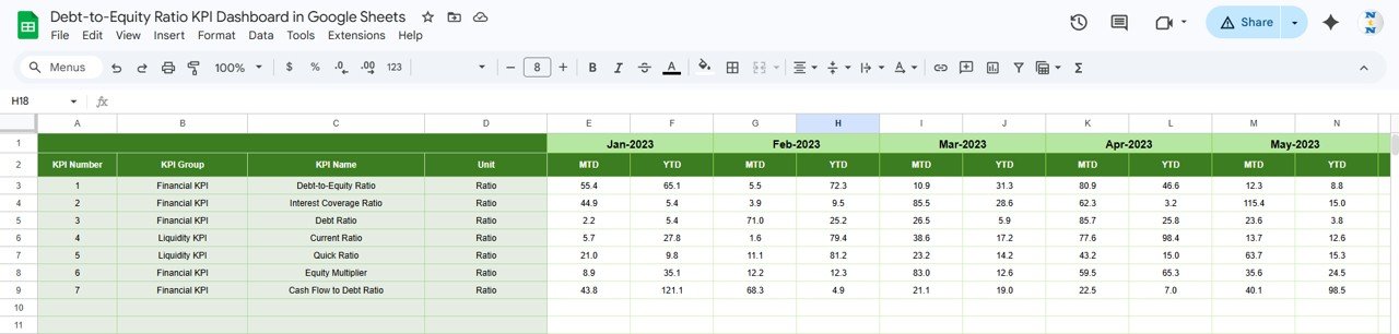
5. Previous Year Number Input Sheet
To facilitate year-over-year comparisons, this sheet stores previous year’s data in the same format as the current year. Accurate historical data entry is crucial for benchmarking and performance trend analysis.
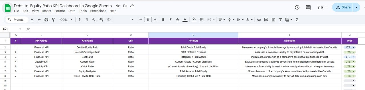
6. KPI Definition Sheet
This sheet contains detailed descriptions of each KPI, including the KPI Name, KPI Group, Unit of measurement, Formula, and a clear definition. The KPI Type (Lower the Better or Upper the Better) is specified to help interpret the KPI results properly.
Click to Buy Debt-to-Equity Ratio KPI Dashboard in Google Sheets
Advantages of Debt-to-Equity Ratio KPI Dashboard in Google Sheets
- User-Friendly Interface: Easy to navigate for both finance professionals and business managers.
- Dynamic Data Updates: Select the month once, and the entire dashboard updates automatically.
- Comprehensive Insights: MTD, YTD, target, and historical data comparisons in one place.
- Visual Performance Indicators: Conditional formatting arrows make it simple to identify positive or negative trends quickly.
- Customizable KPI Definitions: Define KPIs most relevant to your business with formulas and clear explanations.
- Cost-Effective: Built in Google Sheets, making it accessible without expensive software.
Opportunities for Improvement
Click to Buy Debt-to-Equity Ratio KPI Dashboard in Google Sheets
- Automated Data Import: Integrating with financial systems via APIs to reduce manual data entry.
- Expanded KPI Coverage: Adding related KPIs such as interest coverage ratio or liquidity ratios for a broader financial health overview.
- Mobile Responsiveness: Enhancing dashboard views for better usability on mobile devices.
- Scenario Analysis: Incorporating features to simulate the impact of changing debt or equity components.
Best Practices for Using the Debt-to-Equity Ratio KPI Dashboard
- Regularly update actual and target numbers to keep your analysis accurate.
- Review the KPI definitions carefully to ensure correct interpretation.
- Use the trend charts to identify patterns or red flags early.
- Leverage the conditional formatting to focus on key areas needing attention.
- Consult industry benchmarks to contextualize your debt-to-equity ratio results.
- Combine insights from this dashboard with other financial reports for holistic decision-making.
FAQs
Click to Buy Debt-to-Equity Ratio KPI Dashboard in Google Sheets
What is the Debt-to-Equity Ratio and why is it important?
The Debt-to-Equity Ratio measures a company’s financial leverage by dividing total liabilities by shareholders’ equity. It helps assess the risk level related to a company’s financing strategy.
Can I customize the KPIs in this Google Sheets dashboard?
Yes, you can define, add, or modify KPIs through the KPI Definition sheet to tailor the dashboard to your specific business needs.
Is this dashboard suitable for beginners?
Absolutely. The dashboard is designed with user-friendly dropdowns, clear instructions, and visual cues to assist users regardless of their financial background.
Can this template handle multiple companies or divisions?
Currently, the template focuses on single-entity analysis, but with some customization, it can be adapted to handle multiple entities.
Conclusion
Click to Buy Debt-to-Equity Ratio KPI Dashboard in Google Sheets
The Debt-to-Equity Ratio KPI Dashboard in Google Sheets offers a comprehensive, easy-to-use solution for tracking one of the most critical financial ratios in business. By combining actual performance data with targets and prior year comparisons, it empowers businesses to make informed financial decisions. Its modular structure and clean interface make it an ideal template for businesses looking to streamline their financial reporting processes without investing in expensive software.
Download and start using this dashboard today to gain valuable insights into your company’s financial leverage and ensure you stay ahead in financial management.
For more in-depth guidance and tutorials, Visit our YouTube channel to watch the demo.
External Resources
Click to Buy Debt-to-Equity Ratio KPI Dashboard in Google Sheets
- Microsoft Excel Support – For advanced Excel techniques that can complement Google Sheets dashboards.
- Google Docs Editors Help – Official documentation and tutorials for Google Sheets users.
Click to Buy Debt-to-Equity Ratio KPI Dashboard in Google Sheets