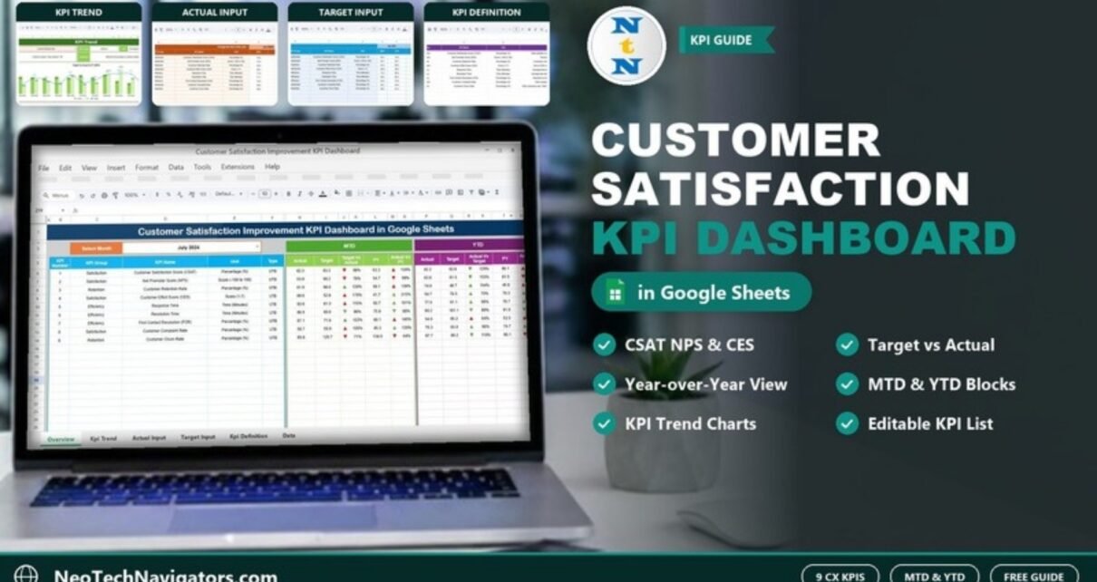
The Customer Satisfaction Improvement KPI Dashboard in Google Sheets is a ready-made template that tracks 9 customer experience KPIs, including CSAT, Net Promoter Score, Customer Effort Score, First Contact Resolution and churn, against monthly targets and last year’s results. It is built for customer service managers, CX teams and small business owners who want a monthly satisfaction report without a BI tool.
The file has six tabs: Dashboard, KPI Trend, Actual Numbers Input, Target Number Input, Previous Year Number Input and KPI Definition. You enter numbers in the three input tabs, pick a month, and the dashboard shows MTD and YTD performance against target and last year, with up and down arrows next to each comparison.
Get the Customer Satisfaction KPI Dashboard
What Problem Does This Dashboard Solve?
Most companies collect satisfaction data in several places: survey scores in one tool, response times in the helpdesk, churn in the CRM or billing system. When the numbers are scattered, nobody can say in one sentence whether customer experience got better this month. Improvement projects then run on opinion rather than evidence.
This dashboard brings the core satisfaction, efficiency and retention KPIs into one Google Sheet and compares every one of them with a target and with the same period last year. That makes it easy to see where an improvement effort is working and where it is not.
The 9 KPIs in the Customer Satisfaction Improvement KPI Dashboard
These are the KPIs exactly as defined in the template’s KPI Definition tab. UTB means “upper the better” and LTB means “lower the better”.
| # | KPI Group | KPI | Unit | Formula (from the template) | Type in template |
|---|---|---|---|---|---|
| 1 | Satisfaction | Customer Satisfaction Score (CSAT) | Percentage (%) | Total satisfied customers / Total customers * 100 | UTB |
| 2 | Satisfaction | Net Promoter Score (NPS) | Score (-100 to 100) | Promoters % – Detractors % | UTB |
| 3 | Retention | Customer Retention Rate | Percentage (%) | Customers retained / Total customers * 100 | UTB |
| 4 | Satisfaction | Customer Effort Score (CES) | Score (1-7) | Sum of CES scores / Number of responses | LTB |
| 5 | Efficiency | Response Time | Time (Minutes) | Average time taken to respond to a customer | LTB |
| 6 | Efficiency | Resolution Time | Time (Minutes) | Average time taken to resolve a customer issue | LTB |
| 7 | Efficiency | First Contact Resolution (FCR) | Percentage (%) | Resolved on first contact / Total issues * 100 | UTB |
| 8 | Satisfaction | Customer Complaint Rate | Percentage (%) | Total complaints / Total customers * 100 | LTB |
| 9 | Retention | Customer Churn Rate | Percentage (%) | Total customers lost / Total customers at the start of the period * 100 | UTB |
A note on Customer Churn Rate: the template ships with this KPI set to UTB. For most businesses a lower churn rate is better, so check this setting and change it to LTB in the KPI Definition tab if that matches how you read churn.
Inside the Template: Sheet by Sheet
1. Dashboard
Choose the reporting month in the Select Month dropdown (cell D3; July 2024 in the screenshot). The left side lists KPI Number, KPI Group, KPI Name, Unit and Type. The MTD block shows Actual, Target, Target Vs Actual, PY and Actual Vs PY, and the YTD block shows Actual, Target, Actual Vs Target, PY and Actual Vs PY. Coloured up and down arrows sit next to each comparison.

Worked example: reading the July 2024 row for CSAT
- MTD Actual is 82.3 and the Target is 83.3. 82.3 ÷ 83.3 = 98.8%, shown as 99%: just below target.
- PY is 63.3. 82.3 ÷ 63.3 = 130%, shown as 130%: well ahead of the same month last year.
So the comparison columns are Actual expressed as a percentage of Target or PY. Read them with the Type column in mind: for a UTB KPI like Customer Retention Rate (81.9 against a target of 68.0, shown as 120%), above 100% is good; for an LTB KPI like Response Time (93.6 against 81.3, shown as 115%), above 100% means you were slower than planned.
In the sample file the arrow colours do not always follow the Type column, so always read the percentage together with the KPI’s UTB or LTB type rather than relying on the arrow colour alone.
2. KPI Trend
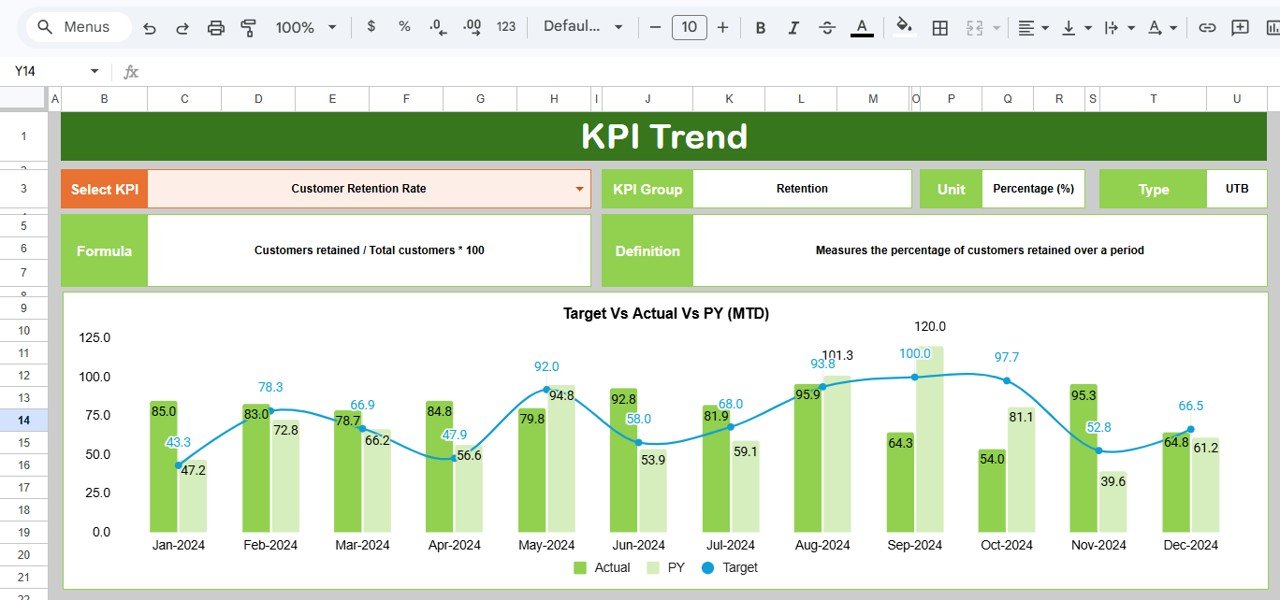
Select a KPI in cell C3 and the sheet shows its KPI Group, Unit, Type, Formula and Definition. The chart Target Vs Actual Vs PY (MTD) plots Actual and PY as columns and Target as a line for every month, and a matching YTD trend chart sits below it. In the screenshot, Customer Retention Rate is selected.
3. Actual Numbers Input
One row per KPI, with an MTD and a YTD column for each month. Set the first month of your year in cell E1 (marked “Change the first of the year”) and the month headers follow it.

4. Target Number Input
The same layout, used for your monthly MTD and YTD targets.

5. Previous Year Number Input
The same layout again, holding last year’s figures (Jan-2023 onwards in the sample) for the year-over-year comparison.

6. KPI Definition
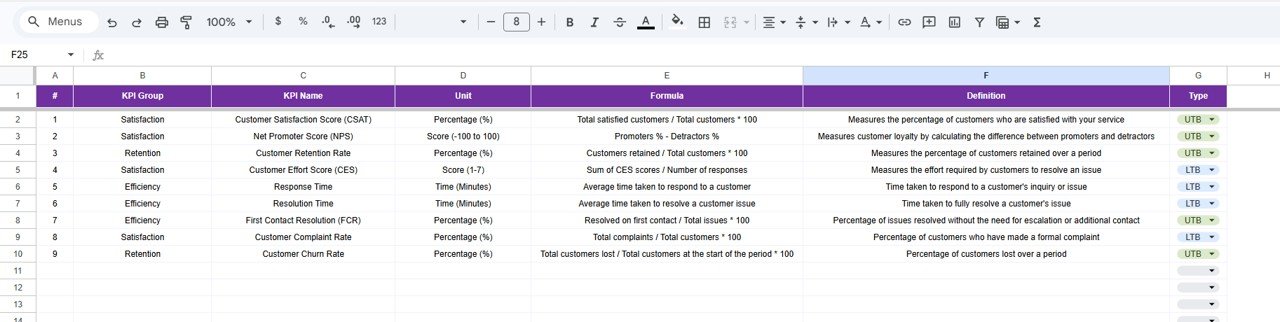
The master list: #, KPI Group, KPI Name, Unit, Formula, Definition and Type. Type is a dropdown with UTB and LTB, and there are empty rows below the 9 KPIs.
How to Use It with Your Own Data
- Make a copy of the Google Sheet and open KPI Definition. Confirm each formula and set the Type (UTB or LTB) to match how you judge that KPI.
- In Actual Numbers Input, set the first month of your year in cell E1.
- Enter last year’s figures in Previous Year Number Input and this year’s goals in Target Number Input.
- At the end of each month, enter the MTD and YTD actuals in Actual Numbers Input.
- On the Dashboard, choose the month in cell D3 and review the Target and PY comparison percentages in the MTD and YTD blocks.
- For any KPI that is off target, open KPI Trend, select it in C3 and check whether the problem is new or has been building for months.
If you want to build your own customer reports from survey or helpdesk exports, the Excel Pivot Tables & Dashboards course on NextGenTemplates Academy teaches the summarising and charting steps in a structured way.
Three Real-World Use Cases
- Support team improvement plan: a service manager sets targets to cut Response Time and lift First Contact Resolution, then checks the dashboard monthly to see whether the new process is working.
- Subscription business: the CX lead tracks Customer Retention Rate and Customer Churn Rate side by side with NPS to see whether loyalty and retention move together.
- Retail or service chain: head office keeps one copy per branch and compares CSAT and Customer Complaint Rate against last year at quarterly reviews.
Best Practices
- Use one survey method all year. Changing the CSAT question or scale breaks the year-over-year comparison.
- Track response and resolution time in minutes, the unit the template uses.
- Set realistic targets. A target far above last year’s actual puts every KPI below target and the dashboard stops being useful.
- Look at KPIs in pairs. Faster Response Time with falling CSAT may mean customers are getting quick but unhelpful replies.
- Review monthly, act quarterly. One bad month is noise; three is a trend.
Other KPIs Worth Tracking
The template does not include these, but many CX teams add them in the spare rows of the KPI Definition tab: survey response rate, average handle time, ticket backlog and repeat-contact rate. Add them only if you can measure them reliably every month.
Limitations: Who Should Not Use It
- All numbers are entered by hand. It does not pull scores from survey tools, helpdesks or CRMs automatically.
- It works with summary numbers, not individual survey responses or comments. For text feedback you need a separate tracker.
- Large contact centres that need real-time or hourly reporting will outgrow a monthly Google Sheets dashboard.
Related Templates and Guides
For a chart-based view of survey results, see the Customer Satisfaction Dashboard in Google Sheets and the Customer Satisfaction Survey Tracker. To focus on single areas, read about the Customer Churn KPI Dashboard, the Customer Retention KPI Dashboard and the Customer Service KPI Scorecard. Prefer Excel? There is also a Customer Satisfaction Improvement KPI Dashboard in Excel.
Frequently Asked Questions
Which KPIs does the Customer Satisfaction Improvement KPI Dashboard track?
Nine: CSAT, Net Promoter Score, Customer Retention Rate, Customer Effort Score, Response Time, Resolution Time, First Contact Resolution, Customer Complaint Rate and Customer Churn Rate.
How is NPS calculated in the template?
As Promoters % minus Detractors %, giving a score between -100 and 100.
Can I add or change KPIs?
Yes. Edit the name, unit, formula, definition and type in the KPI Definition tab, and enter matching values in the three input tabs.
What does a Target Vs Actual value of 115% mean?
The actual was 115% of the target. For a UTB KPI that is good; for an LTB KPI such as Response Time it means you were 15% above (worse than) the target.
Can my team use it at the same time?
Yes. It is a Google Sheets file, so several people can view or edit it together, depending on the sharing permission you give.
How often should I update it?
Once a month, after the month closes, is enough for most teams. Update all three input tabs before the review meeting.
Wrapping Up
The Customer Satisfaction Improvement KPI Dashboard in Google Sheets gives you one monthly view of satisfaction, effort, speed and retention against target and last year. Set your targets, enter last month’s actuals and use the Target and PY comparisons on the Dashboard tab to decide which part of the customer experience to improve next.
Get the Customer Satisfaction KPI Dashboard
📅 Last updated: October 2026