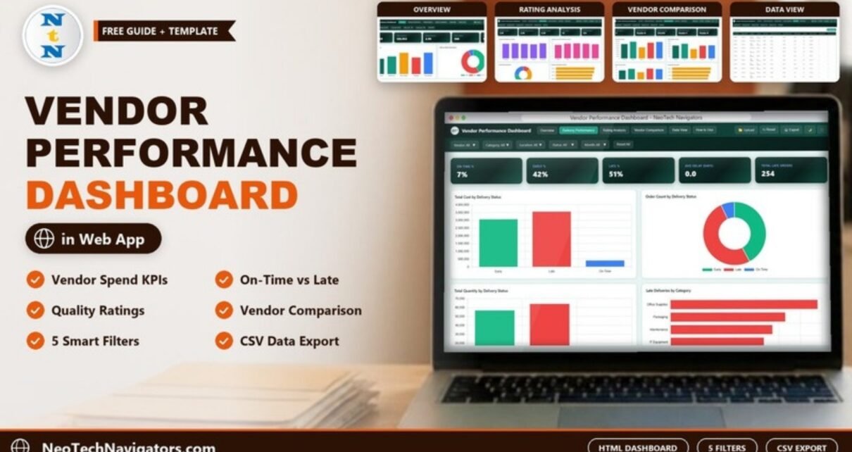
The Vendor Performance Dashboard in HTML is a browser-based report for procurement and supply chain teams who want to see, in one place, what each vendor costs, how reliably they deliver and how well they are rated. You open index.html in a modern browser and get KPI cards, interactive charts and filters for vendor, category, location, delivery status and month, with no Excel, Power BI or installation needed.
This guide walks through every page with the real numbers from the sample data: the Overview, Delivery Performance, Rating Analysis, Vendor Comparison and Data View pages, the KPI cards on each, and how to load your own purchase-order data. It is aimed at procurement managers, buyers, supply chain analysts and small business owners who review suppliers regularly.
🎥 Watch the Video Tutorial
Get the Vendor Performance Dashboard in HTML
What Problem Does a Vendor Performance Dashboard Solve?
Most companies can tell you how much they spent with a supplier last year. Far fewer can say, without a day of spreadsheet work, which vendor delivers late most often, which category suffers the most delays, or whether a cheaper vendor is also the lowest rated. When purchase orders, delivery dates and ratings sit in separate files, vendor reviews turn into opinions instead of evidence.
This dashboard reads one purchase-order table and answers those questions on five linked pages. Because it runs in the browser, you can share the folder with a colleague and they see the same view without any software licence.
Dashboard at a Glance
| Page | KPI cards (sample values) | Main charts |
|---|---|---|
| Overview | Total Cost (USD) $7,009,259 · Total Quantity 128,953 · Average Rating 2.99 · Total Orders 500 · Units Ordered 128,953 | Total Cost by Category, Delivery Status Distribution, plus cost by month, region and vendor |
| Delivery Performance | On Time % 7% · Early % 42% · Late % 51% · Avg Delay (Days) 0.0 · Total Late Orders 254 | Total Cost, Total Quantity and Order Count by Delivery Status, Late Deliveries by Category, Delivery Status by Vendor |
| Rating Analysis | Avg Quality Rating 3.01 · Avg Communication Rating 2.96 · Avg Overall Rating 2.99 · 5-Star Orders 53 · Low Rating Orders 126 | Average Quality Rating by Category, Average Communication Rating by Location, Overall Rating Distribution, Average Overall Rating by Vendor, Average Rating by Month |
| Vendor Comparison | Total Vendors 5 · Top Vendor by Cost Vendor B · Avg Cost per Order $14,019 · Highest Rated Vendor Vendor C · Most Orders Vendor Vendor D | Total Cost, Total Quantity, Order Count and Average Rating by Vendor, Cost and Quantity by Vendor |
| Data View | None | Searchable, sortable table with Export Table (CSV) |
Navigation, Filters and Toolbar
The top bar holds the page tabs (Overview, Delivery Performance, Rating Analysis, Vendor Comparison, Data View and a How to Use guide) and buttons for Upload, Reset, Export, a dark-mode toggle and full screen. Under it, five drop-down filters, Vendor, Category, Location, Status and Month, apply to whichever page you are on, and Reset All clears them.
The sample data covers five vendors (Vendor A to Vendor E), five categories (IT Equipment, Maintenance, Office Supplies, Packaging, Raw Materials), five locations (Atlanta, Chicago, Houston, New York, San Francisco) and three delivery statuses (Early, Late, On Time).
Overview Page
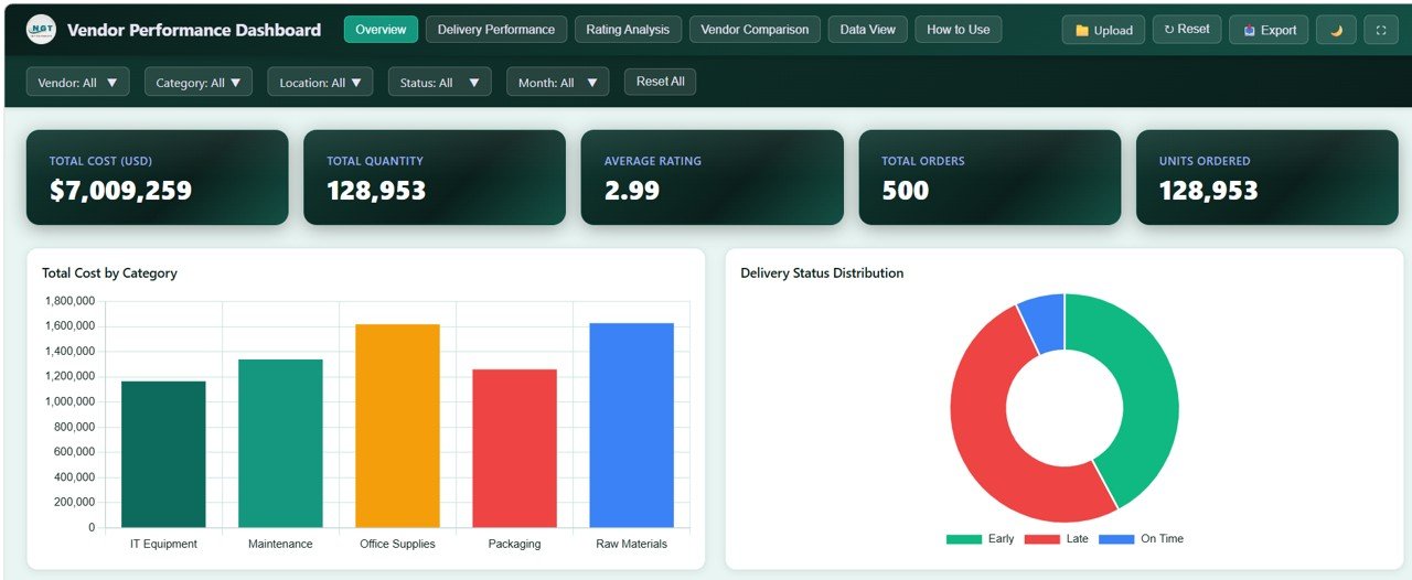
The Overview opens with five KPI cards: Total Cost (USD) of $7,009,259 across 500 orders, Total Quantity and Units Ordered of 128,953, and an Average Rating of 2.99. The Total Cost by Category chart shows Raw Materials and Office Supplies as the largest spend areas in the sample, each a little over $1.6M, with IT Equipment the smallest. The Delivery Status Distribution doughnut gives an immediate sense of how many orders arrived early, late or on time. Further charts on the page break procurement cost down by month, region and vendor.
Delivery Performance Page
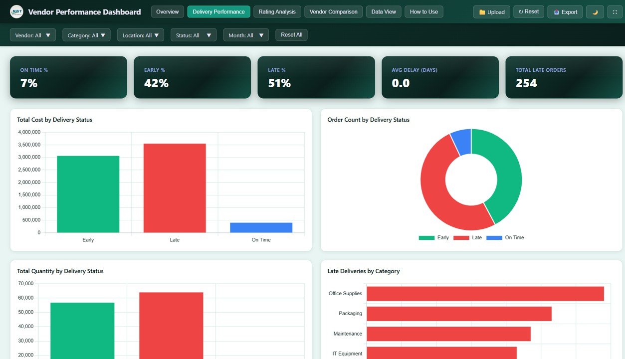
This page is where delivery problems show up. The cards read On Time % 7%, Early % 42%, Late % 51%, Avg Delay (Days) 0.0 and Total Late Orders 254 (254 of 500 orders is the 51%). The status of each order comes from comparing its Actual Delivery Date with its Promised Delivery Date: earlier is Early, the same day is On Time, later is Late.
Total Cost by Delivery Status shows that more than $3.5M of the sample spend sits on late orders, and Late Deliveries by Category ranks Office Supplies first, followed by Packaging, Maintenance and IT Equipment. A Delivery Status by Vendor chart then shows which suppliers are responsible.
Rating Analysis Page
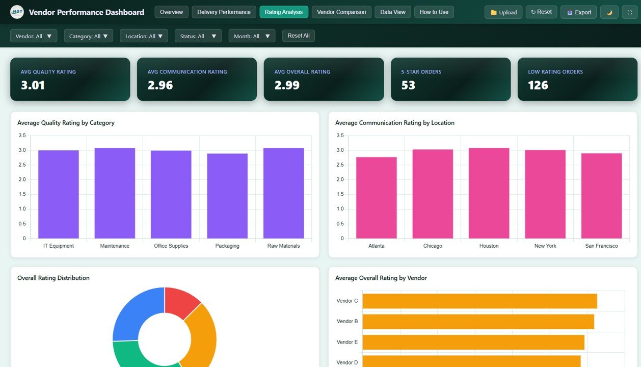
Ratings are scored per order. The sample shows an Avg Quality Rating of 3.01, Avg Communication Rating of 2.96 and Avg Overall Rating of 2.99, with 53 five-star orders and 126 low-rating orders. Average Quality Rating by Category and Average Communication Rating by Location are fairly even (roughly 2.8 to 3.1), Overall Rating Distribution shows the spread of scores, and Average Overall Rating by Vendor puts Vendor C at the top, followed by Vendor B.
Vendor Comparison Page
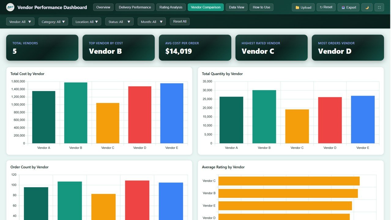
The comparison cards summarise the supplier base: 5 vendors, Vendor B as the top vendor by cost, an average cost per order of $14,019 (total cost of $7,009,259 divided by 500 orders), Vendor C as the highest rated and Vendor D with the most orders. The charts put cost, quantity, order count and average rating for each vendor side by side. In the sample, Vendor C has the lowest spend and quantity but the best rating, which is exactly the kind of trade-off a sourcing review should discuss.
Data View Page
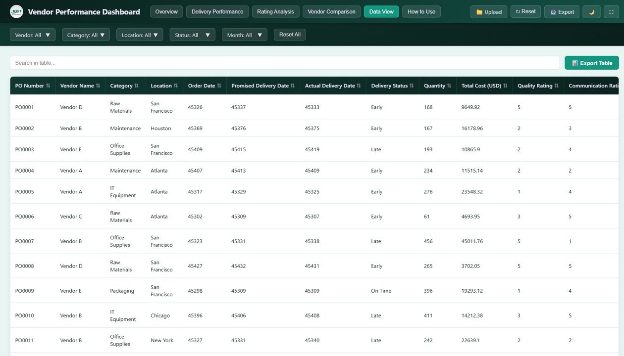
Data View lists every purchase order with columns such as PO Number, Vendor Name, Category, Location, Order Date, Promised Delivery Date, Actual Delivery Date, Delivery Status, Quantity, Total Cost (USD), Quality Rating and Communication Rating. You can search, sort by any column, page through records and click Export Table to download the filtered rows as CSV. In the sample file the dates appear as spreadsheet serial numbers (for example 45326), so format them as dates in your source data if you want readable dates in the table.
How to Use It with Your Own Data
- Download and unzip the files, then open
index.htmlin a modern browser such as Chrome, Edge or Firefox to explore the sample data. - Export your purchase orders from your ERP or purchasing sheet with the same fields as the Data View: PO number, vendor, category, location, order date, promised and actual delivery dates, delivery status, quantity, total cost and the rating columns.
- Make sure each order has a delivery status of Early, Late or On Time, based on actual versus promised delivery date.
- Replace the sample records in the included data file with your own (the in-app How to Use page and the Upload button guide you through loading data).
- Reload the dashboard and check that Total Orders and Total Cost (USD) match your source system before sharing it.
- Use the Vendor and Month filters to prepare each vendor’s review, and Export Table to attach the underlying orders.
Real-World Use Cases
- Quarterly supplier review: a procurement manager filters to one vendor, notes its late percentage and ratings, and brings the exported order list to the meeting.
- Category delay investigation: operations uses Late Deliveries by Category to find that office supplies are late most often, then filters that category to see which vendor and location are involved.
- Sourcing decision: a buyer compares Vendor Comparison cost and rating charts to decide whether moving volume to a better-rated but smaller supplier is worth testing.
Best Practices
- Refresh the data on a fixed schedule, for example monthly after receiving is closed.
- Define your rating scale once (for example 1 to 5) and have the same people score orders, so ratings stay comparable.
- Read percentages with volume: a vendor with 100% late on two orders matters less than one with 40% late on two hundred.
- Keep vendor, category and location names consistent in your source data to avoid duplicate bars.
- Share findings with vendors using the exported table, not just a screenshot, so they can check the underlying orders.
Limitations and Who Should Not Use It
- It is a reporting dashboard, not a procurement system: it does not create purchase orders, approve invoices or send alerts.
- There is no live connection to an ERP; you refresh the data file yourself.
- There is no composite vendor risk score or custom date-range picker; filtering is by month.
- Large organisations with thousands of suppliers and audit requirements will be better served by a dedicated supplier management or BI platform.
Related Dashboards and Guides
If your team works in spreadsheets, the Vendor Performance Dashboard in Google Sheets covers the same topic, and the Vendor Performance Review Tracker helps you record review outcomes. For wider procurement reporting, see the Procurement KPI Dashboard and the Supplier Risk Dashboard, and for another browser-based report, the Supply Chain Analytics Dashboard in HTML.
Related templates: the same dashboard is available in Excel, Google Sheets and Power BI versions.
If you want to learn the reporting skills behind dashboards like this, the Pivot Tables and Dashboards course on NextGenTemplates Academy teaches how to summarise data and design charts step by step.
Frequently Asked Questions
What KPIs should a vendor performance dashboard track?
At minimum: spend, order volume, delivery reliability (on-time, early and late share) and quality ratings. This dashboard covers all four, with Total Cost (USD), Total Orders, On Time %, Late %, Total Late Orders and quality, communication and overall ratings.
How is a delivery marked Early, On Time or Late?
By comparing the Actual Delivery Date with the Promised Delivery Date. In the sample data, an order delivered before the promised date is Early, on the same date is On Time and after it is Late.
Do I need coding skills to use it?
No. You open index.html in a browser. Replacing the sample data only requires preparing your records with the same fields; no programming is needed.
Does it work offline?
Yes. Once downloaded, the dashboard runs locally in a modern browser without an internet connection.
Can I export the data?
Yes. The Data View page has an Export Table button that downloads the currently filtered records as a CSV file you can open in Excel or Google Sheets.
Which browsers are supported?
Current versions of Google Chrome, Microsoft Edge and Mozilla Firefox, or any other modern browser.
Wrapping Up
The Vendor Performance Dashboard in HTML gives procurement teams a clear, shareable view of vendor spend, delivery reliability and ratings across five linked pages, without any software to install. Open the sample, check how the Delivery Performance and Vendor Comparison pages answer your own review questions, then load last quarter’s purchase orders and use it for your next supplier meeting.
Get the Vendor Performance Dashboard in HTML
📅 Last updated: October 2026