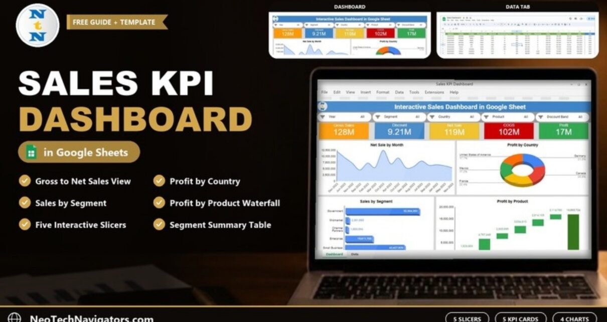
A Sales KPI Dashboard in Google Sheets turns a long sales table into one page you can read in a minute: how much you sold, how much went on discounts, what the goods cost and what profit was left. This guide walks through a ready-made dashboard that does exactly that, built on a single Data tab and a Dashboard tab with five slicers, five scorecards, four charts and a segment table.
It is written for sales managers, business owners and analysts who keep their sales records in Google Sheets and want a clear view by year, segment, country, product and discount band without building pivot tables from scratch. Below you will see what each part shows, how the numbers connect, and how to load your own data.
🎥 Watch the Video Tutorial
Get the Sales KPI Dashboard in Google Sheets
What the Sales KPI Dashboard in Google Sheets Includes
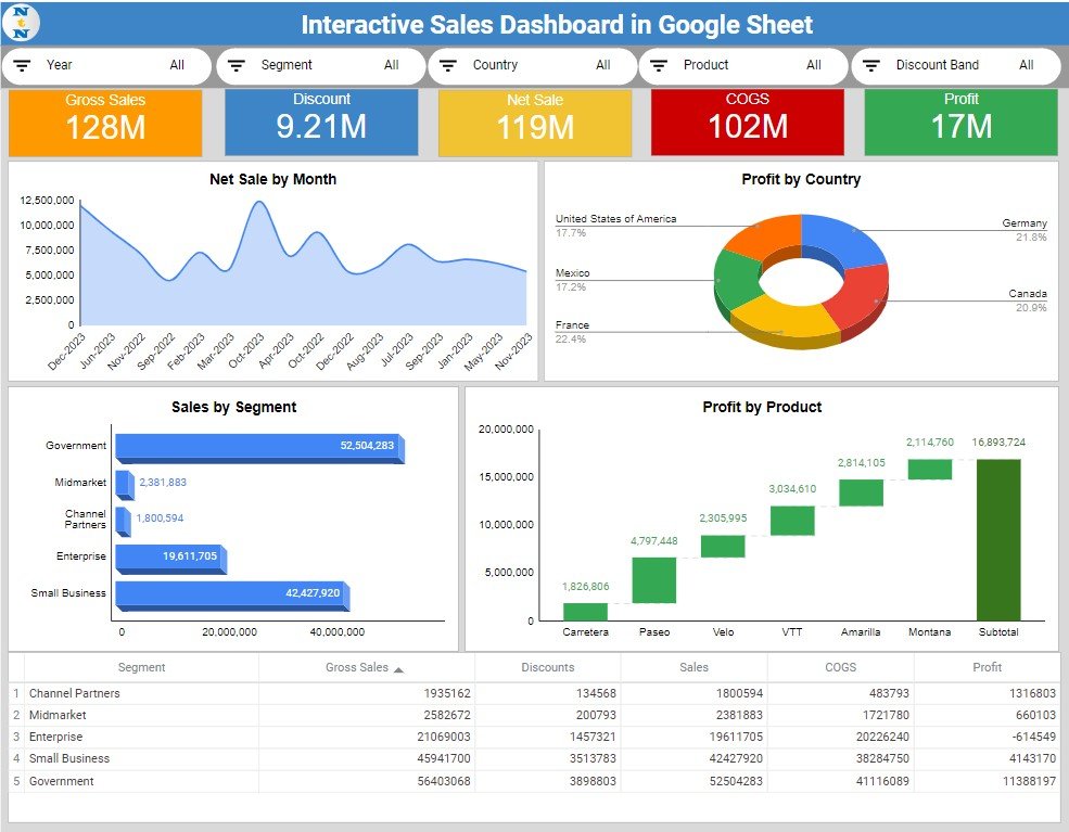
The file has two tabs. You type or paste records into Data, and Dashboard reads from it. Here is a summary of every part, with the sample values visible in the screenshots.
| Part | Type | What it shows | Sample value |
|---|---|---|---|
| Year, Segment, Country, Product, Discount Band | Slicers | Filter the whole dashboard | All selected |
| Gross Sales | Scorecard | Sales before discounts | 128M |
| Discount | Scorecard | Total discounts given | 9.21M |
| Net Sale | Scorecard | Sales after discounts | 119M |
| COGS | Scorecard | Cost of goods sold | 102M |
| Profit | Scorecard | Net sale minus COGS | 17M |
| Net Sale by Month | Area chart | Sales trend by month | Highest month just under 12.5M |
| Profit by Country | 3D doughnut | Share of profit per country | France 22.4%, Germany 21.8% |
| Sales by Segment | 3D bar chart | Net sales per customer segment | Government 52,504,283 |
| Profit by Product | Waterfall chart | Profit per product building up to the total | Subtotal 16,893,724 |
| Segment table | Table | Gross Sales, Discounts, Sales, COGS and Profit by segment | 5 segments |
The Data Tab: Where Your Sales Records Go
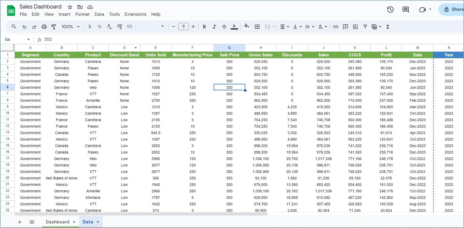
Each row is one sales record. The columns are:
- Segment – customer group, for example Government, Midmarket, Channel Partners, Enterprise and Small Business
- Country – Germany, Canada, France, Mexico and United States of America in the sample
- Product – Carretera, Paseo, Velo, VTT, Amarilla and Montana
- Discount Band – None, Low and so on
- Units Sold, Manufacturing Price and Sale Price
- Gross Sales, Discounts, Sales, COGS and Profit
- Date (shown as month and year, such as Dec-2023) and Year
How the Money Columns Connect (Worked Example)
Take the first row of the sample data: Government, Germany, Carretera, discount band None, 1513 units at a sale price of 350.
Gross Sales = Units Sold × Sale Price   = 1513 × 350      = 529,550
Sales       = Gross Sales − Discounts   = 529,550 − 0     = 529,550
Profit      = Sales − COGS              = 529,550 − 393,380 = 136,170
Row 9 shows the same chain with a discount: Gross Sales 423,500, Discounts 4,235, Sales 419,265, COGS 314,600 and Profit 104,665. If your own data comes from an ERP or billing export, check that these three relationships hold before you trust the dashboard totals.
The Dashboard Tab, Visual by Visual
Slicers
Five slicers across the top filter every scorecard, chart and the table: Year, Segment, Country, Product and Discount Band. Pick “Canada” and “Paseo”, for example, and the whole page shows only Paseo sales in Canada.
Scorecards
Five coloured cards show the headline numbers: Gross Sales (128M), Discount (9.21M), Net Sale (119M), COGS (102M) and Profit (17M). The cards agree with each other: 128M minus 9.21M is about 119M, and 119M minus 102M leaves about 17M.
Net Sale by Month
An area chart that plots net sales for each month in the data, so you can see busy and quiet months at a glance. In the sample the months appear in the order they first occur in the Data tab (Dec-2023, Jun-2023, Nov-2022 and so on), not in calendar order, so sort your Data tab by Date first if you want the chart to read as a timeline.
Profit by Country
A 3D doughnut that splits total profit by country. In the sample, France has the largest share (22.4%), followed by Germany (21.8%), Canada (20.9%), United States of America (17.7%) and Mexico (17.2%).
Sales by Segment
A 3D bar chart of net sales per segment. Government leads with 52,504,283, then Small Business (42,427,920), Enterprise (19,611,705), Midmarket (2,381,883) and Channel Partners (1,800,594).
Profit by Product
A waterfall chart that stacks each product’s profit until it reaches the total. In the sample: Carretera 1,826,806, Paseo 4,797,448, Velo 2,305,995, VTT 3,034,610, Amarilla 2,814,105 and Montana 2,114,760, for a subtotal of 16,893,724. Add the six bars and you get exactly that subtotal.
Segment Table
The table at the bottom gives the exact figures behind the charts. One detail worth noticing: Enterprise shows a profit of −614,549, because its COGS (20,226,240) is higher than its sales (19,611,705). That is the kind of insight a dashboard should surface, and the table makes it easy to spot.
Sales KPIs on the Dashboard
| KPI | What it measures | Formula | Better when |
|---|---|---|---|
| Gross Sales | Revenue before discounts | Units Sold × Sale Price | Higher |
| Discount | Value given away as discounts | Sum of Discounts | Lower, as long as volume holds |
| Net Sale | Revenue after discounts | Gross Sales − Discounts | Higher |
| COGS | Cost of the goods sold | Sum of COGS | Lower relative to sales |
| Profit | What is left after cost | Net Sale − COGS | Higher |
Other KPIs Worth Tracking
These are not in the template, but you can add them with one formula each if you need them:
- Profit margin = Profit ÷ Net Sale. In the sample, 16,893,724 ÷ 118,726,385 is about 14.2%.
- Discount rate = Discount ÷ Gross Sales, useful when you compare discount bands.
- Average selling price = Net Sale ÷ Units Sold.
If you prefer to calculate a card yourself, a filtered total like this works on the Data tab (Sales in column J, Year in column N):
=SUMIFS(Data!J:J, Data!N:N, 2023)For more on this kind of formula, see our guide to the SUMIFS formula in Google Sheets.
How to Use It with Your Own Data
- Make your own copy of the file in Google Drive.
- Open the Data tab and clear the sample rows (keep the header row).
- Paste your records in the same column order: Segment, Country, Product, Discount Band, Units Sold, Manufacturing Price, Sale Price, Gross Sales, Discounts, Sales, COGS, Profit, Date, Year.
- Check the worked-example relationships on a few rows (Gross Sales, Sales and Profit).
- Go to Dashboard. Set every slicer to All and confirm the scorecards match your own totals.
- Share the file with your team using Share and choose Viewer or Editor access.
Real-World Use Cases
- Monthly sales review: a sales head filters by Year and walks through Net Sale by Month and Sales by Segment in the team meeting.
- Country performance check: a regional manager uses the Country slicer and the Profit by Country doughnut to see where margins are thin.
- Product decisions: an owner uses the Profit by Product waterfall to see which product lines carry the business and which barely contribute.
Best Practices
- Keep one row per sale and never leave blank rows in the middle of the Data tab.
- Use the same spelling for countries, products and segments, otherwise the slicers show duplicates.
- Fill the Year column for every row, since the Year slicer depends on it.
- Look at the segment table, not only the charts. Losses such as the Enterprise row are easy to miss on a bar chart.
- Update the data on a fixed day each week or month so everyone reads the same numbers.
Who Should Not Use This Template
Be honest about fit before you buy. This dashboard is built around one flat sales table with fixed columns. It is not a CRM, so it does not track leads, deals or pipeline stages, and it does not compare sales against targets. If you have hundreds of thousands of rows, a tool such as Power BI will feel faster than Google Sheets.
Related templates: the Sales KPI Dashboard in Excel and the Sales KPI Dashboard in Power BI. You may also like our newer Sales KPI Dashboard in Google Sheets walkthrough, the guide on how to track sales performance in Google Sheets and the Monthly Sales Report and Tracker.
If you want to go further with structured lessons on building reports like this, the Excel Pivot Tables and Dashboards course on NextGenTemplates Academy covers the same ideas step by step.
Frequently Asked Questions
What is a sales KPI dashboard in Google Sheets?
It is a one-page summary of your key sales numbers, such as gross sales, discounts, net sales, cost and profit, that updates from a data tab in the same Google Sheets file.
Which KPIs does this dashboard show?
Five: Gross Sales, Discount, Net Sale, COGS and Profit. It also breaks sales and profit down by month, country, segment and product.
Can I filter the dashboard by year or country?
Yes. There are slicers for Year, Segment, Country, Product and Discount Band, and every chart and card responds to them.
Do I need to know formulas to use it?
No. You only paste data into the Data tab in the same column order. Basic formula knowledge helps if you want to add extra KPIs such as profit margin.
Can my team use it at the same time?
Yes. It is a normal Google Sheets file, so you can share it and control who can view or edit it.
Why does a segment show negative profit?
Because its cost of goods sold is higher than its net sales in the selected period. In the sample, Enterprise shows −614,549 for exactly that reason.
Wrapping Up
A good sales dashboard answers three questions quickly: how much did we sell, what did it cost, and where did the profit come from. This Google Sheets version does that with five slicers, five KPI cards, four charts and a segment table, all driven by one Data tab. Watch the video above, load your own records and review the numbers with your team.
Get the Sales KPI Dashboard in Google Sheets
📅 Last updated: October 2026