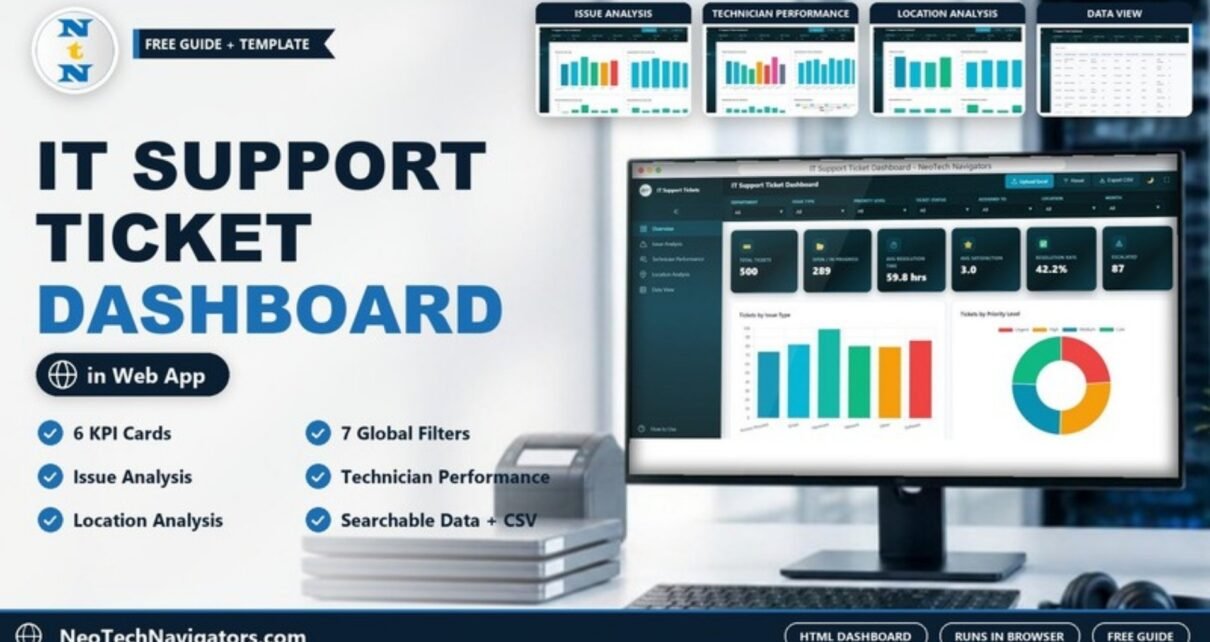
An IT help desk generates data all day: who raised a ticket, what broke, how urgent it was, who fixed it and how long it took. The IT Support Ticket Dashboard in HTML turns that ticket log into an interactive report that opens in any modern browser – six KPI cards, four analysis pages and a searchable data table, with seven filters that apply across every page.
This guide walks through each page as it appears in the template, explains how the KPIs relate to each other using the sample numbers, and shows how to load your own tickets. It is for IT managers, service desk leads and help desk analysts who want a clean, shareable view of support performance without setting up a BI tool or installing software.
🎥 Watch the Video Tutorial
Get the IT Support Ticket Dashboard in HTML
What the Dashboard Helps You Answer
Most ticketing tools are good at handling one ticket at a time and less good at showing the pattern. This dashboard is built for the pattern questions a support lead gets asked every month:
- How many tickets are still open, and how many have been escalated?
- Which issue types take the longest to fix, and which leave users least satisfied?
- Is the workload spread fairly across technicians?
- Does one office or the remote team get slower or poorer service than the others?
Layout and Controls
A left sidebar switches between the five pages – Overview, Issue Analysis, Technician Performance, Location Analysis and Data View – and includes a How to Use link. The top bar carries seven dropdown filters: Department, Issue Type, Priority Level, Ticket Status, Assigned To, Location and Month. Next to them are the Upload Excel, Reset and Export CSV buttons, plus a light/dark theme toggle and a full-screen button.
Filters apply to every page, so you can, for example, set Location to Remote and Priority Level to Urgent and then move from page to page to see only those tickets.
The Six KPI Cards
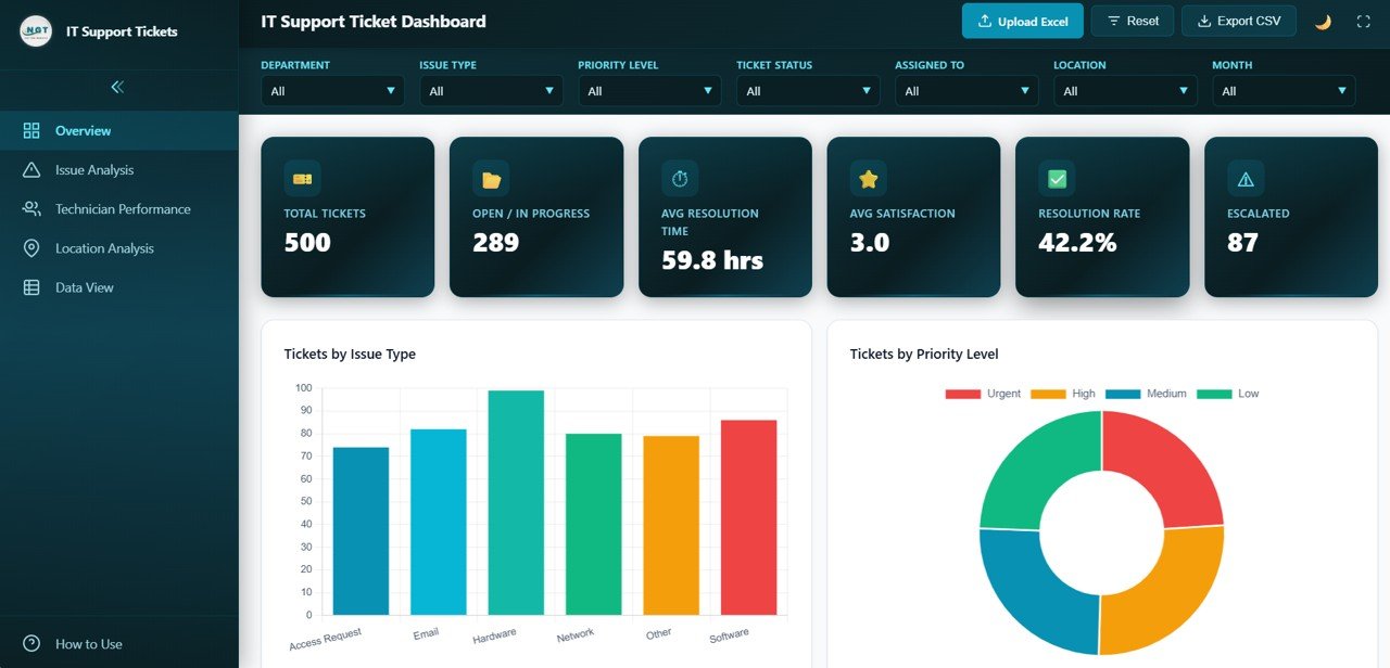
The Overview opens with six cards. Here is what each one measures and the value it shows for the 500 sample tickets:
| KPI | What it measures | Sample value | Better when |
|---|---|---|---|
| Total Tickets | Number of tickets in the current filter | 500 | – (volume indicator) |
| Open / In Progress | Tickets not yet resolved or closed | 289 | Lower |
| Avg Resolution Time | Average of the Resolution Time (Hours) column | 59.8 hrs | Lower |
| Avg Satisfaction | Average of the satisfaction score given by users | 3.0 | Higher |
| Resolution Rate | Share of tickets resolved or closed | 42.2% | Higher |
| Escalated | Tickets with the status Escalated | 87 | Lower |
The cards fit together. With 500 tickets and 289 still open or in progress, 211 have been resolved or closed:
Resolved or closed = 500 – 289 = 211
Resolution Rate    = 211 / 500 = 42.2%
A resolution rate this low alongside an average of almost 60 hours per ticket would be the first thing to investigate in a real help desk – and the other pages show where to look.
Page-by-Page Walkthrough
1. Overview
Below the KPI cards, the Overview shows Tickets by Issue Type (Access Request, Email, Hardware, Network, Other and Software, with Hardware the largest category in the sample) and Tickets by Priority Level (a doughnut split into Urgent, High, Medium and Low). Further down the page are charts for tickets by status, by department and a monthly ticket trend.
2. Issue Analysis
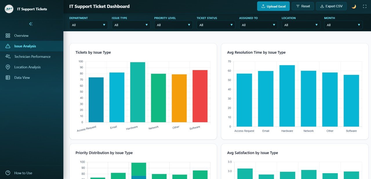
Four charts look at problem categories from different angles:
- Tickets by Issue Type – volume per category.
- Avg Resolution Time by Issue Type – Hardware takes the longest in the sample (mid-60s hours), Software the shortest.
- Priority Distribution by Issue Type – a stacked view of how urgent each category’s tickets are.
- Avg Satisfaction by Issue Type – Access Request scores highest in the sample, Email and Other lowest.
Read volume and resolution time together: a category that is both frequent and slow (Hardware in the sample) is where preventive work or better spares stock pays off most.
3. Technician Performance
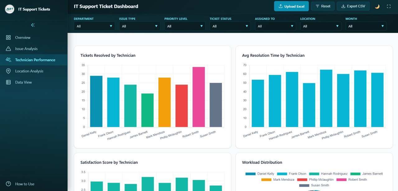
The sample team has eight technicians: Daniel Kelly, Frank Olson, Hannah Rodriguez, James Barnett, Mark Mendoza, Phillip Mclaughlin, Robert Smith and Susan Smith. The page shows:
- Tickets Resolved by Technician – Robert Smith resolves the most in the sample, James Barnett the fewest.
- Avg Resolution Time by Technician – James Barnett has the shortest average, Mark Mendoza and Robert Smith among the longest.
- Satisfaction Score by Technician – per-person average rating.
- Workload Distribution – each technician’s share of all assigned tickets.
Use these charts together and with context. A technician with a long average time may be the one handling the hardest tickets; check the Issue Type filter before drawing conclusions.
4. Location Analysis
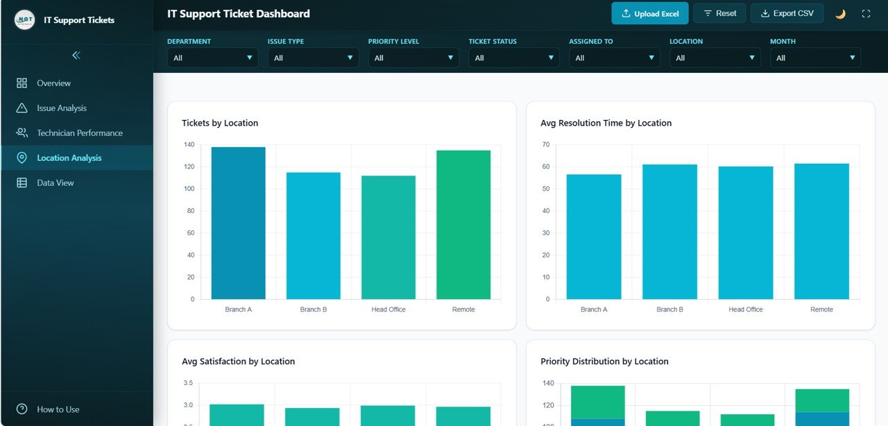
Four charts compare Branch A, Branch B, Head Office and Remote: Tickets by Location, Avg Resolution Time by Location, Avg Satisfaction by Location and Priority Distribution by Location. In the sample, Branch A and Remote raise the most tickets, and Branch A is resolved slightly faster than the other three locations.
5. Data View
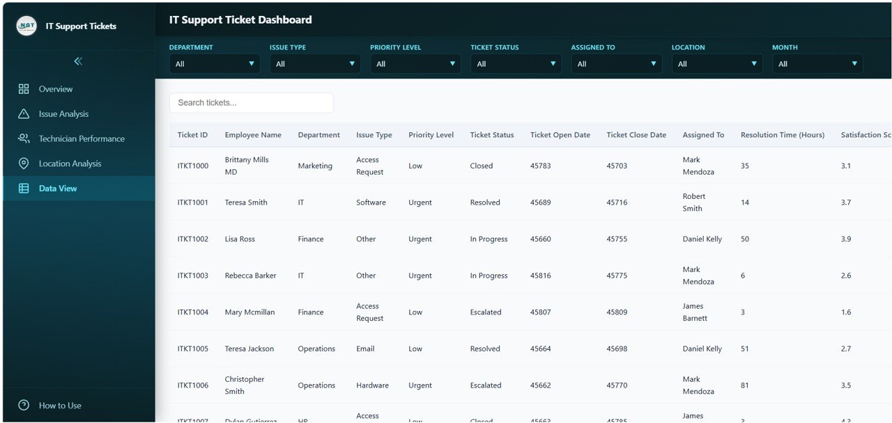
The Data View lists every ticket with a Search tickets… box above the table. Columns include Ticket ID, Employee Name, Department, Issue Type, Priority Level, Ticket Status, Ticket Open Date, Ticket Close Date, Assigned To, Resolution Time (Hours) and the satisfaction score. The sample departments are Marketing, IT, Finance, Operations and HR, and statuses include Closed, Resolved, In Progress and Escalated. Use the Export CSV button in the top bar to download ticket records as a CSV file.
How to Use It With Your Own Tickets
- Unzip the download and open the dashboard’s HTML file in Chrome, Edge or Firefox. It loads with sample data so you can explore first.
- Export your tickets from your help desk tool or spreadsheet to Excel, with one row per ticket and, to be safe, the same column headings as the sample (Ticket ID, Department, Issue Type, Priority Level, Ticket Status, Ticket Open Date, Ticket Close Date, Assigned To, Resolution Time (Hours), satisfaction score, Location).
- Click Upload Excel and choose your file. The product page also describes replacing the sample records in the included data file if you prefer to keep your data inside the package.
- Check the Overview totals against your source system – Total Tickets should match your row count.
- Use the filters to review each location, technician or month, and press Reset to return to the full view.
- Export CSV when you need the ticket list in a spreadsheet for a meeting or follow-up.
Tip: the sample Data View shows dates as five-digit spreadsheet date numbers (such as 45783). If you want readable dates in the table, format the date columns as dates in your Excel file before uploading.
Real-World Use Cases
- Monthly service review: an IT manager filters to last month, screenshots the Overview and Issue Analysis pages, and uses them as the backbone of the monthly report.
- Team one-to-ones: a service desk lead filters Assigned To for one technician and reviews their volume, speed and satisfaction with them.
- Multi-site support: a company with branch offices and remote staff uses Location Analysis to decide where on-site support or better remote tooling is needed.
Which Version Should You Use?
| Version | Runs in | Good fit when |
|---|---|---|
| HTML (this template) | Any modern web browser | You want an app-style dashboard that opens without Excel, Google or a BI licence |
| Google Sheets | Google Drive | Your team already logs tickets in a shared sheet |
| Excel / Power BI | Microsoft Excel or Power BI Desktop | Your reporting already lives in the Microsoft stack |
Best Practices
- Use a fixed list of issue types and priority levels in your ticketing tool, so the charts group tickets cleanly.
- Record Resolution Time in hours consistently – mixing hours and days distorts every average.
- Agree what Resolved and Closed mean in your team, since both count toward the Resolution Rate.
- Refresh the data on a regular schedule (weekly or monthly) rather than ad hoc.
- Treat technician charts as conversation starters, not rankings; ticket difficulty varies.
Limitations
- It is a reporting dashboard, not a ticketing system. Tickets are created and updated in your own tool, then loaded here.
- It does not connect live to ServiceNow, Jira or Zendesk; you refresh it by loading a new export.
- There is no SLA target or breach calculation built in.
- Very large ticket histories (tens of thousands of rows) may be slow in a browser; filter your export to the period you need.
Related Guides and Templates
If your team prefers spreadsheets, the IT Support Ticket Dashboard in Google Sheets covers the same topic, and the IT Helpdesk Ticket Tracker is a simple way to log tickets in the first place. For SLA monitoring, see the IT SLA Compliance and Ticket Monitoring Dashboard. Other browser-based dashboards in the same style include the IT Services Dashboard in HTML and the Customer Service Dashboard in HTML.
Working in Power BI? There is also an IT Support Ticket Dashboard in Power BI.
If you want to learn how to summarise ticket data and build dashboards like this yourself, the Pivot Tables & Dashboards course on NextGenTemplates Academy teaches the method step by step.
Frequently Asked Questions
Do I need to install anything to use the IT Support Ticket Dashboard in HTML?
No. You open the HTML file in a modern browser such as Chrome, Edge or Firefox. No server, Excel licence or BI tool is needed to view it.
What KPIs does the dashboard track?
Six: Total Tickets, Open / In Progress, Avg Resolution Time, Avg Satisfaction, Resolution Rate and Escalated.
How is the Resolution Rate calculated?
It is the share of tickets that are resolved or closed. In the sample, 211 of 500 tickets are resolved or closed, giving 42.2%.
Can I filter by technician, location or month?
Yes. The top bar has filters for Department, Issue Type, Priority Level, Ticket Status, Assigned To, Location and Month, and they apply to every page.
Can I export the data?
Yes. The Export CSV button downloads ticket records, and the Data View has a search box to find specific tickets first.
Does it connect directly to my ticketing system?
No. Export your tickets to Excel from your help desk tool and load them with Upload Excel. Repeat whenever you want fresh numbers.
Wrapping Up
The IT Support Ticket Dashboard in HTML gives a help desk one place to see volume, speed, satisfaction and escalations, then drill into issue types, technicians and locations. Load a recent export of your tickets, compare the Resolution Rate and Avg Resolution Time with what you expected, and use the analysis pages to find the one or two changes that will make the biggest difference.
Get the IT Support Ticket Dashboard in HTML
📅 Last updated: October 2026