Introduction
SaaS Metrics Dashboard in Google Sheets is a powerful, cloud-based analytics template designed for SaaS founders, product managers, and subscription business teams who want to track their most critical growth and retention metrics in one place. Whether you are monitoring Monthly Recurring Revenue, analyzing customer churn patterns, or evaluating product engagement scores, this dashboard provides a comprehensive view of your SaaS business health without requiring any desktop software installation.
Built with interactive charts, slicer-based filters, and a clean multi-page layout, this Google Sheets dashboard template makes it easy to visualize MRR trends, compare plan-level performance, and identify growth opportunities at a glance. If you have been looking for the best way to track SaaS KPIs in Google Sheets, this template from NextGenTemplates is the solution you need.
Key Features of SaaS Metrics Dashboard in Google Sheets
Click here to Purchase SaaS Metrics Dashboard in Google Sheets
This SaaS Metrics Dashboard in Google Sheets includes 6 interactive sheet tabs, 5 KPI cards, and over 10 analytical charts covering revenue, customers, engagement, and data management. The template tracks Total MRR, Total ARR, Avg LTV, Avg CAC, and Churn Rate as primary KPIs. Each dashboard page provides a focused view of a specific business dimension — from revenue breakdown by plan and acquisition source to customer segmentation, churn analysis, NPS scores, and feature usage metrics.
Key highlights include multi-plan revenue tracking, customer segment analysis, churn vs total comparison by plan, monthly trend analysis, NPS scoring by subscription tier, support ticket volume monitoring, and a built-in record search functionality. The dashboard works entirely in your browser via Google Sheets — accessible from any device with real-time collaboration support.
Dashboard Pages Explanation
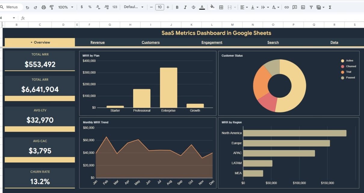
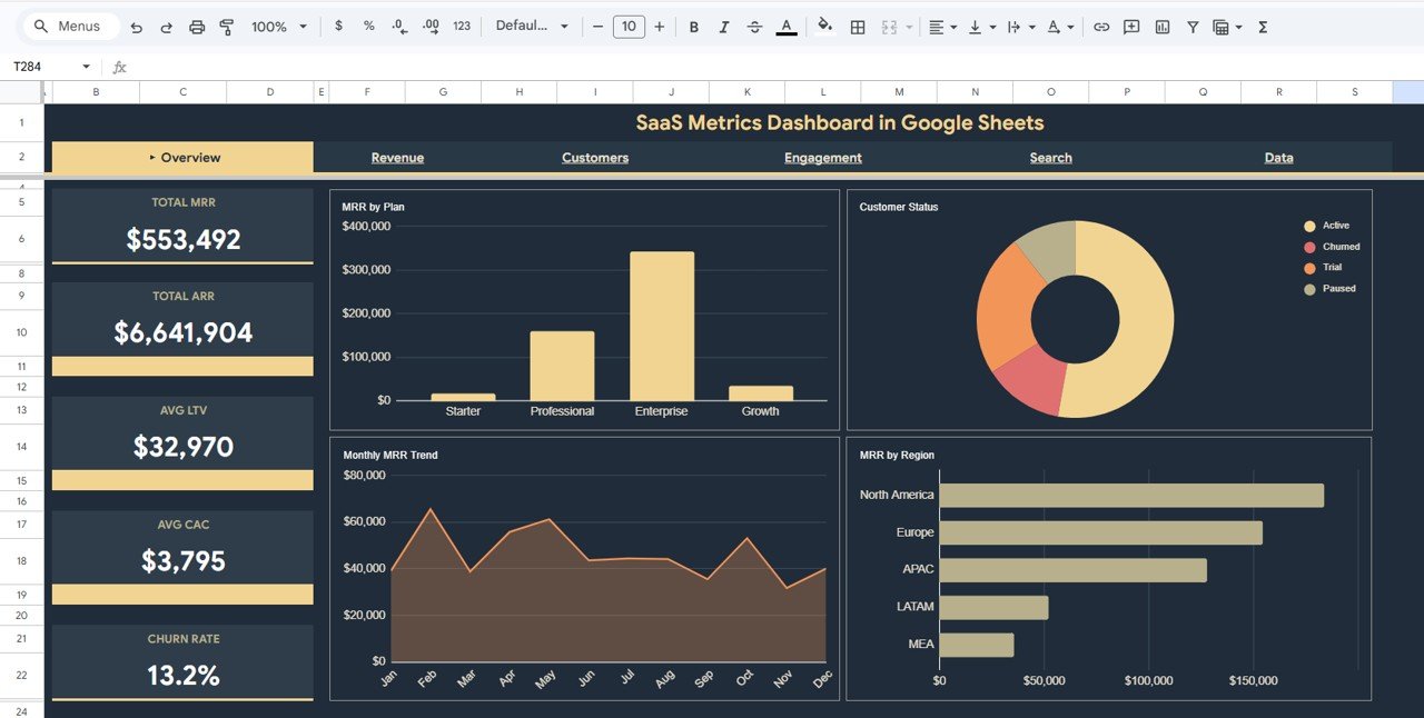
1. Overview Page
The Overview page serves as the main command center of the SaaS Metrics Dashboard in Google Sheets. At the top, 5 high-level KPI cards display Total MRR, Total ARR, Avg LTV, Avg CAC, and Churn Rate — giving you an instant snapshot of your SaaS business health. Below the cards, 4 interactive charts break down the data further: MRR by Plan shows how revenue distributes across subscription tiers, Customer Status by Category reveals active vs churned customer ratios, Monthly MRR Trend by Month tracks recurring revenue growth over time, and MRR by Region highlights geographic revenue distribution. Multiple slicers let you filter the entire dashboard by plan, region, status, and more.
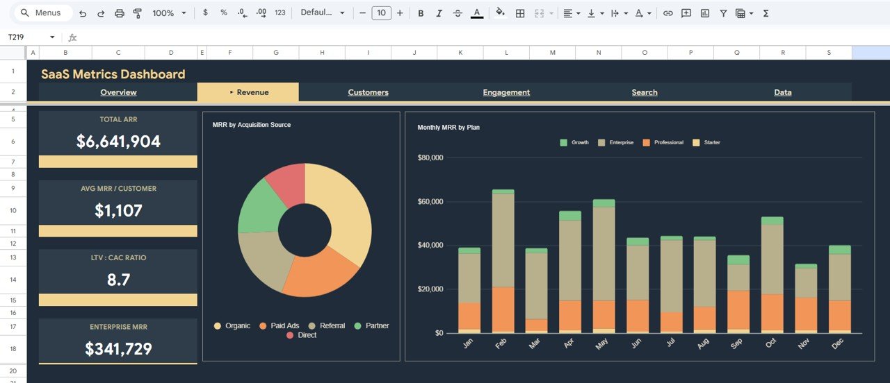
SaaS Metrics Dashboard in Google Sheets2. Revenue Analysis
The Revenue Analysis page dives deeper into your SaaS revenue data with 2 focused charts. MRR by Acquisition Source breaks down monthly recurring revenue by the channels that brought customers in — helping you understand which acquisition strategies deliver the highest-value subscribers. Monthly MRR by Plan tracks how each subscription tier (Basic, Pro, Enterprise, etc.) contributes to your total recurring revenue month over month, making it easy to spot upsell opportunities and plan-level growth trends.
 Revenue Analysis
3. Customers Analysis
The Customers Analysis page provides a comprehensive view of your subscriber base through 3 analytical charts. Customers by Segment categorizes your customer base into meaningful groups for targeted analysis. Churn vs Total by Plan compares the number of churned customers against total subscribers for each plan — instantly revealing which tiers have the highest attrition. Monthly New Customer Trend by Month tracks your customer acquisition velocity over time, helping you evaluate whether your growth efforts are accelerating or plateauing.
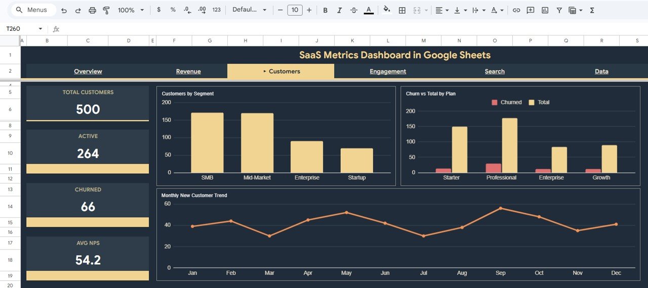 Customers Analysis
4. Engagement Analysis
The Engagement Analysis page focuses on product health and customer satisfaction metrics through 3 insightful charts. Average NPS by Plan measures Net Promoter Score across subscription tiers — helping you identify which plans deliver the most satisfied customers. Monthly Support Ticket Volume by Month tracks the support burden over time so you can plan resources accordingly. Avg Feature Usage by Plan shows how deeply customers on each tier engage with your product features, providing valuable input for product development and packaging decisions.
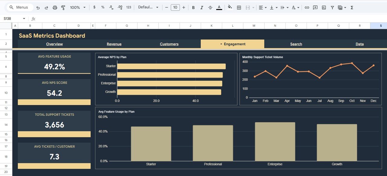 Engagement Analysis
5. Search Page
The Search page features a Customer Record Lookup tool that lets you search for any individual customer by Record ID using a dropdown selector. Once selected, the page instantly displays all details for that customer including Record ID, Date, Plan Type, Customer Segment, Region, MRR, ARR, Signup Source, Status, Churn Flag, LTV, CAC, Support Tickets, NPS Score, and Feature Usage. This is invaluable for quick customer lookups during support calls, account reviews, or ad-hoc analysis.
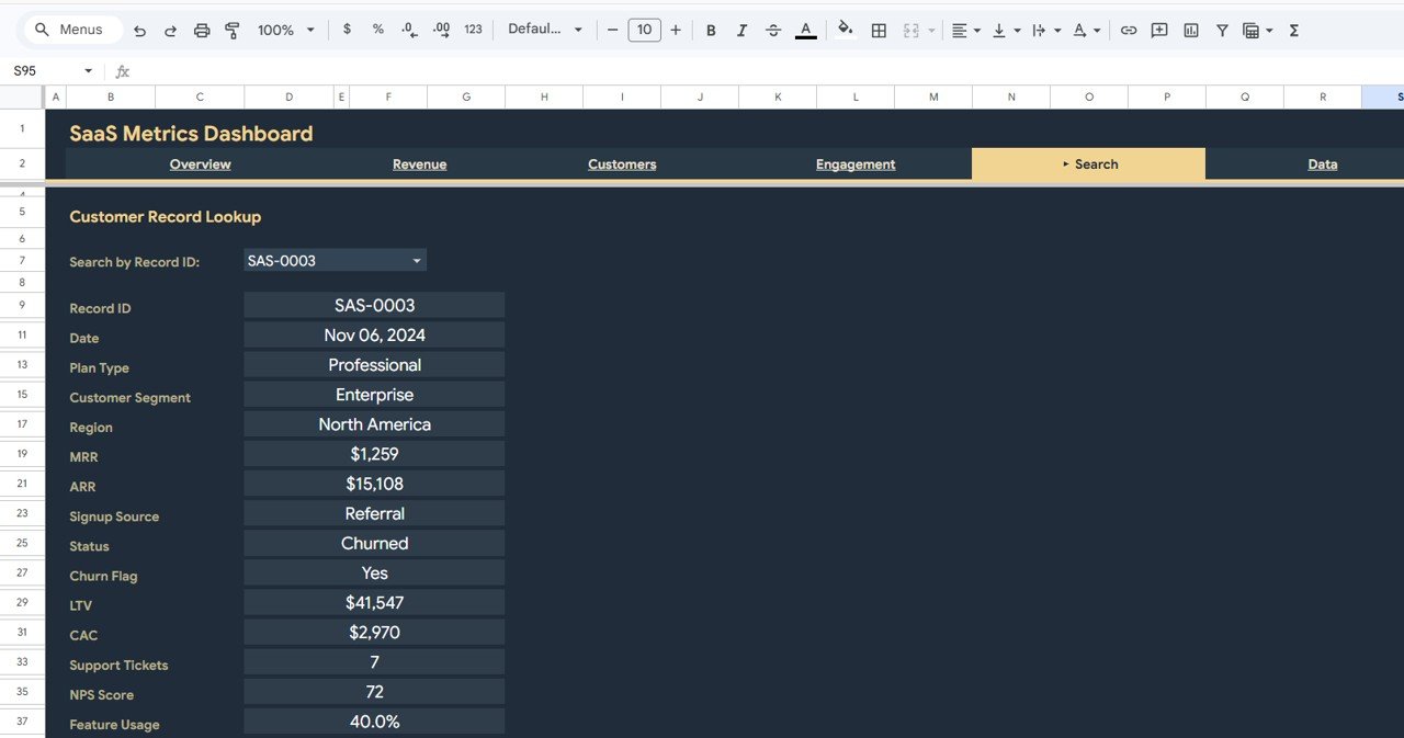 Search Sheet Tab
6. Data Sheet
The Data Sheet is where all the raw SaaS customer and revenue data lives. Simply replace the sample data with your own records in the same format and every chart, KPI card, and dashboard page will update automatically. No formulas to modify and no manual adjustments needed.
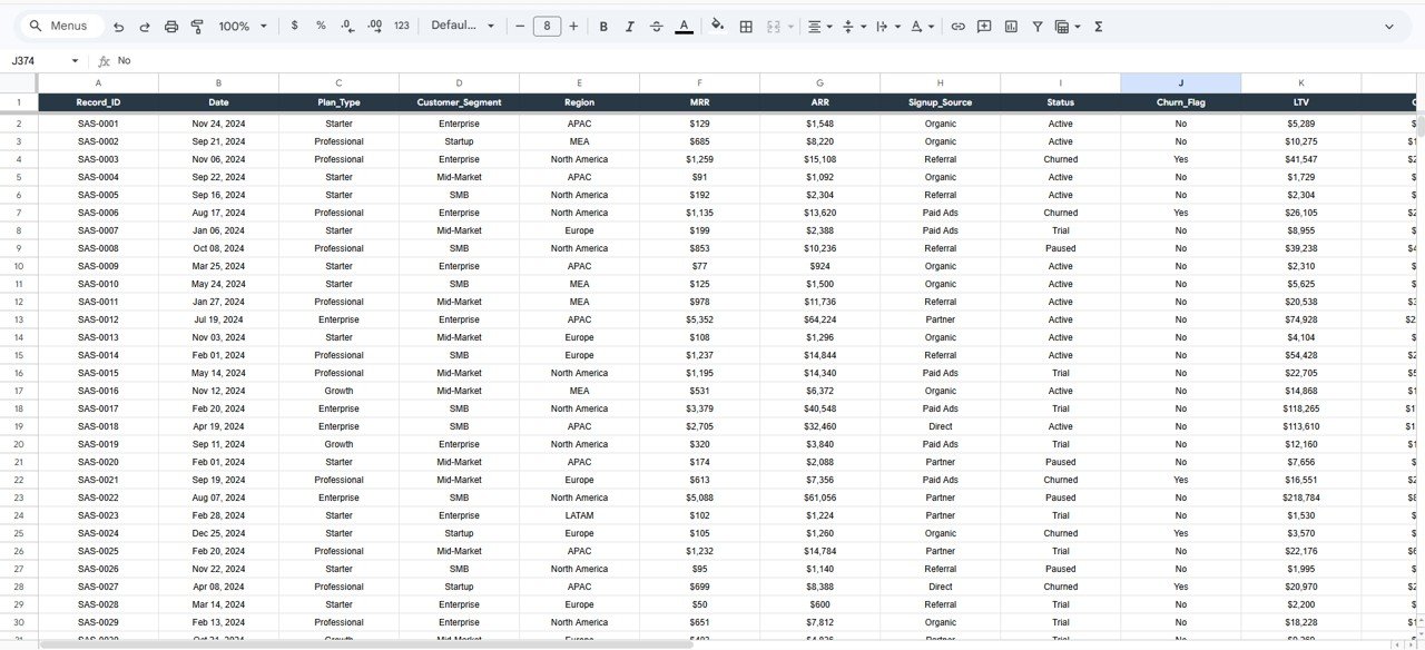 Data Sheet Tab
Advantages of SaaS Metrics Dashboard in Google Sheets
- All-in-One SaaS Analytics — Track revenue, customers, engagement, and churn from a single cloud-based dashboard without switching between multiple tools.
- Zero Installation Required — Works entirely in Google Sheets via your browser. No desktop software, plugins, or add-ons needed.
- Real-Time Collaboration — Share the dashboard with your team and work on it simultaneously with Google Sheets’ built-in collaboration features.
- Interactive Filtering — Slicer-based filters let you drill down by plan, region, customer segment, and time period for targeted insights.
- Plug-and-Play Design — Replace the sample data with your own records and all 6 pages update instantly. No formula editing required.
- Multi-Device Access — Access your SaaS dashboard from desktop, tablet, or mobile through Google Drive.
Opportunities for Improvement
Click here to Purchase SaaS Metrics Dashboard in Google Sheets
- Adding cohort analysis charts to track retention by signup month would provide deeper insight into customer lifecycle patterns.
- Including a dedicated financial forecasting page with MRR projection models could help teams plan for future growth scenarios.
- A competitive benchmarking section comparing your SaaS metrics against industry averages would add strategic context to the analysis.
- Integration with Google Apps Script for automated data import from payment processors like Stripe or Chargebee could streamline the data entry process.
Best Practices
Click here to Purchase SaaS Metrics Dashboard in Google Sheets
- Update Data Weekly — Keep your Data Sheet current with weekly exports from your billing or CRM system to ensure dashboard accuracy.
- Use Slicers for Presentations — Apply slicer filters before board meetings or team reviews to show only the most relevant data segments.
- Monitor Churn Trends Monthly — Use the Customers Analysis page to track churn vs total by plan each month and take proactive retention action.
- Compare NPS Across Plans — Use the Engagement Analysis page to identify which plans have the lowest NPS and investigate root causes.
- Leverage the Search Page — Use the record lookup feature for quick customer-level analysis during support escalations or account reviews.
Explore Relevant Templates
If you found this SaaS Metrics Dashboard useful, explore these related templates from NextGenTemplates Google Sheets Dashboards:
- SaaS Renewal KPI Dashboard in Google Sheets — Track renewal rates, retention metrics, and subscription lifecycle KPIs.
- Revenue Growth KPI Dashboard in Google Sheets — Monitor MRR growth rate, expansion revenue, and net revenue retention.
- Customer Onboarding Effectiveness Dashboard in Google Sheets — Analyze onboarding funnels, time-to-value, and activation metrics.
- SaaS Metrics Dashboard in Excel — The same SaaS analytics in a desktop Excel format.
- SaaS Metrics Dashboard in HTML — A browser-based interactive HTML version of this dashboard.
Frequently Asked Questions
What is the best Google Sheets dashboard for tracking SaaS metrics?
The SaaS Metrics Dashboard in Google Sheets from NextGenTemplates is one of the best options. It includes 6 interactive pages covering Overview, Revenue Analysis, Customers Analysis, Engagement Analysis, Search, and Data — tracking 5 core KPIs (MRR, ARR, LTV, CAC, Churn Rate) with over 10 analytical charts and slicer-based filtering.
How do I track MRR and ARR in Google Sheets?
This template automatically calculates and displays Total MRR and Total ARR on the Overview page. The Revenue Analysis page further breaks down MRR by acquisition source and by subscription plan on a monthly basis. Simply enter your customer records in the Data Sheet and all revenue metrics update automatically.
Can I use this dashboard for a multi-product SaaS business?
Yes. The dashboard supports multiple plan types and segments. You can track MRR, churn, NPS, and feature usage by plan using built-in charts and slicer filters. For businesses with multiple products, you can adapt the plan type field to represent different product lines.
How does this compare to the SaaS Metrics Dashboard in Excel?
The Google Sheets version works in the cloud with real-time collaboration and multi-device access. The Excel version offers more advanced formatting options and works offline. Both track the same KPIs and include similar dashboard pages. Choose Google Sheets for team collaboration and Excel for desktop power users.
Do I need to know Google Sheets formulas to use this?
No. All formulas, charts, and KPI calculations are pre-built. Simply replace the sample data in the Data Sheet with your own SaaS records and every dashboard page updates automatically. No coding, formula editing, or technical skills required.
How do I measure customer engagement using this dashboard?
The Engagement Analysis page tracks three key engagement metrics: Average NPS by Plan, Monthly Support Ticket Volume, and Avg Feature Usage by Plan. These charts help you understand customer satisfaction levels, support demand trends, and how deeply customers use your product across different subscription tiers.
Conclusion
The SaaS Metrics Dashboard in Google Sheets is a must-have analytics tool for any subscription-based business looking to make data-driven decisions. With 6 interactive pages, 5 core KPI cards, and 10+ analytical charts, it provides a complete picture of your SaaS revenue, customer base, and product engagement — all from a single, cloud-based Google Sheets file.
Click here to Purchase SaaS Metrics Dashboard in Google Sheets
Visit our YouTube channel for step-by-step video tutorials on how to use this dashboard and other Google Sheets templates:
👉 Youtube.com/@NeoTechNavigators