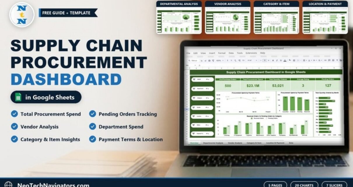
The Supply Chain Procurement Dashboard in Google Sheets turns a purchase order list into a clear report on spend, order volume, quantities, vendor ratings and pending orders. It is built for procurement managers, buyers, supply chain analysts and operations leads at small and mid-size companies who track purchasing in a spreadsheet and want a dashboard on top of it.
The workbook has five dashboard pages (Overview, Departmental Analysis, Vendor Analysis, Category & Item Insights and Location & Payment Terms) and a Data sheet. The Overview shows five KPI cards, each page has four charts, and seven slicers on the left (Month, Department, Category, Vendor, Location, Status and Payment Terms) filter the view. Because it is a Google Sheet, the whole team can work in the same file.
🎥 Watch the Video Tutorial
Get the Supply Chain Procurement Dashboard
What the Supply Chain Procurement Dashboard in Google Sheets Solves
Purchase orders are easy to record and hard to review. Once a sheet holds a few hundred lines, simple questions take time: Which department spends the most? Which vendor has the most orders still pending? How much of our spend is on Net 60 terms? Which categories are waiting on deliveries?
This template answers those questions from one table. Each row is one purchase order with its department, category, item, vendor, location, quantity, unit price, payment terms, status and rating. The dashboard pages summarise that table and the slicers let you narrow everything to a month, vendor or location in a click. The sample contains 500 purchase orders worth $23.1M.
Overview KPIs
| KPI card | Sample value | What it tells you |
|---|---|---|
| # of Purchase Orders | 500 | Count of purchase orders in view |
| Total Procurement Spend | $23.1M | Sum of Total Cost across those orders |
| Total Quantity Ordered | 53,021 | Total units ordered |
| Average Rating | 3 | Average of the 1–5 rating recorded for each order |
| Pending Orders | 127 | Orders with a status of Pending |
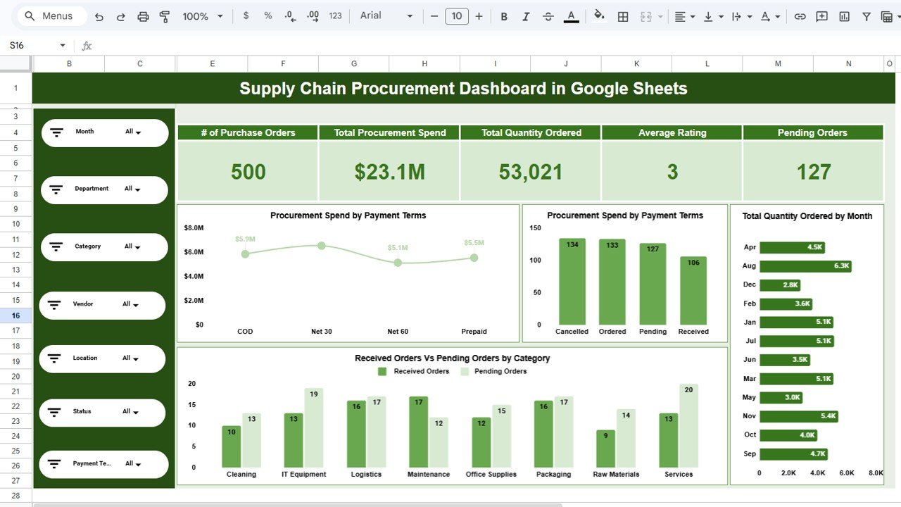
The figures are consistent across pages. The status chart on the Overview shows 134 Cancelled, 133 Ordered, 127 Pending and 106 Received orders, which add up to 500. The Received vs Pending chart by category also totals 106 received and 127 pending. In the Data sheet, Total Cost is Quantity × Unit Price; for example, PO2000 is 178 × 254 = 45,212. If you want to check the Pending Orders card in your own copy, a formula like this works:
=COUNTIF(Data!K2:K, "Pending")Column K holds Status in the sample Data sheet; change the sheet name in the formula if your data tab is named differently.
Dashboard Pages Explained
1. Overview
Besides the five cards, the Overview shows Procurement Spend by Payment Terms (COD, Net 30, Net 60 and Prepaid), a count of purchase orders by status, Total Quantity Ordered by Month and Received Orders Vs Pending Orders by Category across Cleaning, IT Equipment, Logistics, Maintenance, Office Supplies, Packaging, Raw Materials and Services. In the sample, Services has the most pending orders (20).
2. Departmental Analysis
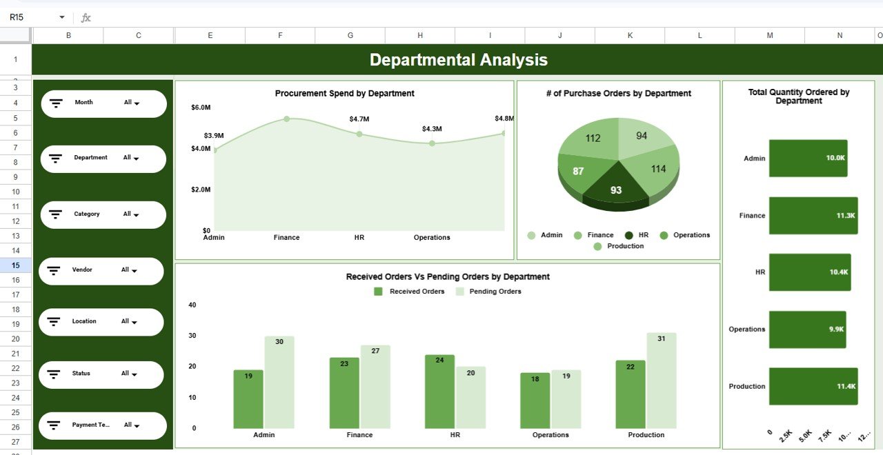
This page compares Admin, Finance, HR, Operations and Production. Charts show Procurement Spend by Department, # of Purchase Orders by Department, Total Quantity Ordered by Department and Received Orders Vs Pending Orders by Department. In the sample, Production has the most pending orders (31) and Admin follows with 30, so those are the teams to check in with about late deliveries.
3. Vendor Analysis
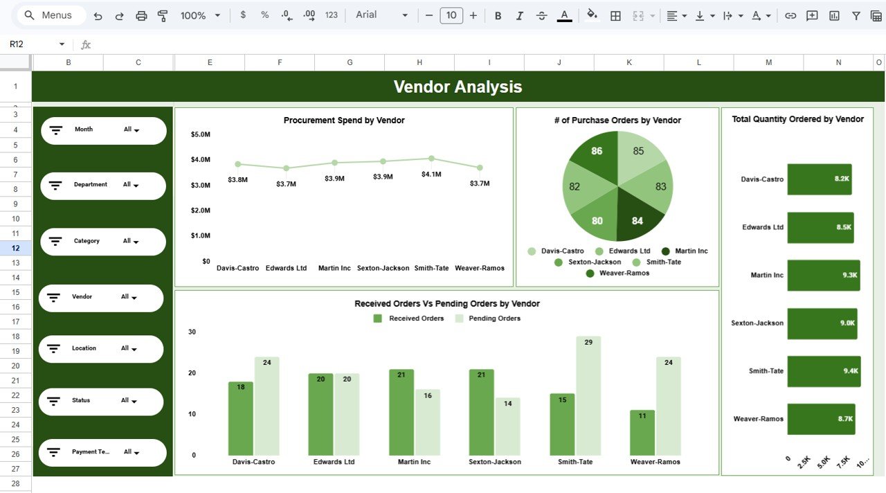
Vendor Analysis puts the six suppliers in the sample side by side: Davis-Castro, Edwards Ltd, Martin Inc, Sexton-Jackson, Smith-Tate and Weaver-Ramos. You see spend, order count, quantity and received vs pending orders for each. Spend is fairly even ($3.7M to $4.1M per vendor), but Smith-Tate has 29 pending orders against 15 received, which is the kind of gap worth raising in a supplier review.
4. Category & Item Insights
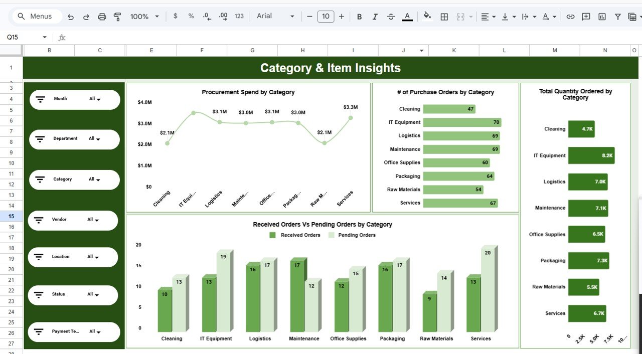
This page shows where the money goes by category. Charts cover Procurement Spend by Category, # of Purchase Orders by Category, Total Quantity Ordered by Category and received vs pending orders. IT Equipment has the most orders (70) and the highest quantity (8.2K units) in the sample, while Cleaning has the fewest orders (47).
5. Location & Payment Terms
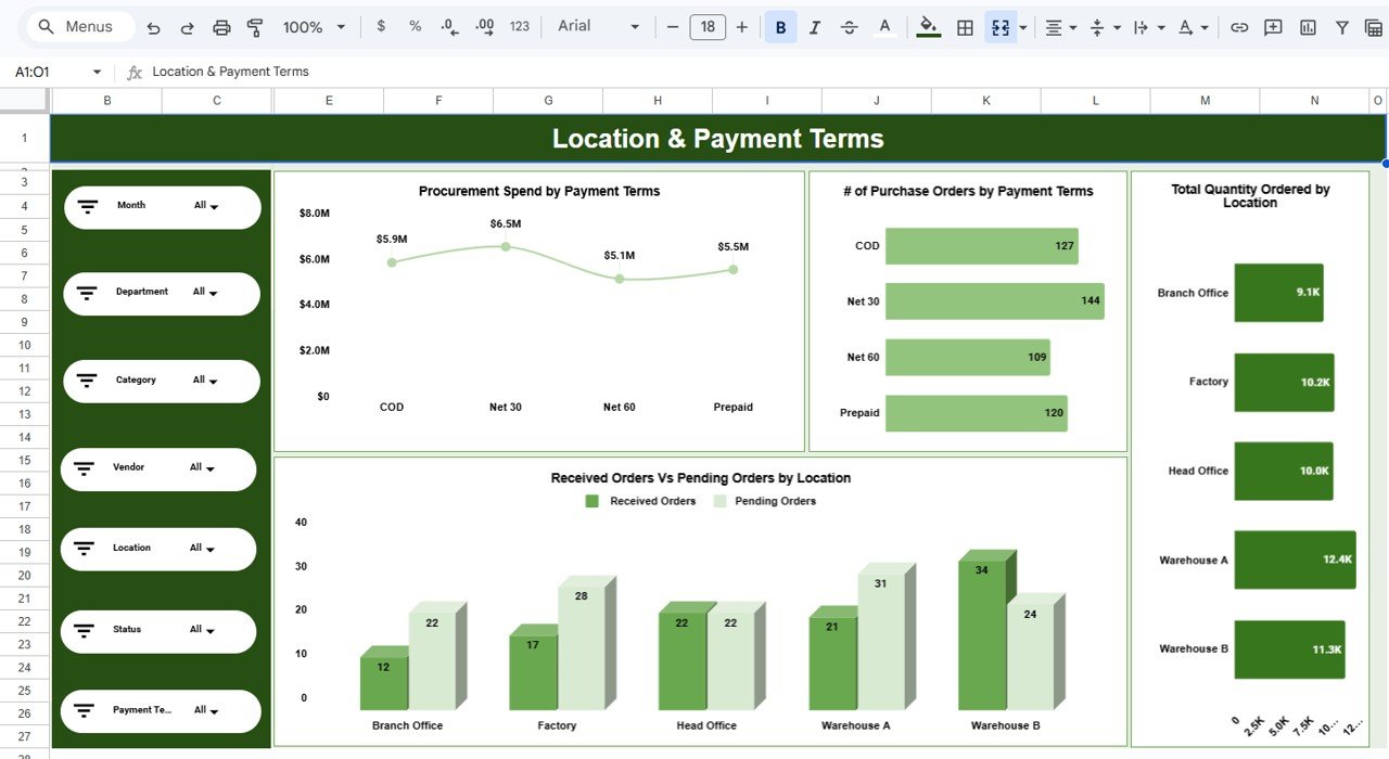
The last page shows Procurement Spend by Payment Terms, # of Purchase Orders by Payment Terms (Net 30 leads with 144 orders, then COD 127, Prepaid 120 and Net 60 109), Total Quantity Ordered by Location and received vs pending orders across Branch Office, Factory, Head Office, Warehouse A and Warehouse B. Warehouse A receives the largest quantity (12.4K units) in the sample.
6. Data Sheet
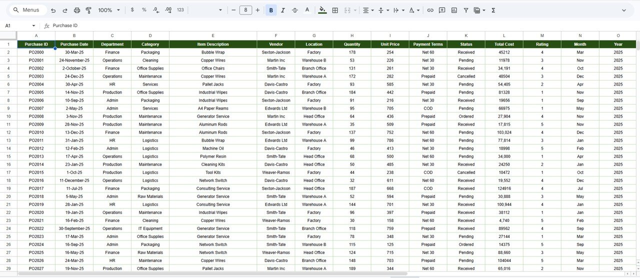
The Data sheet is where purchase orders are entered. Columns are Purchase ID, Purchase Date, Department, Category, Item Description, Vendor, Location, Quantity, Unit Price, Payment Terms, Status, Total Cost, Rating, Month and Year. Status uses four values: Received, Pending, Ordered and Cancelled. Items in the sample include Bubble Wrap, Copper Wires, Office Chairs, Pallet Jacks and Generator Service.
How to Use It With Your Own Data
- Open the copy link in the download PDF and choose Make a copy to save the workbook to your Google Drive.
- Go to the Data sheet and review the sample rows and column order.
- Replace the sample rows with your purchase orders. Keep Total Cost as Quantity × Unit Price, and fill Month and Year for every row so the month chart and slicer work.
- Use a fixed list of values for Department, Category, Vendor, Location, Payment Terms and Status.
- Open any dashboard page and use the slicers on the left to filter by month, department, vendor or any other field.
- Update the Status column as orders arrive so Pending Orders and the received vs pending charts stay accurate.
Real-World Use Cases
- Monthly spend review. A procurement manager filters to the latest month and walks department heads through spend and pending orders by department.
- Supplier review meeting. A buyer opens Vendor Analysis, filters Status to Pending and brings the list of late orders to each supplier call.
- Cash planning. A finance lead checks spend by payment terms to see how much money is tied up in Prepaid and COD orders versus Net 30 and Net 60.
Best Practices
- Standardise vendor and category names before importing; one typo creates a new bar on every chart.
- Record the rating when an order is received so Average Rating reflects real experience.
- Update the Data sheet weekly so pending figures are current.
- Give view-only access to stakeholders and edit access only to the people who maintain the data.
- Archive each year in its own copy if the sheet grows large.
Limitations
- It is a reporting dashboard, not a purchasing system. It does not raise POs, run approvals or match invoices.
- Data is entered or pasted in; there is no live link to an ERP or supplier portal.
- The rating is a single 1–5 score per order, not a full supplier scorecard.
- Very large data sets will make slicers slower; at that scale a BI tool or the Power BI version of a procurement dashboard is a better fit.
Spreadsheet vs This Dashboard vs Procurement Software
| Need | Plain PO list | Supply Chain Procurement Dashboard | Procurement / ERP software |
|---|---|---|---|
| Ready-made charts and KPIs | Build yourself | 5 KPI cards and 20 charts on five pages | Varies |
| Filter by vendor, department, location | Manual filters | Seven slicers | Yes |
| PO approval workflow | No | No | Yes |
| Team editing in one file | Yes | Yes | Yes |
| Ongoing subscription | No | No (one-time purchase) | Usually yes |
Related Guides and Templates
For a wider view of purchasing, see the Procurement Management Dashboard in Google Sheets and the Purchase Order Management Dashboard. If you track targets for procurement KPIs, the Procurement KPI Scorecard in Google Sheets fits alongside this report. Supplier-focused teams can compare the Vendor Performance Dashboard in Google Sheets, and if you need a simple source list first, start with the Purchase Order Tracker in Google Sheets.
Related template: for a broader procurement view, see the Procurement Management Dashboard in Google Sheets.
If you want to learn how slicer-driven dashboards like this are built, the Excel Pivot Tables and Dashboards course on NextGenTemplates Academy covers the same pivot and chart techniques.
Frequently Asked Questions
Which KPIs does the Supply Chain Procurement Dashboard show?
Five cards on the Overview: # of Purchase Orders, Total Procurement Spend, Total Quantity Ordered, Average Rating and Pending Orders.
Which filters are available?
Seven slicers on every page: Month, Department, Category, Vendor, Location, Status and Payment Terms.
How is Total Cost calculated?
In the sample Data sheet, Total Cost is Quantity × Unit Price for each purchase order, for example 178 × 254 = 45,212.
Can I use my own departments, vendors and categories?
Yes. The charts group by whatever values you enter, so replace the sample names with your own and keep the spelling consistent.
Can my team work in it at the same time?
Yes. Share your copy from Google Drive. Editors can update the Data sheet while others view the dashboard pages.
Does it connect to my ERP?
No. You paste or type purchase orders into the Data sheet. A simple routine is to export a CSV from your ERP each week and paste it in, keeping the same column order.
Wrapping Up
The Supply Chain Procurement Dashboard in Google Sheets gives buyers and procurement managers one shared view of spend, vendors, categories, locations and pending orders. Make your copy, paste in last quarter’s purchase orders and start with the Vendor Analysis page to see which suppliers need a follow-up.
Get the Supply Chain Procurement Dashboard in Google Sheets
📅 Last updated: October 2026