The travel and tourism sector is operating at a scale where spreadsheet reporting cannot be casual. WTTC reported that Travel & Tourism contributed US$11.6 trillion to global GDP in 2025 and supported 366 million jobs worldwide. The Travel and Tourism Dashboard in Google Sheets gives travel agencies, tour operators, tourism boards, and destination teams a practical way to track revenue, cost, profit, bookings, travelers, regions, packages, channels, agents, and booking records from one editable dashboard.
Because this dashboard runs in Google Sheets, teams can create a copy, replace sample records, share the file with authorized users, and review live charts without installing desktop BI software. It is designed for users who want a ready reporting layer rather than a large SaaS implementation.
Get the Travel and Tourism Dashboard
Key Features of Travel and Tourism Dashboard in Google Sheets
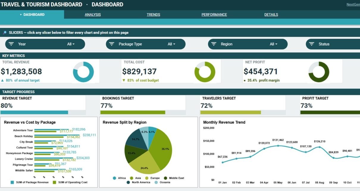
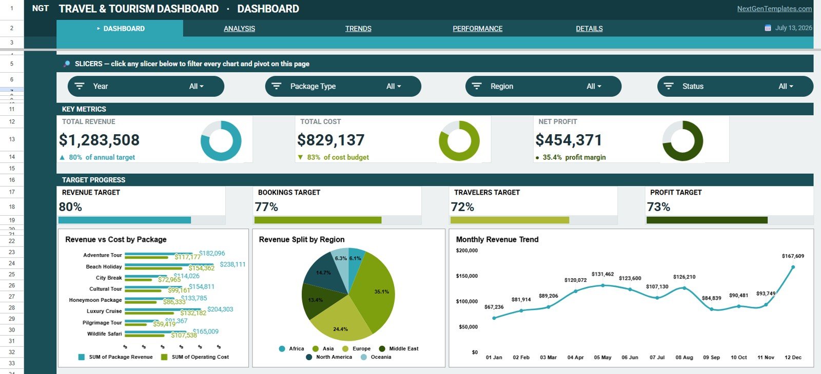
- Overview KPI cards: The top of the dashboard shows Total Revenue, Total Cost, Net Profit, Revenue Target, Bookings Target, Travelers Target, and Profit Target.
- Multi-page dashboard structure: The workbook includes Overview, Analysis, Trends, Performance, Details, and Data Sheet tabs.
- Interactive slicers: Slicers help users filter the dashboard quickly and review selected data without rebuilding reports.
- Financial analysis: Revenue, cost, and profit are analyzed by package, region, month, agent, and booking ID.
- Booking analysis: The dashboard reviews bookings by channel, status, month, and individual booking records.
- Traveler movement: Monthly traveler charts help teams identify demand patterns and seasonal changes.
- Editable Google Sheets format: Users can customize labels, data fields, charts, slicers, and formatting after creating their own copy.
Dashboard Pages Explanation
The dashboard is organized around a natural review flow. The Overview page starts with executive metrics, while the Analysis, Trends, Performance, and Details tabs explain the drivers behind the summary numbers. The Data Sheet tab is the input layer where users add records in the same format as the sample data.
1. Overview Page
The Overview page gives managers a quick business snapshot before they investigate details. The top cards show Total Revenue, Total Cost, Net Profit, Revenue Target, Bookings Target, Travelers Target, and Profit Target.
Revenue and Cost by Package: This chart compares revenue and cost across travel packages.
Use it to identify packages that generate strong sales but may need margin review.
Revenue by Region: This chart shows how revenue is distributed across regions.
Use it to find high-performing destinations and areas that need sales attention.
Revenue by Month: This chart tracks monthly revenue movement.
Use it to spot seasonal peaks, slower months, and the timing of demand changes.
2. Analysis
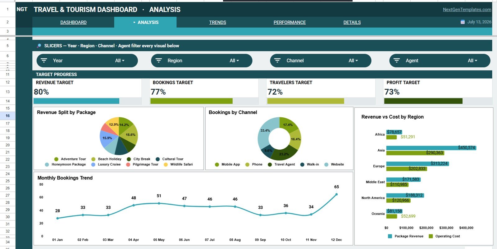
The Analysis tab focuses on package, channel, region, and monthly booking performance. It is useful for monthly business reviews, campaign checks, and package-level planning.
Revenue by Package: This chart compares revenue generated by each package.
Use it to understand which package types are driving the largest share of sales.
Bookings by Channel: This chart shows bookings grouped by sales or marketing channel.
Use it to see whether website, partner, referral, or agent channels are producing volume.
Revenue and Cost by Region: This chart compares regional revenue against regional cost.
Use it to review regional profitability instead of looking only at top-line sales.
Bookings by Month: This chart displays booking volume over time.
Use it to identify booking seasonality and prepare staffing or campaign plans.
3. Trends
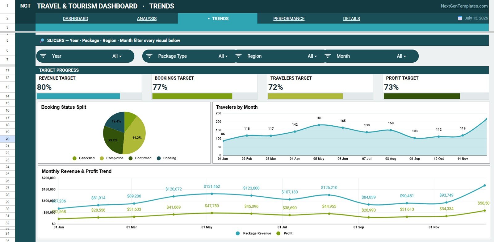
The Trends tab helps users understand how booking status, traveler count, revenue, and profit move across time. It is useful when management wants to separate short-term activity from longer seasonal movement.
Bookings by Status: This chart groups bookings by status such as confirmed, pending, cancelled, or completed.
Use it to understand pipeline health and whether follow-up is needed.
Travelers by Month: This chart shows traveler count across months.
Use it to compare traveler demand with booking volume and revenue movement.
Revenue and Profit by Month: This chart compares monthly revenue against monthly profit.
Use it to check whether revenue growth is also improving profitability.
4. Performance
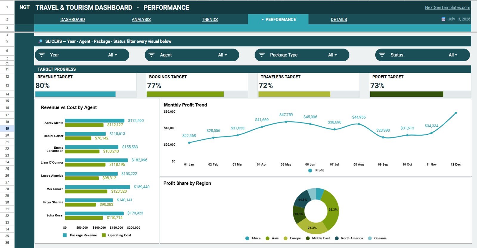
The Performance tab brings the review closer to agent and region accountability. It helps managers understand who is driving revenue, where cost is concentrated, and which regions are producing profit.
Revenue and Cost by Agent: This chart compares agent-level revenue and cost.
Use it to review sales contribution and understand where support or coaching may be needed.
Profit by Month: This chart tracks monthly profit movement.
Use it to see whether the business is improving after cost and package mix are considered.
Profit by Region: This chart compares profit across regions.
Use it to identify regions that are financially stronger, not just higher in revenue.
5. Details
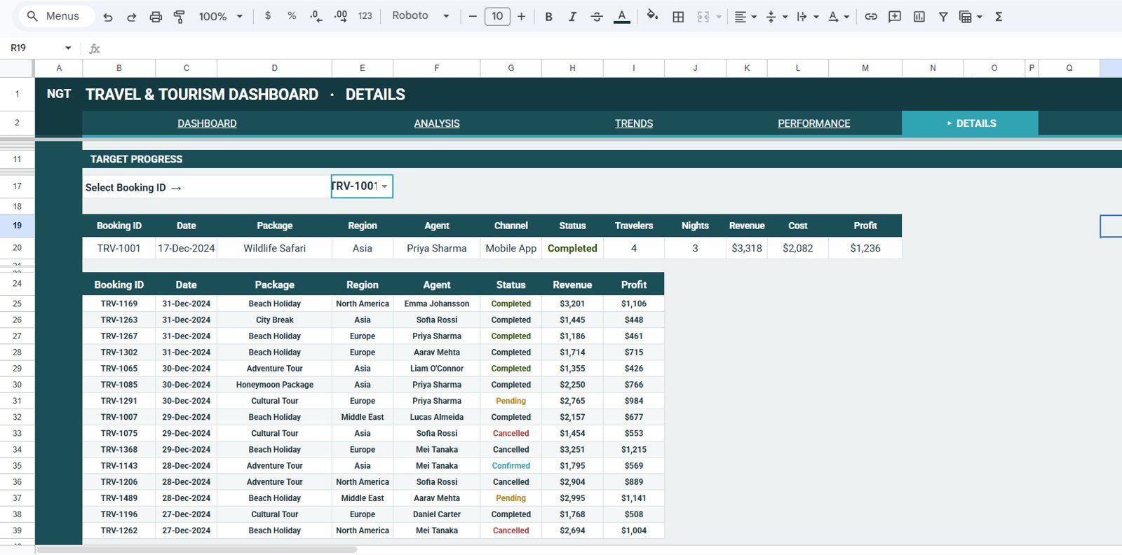
The Details tab gives users booking-level visibility. This is helpful when a manager wants to investigate individual booking records behind the dashboard totals.
Booking Records by Booking ID: This chart or view shows record counts by Booking ID.
Use it to locate specific booking activity and confirm the underlying record set.
Revenue by Booking ID: This chart compares revenue at booking level.
Use it to identify high-value bookings and investigate unusual revenue values.
Profit by Booking ID: This chart shows profit by individual booking.
Use it to understand which bookings created the strongest or weakest margin.
6. Data Sheet Tab
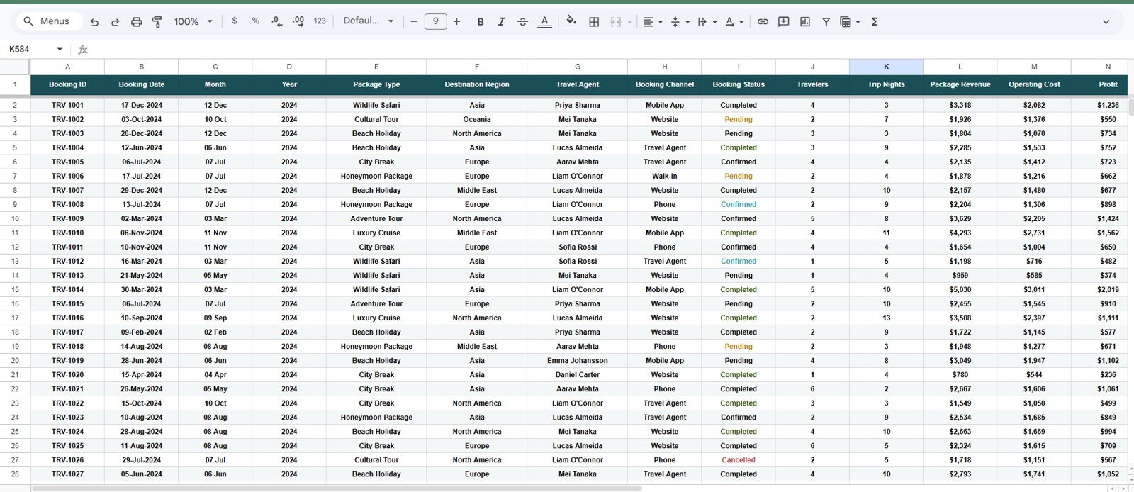
The Data Sheet tab is where users add booking records in the same structure as the sample data. Keep fields such as Booking ID, package, region, channel, month, agent, status, revenue, cost, profit, and travelers consistent so the dashboard remains accurate.
Travel and Tourism Dashboard in Google Sheets vs. Microsoft Excel vs. Paid CRM/SaaS – Feature Comparison
| Feature | Travel and Tourism Dashboard in Google Sheets | Microsoft Excel dashboard | Paid travel CRM/SaaS |
|---|---|---|---|
| Cost | $9.99 one-time sale price | Template cost plus Excel access | Monthly or annual subscription |
| Platform | Google Sheets in browser | Excel desktop or web | Vendor-hosted platform |
| Setup time | Create a copy and replace sample data | Open workbook and adjust data | Onboarding and configuration |
| Real-time team collaboration | Built into Google Sheets sharing | Requires online storage setup | Usually included with user permissions |
| Mobile access | Google Sheets app or browser | Excel app or browser | Vendor app or portal |
| Customizable fields | Editable spreadsheet structure | Editable workbook structure | Depends on vendor settings |
| Share with link | Yes, through Google Drive permissions | Possible through OneDrive or SharePoint | Usually role-based |
| Year-1 cost at 5 users | $9.99 plus Google Workspace if used | Template plus licensing | Often hundreds or thousands |
| Booking ID detail | Included in Details page | Possible with custom formulas | Depends on the product |
| Best fit | Fast reporting and team review | Offline spreadsheet analysis | End-to-end booking operations |
Who Should Use This Template
This template is useful for travel agency owners, tour package managers, destination marketing teams, tourism consultants, operations managers, finance analysts, and small business owners who need a clear dashboard for travel records.
It is best for teams that already have booking data but need a better way to summarize revenue, cost, profit, travelers, regions, packages, channels, agents, and monthly trends.
Real-World Use Cases
Travel agency owner: Reviews revenue targets, bookings targets, and channel mix before deciding where to invest in the next campaign.
Tour operations manager: Compares package revenue, package cost, regional profit, and agent performance before changing tour pricing.
Destination analyst: Uses traveler movement and monthly revenue trends to explain seasonal demand to a tourism board.
Advantages of Travel and Tourism Dashboard in Google Sheets
The main advantage is speed. Users start from a ready-made dashboard instead of building KPI cards, slicers, charts, and data tables from scratch.
The second advantage is collaboration. Google explains that Sheets files can be shared with specific people or by link, with access levels such as viewer, commenter, or editor through Google Drive sharing controls. You can review the official guidance in Google’s help article on collaborating in Sheets.
The third advantage is focus. The workbook is built around travel and tourism reporting, so the pages center on packages, regions, channels, agents, statuses, bookings, travelers, revenue, cost, and profit.
Opportunities for Improvement
This is a spreadsheet dashboard, so it depends on clean input data. If package names, regions, channels, agents, months, or statuses are entered inconsistently, charts can become harder to read.
Teams with larger systems may eventually want automatic imports from booking platforms, CRM integration, controlled refresh, data validation workflows, or a full BI environment. This template is best used as a practical reporting layer, not as a complete booking or CRM system.
Best Practices
- Keep the Data Sheet column structure unchanged unless you also update connected formulas, slicers, and charts.
- Use consistent names for packages, regions, channels, agents, and booking statuses.
- Review the Overview page first, then use Analysis, Trends, Performance, and Details to explain what changed.
- Protect formula ranges if multiple team members will edit the file.
- Create a backup copy before major customization.
- Limit file access to people who should see booking, revenue, cost, and profit information.
Explore Relevant Templates
- Travel and Tourism Dashboard in Google Sheets
- Travel and Tourism KPI Scorecard in Google Sheets
- Travel & Tourism KPI Dashboard in Power BI
- Google Sheets dashboard templates
- Travel and Tourism KPI Scorecard blog post
Want to build skills like this step by step? The Excel Pivot Tables & Dashboards course on NextGenTemplates Academy walks you through reporting and charts with practice files.
Frequently Asked Questions
What is included in the Travel and Tourism Dashboard in Google Sheets?
It includes Overview, Analysis, Trends, Performance, Details, and Data Sheet tabs with KPI cards, slicers, charts, and booking-level views.
Can I use my own booking data?
Yes. Replace the sample rows in the Data Sheet tab with your own travel and tourism records using the same structure.
Does the dashboard track targets?
Yes. The Overview page includes Revenue Target, Bookings Target, Travelers Target, and Profit Target cards.
Can I share this dashboard with my team?
Yes. After creating your own Google Sheets copy, you can share it with authorized users and choose access permissions.
Does it connect directly to a booking platform?
No. This is a Google Sheets dashboard template. You add, paste, or import data into the Data Sheet tab.
Is this dashboard suitable for a tour operator?
Yes. Tour operators can use it to compare packages, regions, agents, bookings, travelers, revenue, cost, and profit.
About the Author
Built by PK – Microsoft Certified Professional with 15+ years of Excel, Google Sheets, and Power BI experience. Founder of NextGenTemplates, reaching 300K+ subscribers across YouTube channels. Every template is hand-built and tested before release.
Conclusion
The Travel and Tourism Dashboard in Google Sheets gives travel teams a focused way to review revenue, cost, profit, booking targets, traveler targets, package performance, regional performance, monthly trends, agent performance, and booking-level detail. It is a good fit when you need a shareable dashboard quickly and already have booking records available.