SaaS Financial Model Dashboard in HTML — A Complete Browser-Based Analytics Solution
SaaS Financial Model Dashboard in HTML is a ready-to-use, browser-based analytics template designed for SaaS founders, CFOs, finance teams, and business analysts who need instant visibility into their subscription business health. This dashboard delivers 5 interactive pages, 6 executive-level KPI cards, and over 15 dynamic charts — all running directly in your web browser without any software installation.
Whether you are preparing for a board meeting, building an investor report, or conducting a quarterly business review, this template gives you a professional SaaS financial dashboard in seconds. Simply unzip the file, open index.html, and start analyzing. No Excel, no Power BI, no coding required.
Click here to Purchase SaaS Financial Model Dashboard in HTML
Key Features of SaaS Financial Model Dashboard in HTML
This template is packed with features that make SaaS financial analysis fast and intuitive:
- 5 Interactive Dashboard Pages — Overview, Revenue Analysis, Customer Insights, Retention & Churn, and Data View tabs provide 360-degree visibility into your SaaS business
- 6 Executive KPI Cards — Total Revenue, Monthly Recurring Revenue (MRR), Active Customers, Gross Margin, Churn Rate, and Average NPS displayed prominently on the Overview page
- 15+ Dynamic Charts — Revenue by Plan, Revenue by Month, MRR and ARR by Plan, Churn Rate by Region, NPS Score Distribution, and many more visualizations
- Smart Slicers and Filters — Filter the entire dashboard by plan type, region, billing cycle, time period, or any other dimension instantly
- Searchable Data Table — Full data view with search, sort, pagination, and CSV export for further analysis
- Zero Software Dependencies — Works in Chrome, Edge, Firefox, and Safari with no installation or plugins required
- Plug and Play — Replace sample data with your own SaaS metrics and all charts and KPIs auto-update
If you are looking for more HTML-based analytics solutions, explore our collection of HTML Dashboard Templates covering every business domain.
Dashboard Pages Explained
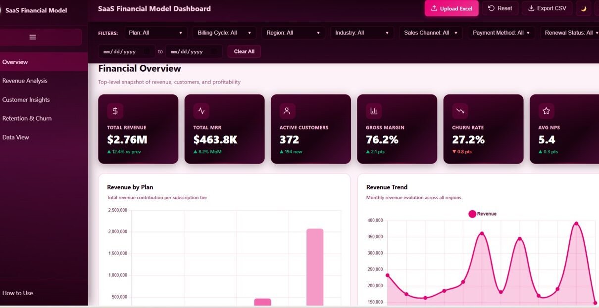
1. Overview Page
The Overview page is your executive command center. At the top, 6 KPI cards display the most critical SaaS metrics: Total Revenue, Total MRR, Active Customers, Gross Margin, Churn Rate, and Average NPS. Below the cards, four strategic charts break down your business performance: Revenue by Plan shows which subscription tiers drive the most income, Revenue by Month tracks growth trends over time, Renewal Status Mix reveals the balance between renewed, pending, and churned contracts, and Revenue by Region highlights geographic performance. Multiple slicers sit above the charts, enabling you to filter the entire dashboard by plan, region, or time period with a single click.
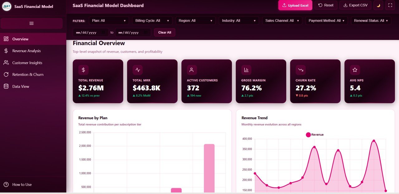
Overview Page
2. Revenue Analysis
The Revenue Analysis page provides a deep-dive into your subscription revenue engine. Four specialized charts dissect your revenue from different angles: MRR and ARR by Plan compares monthly and annual recurring revenue across subscription tiers, Revenue by Billing Cycle shows the split between monthly, quarterly, and annual billing, Gross Margin by Plan reveals profitability differences across your product lineup, and Expansion Revenue by Month tracks upsell and cross-sell growth over time. This page is essential for identifying which plans are most profitable and where revenue expansion opportunities exist.
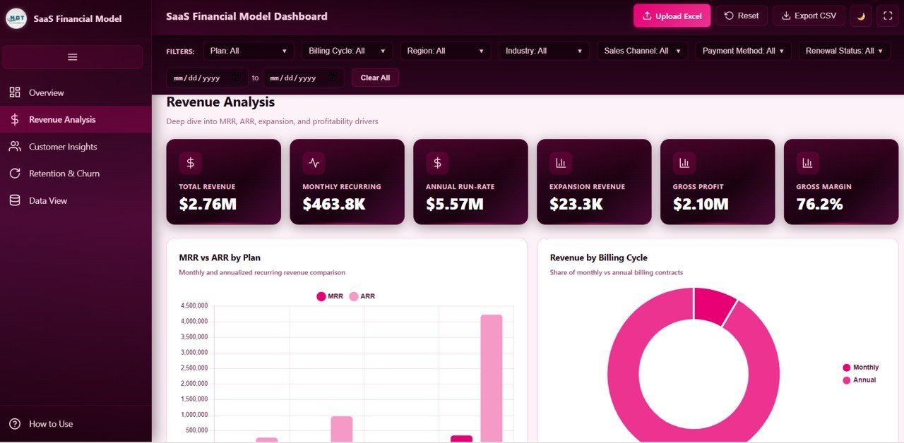
Revenue Analysis
3. Customer Insights
The Customer Insights page helps you understand who your customers are and how they find you. Customers by Industry breaks down your user base across verticals, New Customers by Sales Channel reveals which acquisition sources deliver the most signups, NPS Score Distribution shows overall customer satisfaction patterns, and Average Seats by Plan indicates adoption depth across subscription tiers. This intelligence is invaluable for sales strategy, marketing budget allocation, and product development prioritization.
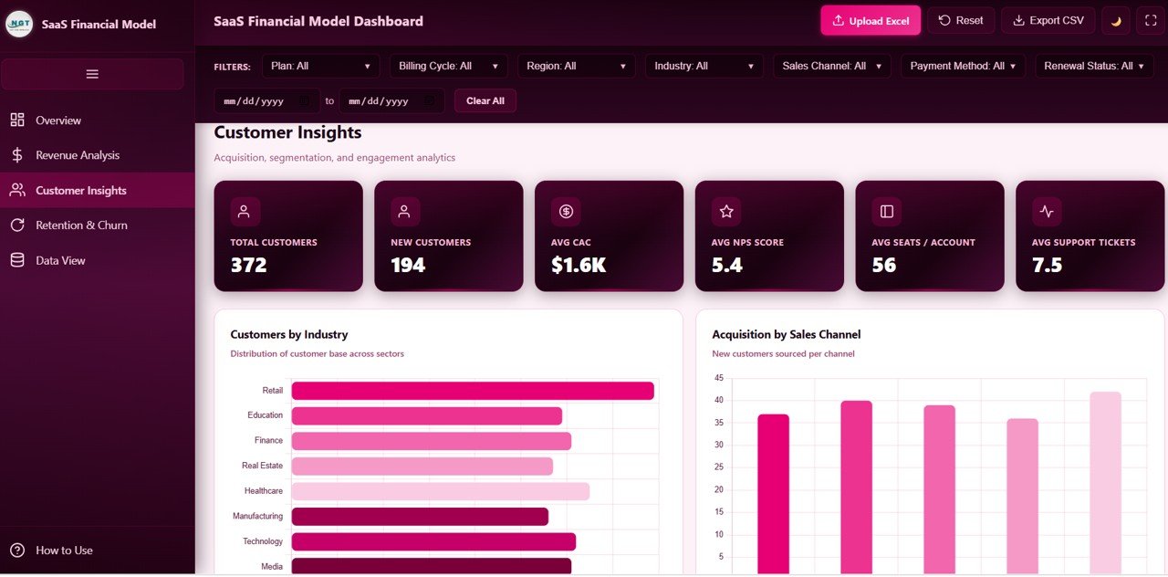
Customer Insights
4. Retention and Churn
The Retention and Churn page focuses on the health of your subscription base — the metrics that determine long-term SaaS viability. Churn Rate by Region pinpoints geographic areas with the highest customer loss, Renewal Status by Plan shows which tiers have the strongest retention, Average Support Tickets by Plan correlates service load with subscription level, and Contracts by Contract Length reveals how deal duration impacts retention. Reducing churn by even a small percentage can dramatically improve customer lifetime value, making this page a critical tool for customer success teams. You might also find the SaaS Metrics Dashboard in HTML blog post helpful for additional SaaS tracking strategies.
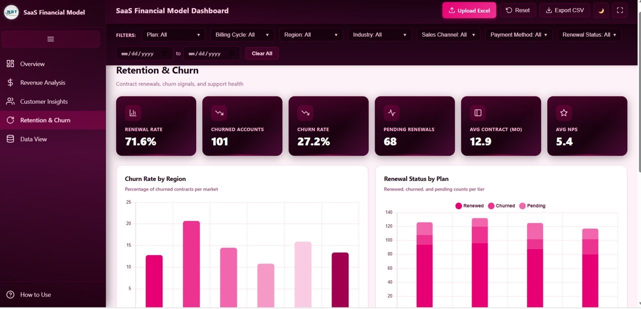
Retention and Churn
5. Data View
The Data View page is a detailed data table that displays all underlying records powering the dashboard. It includes search functionality to find specific entries, column sorting to organize data by any field, pagination to navigate through large datasets, and a CSV export button to download filtered data for offline analysis or presentations. This page makes the dashboard fully transparent — every chart and KPI can be traced back to its source data.
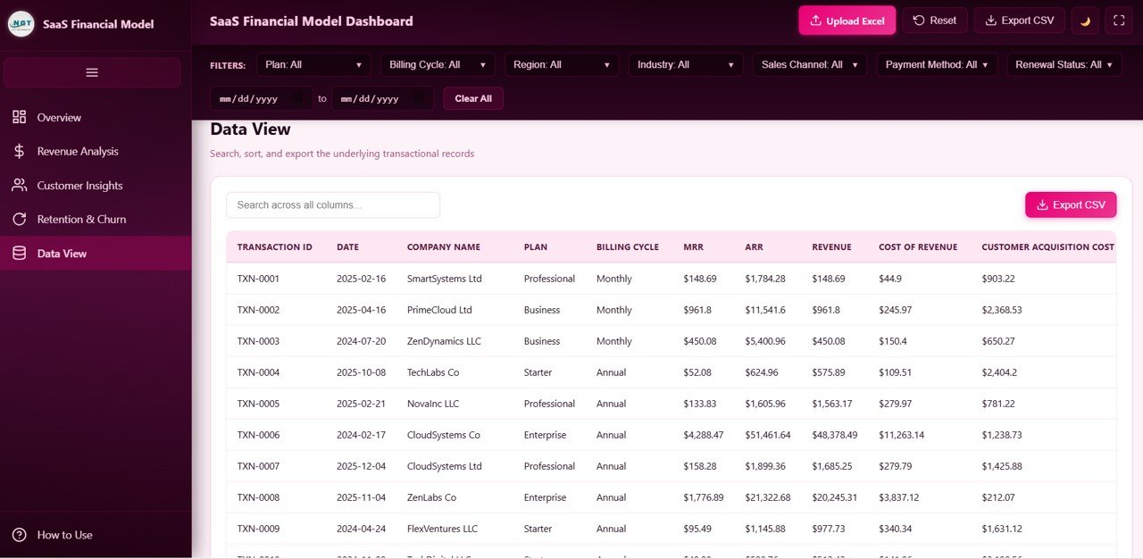
Data View
Advantages of SaaS Financial Model Dashboard in HTML
This template offers several compelling advantages over building a SaaS dashboard from scratch or using traditional spreadsheet tools:
- Instant Setup — No database, no server, no configuration. Unzip and open in your browser.
- Cross-Platform Compatibility — Works identically on Windows, Mac, Linux, and even mobile browsers.
- Shareable — Send the HTML file to investors, board members, or colleagues. They open it and see the dashboard instantly.
- Professional Design — SaaS-grade visual design with consistent color coding, clear typography, and intuitive navigation.
- Comprehensive Coverage — Five pages covering revenue, customers, retention, churn, and raw data in a single template.
- No Recurring Costs — Unlike SaaS analytics tools that charge monthly, this is a one-time purchase you own forever.
For a collaborative version, check out the SaaS Metrics Dashboard in Google Sheets which offers real-time team collaboration via Google Drive.
Opportunities for Improvement
While this dashboard covers the core SaaS financial metrics comprehensively, there are areas where you can extend it further:
- Cohort Analysis — Adding monthly cohort retention curves would provide deeper churn visibility over time
- Forecasting — Integrating a simple MRR forecast based on current growth rate and churn would add predictive value
- Unit Economics — Adding CAC, LTV, and LTV:CAC ratio calculations would round out the financial model
- API Integration — Connecting to Stripe, Chargebee, or Recurly APIs could automate data refresh
Best Practices for Using This SaaS Financial Model Dashboard
- Update data monthly — Refresh your metrics at the start of each month to track trends accurately
- Use filters strategically — Isolate underperforming plans or regions to identify churn risk before it impacts revenue
- Share with stakeholders — Export the filtered views before board meetings or investor calls for focused discussions
- Benchmark against industry — Compare your churn rate, NPS, and gross margin against SaaS industry benchmarks to gauge health
- Combine with other templates — Pair this with the Sales and Revenue Command Center Dashboard in HTML for end-to-end revenue visibility
Explore Relevant Templates
If you found this SaaS Financial Model Dashboard useful, explore these related templates from NextGenTemplates:
- SaaS Financial Model Dashboard in Excel — The same financial model in a Microsoft Excel format with pivot tables and formulas
- SaaS Financial Model Dashboard in Power BI — Power BI version with advanced data connectivity and DAX measures
- SaaS Metrics Dashboard in Google Sheets — Track MRR, churn, and customer metrics collaboratively in Google Sheets
- Sales and Revenue Command Center Dashboard in HTML — Broader sales and revenue tracking for any business model
Frequently Asked Questions
What KPIs does the SaaS Financial Model Dashboard in HTML track?
This dashboard tracks 6 executive KPIs — Total Revenue, Monthly Recurring Revenue (MRR), Active Customers, Gross Margin, Churn Rate, and Average NPS. Beyond the KPI cards, it visualizes over 15 chart-based metrics covering revenue breakdown by plan, billing cycle, and region, customer segmentation by industry and sales channel, and retention analysis by churn rate, renewal status, and contract length.
Do I need any special software to use this HTML dashboard?
No. This dashboard runs entirely in your web browser. Simply unzip the downloaded file and open index.html in Chrome, Edge, Firefox, or Safari. There is no need for Microsoft Excel, Power BI, or any other software installation.
Can I customize this template with my own SaaS data?
Yes. The template includes a structured data file where you can replace the sample data with your own subscription, revenue, and customer metrics. Once updated, all 6 KPI cards and 15+ charts refresh automatically to reflect your real business data.
What is the best dashboard template for SaaS financial modeling?
The SaaS Financial Model Dashboard in HTML from NextGenTemplates is purpose-built for SaaS financial analysis. It covers MRR, ARR, churn, NPS, gross margin, expansion revenue, and customer segmentation across 5 interactive pages — all accessible instantly in any web browser without software dependencies.
How is this HTML version different from the Excel or Power BI version?
The HTML version requires zero software installation — just a web browser. The Excel version offers pivot table flexibility and offline formula editing. The Power BI version provides advanced data connectivity and DAX-powered calculations. Choose based on your tool preference and data workflow.
Who should use this SaaS Financial Model Dashboard?
This template is ideal for SaaS founders and CEOs, CFOs preparing board reports, revenue operations managers, customer success teams tracking churn, business analysts building financial models, and startup consultants who need a professional SaaS analytics tool without building one from scratch.
Conclusion
The SaaS Financial Model Dashboard in HTML is the fastest way to get a professional, interactive SaaS analytics dashboard without any software dependencies. With 5 purpose-built pages covering revenue, customers, retention, churn, and raw data — plus 6 KPI cards and 15+ dynamic charts — this template gives SaaS teams everything they need to make data-driven decisions.
Click here to Purchase SaaS Financial Model Dashboard in HTML
Visit our YouTube channel for step-by-step video tutorials on how to use this and other dashboard templates:
👉 Youtube.com/@NeoTechNavigators