The Driving School Dashboard in Google Sheets is built for driving school owners, branch managers, and training coordinators who need a faster way to review enrollments, fees, test outcomes, instructors, and branch activity. Instead of jumping between raw student records and separate payment sheets, this template turns your enrollment data into a structured dashboard with 6 worksheet tabs, 4 headline KPI cards, 16 analysis charts, multiple slicers, and a Search Sheet for single-record lookup.
The full template is available on NextGenTemplates here: Driving School Dashboard in Google Sheets. It is designed as a practical Google Sheets dashboard for schools that want clear reporting without immediately moving to an expensive driving school software platform.
Click here to get the Driving School Dashboard in Google Sheets.
Many small and mid-sized driving schools already use spreadsheets for student records, lesson progress, fees, and test results. The challenge is that raw data alone does not answer management questions quickly. How many students enrolled this month? Which branch is growing fastest? Which instructor has the strongest pass results? Which payment methods or pending balances need attention? A dashboard gives those answers in one place. Google Sheets also makes it easy for teams to collaborate in the browser, and Google provides general help for working with Sheets and Docs through Google Docs Editors Help.
Key Features of Driving School Dashboard in Google Sheets
- Overview dashboard with Total Enrollments, Total Revenue, Test Pass Rate, and Avg Fee per Student.
- Students analysis page for age group, test result, monthly enrollment, course type, and gender reporting.
- Revenue analysis page covering payment method, branch revenue, and payment status.
- Instructor performance page for students, test results, lessons, revenue, and lesson volume by instructor.
- Search Sheet that displays a complete enrollment record from a selected Enrollment ID.
- Data Sheet where users add or replace records in the same structured format.
- Multiple slicers for fast filtering across branches, courses, instructors, payment fields, and statuses.
- Editable Google Sheets format so teams can customize labels, formulas, and visuals as their reporting needs grow.
Dashboard Pages Explained
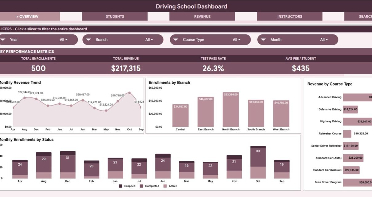
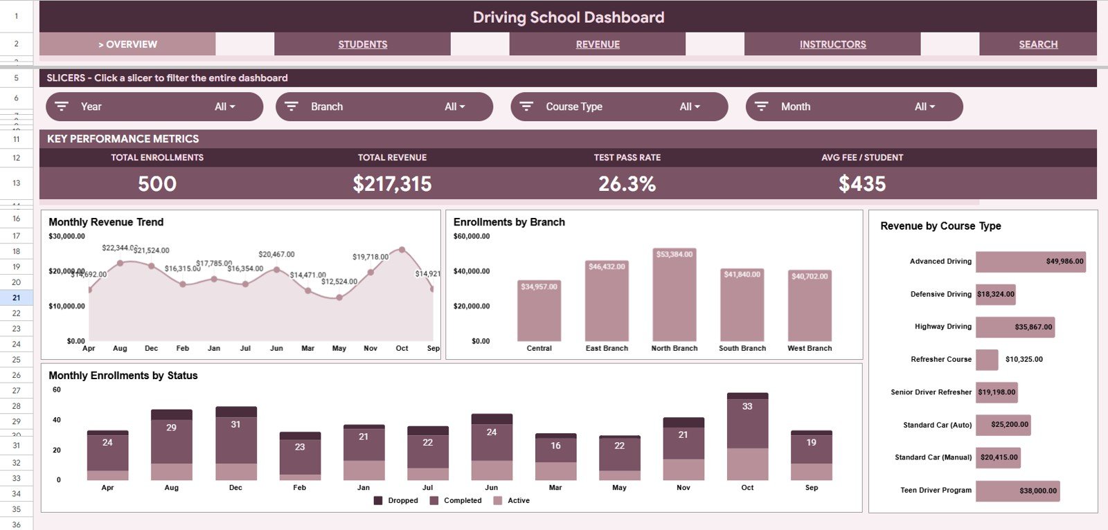
1. Overview Page
Click here to get the Driving School Dashboard in Google Sheets.
The Overview page is the management summary. At the top of the sheet, the dashboard displays 4 KPI cards: Total Enrollments, Total Revenue, Test Pass Rate, and Avg Fee per Student. These cards give owners and coordinators a quick read on enrollment activity, income, student outcomes, and average transaction value.
Revenue by Month: This chart shows how driving school revenue changes across the year. It helps identify seasonal peaks, slow months, and whether recent promotions or branch activity are improving monthly income.
Enrollments by Branch: This chart compares student volume across branches. It is useful for spotting high-demand locations, underperforming branches, and areas where instructor capacity or marketing support may need adjustment.
Revenue by Course Type: This chart shows which course categories generate the most income. Driving schools can use it to compare standard driving lessons, advanced training, refresher courses, motorcycle programs, or commercial license training.
Enrollments by Month and Status: This chart combines time and enrollment status. It helps teams understand whether students are active, completed, pending, cancelled, or waiting for test results across different months.
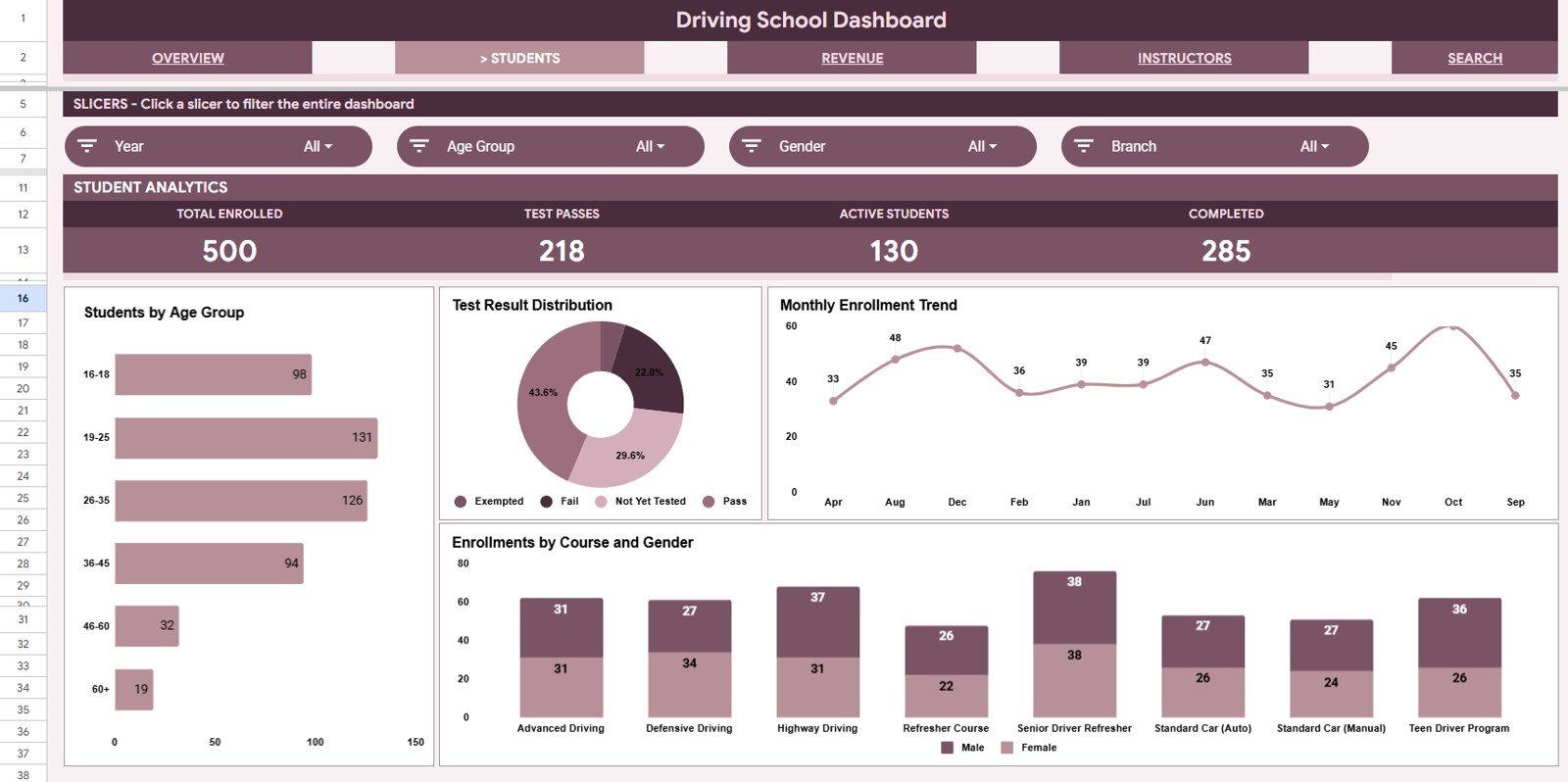
2. Students Page
The Students page focuses on learner mix and student outcomes. It helps answer who is enrolling, what course types they choose, and how test results are trending.
Students by Age Group: This chart groups students by age range so the school can understand its main learner segments. It can support decisions around advertising, class timing, and beginner versus refresher course positioning.
Students by Test Result: This chart summarizes pass, fail, pending, and retest outcomes. It gives a quick quality signal for training effectiveness and highlights whether follow-up lessons may be needed.
Enrollments by Month: This chart shows student acquisition trends over time. Managers can compare monthly demand and identify whether campaigns, seasonal patterns, or branch changes are affecting student signups.
Enrollments by Course Type and Gender: This chart compares course demand across student groups. It can reveal which courses are popular with different learner segments and help shape future scheduling or package design.
Click here to get the Driving School Dashboard in Google Sheets.
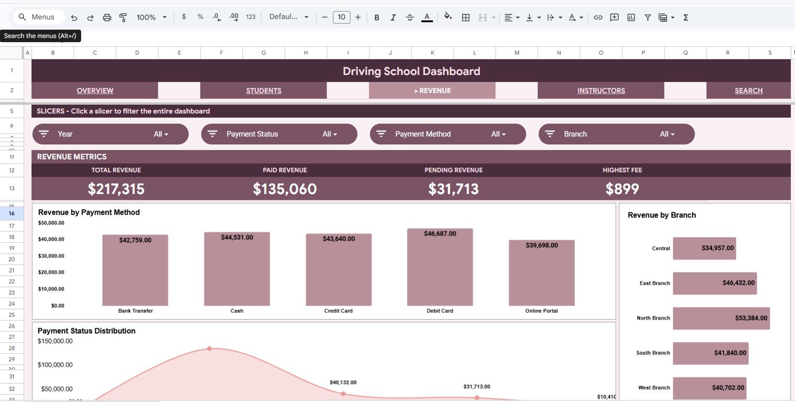
3. Revenue Page
The Revenue page gives a clean financial view for fee collection and branch performance. It is especially useful when a school accepts different payment methods or needs to monitor pending balances.
Revenue by Payment Method: This chart breaks revenue into cash, card, online transfer, or other payment channels. It helps the finance team understand how students prefer to pay and where reconciliation work may be needed.
Revenue by Branch: This chart compares total revenue across locations. It helps owners see which branches are driving income and whether enrollment volume is translating into stronger fees.
Revenue by Payment Status: This chart separates paid, pending, partial, or overdue amounts. It is useful for follow-up because unpaid or partially paid enrollments become easier to identify.
Click here to get the Driving School Dashboard in Google Sheets.
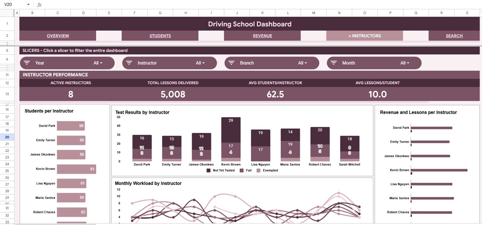
4. Instructors Page
The Instructors page helps monitor workload, training outcomes, and contribution by instructor. It is useful for scheduling, coaching, and understanding whether instructor assignments are balanced.
Students by Instructor: This chart shows how many learners are assigned to each instructor. It helps management avoid overload and ensure new students are distributed fairly.
Test Results by Instructor: This chart compares results across instructors. It can highlight strong training outcomes and reveal where additional coaching, review sessions, or curriculum support may help.
Lessons by Month and Instructor: This chart tracks teaching activity by month. It helps coordinators understand instructor availability, lesson volume, and monthly workload trends.
Revenue and Lessons by Instructor: This chart connects lesson volume with revenue contribution. It helps owners see which instructors are handling high-value training activity and where capacity planning may be needed.
Click here to get the Driving School Dashboard in Google Sheets.
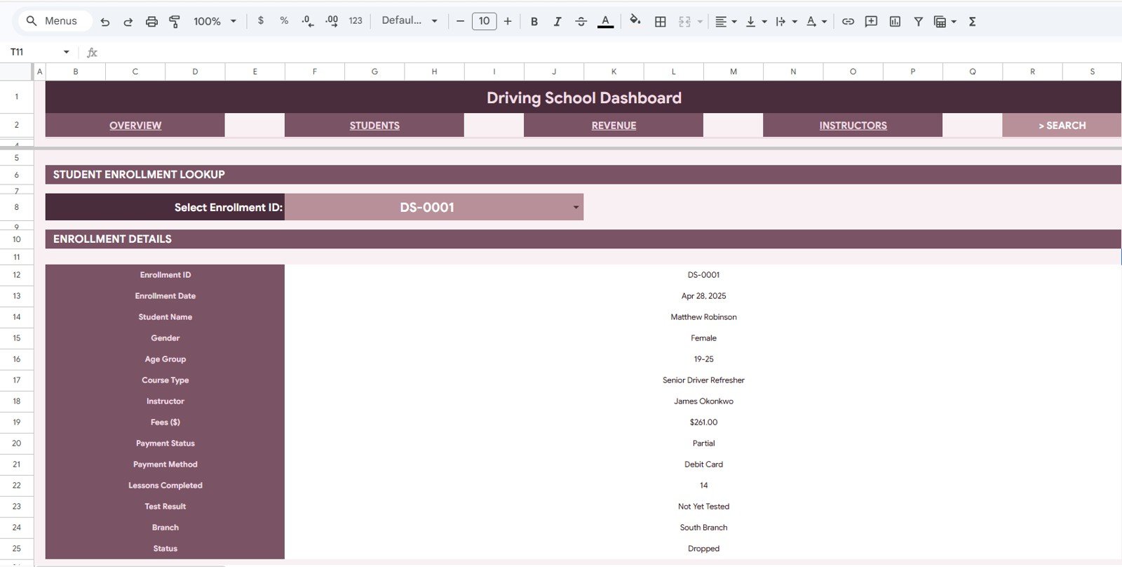
5. Search Sheet
The Search Sheet is built for quick record lookup. Select an Enrollment ID from the dropdown and the sheet automatically displays the enrollment date, student name, gender, age group, course type, instructor, fees, payment status, payment method, lessons completed, test result, branch, and current status for that record.
This is useful when a student calls, visits the office, or asks about payment, lessons, or test status. Instead of filtering the full data table, staff can use a single dropdown and view the complete enrollment details in a cleaner format.
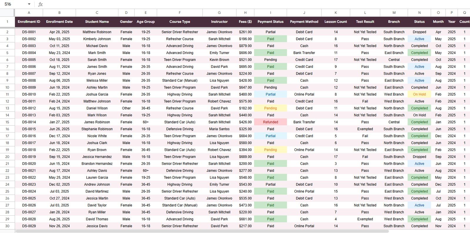
6. Data Sheet Tab
The Data Sheet is the source table for the dashboard. This is where you add, paste, or replace records in the same format used by the template. Keeping the structure consistent helps the KPI cards, charts, slicers, and lookup sheet continue to work correctly.
For best results, keep each enrollment on one row and use consistent labels for branch, course type, instructor, payment method, payment status, test result, and enrollment status. Clean data makes the dashboard much easier to filter and interpret.
Google Sheets Dashboard vs. Excel Dashboard vs. Paid Driving School SaaS
| Feature | Google Sheets Dashboard | Excel Dashboard | Paid Driving School SaaS |
|---|---|---|---|
| Cost | Low one-time template price | Low one-time template price, plus Excel needs | Recurring monthly subscription |
| Collaboration | Easy browser-based sharing | Best with OneDrive or SharePoint | Usually included with user accounts |
| Setup | Copy the sheet and replace sample data | Open workbook and replace sample data | May need onboarding and setup |
| Customization | Editable formulas, tabs, charts, and labels | Highly editable in Excel | Limited by software settings |
| Best for | Schools that want shared spreadsheet reporting | Teams that prefer desktop Excel | Schools needing booking, portals, reminders, and automation |
Who Should Use This Template?
Click here to get the Driving School Dashboard in Google Sheets.
This dashboard is a strong fit for independent driving schools, multi-branch driver training companies, motorcycle schools, commercial license training providers, and education-service teams that already maintain enrollment records in a spreadsheet. It is also useful for owners who want a lightweight reporting layer before investing in a full software system.
It is not meant to replace a complete driving school management platform. It does not book lessons, process payments, send SMS reminders, manage instructor calendars, or provide a student portal. Its purpose is reporting: turning structured enrollment data into useful management views.
Real-World Use Cases
Branch review meeting: A driving school owner can open the Overview page and compare revenue, enrollment status, pass rate, and branch activity before a weekly meeting.
Instructor planning: A training coordinator can review lesson volume and test outcomes by instructor before assigning new students or balancing workload.
Payment follow-up: A finance assistant can use the Revenue page to check pending and partial payment status, then use the Search Sheet to view the full enrollment record.
Advantages of This Dashboard
- It keeps important driving school metrics in one shared Google Sheets file.
- It reduces manual reporting work by using built-in cards, charts, slicers, and lookup views.
- It is easy for office teams to understand because the data stays in spreadsheet format.
- It supports quick decisions around branches, courses, instructors, payments, and test outcomes.
Opportunities for Improvement
Because this is a spreadsheet dashboard, it depends on clean and consistent data entry. If staff use different labels for the same branch, course, or payment status, the charts may split the same category into multiple versions. The dashboard also does not automate data entry from booking systems or payment gateways. Teams that need full operational automation may eventually connect this template to forms, imports, or a dedicated system.
Best Practices for Using the Template
Click here to get the Driving School Dashboard in Google Sheets.
- Use the same column structure on the Data Sheet.
- Standardize branch, course type, instructor, payment status, test result, and enrollment status names.
- Update the dashboard on a weekly or monthly reporting schedule.
- Use slicers during review meetings to focus on one branch, instructor, or course type at a time.
- Keep a backup copy before making major formula or layout changes.
Explore Relevant Templates
- Driving School Dashboard in Google Sheets – the template covered in this article.
- Driving School Dashboard in Excel – a desktop Excel version for workbook-focused teams.
- Driving School Dashboard in Power BI – a Power BI version for richer report publishing.
- School Admin Dashboard in Google Sheets – useful for broader school administration reporting.
- School Admin Dashboard in Google Sheets article – another Google Sheets education dashboard walkthrough.
Frequently Asked Questions
What is the Driving School Dashboard in Google Sheets?
It is a Google Sheets reporting template for tracking driving school enrollments, revenue, fees, students, instructors, test results, branches, lesson completion, and payment status.
Can I use this template for multiple branches?
Yes. The dashboard includes branch-based analysis, including Enrollments by Branch and Revenue by Branch, so it can support multi-location reporting if your Data Sheet includes branch values.
Does the dashboard include student lookup?
Yes. The Search Sheet lets you choose an Enrollment ID and view the full student enrollment details in one place.
Can I filter the charts?
Yes. The dashboard uses slicers so you can filter the report quickly by available fields such as branch, course type, instructor, status, payment method, or payment status.
Is this better than a paid driving school SaaS tool?
It is better for lightweight reporting and spreadsheet-based management. A paid SaaS tool is better if you need online booking, automated reminders, instructor dispatch, payment gateway integration, or student portals.
Do I need advanced Google Sheets knowledge?
No. You mainly need to replace the sample rows in the Data Sheet and keep the same format. Advanced users can customize charts, formulas, and layouts further.
About the Author
This template is created by PK, a Microsoft Certified Professional with 15+ years of experience in Excel, Google Sheets, Power BI, dashboards, automation, and business reporting templates. NextGenTemplates builds practical dashboard products for teams that want faster reporting without unnecessary complexity.
Conclusion
The Driving School Dashboard in Google Sheets is a practical reporting tool for schools that want a clean view of enrollments, revenue, pass rates, instructors, payments, and branches. With dashboard cards, slicers, charts, a Search Sheet, and a structured Data Sheet, it gives driving school teams a better way to review performance from the data they already maintain.
Click here to get the Driving School Dashboard in Google Sheets.
Last updated: May 20, 2026