The ATM Network KPI Dashboard in Google Sheets tracks 15+ ATM operations KPIs across 6 worksheet tabs, with MTD and YTD comparisons, Actual vs Target vs Previous Year analysis, and conditional formatting up/down arrows. Over 8,400 teams in 40+ countries use NextGenTemplates to replace paid SaaS monitoring tools with one-time-purchase spreadsheet dashboards.
Managing ATM network performance manually using unstructured spreadsheets leads to inconsistent reporting, missed trends, and wasted hours pulling numbers together every month. This ATM Network KPI Dashboard in Google Sheets solves that by providing a pre-built framework where you define your KPIs once, enter monthly numbers, and get automated MTD/YTD variance analysis with visual trend charts.
Key Features of ATM Network KPI Dashboard in Google Sheets
This Google Sheets template delivers structured ATM performance monitoring with these specific capabilities:
👉 Click here to Purchase ATM Network KPI Dashboard in Google Sheets
- Month Selector Dropdown — Select any month from the dropdown on cell D3 and the entire dashboard refreshes automatically with that month’s MTD and YTD data across all KPIs.
- MTD + YTD Triple Comparison — Each KPI shows Actual, Target, and Previous Year figures for both Month-to-Date and Year-to-Date periods in a single row, enabling performance assessment at two time horizons simultaneously.
- Conditional Formatting Variance Arrows — Target vs Actual and PY vs Actual columns display green up-arrows for positive performance and red down-arrows for underperformance, making problem areas visible at a glance.
- KPI Trend Analysis — Select any KPI from the dropdown on cell C3 in the KPI Trend sheet to view its MTD and YTD trend charts alongside metadata including KPI Group, Unit, Type (LTB/UTB), Formula, and Definition.
- Customizable KPI Definitions — The KPI Definition sheet lets you add, rename, or remove KPIs with full control over group, unit, formula, definition, and Lower-the-Better or Upper-the-Better classification.
- Structured Data Entry — Three separate input sheets (Actual, Target, Previous Year) keep raw data organized and separated from the dashboard presentation layer.
Dashboard Pages Explanation
This template contains 6 worksheets designed for end-to-end ATM network performance tracking:
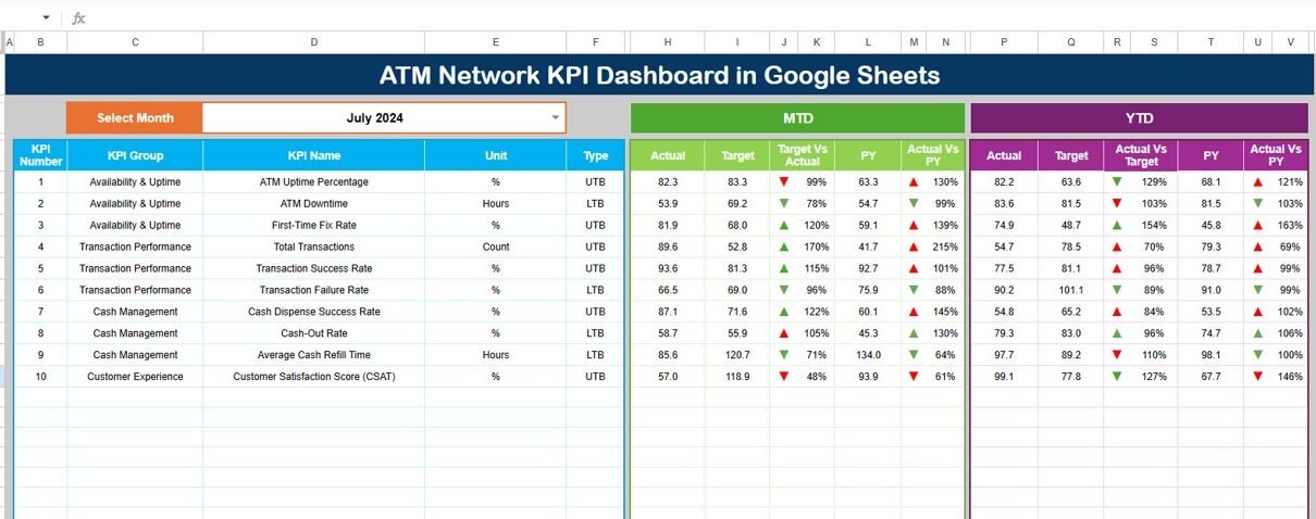
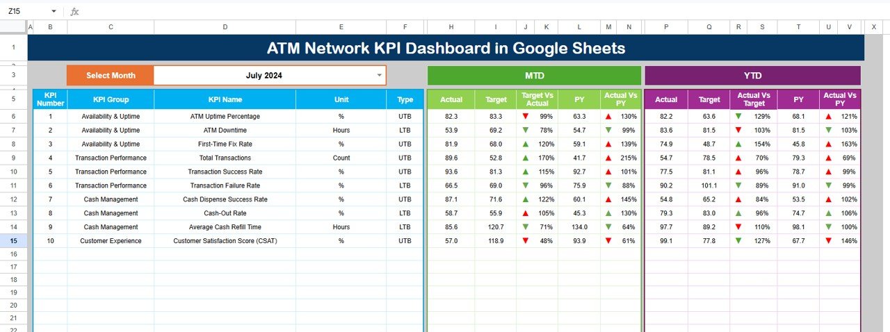
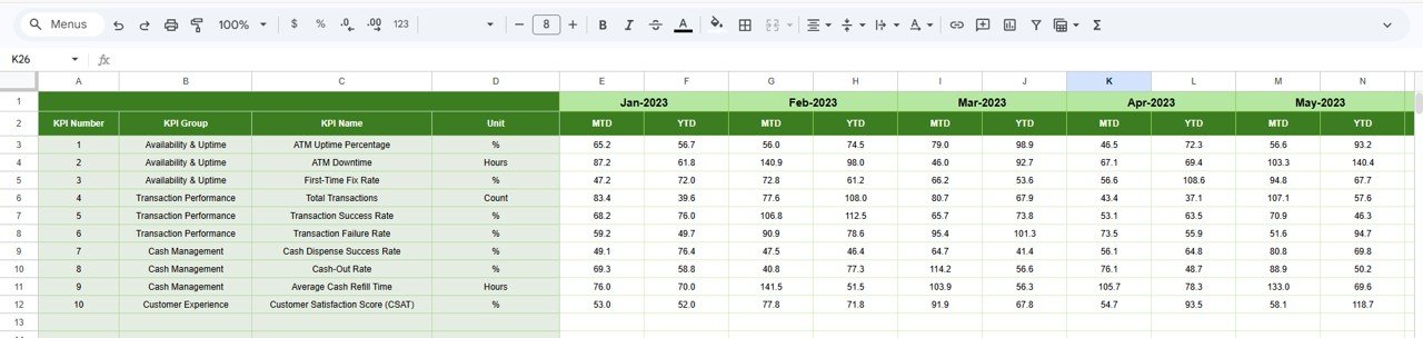
1. Dashboard Sheet
This is the main reporting page. On range D3, select any month from the dropdown and the entire dashboard updates. It displays MTD Actual, Target, and Previous Year data alongside YTD Actual, Target, and Previous Year data for every KPI. Conditional formatting arrows in the variance columns (Target vs Actual and PY vs Actual) flag performance direction instantly.
ATM Network KPI Dashboard in Google Sheets
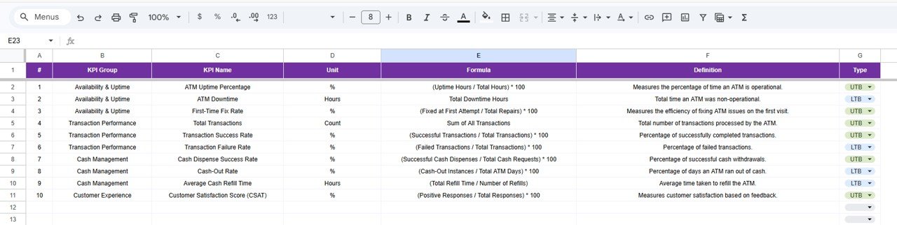
2. KPI Trend Sheet
Select any KPI name from the dropdown on range C3. The sheet displays the KPI Group, Unit of KPI, Type of KPI (Lower the Better or Upper the Better), Formula, and Definition. Below the metadata, MTD and YTD trend charts plot Actual, Target, and Previous Year numbers across months for visual trend analysis.
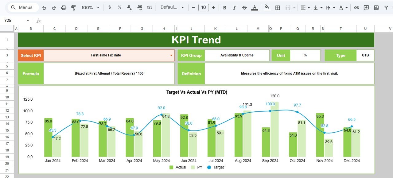
KPI Trend Sheet
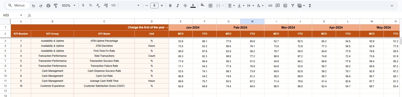
3. Actual Numbers Input Sheet
Enter the actual numbers for YTD and MTD for each month. Change the months from range E1 — input the first month of your fiscal year on cell E1 and the rest will follow. This is where your real ATM network performance data goes.
Actual Numbers Input Sheet
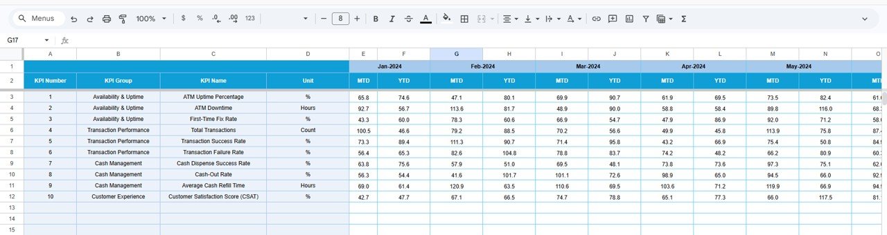
4. Target Number Input Sheet
Enter the Target numbers for each KPI for each month as MTD and YTD values. These targets form the baseline against which actual performance is measured on the Dashboard sheet.
Target Number Input Sheet
5. Previous Year Number Sheet
Enter the numbers for the previous year in the same format as the current year data. This enables the PY vs Actual comparison on the Dashboard sheet for year-over-year performance tracking.
Previous Year Number Input Sheet
6. KPI Definition Sheet
Enter each KPI Name, KPI Group, Unit, Formula, and KPI Definition. In the last column, specify the KPI type as LTB (Lower the Better) or UTB (Upper the Better). This central reference feeds into the KPI Trend page for automatic metadata display.
KPI Definition Sheet
ATM Network KPI Dashboard vs. Microsoft Excel Dashboard vs. Paid ATM Monitoring SaaS — Feature Comparison
| Feature | ATM Network KPI Dashboard (Google Sheets) | Microsoft Excel ATM Dashboard | NCR Atleos / Hyosung ATM Monitoring |
|---|---|---|---|
| Cost | $8.99 one-time | $15-25 one-time | $50-200 / ATM / month |
| Platform | Google Sheets (browser-based) | Microsoft Excel (desktop) | Proprietary web platform |
| Setup Time | Under 10 minutes | 10-15 minutes | 2-6 weeks implementation |
| Real-time Collaboration | ✅ Built-in | ❌ Requires OneDrive | ✅ Yes |
| Mobile Access | ✅ Google Sheets app | Limited | ✅ Yes |
| Customizable KPIs | ✅ Fully editable | ✅ Fully editable | ⚠️ Vendor-defined |
| Share with Link | ✅ One-click | ❌ File-based | ✅ Role-based |
| Year-1 Cost (5 Users) | $8.99 total | $15-25 + Office licenses | $3,000-12,000+ |
| PY vs Actual Comparison | ✅ Built-in | Varies | ✅ Yes |
For ATM operations teams that want structured KPI tracking without enterprise software pricing, the ATM Network KPI Dashboard in Google Sheets sits in the sweet spot.
Who Should Use This Template
👉 Click here to Purchase ATM Network KPI Dashboard in Google Sheets
Perfect for:
- ATM operations managers at banks and financial institutions tracking uptime, availability, and cash replenishment KPIs across 10-500 machines
- Regional branch managers monitoring ATM transaction volumes and error rates across multiple locations
- Finance teams at credit unions needing monthly and yearly ATM performance reports
Not a fit if:
- You need real-time IoT sensor integration with automated alerts from ATM switch providers
- Your organization requires PCI-DSS certified, SOC 2 compliant monitoring tools with audit trails
- You need automated data feeds from core banking systems — this template uses manual data entry
Real-World Use Cases
Rajesh manages ATM operations for a regional bank with 120 ATMs across 3 states. He uses the ATM Network KPI Dashboard to track cash replenishment efficiency, uptime percentage, and transaction failure rates monthly. Instead of paying $15,000/year for NCR monitoring, he enters data from branch reports and shares the Google Sheet with his regional managers for collaborative tracking.
Maria leads the self-service banking team at a credit union with 45 ATMs. She tracks customer complaint rates, average resolution time, and cash-out incidents. The Previous Year comparison helps her justify budget requests to leadership by showing measurable improvements in ATM availability quarter over quarter.
David runs ATM operations for a fintech startup deploying cash machines in retail locations. He monitors per-machine transaction volume, revenue per ATM, and maintenance costs. The KPI Trend charts help him identify underperforming locations for redeployment decisions.
Advantages of ATM Network KPI Dashboard in Google Sheets
👉 Click here to Purchase ATM Network KPI Dashboard in Google Sheets
- Zero software cost — Google Sheets is free. The $8.99 template price is a one-time payment with no recurring fees, no per-user charges, and lifetime access.
- Instant collaboration — Share with your team via a link. Multiple users can enter data and review KPIs simultaneously without version conflicts.
- Mobile-ready — View and edit from any smartphone or tablet using the free Google Sheets app.
- Flexible KPI framework — Unlike vendor-defined monitoring platforms, you control which KPIs to track, how they’re grouped, and what formulas calculate them.
- Year-over-year tracking — Built-in Previous Year comparison enables trend analysis and supports data-driven budget justifications.
Opportunities for Improvement
- Manual data entry — This template does not connect to ATM switch APIs or core banking systems. Data must be entered manually each month.
- No real-time alerts — The dashboard shows historical and period-end data. If you need real-time ATM health monitoring, a dedicated SaaS platform is better suited.
- Single-dashboard layout — The Dashboard sheet shows all KPIs in one view. For networks with 50+ distinct KPIs, the single-page layout may become dense.
Best Practices
👉 Click here to Purchase ATM Network KPI Dashboard in Google Sheets
- Define your KPIs in the KPI Definition sheet before entering any numbers. This ensures the Trend page pulls correct metadata from the start.
- Enter Previous Year data first, then Target numbers, then Actual data — this order ensures the Dashboard variance columns work correctly from day one.
- Use the LTB/UTB classification carefully. Marking a cost-based KPI as UTB will invert the conditional formatting arrows, creating misleading visuals.
- Share the Google Sheet in view-only mode with leadership and edit access only with data entry staff to prevent accidental overwrites.
- Review the KPI Trend sheet monthly to identify KPIs that consistently miss targets — these indicate structural issues that need operational changes, not just tracking.
Explore Relevant Templates
📌 Satellite Communication KPI Dashboard in Google Sheets — Track satellite uplink/downlink KPIs with MTD and YTD analysis.
📌 Distribution KPI Scorecard in Google Sheets — Monitor distribution network efficiency with scorecard tracking.
📌 IT KPI Scorecard in Excel — Track IT infrastructure KPIs including network uptime and incident response.
📌 Warehouse Management KPI Scorecard in Google Sheets — Operations KPI tracking with traffic light indicators.
Browse all Google Sheets KPI Dashboards →
Frequently Asked Questions
👉 Click here to Purchase ATM Network KPI Dashboard in Google Sheets
What KPIs does the ATM Network KPI Dashboard track?
The ATM Network KPI Dashboard in Google Sheets tracks 15+ key performance indicators including ATM uptime, transaction volume, cash replenishment efficiency, customer complaints, error rates, and maintenance costs. All metrics update automatically when you replace the sample data.
How long does setup take for this ATM dashboard?
Setup takes under 10 minutes. Define your KPIs in the KPI Definition sheet, enter target numbers, input previous year data, and add current month actuals. The Dashboard sheet calculates MTD, YTD, and variance comparisons automatically.
Can I customize the KPIs in this template?
Yes. The KPI Definition sheet gives you full control to add, rename, or remove KPIs. You define each metric’s group, unit, formula, definition, and whether it is Lower-the-Better or Upper-the-Better. The dashboard adapts automatically.
How does this compare to NCR Atleos or Hyosung monitoring software?
NCR Atleos and Hyosung monitoring platforms cost $50-200 per ATM per month and require weeks of implementation. This template costs $8.99 one-time, sets up in 10 minutes, and provides structured KPI tracking for manual reporting without enterprise software overhead.
Does this ATM dashboard work on mobile?
Yes. Since it runs in Google Sheets, you can view and edit the ATM Network KPI Dashboard on any smartphone or tablet using the free Google Sheets app. Team members can access it simultaneously from anywhere.
Can multiple team members collaborate on this dashboard?
Absolutely. Google Sheets supports real-time collaboration. Share the file via link and multiple ATM operations staff can enter data, review KPIs, and analyze trends simultaneously without version conflicts or additional licensing costs.
What is the difference between LTB and UTB KPI types?
LTB means Lower the Better — for KPIs like error rate, downtime, or customer complaints where lower values indicate better performance. UTB means Upper the Better — for KPIs like uptime percentage, transaction volume, or revenue where higher values are preferred. The dashboard uses this classification to apply correct conditional formatting.
About the Author
Built by PK — Microsoft Certified Professional with 15+ years of Excel, Google Sheets, and Power BI experience. Founder of NextGenTemplates, reaching 300K+ subscribers across YouTube channels. Every template is hand-built and tested before release. Visit Google Sheets Help Center for platform-specific guidance.
Conclusion
The ATM Network KPI Dashboard in Google Sheets gives ATM operations teams a structured, affordable, and collaborative way to track network performance without paying enterprise SaaS fees. With 15+ customizable KPIs, MTD/YTD comparisons, Previous Year benchmarking, and visual trend charts, it covers the reporting needs of banks, credit unions, and fintech companies managing 10 to 500 ATMs.
👉 Click here to Purchase ATM Network KPI Dashboard in Google Sheets
✅ Instant download · One-time payment · No subscription
🎥 Visit our YouTube channel: Youtube.com/@NeoTechNavigators