The HVAC Service Dashboard in Google Sheets tracks 4 headline KPIs across 3 interactive analysis pages, plus a Search Sheet and a Data Sheet, with 11 pre-built charts covering revenue, service type, and equipment performance. Setup takes under 10 minutes — make a copy from the link in your download, paste your service call records into the Data Sheet, and every card, chart, and slicer rebuilds automatically through Google Sheets’ native pivot engine.
🌍 Join 8,400+ teams in 40+ countries using NextGenTemplates to replace paid SaaS tools with one-time-purchase Excel, Google Sheets, Power BI, and HTML templates.
✅ Instant download · One-time payment · No subscription · No per-user fees · Lifetime access
Overview of the HVAC Service Dashboard in Google Sheets
HVAC service businesses live and die by three numbers: how much revenue did this month bring, how many calls did the crew run, and how much did the average ticket pay. The HVAC Service Dashboard in Google Sheets gives you those three answers — plus an Emergency Calls counter — in 4 KPI cards on the Overview page, refreshed every time you paste new data into the Data Sheet.
Built for HVAC contractors, multi-branch service operators, and field service consultants, the template runs entirely in the browser. No add-ons, no Apps Script edits required for daily use, and no per-user SaaS fees. You can share the dashboard with your dispatchers and technicians by link in seconds — something a paid platform like ServiceTitan or Housecall Pro would charge $99–$398 per technician per month for.
Key Features of the HVAC Service Dashboard in Google Sheets
👉 Click here to Purchase the HVAC Service Dashboard in Google Sheets
The HVAC Service Dashboard in Google Sheets ships with five sheet tabs — Overview, Service Type Analysis, Equipment Analysis, Search Sheet, and Data Sheet — engineered around the questions a service owner asks every Monday morning. Here’s what each one delivers.
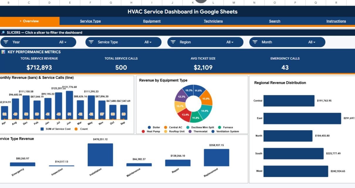
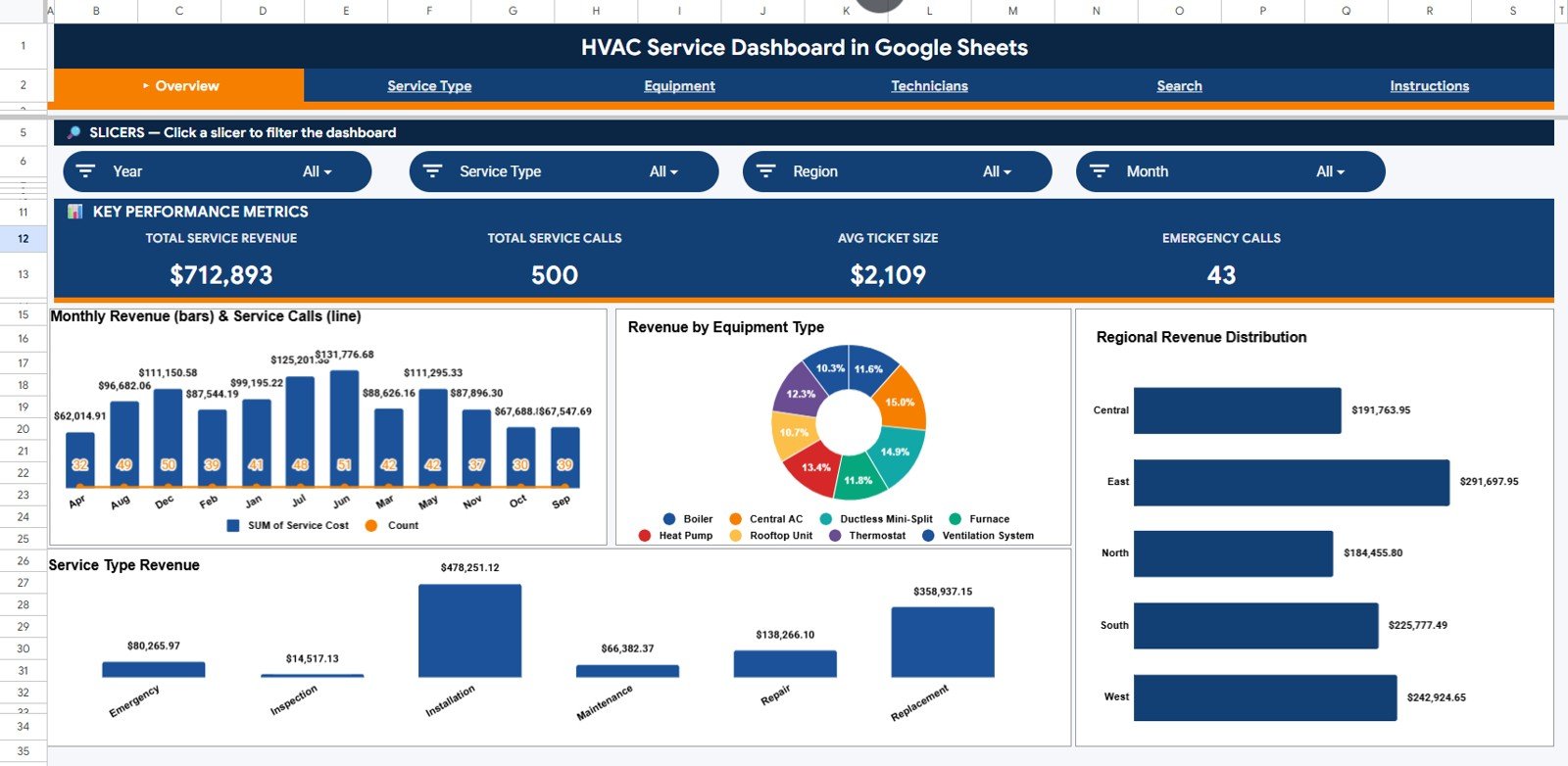
🔹 4 KPI cards on the Overview page: Total Service Revenue, Total Service Calls, Avg Ticket Size, and Emergency Calls. Slicers filter the entire dashboard by region, service type, equipment, and priority.
🔹 11 interactive charts across 3 analysis pages covering monthly revenue and call volume, equipment-level revenue, regional revenue mix, service-type income split, monthly revenue by service, calls by priority, and three equipment-level analytics.
🔹 Service Ticket Lookup (Search Sheet) – Pick or type any Service ID and instantly see Date, Service Type, Equipment Type, Brand, Customer, Technician, Service Cost, Region, Customer Type, Priority, Status, Month, and Year.
🔹 Native Google Sheets pivot tables and charts — no add-ons, no Apps Script for daily use, no admin permission needed.
🔹 Cloud collaboration by default — share view, comment, or edit access in one click.
🔹 Mobile-friendly — opens cleanly in the Google Sheets mobile app on iOS and Android for technicians and dispatchers in the field.
Dashboard Pages Explanation
1. Overview Page
The Overview page is the page every HVAC owner opens first. Four KPI cards across the top — Total Service Revenue, Total Service Calls, Avg Ticket Size, Emergency Calls — give the high-level snapshot in one second. Below that, four charts answer the next layer of questions:
🔹 Monthly Revenue and Service Calls by Month — Tracks revenue alongside call volume month over month. Helps catch summer AC peaks, winter heating spikes, and shoulder-season slowdowns before they overload dispatch or starve cash flow.
🔹 Revenue by Equipment Type — Splits revenue across air conditioners, furnaces, heat pumps, boilers, ventilation systems, and other HVAC categories. Service owners use this view to refocus marketing spend and parts inventory on the highest-revenue lines.
🔹 Revenue by Region — Ranks every service territory by revenue contribution. Multi-branch operators and franchise owners see at a glance which regions need more dispatch capacity and which underperformers need attention.
🔹 Revenue by Service Type — Splits income across installation, repair, maintenance, inspection, and emergency calls. The fastest way for an HVAC business to identify whether maintenance contracts or one-off emergency revenue is driving growth.
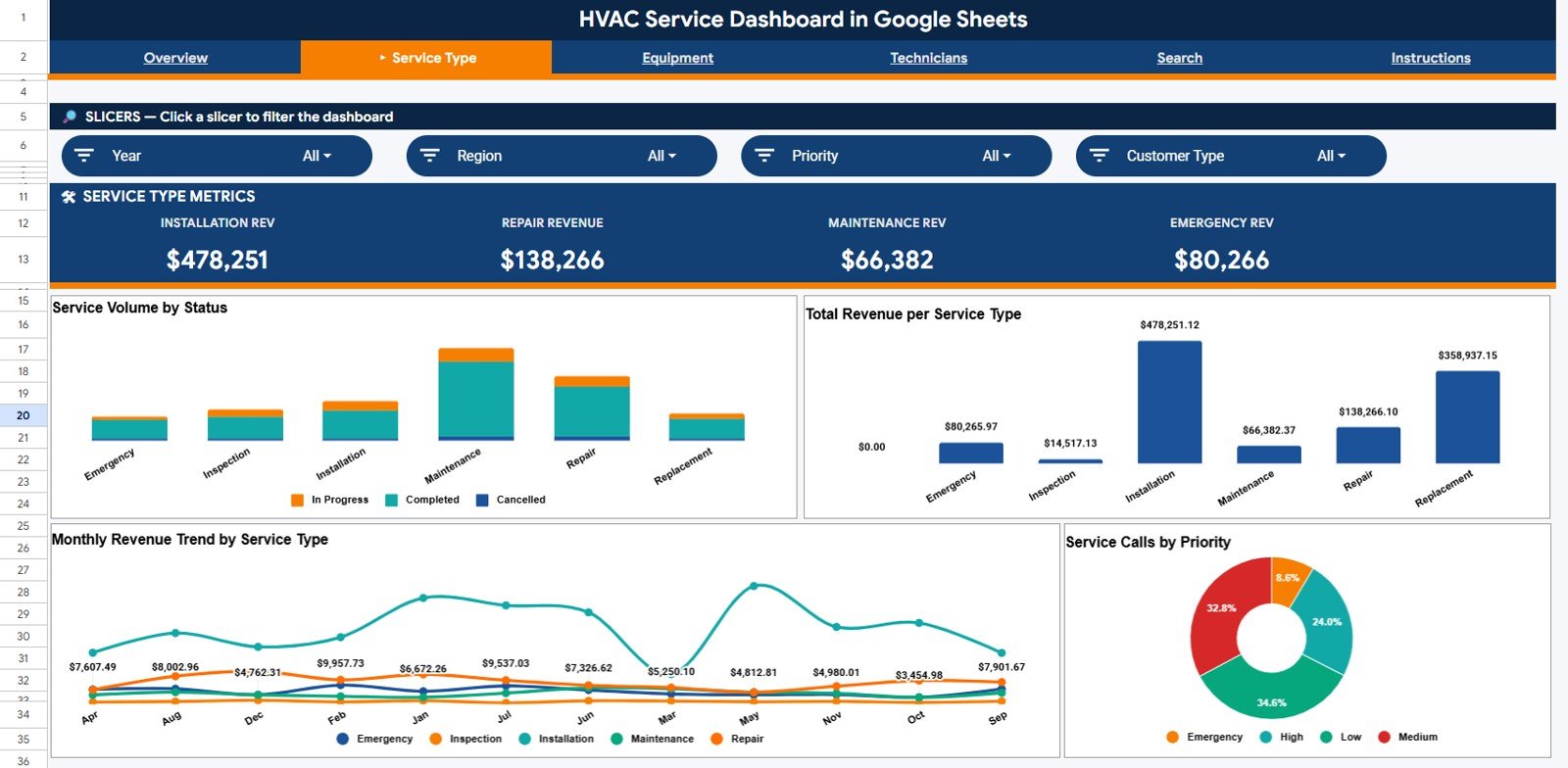
2. Service Type Analysis
👉 Click here to Purchase the HVAC Service Dashboard in Google Sheets
The Service Type Analysis page drills into the work itself — what kinds of jobs are on the call book, which ones bring in the most revenue, and how priority calls split across the month. Four visuals: Service Volume by Service Type, Revenue by Service Type, Monthly Revenue by Service Type, and Service Calls by Priority. Operations managers use this page to balance technician capacity against the service mix that pays the most.
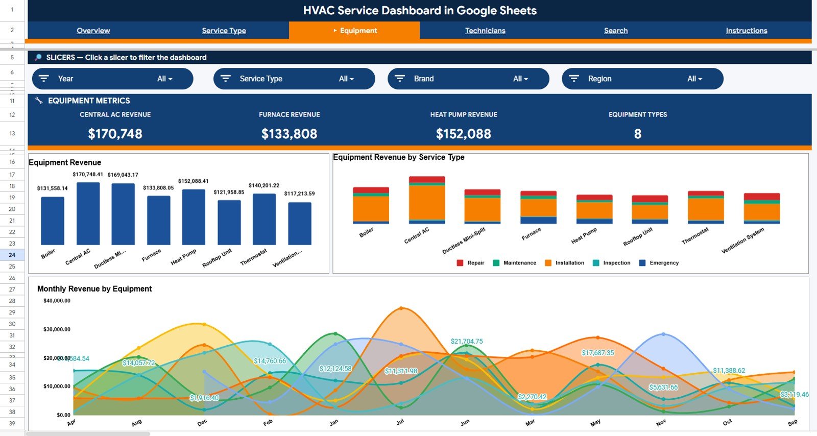
3. Equipment Analysis
The Equipment Analysis page is where service supervisors and parts buyers plan inventory and equipment-line marketing budgets. Three visuals: Equipment Revenue by Equipment Type, Equipment Revenue by Service Type, and Monthly Revenue by Equipment. Helps spot whether heat pump revenue is creeping past traditional AC revenue, or whether boiler service is shifting from repair to full replacement income.
👉 Click here to Purchase the HVAC Service Dashboard in Google Sheets
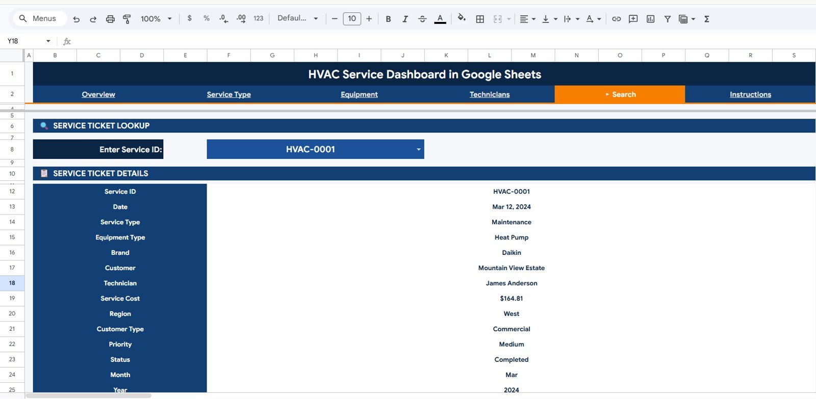
4. Search Sheet
The Search Sheet is built for technicians and dispatchers who need a clean record without scrolling through 1,000+ rows. Pick or type any Service ID into the Service Ticket Lookup field, and the entire row prints below — Date, Service Type, Equipment Type, Brand, Customer, Technician, Service Cost, Region, Customer Type, Priority, Status, Month, and Year. Perfect for follow-up calls, warranty checks, and customer complaints.
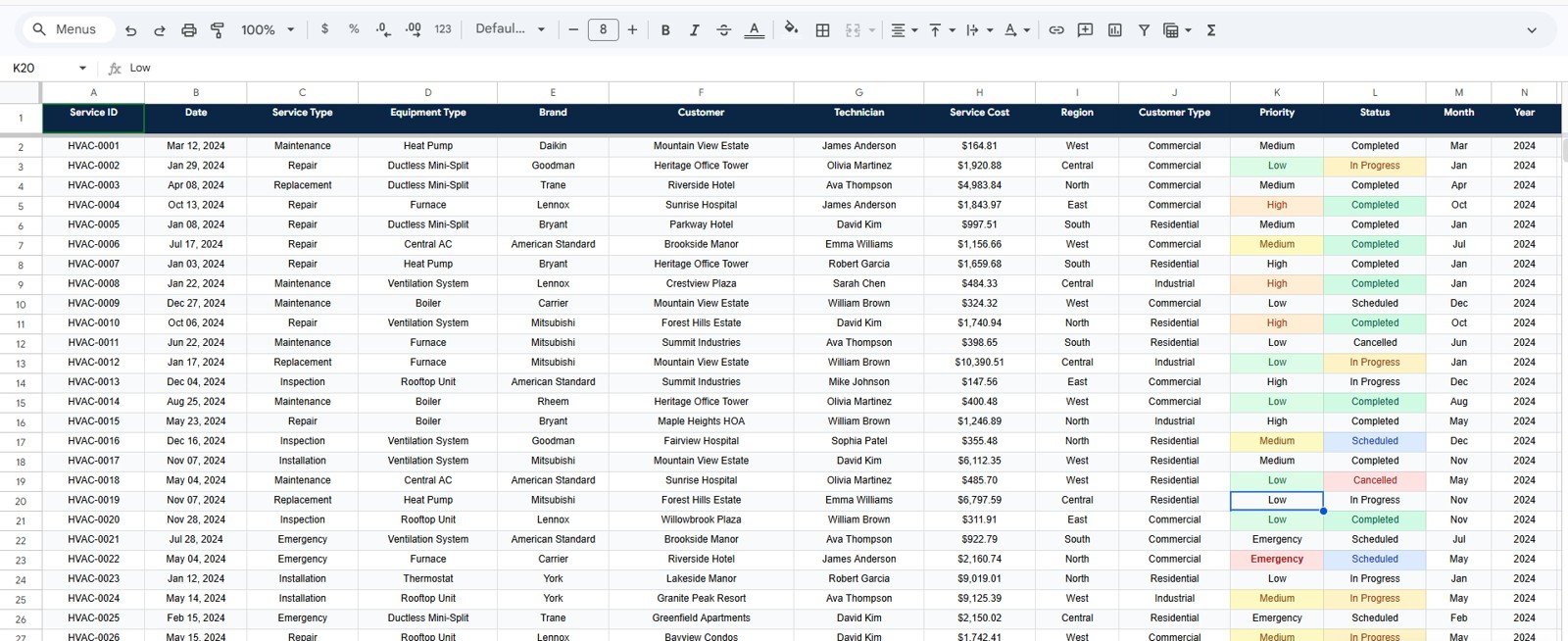
5. Data Sheet
The Data Sheet is where you paste or type your HVAC service call records in the same column order as the sample data. Every chart, KPI card, and slicer reads directly from this sheet, so adding new rows or new categories (a new region, a new equipment type, a new technician) flows through to every visual automatically — no formula edits required.
HVAC Service Dashboard in Google Sheets vs. Microsoft Excel Dashboard vs. ServiceTitan / Housecall Pro — Feature Comparison
| Feature | HVAC Service Dashboard in Google Sheets | Microsoft Excel Dashboard | ServiceTitan / Housecall Pro |
|---|---|---|---|
| Cost | $9.99 one-time | $17.99 one-time | $99–$398 / technician / month |
| Platform | Google Sheets (browser, free) | Microsoft Excel | Cloud SaaS + mobile app |
| Setup time | Under 10 minutes | Under 15 minutes | 4–8 weeks onboarding |
| Real-time team collaboration | ✅ Native — share a link | Requires SharePoint or 365 | ✅ Built-in |
| Mobile access | ✅ Google Sheets app | Limited mobile editing | ✅ Native app |
| Customizable fields and charts | ✅ Fully editable | ✅ Editable | ❌ Vendor-locked reports |
| Share with link | ✅ One click | Requires file send | User seat required |
| Year-1 cost at 5 users | $9.99 | $17.99 | $5,940 – $23,880 |
| Service ticket lookup | ✅ Built-in Search Sheet | Add-on PivotTable filter | ✅ Built-in |
For HVAC contractors who want browser-based, share-by-link service analytics without paying $99+ per technician per month, the HVAC Service Dashboard in Google Sheets sits in the sweet spot.
Who Should Use This Template
✅ Perfect for:
- Owner-operated HVAC contractors with 2–25 technicians who run their business in Google Workspace
- Multi-branch residential and commercial HVAC service companies tracking revenue across 2–10 regions
- Field service consultants who need a portable, browser-based dashboard to share with HVAC clients
- Franchise owners benchmarking emergency-call mix and average ticket size across territories
- HVAC dispatchers who want a Service ID lookup view without scrolling through thousands of rows
❌ Not a fit if:
- You run an enterprise HVAC chain that needs live GPS routing, payroll integration, and SOC 2 compliance — stick with ServiceTitan or Housecall Pro
- You prefer Microsoft Excel — pick the HVAC Service Dashboard in Excel instead
- You’re a Power BI shop that wants an interactive .pbix model — see the HVAC Service Dashboard in Power BI
Real-World Use Cases
Aman runs an 8-technician residential HVAC company in Bengaluru. He uses the HVAC Service Dashboard in Google Sheets every Monday morning to review the Revenue by Service Type chart and see whether emergency calls are starting to outweigh maintenance contract revenue — the leading indicator that his crew needs another preventive-maintenance push before the summer AC peak hits. Because the file lives in his Google Drive, his lead technician and dispatcher can look at the same numbers from the field.
Lisa manages 4 HVAC service branches for a commercial contractor in Florida. She uses the Revenue by Region visual to compare Miami, Tampa, Orlando, and Jacksonville monthly, then drills into the Equipment Revenue by Equipment Type chart to find out why one branch’s heat pump revenue is lagging — without paying $5,940 per year for ServiceTitan seats for her 5-person ops team. The Service Ticket Lookup gives her the audit trail she needs when a customer disputes a billing line.
Marcus is a field-service consultant. He customizes the HVAC Service Dashboard in Google Sheets for each new HVAC client, shares the link by email, and trains them in 30 minutes — replacing what used to be a 2-week Tableau implementation. Because everything runs in the browser, his clients can review their dashboards on a phone, tablet, or laptop without installing anything.
Advantages of the HVAC Service Dashboard in Google Sheets
👉 Click here to Purchase the HVAC Service Dashboard in Google Sheets
🔹 One-time $9.99 vs. $99–$398/technician/month — At 5 technicians, ServiceTitan or Housecall Pro can cost $5,940–$23,880 in year one. This template costs less than dinner.
🔹 Built on Google Sheets pivot tables — Adding new service types, regions, or equipment categories happens automatically. No formulas to rewrite, no charts to rebuild.
🔹 Browser-based collaboration — Share a link with your dispatcher in Phoenix and your owner in Dallas, and they edit the same file at the same time.
🔹 Service Ticket Lookup is built-in — Find any ticket in seconds without scrolling through the Data Sheet.
🔹 Mobile-ready — Field technicians look up tickets on the Google Sheets mobile app between calls.
🔹 You own the file — Customer contact details, service prices, and technician records stay in your Google Drive, not in a vendor’s cloud.
Opportunities for Improvement
Honesty matters. The HVAC Service Dashboard in Google Sheets is a reporting layer, not a full field-service management platform. It does not include live GPS dispatch, automated customer SMS, payroll integration, or invoicing. If you need those features, ServiceTitan or Housecall Pro will serve you better — at a price.
For very large datasets (50,000+ service rows), Google Sheets pivot performance can slow noticeably compared to Microsoft Excel or Power BI. If you’re running a chain with 100,000+ tickets a year, consider the HVAC Service Dashboard in Power BI instead, which is built on a columnar engine that handles large datasets more efficiently. Google has a thorough overview of how to create and use pivot tables in Google Sheets if you want to extend the dashboard yourself.
Best Practices
🔹 Keep the column order intact on the Data Sheet. The pivot tables and charts read columns by position, not name, so reordering can break the visuals.
🔹 Use consistent values for service types, regions, and equipment. “AC Repair” and “A/C Repair” will count as two different categories. Use a Data Validation dropdown if you want to lock the values.
🔹 Update the dashboard weekly, not monthly. Catching a slow region 30 days early is cheaper than catching it 90 days late.
🔹 Share with view-only access by default. Give edit access only to your dispatcher and a backup owner, so the data sheet doesn’t get accidentally overwritten.
🔹 Make a yearly archive copy. Each January, duplicate the entire file as a year-over-year snapshot, then clear the Data Sheet and start the new year fresh.
Explore Relevant Templates
🔹 HVAC Service Dashboard in Excel — Same KPI logic with pivot-driven Excel charts and 5 analytical pages for teams that live in Microsoft Excel.
🔹 HVAC Service Dashboard in Power BI — Interactive .pbix file for BI teams running Power BI Desktop.
🔹 HVAC Service Dashboard in HTML — Self-contained HTML file for offline reporting without any cloud account.
🔹 Maintenance Tasks Calendar in Google Sheets — Schedule preventive HVAC maintenance jobs alongside this revenue dashboard.
🔹 Plumbing Contractor Dashboard in Excel — Sister field-service template for plumbing operators.
🔹 Browse the full Google Sheets Dashboard collection for more cloud-based templates.
Frequently Asked Questions
👉 Click here to Purchase the HVAC Service Dashboard in Google Sheets
What KPIs does the HVAC Service Dashboard in Google Sheets track?
The HVAC Service Dashboard in Google Sheets tracks 4 headline KPIs on the Overview page: Total Service Revenue, Total Service Calls, Avg Ticket Size, and Emergency Calls. Across 3 analysis pages, it covers 11 charts spanning revenue by month, equipment, region, service type, and priority.
How does this compare to ServiceTitan or Housecall Pro?
ServiceTitan and Housecall Pro charge $99–$398 per technician per month, reaching $5,940–$23,880 per year at 5 seats. The HVAC Service Dashboard in Google Sheets is a $9.99 one-time purchase that runs in any browser, with no per-user fees and full edit and share control through your existing Google Workspace account.
How long does setup take?
Setup takes under 10 minutes. Make a copy to your Google Drive, open the Data Sheet, paste your HVAC service call records in the same column order as the sample data, and every KPI card, chart, and slicer on the Overview, Service Type Analysis, and Equipment Analysis pages updates automatically.
Do I need a paid Google Workspace account to use this template?
No. The HVAC Service Dashboard in Google Sheets works on any free personal Google account. A paid Google Workspace plan is optional — useful if you want admin controls, longer file retention, and shared team drives, but not required for daily operation.
Can I add my own service types, regions, or equipment categories?
Yes. Add any new service types, regions, equipment categories, technicians, or priority levels directly to the Data Sheet. The pivot tables and charts on the Overview, Service Type Analysis, and Equipment Analysis pages pick up the new values automatically — no formula edits needed.
Does the dashboard work on mobile?
Yes. The HVAC Service Dashboard in Google Sheets opens in the Google Sheets mobile app on iOS and Android. Field technicians can look up a Service ID on the Search Sheet from a job site, and dispatchers can review the Overview page from a phone between calls.
Can I share this with my team without paying per user?
Yes. Click Share in Google Sheets, paste the email addresses of your dispatchers, technicians, or owners, and grant view, comment, or edit access. There are no per-user fees from NextGenTemplates — your $9.99 covers unlimited internal users.
About the Author
Built by PK — Microsoft Certified Professional with 15+ years of Excel, Google Sheets, and Power BI experience. Founder of NextGenTemplates, reaching 300K+ subscribers across YouTube channels. Every template is hand-built and tested before release.
Conclusion
The HVAC Service Dashboard in Google Sheets gives owner-operators and multi-branch HVAC service companies a clean, browser-based way to track revenue, calls, ticket size, and emergency volume — without committing to a per-technician SaaS subscription. The 4 KPI cards, 11 charts across 3 analysis pages, plus the Service Ticket Lookup, cover the questions that come up in every Monday-morning review.
👉 Click here to Purchase the HVAC Service Dashboard in Google Sheets
✅ Instant download · One-time payment · No subscription
🎥 Visit our YouTube channel for step-by-step video tutorials
👉 Youtube.com/@NeoTechNavigators