Oil and gas reporting becomes difficult when production, revenue, operating cost, well status, and transaction details live in separate exports. The Oil and Gas Analysis Dashboard in Google Sheets solves that problem with 6 structured tabs, 4 executive KPI cards, 20+ analysis views, slicer-based filtering, and a searchable transaction lookup page. Instead of rebuilding reports every week, teams can refresh one Google Sheets dashboard and review production, revenue, and operations from the same file.Oil and Gas Analysis Dashboard in Google Sheets
This template is designed for analysts, finance controllers, operations managers, and consultants who need a collaborative dashboard without paying for a full BI subscription. Because it runs in Google Sheets, users can share the file, work in the browser, and control access with standard Google sharing permissions. Google also explains how sharing and collaboration work in Google Docs Editors sharing settings.Oil and Gas Analysis Dashboard in Google Sheets
Click here to view the Oil and Gas Analysis Dashboard in Google Sheets on NextGenTemplates.
Key Features of Oil and Gas Analysis Dashboard in Google Sheets
- Overview dashboard with Total Revenue, Total Production Volume, Producing Transactions, and Net Margin cards.
- Production Analysis tab for region, well type, operator, month, and product type production views.
- Revenue Analysis tab for product type, quality grade, operator, month, and regional product mix reporting.
- Operations Analysis tab for operating cost, well status, well type, and status-by-region tracking.
- Search Analysis tab for Transaction ID lookup across date, region, product type, well, operator, cost, volume, status, quality, month, and year.
- Data sheet tab where users replace the sample records in the same format.
- Multiple slicers to filter dashboards quickly by fields such as region, month, product type, operator, well type, status, and quality grade.
- Editable Google Sheets structure so teams can adjust fields, formulas, colors, and charts for internal reporting.
Dashboard Pages Explanation
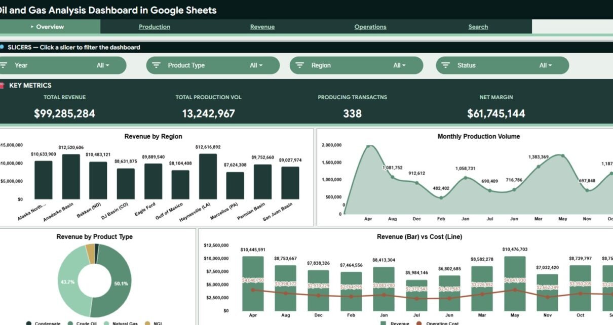
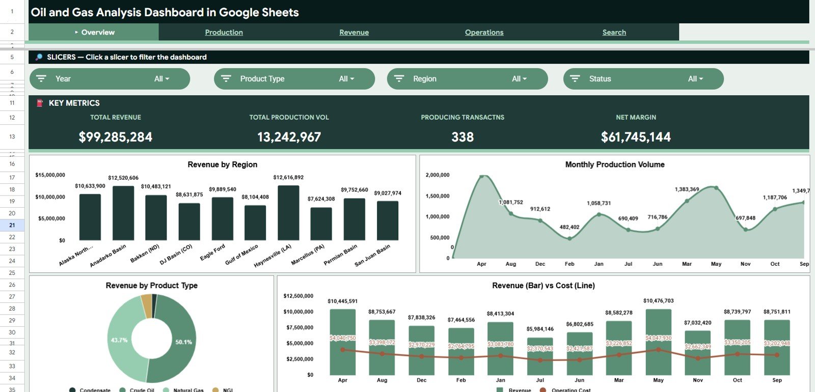
1. Overview Page
The Overview page is built for a fast executive read. At the top, the dashboard shows four cards: Total Revenue, Total Production Volume, Producing Transactions, and Net Margin.
Total Revenue summarizes the full revenue value for the selected filters. It gives finance and leadership teams a quick answer to how much commercial value the selected period, region, or product mix produced.Oil and Gas Analysis Dashboard in Google Sheets
Total Production Volume shows the total output captured in the data. This card helps operations teams compare revenue movement against actual production movement.Oil and Gas Analysis Dashboard in Google Sheets
Producing Transactions counts the transaction records that represent producing activity. It is useful for quickly understanding activity volume before reviewing detailed well or operator performance.Oil and Gas Analysis Dashboard in Google Sheets
Net Margin shows the difference between revenue and operating cost. This card is often the most important commercial indicator because higher production does not always mean stronger margin.
Revenue by Region compares revenue across operating regions. It helps teams identify which basins, fields, territories, or business regions are contributing the most revenue.
Production Volume by Month displays monthly production movement. This makes seasonal changes, maintenance impacts, and month-over-month production swings easier to see.
Revenue by Product Type breaks revenue into the product categories used in the dataset. Teams can use it to see whether revenue depends on one product stream or is spread across oil, gas, condensate, or other categories.
Revenue and Operating Cost by Month places revenue and cost trends in the same monthly view. It is useful for seeing whether margins are improving or shrinking over time.
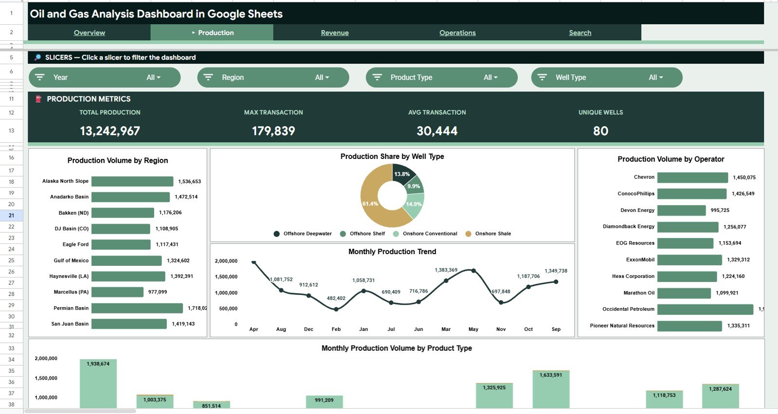
2. Production Analysis
The Production Analysis tab focuses on operational output. It helps teams understand where production volume is coming from and how it changes by region, well type, operator, product type, and month.
Production Volume by Region ranks regions by total output. This chart helps operations managers compare field-level or regional production without rebuilding pivot tables manually.
Production Share by Well Type shows the percentage share of production by well classification. It helps compare the production mix between horizontal, vertical, offshore, or any custom well type used in the source data.
Production Volume by Operator compares output by operator. This is useful for partner performance reviews, contractor analysis, and internal operator-level accountability.
Production Volume by Month tracks output across months. Use this trend to detect production dips, ramp-up periods, and changes after maintenance or operational changes.
Production Volume by Product Type and Month combines product type with monthly movement. This view shows whether each product category is growing, declining, or remaining steady over time.
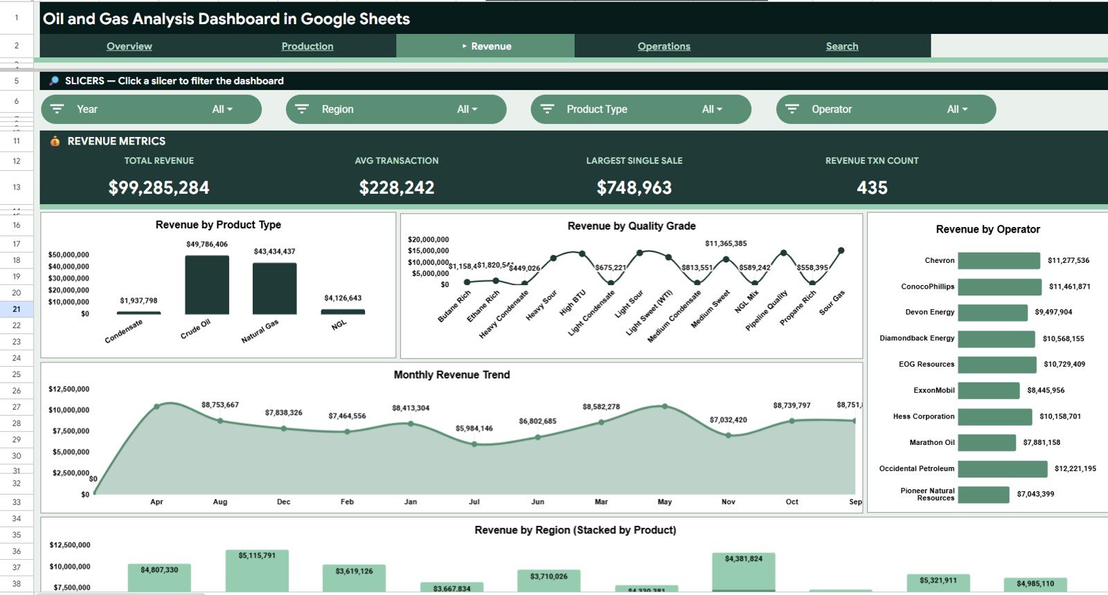
3. Revenue Analysis
The Revenue Analysis tab turns commercial data into product, quality, operator, month, and region-level insights. It is especially useful for finance reviews and monthly business reporting.
Revenue by Product Type shows which product categories generate the most revenue. This gives decision-makers a clearer view of product contribution instead of looking only at total revenue.
Revenue by Quality Grade compares revenue across quality grades. It helps teams see whether higher-grade output is producing a meaningful revenue advantage.
Revenue by Operator breaks revenue down by operator. This supports operator scorecards, partner discussions, and internal performance comparisons.
Revenue by Month shows monthly top-line movement. It helps analysts explain whether revenue changes are isolated to one month or part of a broader trend.
Revenue by Region and Product Type combines geographic and product-level revenue analysis. This makes it easier to see whether each region is diversified or dependent on one product type.
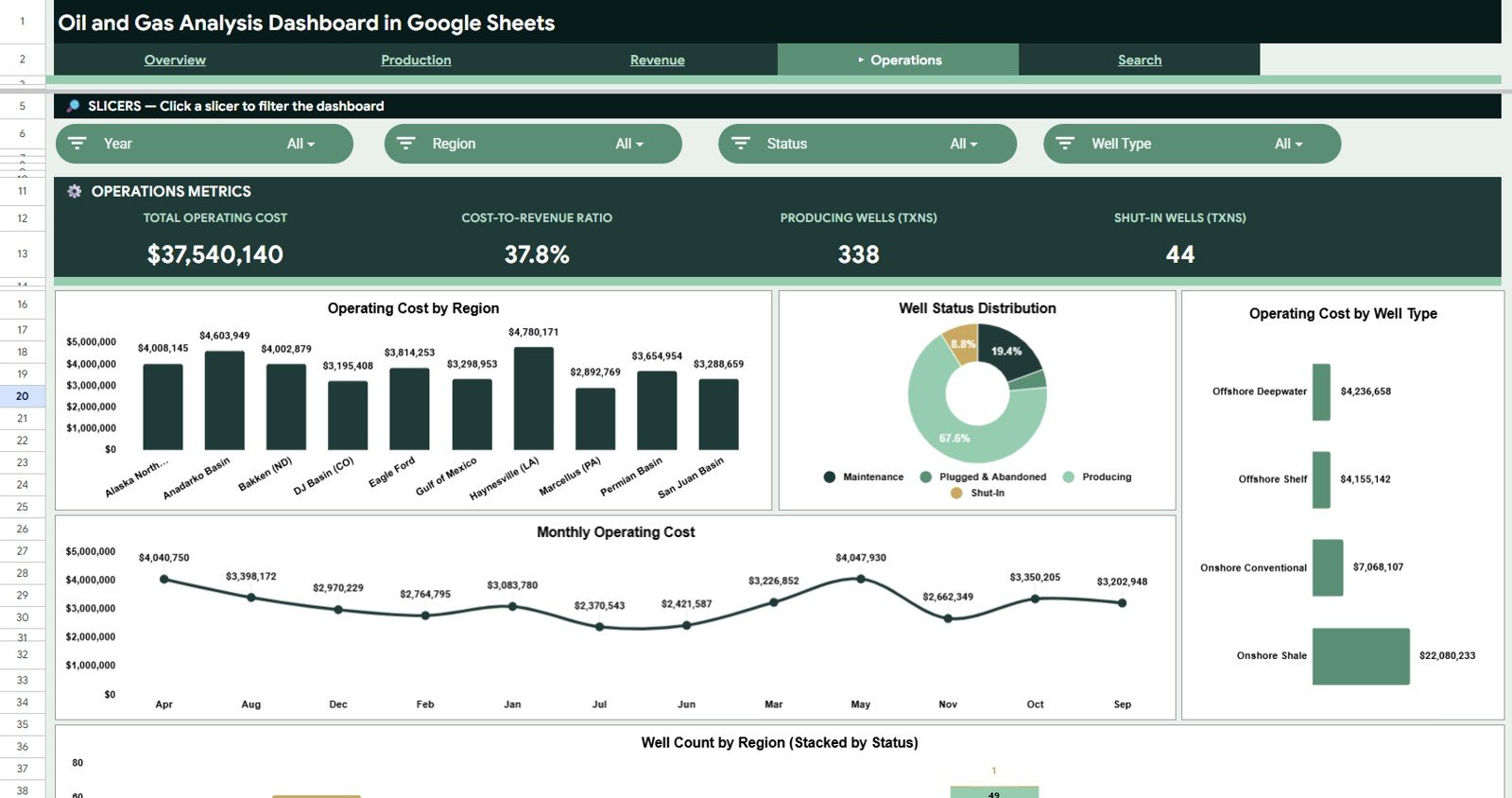
4. Operations Analysis
The Operations Analysis tab is built for cost control and asset status review. It helps teams find where operating costs are concentrated and how well status varies across the business.
Operating Cost by Region compares cost levels across regions. This highlights high-cost operating areas and helps managers decide where deeper cost analysis is needed.
Well Status Distribution by Status shows the count or share of wells by status. It helps teams quickly see producing, non-producing, maintenance, shut-in, or inactive status groups.
Operating Cost by Well Type compares cost by well classification. This can reveal whether specific well types create higher operating burden than others.
Operating Cost by Month tracks monthly cost movement. Teams can use this chart to identify unusual cost spikes and connect them to maintenance, labor, logistics, or service activity.
Well Count by Region and Status combines region and well status in one view. It helps managers see where non-producing or maintenance wells are concentrated.
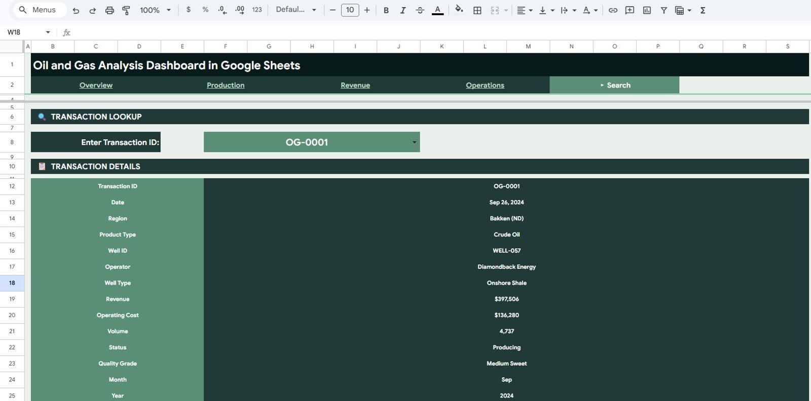
5. Search Analysis
The Search Analysis tab is a transaction lookup page. It is designed for quick investigation when a manager, analyst, or finance reviewer wants to inspect one record without scrolling through the full Data sheet.
Transaction Details by Transaction ID returns all key fields attached to a selected transaction. This reduces lookup time when reviewing exceptions, unusually high costs, or specific well activity.
Date by Transaction ID shows when the transaction occurred. This supports monthly reporting, audit checks, and period-based review.
Region by Transaction ID identifies the region connected to the selected record. It helps connect a transaction to the right operating geography.
Product Type by Transaction ID shows the product stream tied to the transaction. This is useful when revenue or volume needs to be reviewed by product category.
Well ID by Transaction ID identifies the specific well record. Analysts can use this field to connect financial activity back to a physical asset.
Operator by Transaction ID shows the responsible operator. This supports partner review, internal accountability, and transaction validation.
Well Type by Transaction ID displays the classification of the well. This can help explain cost or volume differences between well groups.
Revenue by Transaction ID returns the revenue value for the selected transaction. It helps finance reviewers validate individual revenue records.
Operating Cost by Transaction ID returns the cost attached to the selected transaction. It is useful for exception review when costs appear unusually high or low.
Volume by Transaction ID shows the production volume tied to the transaction. Teams can compare the revenue and cost values against physical output.
Status by Transaction ID shows the well or transaction status. This helps users understand whether a record is tied to producing, maintenance, shut-in, or another status group.
Quality Grade by Transaction ID displays the quality classification. This helps explain pricing or revenue differences between records.
Month by Transaction ID returns the month used in dashboard reporting. It helps validate that a record is feeding the expected period.
Year by Transaction ID returns the reporting year. This supports annual checks, period filtering, and historical analysis.
6. Data Sheet Tab
The Data sheet is the source table for the entire dashboard. Users should add their data in the same column format so the cards, charts, slicers, and lookup formulas continue working correctly.
This sheet is intentionally structured for repeat use. Each new reporting cycle can be added by replacing or appending records, then reviewing the updated dashboard tabs.
Oil and Gas Analysis Dashboard in Google Sheets vs. Excel vs. Paid Energy BI SaaS – Feature Comparison
| Feature | Google Sheets Dashboard | Microsoft Excel Dashboard | Paid Energy BI SaaS |
|---|---|---|---|
| Cost | $9.99 one-time | One-time template purchase | Monthly or annual subscription |
| Platform | Google Sheets browser workflow | Excel desktop workflow | Vendor-hosted platform |
| Setup time | Under 10 minutes with matching data | Under 10 minutes | Implementation and onboarding required |
| Real-time team collaboration | Yes, through Google Sheets sharing | Limited unless using Microsoft 365 cloud sharing | Usually yes |
| Mobile access | Google Sheets app or browser | Excel app with limitations | Usually included |
| Customizable fields | Fully editable | Fully editable | Often limited by vendor settings |
| Share with link | Yes | Only with cloud storage setup | Usually yes |
| Year-1 cost at 5 users | $9.99 total | Template price only | $6,000+ possible depending on vendor |
| Transaction search page | Included | Depends on workbook version | Usually available, but vendor-controlled |
| Oil and gas chart structure | Pre-built for production, revenue, and operations | Pre-built in the Excel version | Requires configuration |
Who Should Use This Template
- Oil and gas operations analysts who need a clean reporting layer for production and well status data.
- Finance controllers who want to connect revenue, operating cost, and net margin in one dashboard.
- Operations managers who review regional production volume, operating cost, and well status every week.
- Energy consultants who need a fast client-ready dashboard in Google Sheets.
- Small and mid-sized energy teams that want browser-based collaboration without investing in a full BI platform.
Real-World Use Cases
Weekly production review: An operations analyst filters Production Analysis by region and product type to explain which areas delivered the highest output for the week.
Monthly finance close: A controller uses Revenue Analysis and Operations Analysis together to explain whether margin movement came from production changes, product mix, or higher operating cost.
Client consulting report: An energy consultant replaces the sample Data sheet with client records, adjusts the color theme, and shares the Google Sheets file as a read-only dashboard for review.
Transaction audit check: A finance reviewer uses the Search Analysis page to pull every field attached to one Transaction ID, including revenue, operating cost, volume, quality grade, and well details.
Advantages of Oil and Gas Analysis Dashboard in Google Sheets
- Fast setup: replace sample data and start reviewing dashboard results.
- Low cost: one-time price instead of monthly software fees.
- Collaboration: share the dashboard with teammates in Google Drive.
- Operational clarity: production, revenue, and operating cost are connected in one reporting file.
- Flexible structure: edit formulas, charts, fields, and colors to match your reporting style.
- Searchable records: transaction-level lookup reduces time spent scrolling through raw data.
Opportunities for Improvement
This dashboard is intentionally lightweight and spreadsheet-based, so it is not a replacement for a full enterprise data warehouse. Teams with live SCADA feeds, ERP integrations, automated ETL pipelines, or strict role-based security may need to connect this reporting structure to a larger system.
The template also depends on consistent source data. If column names or source formats change often, users should create a standard export format before relying on the dashboard for recurring reporting.
Best Practices
- Keep one consistent Data sheet format for every reporting cycle.
- Use clear Transaction IDs so the Search Analysis page can return accurate details.
- Review Net Margin together with Revenue and Operating Cost, not in isolation.
- Check well status definitions before comparing regions or operators.
- Protect formula cells after customizing the dashboard to avoid accidental edits.
- Create a backup copy before making large structural changes.
- Use Google Sheets sharing permissions carefully when working with commercial or operational data.
Explore Relevant Templates
- Oil and Gas Analysis Dashboard in Power BI – ideal when you need Power BI Desktop, DAX measures, and Power BI Service publishing.
- Oil and Gas Analysis Dashboard in Excel – ideal when your reporting team prefers Excel workbooks and pivot-table workflows.
- Industrial Safety KPI Dashboard in Google Sheets – useful for pairing operations reporting with safety performance tracking.
- Textiles & Apparel Manufacturing Dashboard in Excel – another operations-focused dashboard for production and cost review.
Frequently Asked Questions
What is the Oil and Gas Analysis Dashboard in Google Sheets?
It is a Google Sheets dashboard template for analyzing revenue, production volume, operating cost, well status, product type, quality grade, operator performance, and transaction details.
How many pages are included?
The template includes 6 tabs: Overview, Production Analysis, Revenue Analysis, Operations Analysis, Search Analysis, and Data.
What KPI cards are shown on the Overview page?
The Overview page includes Total Revenue, Total Production Volume, Producing Transactions, and Net Margin.
Can I use this with my own data?
Yes. Replace the sample records in the Data sheet while keeping the same format, then review the updated cards, charts, slicers, and lookup results.
Does it work for both oil and gas operations?
Yes. The structure supports product type, well type, operator, region, volume, revenue, operating cost, quality grade, and status fields, so it can be adapted for oil, gas, condensate, and related product categories.
Is this a live monitoring dashboard?
No. It is a Google Sheets reporting dashboard based on structured data. It does not directly connect to live field systems unless your team adds its own integration.
Can I customize the dashboard?
Yes. You can edit charts, formulas, colors, tabs, and data fields because the dashboard is delivered as an editable Google Sheets copy.
About the Author
Built by PK – Microsoft Certified Professional with 15+ years of Excel, Google Sheets, and Power BI experience. Founder of NextGenTemplates, reaching 300K+ subscribers across YouTube channels. Every template is hand-built and tested before release.
Conclusion
The Oil and Gas Analysis Dashboard in Google Sheets is a practical reporting template for teams that want to analyze production volume, revenue, operating cost, well status, and transaction details without building a dashboard from scratch. Its Overview, Production Analysis, Revenue Analysis, Operations Analysis, Search Analysis, and Data tabs give users a structured workflow for recurring oil and gas reporting.
For teams that need collaborative browser-based reporting, this Google Sheets version is a strong fit. For teams that prefer Power BI or Excel, the related templates give the same business domain a different reporting platform.
Click here to get the Oil and Gas Analysis Dashboard in Google Sheets.
Visit our YouTube channel for step-by-step tutorials: Youtube.com/@NeoTechNavigators