SaaS Financial Model Dashboard in Google Sheets is a powerful, ready-to-use spreadsheet dashboard built for SaaS founders, CFOs, finance teams, and startup operators who need to monitor Monthly Recurring Revenue (MRR), Annual Recurring Revenue (ARR), Customer Acquisition Cost (CAC), Lifetime Value (LTV), subscription health, and cash flow from a single Google Sheets workbook. This template includes 4 dynamic dashboard pages, a search page, and a structured data sheet with sample SaaS subscription records that auto-update when you add your own data 📊💰.SaaS Financial Model Dashboard in Google Sheets
Whether you’re preparing for a board meeting, conducting due diligence, or simply tracking your startup’s financial health, this dashboard provides instant clarity on every critical SaaS metric. It eliminates manual spreadsheet work by auto-calculating KPIs and rendering professional charts that update in real time. Let’s explore what’s inside each page of this SaaS Financial Model Dashboard in Google Sheets.
Key Features of SaaS Financial Model Dashboard in Google Sheets
This Google Sheets SaaS dashboard delivers complete financial visibility across 4 interactive analysis pages with dynamic charts and built-in slicers. It tracks 5 key performance indicators — Total MRR, Total ARR, Average Lifetime Value, Average CAC, and Total Customers — and includes dedicated pages for Revenue analysis, Unit Economics, and Cash Flow tracking. The template uses formula-driven charts that auto-refresh when you update the data sheet, requiring zero coding or scripting knowledge.
- 4 interactive dashboard pages with dynamic charts and KPI cards
- 5 KPI cards on the Overview page — Total MRR, Total ARR, Avg LTV, Avg CAC, Total Customers
- Built-in slicers for instant filtering by Plan Type, Region, Industry, and Subscription Status
- Dedicated Revenue, Unit Economics, and Cash Flow analysis pages
- Search page for individual customer record lookups
- Structured data sheet — replace sample data and everything auto-updates
- No macros, no coding — pure Google Sheets formulas and charts
- Professional design suitable for investor presentations and board meetingsSaaS Financial Model Dashboard in Google Sheets
Dashboard Pages Explanation
👉 Click here to Purchase SaaS Financial Model Dashboard in Google Sheets
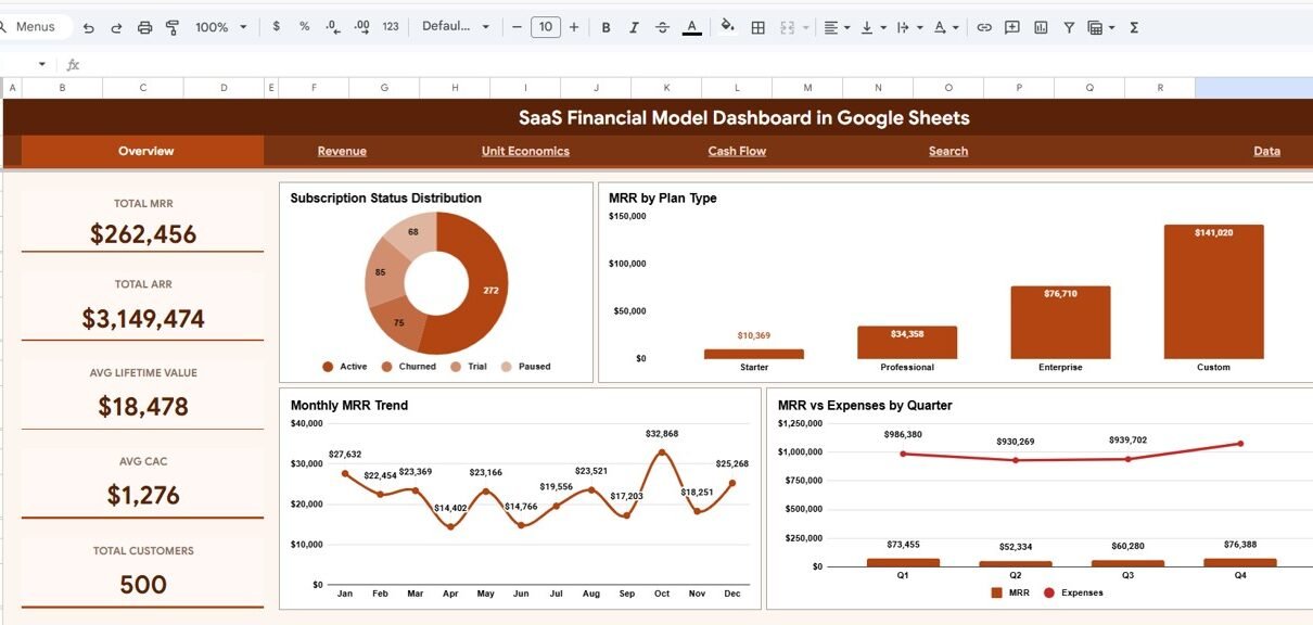
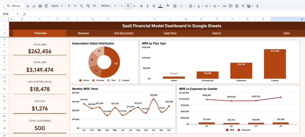
1. Overview Page
The Overview page is the landing page of the SaaS Financial Model Dashboard. At the top, 5 KPI cards provide high-level metrics at a glance: Total MRR shows your aggregate monthly recurring revenue, Total ARR displays the annualized figure, Avg Lifetime Value reveals the average revenue per customer over their entire lifecycle, Avg CAC shows the average cost to acquire each customer, and Total Customers provides the headcount of active subscribers.SaaS Financial Model Dashboard in Google Sheets
Below the KPI cards, 4 analytical charts break down your SaaS data visually. The Subscription Status Distribution chart shows how your customers are split across active, churned, and trial statuses. MRR by Plan Type reveals which subscription tiers contribute the most revenue. The Monthly MRR Trend chart tracks revenue trajectory over time, and MRR vs Expenses by Quarter compares income against costs to highlight profitability trends. Interactive slicers allow instant filtering across the entire dashboard.SaaS Financial Model Dashboard in Google Sheets
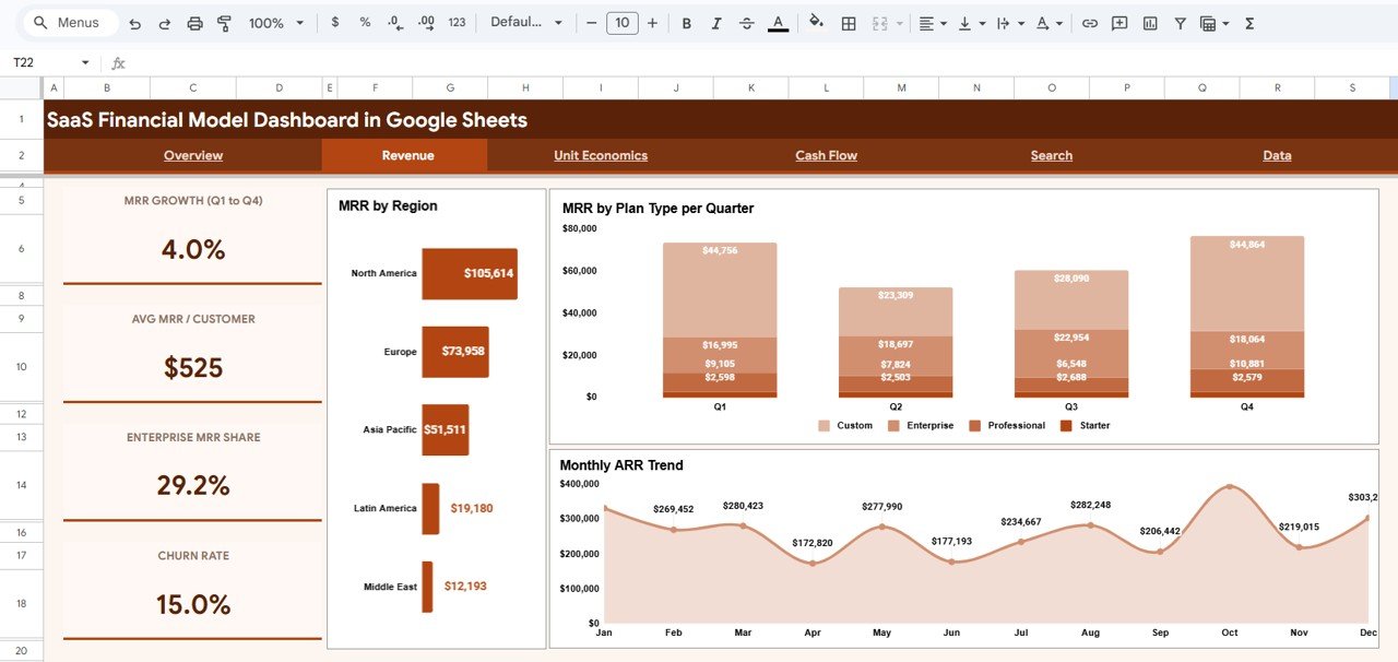
SaaS Financial Model Dashboard in Google Sheets2. Revenue Page
The Revenue page provides deeper analysis of your SaaS revenue streams. The MRR by Region chart breaks down monthly recurring revenue across geographic regions, helping you identify your strongest and weakest markets. MRR by Plan Type per Quarter provides a stacked view showing how each subscription tier contributes to quarterly revenue, making it easy to spot plan-level growth or decline. The Monthly ARR Trend chart tracks your annualized recurring revenue over time, giving you a clear picture of overall growth trajectory and momentum.
 Revenue Analysis Page
3. Unit Economics Page
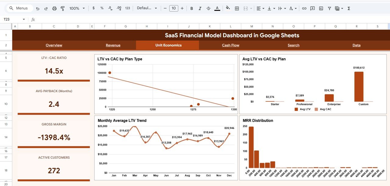
The Unit Economics page is essential for understanding customer profitability and acquisition efficiency. The LTV vs CAC by Plan Type chart compares lifetime value against acquisition cost for each subscription tier, instantly revealing which plans are most profitable. The Avg LTV vs CAC by Plan chart provides a side-by-side comparison for quick decision-making. Monthly Average LTV Trend tracks how customer value evolves over time, and the MRR Distribution by Range histogram shows how your revenue is concentrated across different MRR bands — helping identify customer segments that drive the most value.
 Unit Economics Page
4. Cash Flow Page
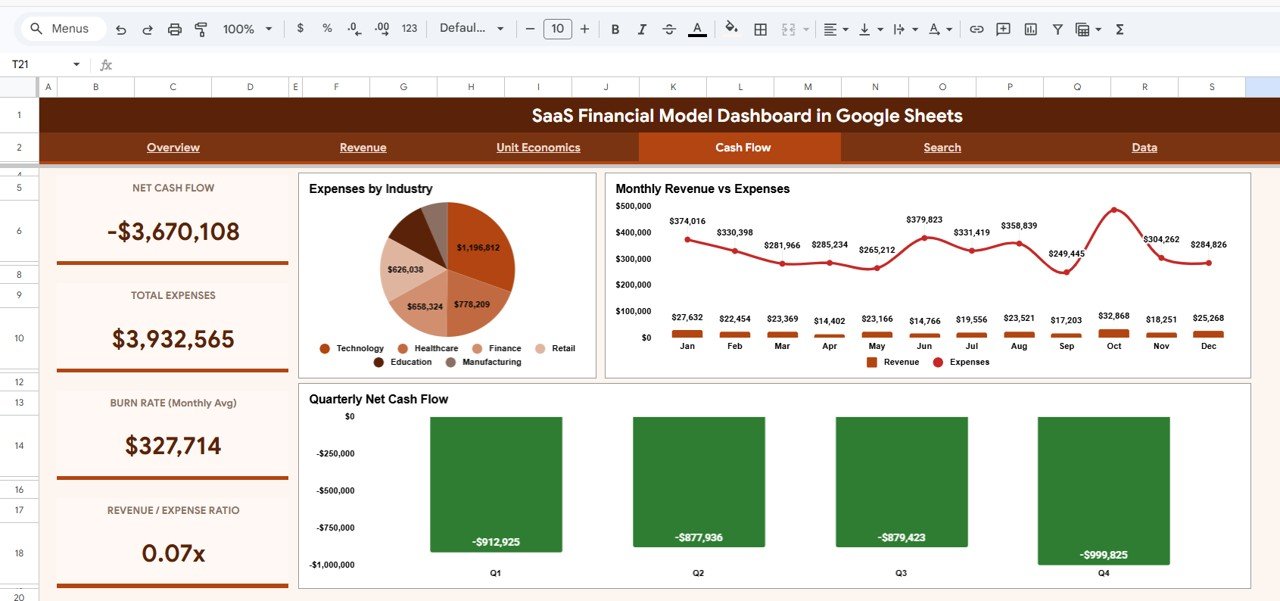
The Cash Flow page focuses on financial sustainability and expense management. Expenses by Industry breaks down where your costs are concentrated across different industry verticals. Monthly Revenue vs Expenses provides a trend comparison showing whether your SaaS business is generating positive cash flow or burning through reserves. The Quarterly Net Cash Flow chart aggregates the difference between revenue and expenses per quarter, giving a clear view of cash position and runway. This page is especially useful when presenting to investors or managing operational budgets.
 Cash Flow Page
5. Search Page
The Search page allows you to look up any customer record by Record ID. Once selected, the page displays complete details including Record ID, Date, Customer ID, Customer Name, Plan Type, Subscription Status, MRR, ARR, CAC, LTV, and Monthly Expense. On the right side, it also displays all records that share the same Plan Type for quick comparison — making it easy to benchmark individual customers against their plan cohort.
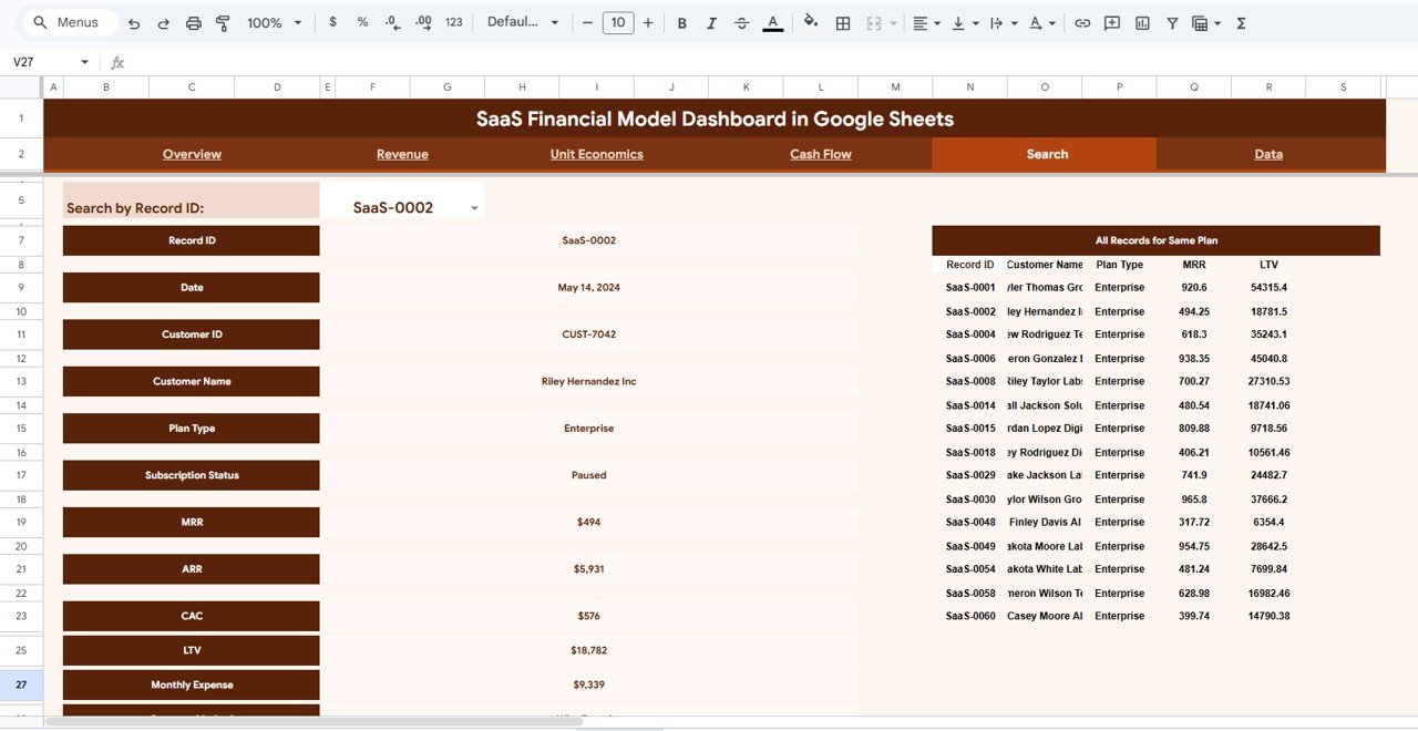 Search Sheet Tab
6. Data Sheet Tab
The Data sheet contains all the raw SaaS subscription records that power the dashboard. Each row represents a customer record with fields for Record ID, Date, Customer ID, Customer Name, Plan Type, Subscription Status, Region, Industry, MRR, ARR, CAC, LTV, and Monthly Expense. To use this template with your own data, simply replace the sample records with your actual subscription data in the same column format — all KPI cards, charts, and slicers across the dashboard will auto-update instantly.
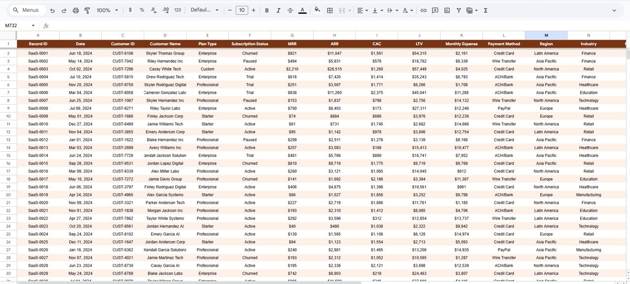 Data Sheet Tab
Advantages of SaaS Financial Model Dashboard in Google Sheets
- Instant financial visibility — See MRR, ARR, LTV, CAC, and customer metrics in one place without switching between tools.
- Zero setup required — Copy the template to your Google Drive, paste your data, and the dashboard is ready. No add-ons, APIs, or coding needed.
- Investor-ready format — Clean, professional charts and KPIs that can be shared directly in board meetings, pitch decks, or due diligence reports.
- Unit economics clarity — Understand which plans, regions, and customer segments generate the highest return on acquisition spend.
- Cash flow monitoring — Track revenue vs expenses by month and quarter to manage runway and make informed spending decisions.
- Collaborative by nature — Being in Google Sheets, multiple team members can view and collaborate in real time.
Opportunities for Improvement
👉 Click here to Purchase SaaS Financial Model Dashboard in Google Sheets
- Adding a churn analysis page with monthly churn rate, churned MRR, and retention cohort charts would deepen subscription health insights.
- A cohort analysis view could show revenue retention by signup month, helping identify long-term customer value trends.
- Integration with Google Apps Script could enable automated email alerts when MRR drops below a threshold or CAC exceeds LTV.
- Adding a forecast/projection section with scenario modeling (best/worst/base case) would enhance strategic planning capabilities.
Best Practices for Using This Dashboard
- Update data monthly — Refresh the Data sheet at the end of each month for accurate MRR and ARR tracking.
- Use consistent plan names — Keep Plan Type values consistent (e.g., always “Enterprise” not sometimes “enterprise” or “ENTERPRISE”) so slicers and charts aggregate correctly.
- Monitor LTV/CAC ratio — A healthy SaaS business typically maintains an LTV/CAC ratio above 3:1. Use the Unit Economics page to track this continuously.
- Review cash flow quarterly — The Cash Flow page’s quarterly net cash flow chart is your early warning system for runway issues.
- Share with stakeholders — Use Google Sheets’ built-in sharing to give view-only access to investors, advisors, or board members for real-time visibility.
Explore Relevant Templates
If you found the SaaS Financial Model Dashboard useful, explore these related templates on NextGenTemplates:
- Startup Burn Rate Dashboard in Excel — Track runway, monthly burn rate, and expense categories with dynamic Excel charts and pivot tables.
- Construction Project Cost Dashboard in Google Sheets — Monitor project budgets, actual costs, variance, and contractor performance across multiple construction projects.
- Dental Practice Dashboard in Google Sheets — Manage revenue, patient metrics, and appointment analytics for dental clinics.
- Insurance Agency Dashboard in Excel — Track premiums, claims, policy renewals, and agent performance with interactive Excel dashboards.
Browse the full collection of Google Sheets Dashboard Templates at NextGenTemplates.com.
Frequently Asked Questions
👉 Click here to Purchase SaaS Financial Model Dashboard in Google Sheets
What is the best Google Sheets template for tracking SaaS MRR and ARR?
The SaaS Financial Model Dashboard in Google Sheets is the best template for tracking MRR and ARR. It includes dedicated KPI cards for Total MRR and Total ARR on the Overview page, MRR by Region and MRR by Plan Type breakdowns on the Revenue page, and a Monthly ARR Trend chart that tracks annualized growth over time.
How does this SaaS dashboard help with unit economics analysis?
The Unit Economics page provides 4 charts: LTV vs CAC by Plan Type, Avg LTV vs CAC by Plan, Monthly Average LTV Trend, and MRR Distribution by Range. These visualizations help SaaS teams identify which subscription plans deliver the highest customer profitability and where acquisition costs need optimization.
Can I use this template for SaaS investor reporting?
Yes. The SaaS Financial Model Dashboard presents MRR, ARR, LTV/CAC ratios, cash flow trends, and subscription status in a clean, professional format. The charts and KPI cards are designed for executive-level reporting and can be shared directly with investors, board members, and advisors via Google Sheets’ built-in sharing features.
Do I need any coding skills to use this Google Sheets SaaS dashboard?
No coding or scripting skills are required. Simply copy the template to your Google Drive, navigate to the Data sheet, replace the sample records with your own SaaS subscription data, and all 4 dashboard pages with their charts and KPI cards will auto-update instantly.
What data do I need to populate this SaaS financial model?
You need customer-level subscription data including Record ID, Date, Customer ID, Customer Name, Plan Type, Subscription Status, Region, Industry, MRR, ARR, CAC, LTV, and Monthly Expense. Enter this data in the Data sheet tab using the same column format as the sample records provided.
How is this different from a simple SaaS spreadsheet tracker?
Unlike basic spreadsheet trackers that only store data in rows and columns, this dashboard includes 4 interactive analysis pages with professional charts, 5 auto-calculated KPI cards, built-in slicers for instant filtering, a search page for individual record lookups, and dedicated Unit Economics and Cash Flow pages. It transforms raw data into visual, actionable insights without manual charting.
Conclusion
The SaaS Financial Model Dashboard in Google Sheets is an essential tool for any SaaS team serious about tracking financial performance. With 4 interactive dashboard pages covering Revenue, Unit Economics, and Cash Flow, plus 5 auto-calculated KPI cards and built-in slicers, it provides instant visibility into every critical metric — from MRR and ARR to LTV/CAC ratios and quarterly cash position. Whether you’re a solo founder tracking growth or a CFO preparing investor reports, this template delivers professional-grade financial analytics in a zero-code Google Sheets format.
👉 Click here to Purchase SaaS Financial Model Dashboard in Google Sheets
🎥 Visit our YouTube channel for step-by-step tutorials: Youtube.com/@NeoTechNavigators