Most early-stage and mid-market SaaS teams already have the data they need — CRM exports, billing records and CSM notes — but they keep it in scattered spreadsheets with no consistent funnel view. The SaaS Onboarding Dashboard in Google Sheets brings the whole onboarding funnel, from first signup to churn risk, into 4 interactive dashboard pages with 16 pre-built charts, native slicers and a user search sheet, in a tool your team already uses every day.
The hard part is connecting acquisition channels to activation and churn risk in one view without an engineer or a BI subscription. This dashboard does that: paste your user records into the Data sheet and the charts, KPI cards and slicers update automatically. It suits SaaS founders, customer success managers and growth teams who review onboarding weekly.
🎥 Watch the Video Tutorial
Get the SaaS Onboarding Dashboard in Google Sheets
Key Features of the SaaS Onboarding Dashboard in Google Sheets
- 4 dashboard pages — Overview, Acquisition, Onboarding and Retention — each with its own slicers and its own row of 4 KPI cards
- 16 KPI cards such as Total MRR, Activated Users, Churn Rate, Organic Share, Avg Days to Activate, Activation Rate, At-Risk MRR and Retention Rate (full list in the table below)
- 16 pre-built charts covering the customer journey from acquisition through retention, with no formulas to update by hand
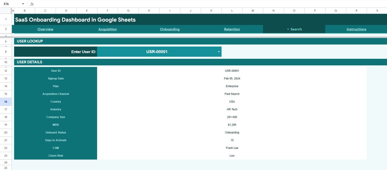
- User Search sheet — choose any User ID to see that user’s profile: Signup Date, Plan, Acquisition Channel, Country, Industry, Company Size, MRR, Onboard Status, Days to Activate, CSM and Churn Risk
- Native Google Sheets slicers — no add-ons or scripts; each slicer filters every chart on its page
- Instructions tab inside the file, plus a PDF setup guide with the copy link
- Works on any device — Mac, Windows, Chromebook or the Google Sheets mobile app
- One-time purchase — not a subscription
KPI Cards on Each Page
Every dashboard page opens with four KPI cards. Where the sample numbers in the screenshots confirm how a card is calculated, the calculation is shown; otherwise the card is described in words.
| Page | KPI | What it measures | Better when |
|---|---|---|---|
| Overview | Total MRR | Sum of MRR ($) across the filtered users | Higher |
| Overview | Total Signups | Number of user records (signups) in the filtered view | Higher |
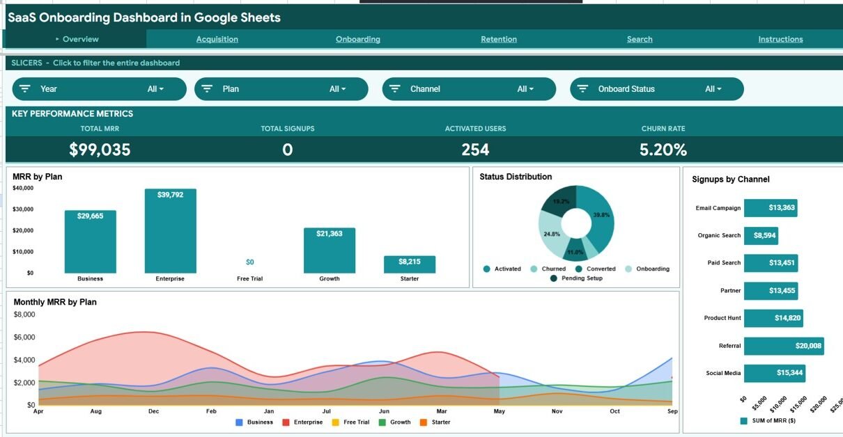
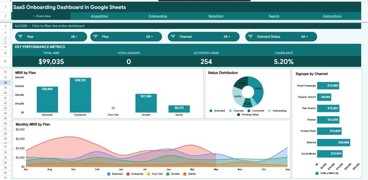
| Overview | Activated Users | Users whose Onboard Status is Activated or Converted (199 + 55 = 254 in the sample) | Higher |
| Overview | Churn Rate | Churned users ÷ total signups (26 ÷ 500 = 5.20% in the sample) | Lower |
| Acquisition | Total Signups | Signups for the selected year, channel, plan and country | Higher |
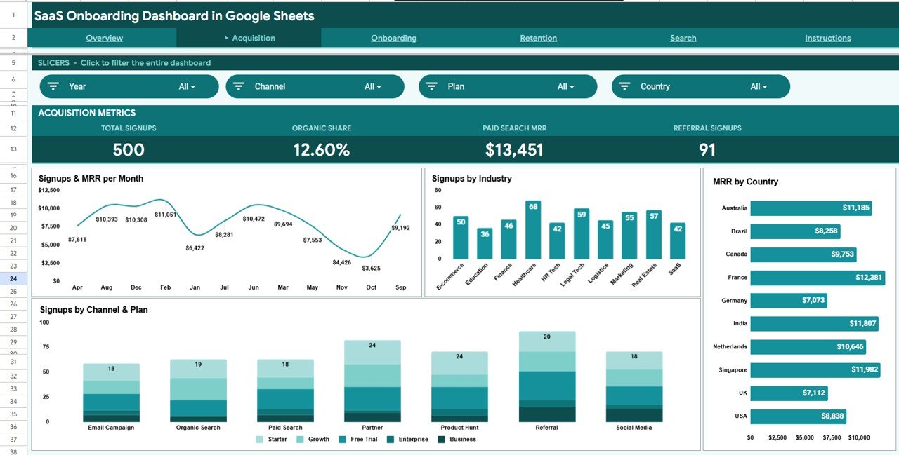
| Acquisition | Organic Share | Organic Search channel’s share of signups (12.60% in the sample) | Depends on strategy |
| Acquisition | Paid Search MRR | MRR from users acquired through Paid Search | Higher |
| Acquisition | Referral Signups | Signups from the Referral channel | Higher |
| Onboarding | Activated Users | Users who reached the Activated or Converted status (254 in the sample) | Higher |
| Onboarding | Avg Days to Activate | Average number of days users took to activate (7.2 days in the sample) | Lower |
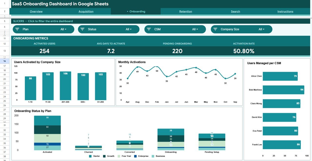
| Onboarding | Pending Onboarding | Users still in Onboarding or Pending Setup status (124 + 96 = 220 in the sample) | Lower |
| Onboarding | Activation Rate | Activated users (Activated + Converted) ÷ total signups (254 ÷ 500 = 50.80% in the sample) | Higher |
| Retention | High Churn Risk | Users flagged High in the Churn Risk column (150 in the sample) | Lower |
| Retention | At-Risk MRR | MRR held by users at risk of churning ($19,966 in the sample) | Lower |
| Retention | Churned Users | Users whose Onboard Status is Churned | Lower |
| Retention | Retention Rate | 1 − churned users ÷ total signups (1 − 26 ÷ 500 = 94.80% in the sample) | Higher |
Dashboard Pages Explained
Page 1: Overview
The Overview page is the starting point for a weekly or monthly review. It shows 4 headline KPI cards — Total MRR, Total Signups, Activated Users and Churn Rate — followed by 4 charts: MRR by Plan, Status Distribution, Signups by Channel and Monthly MRR by Plan. Slicers for Year, Plan, Channel and Onboard Status filter the whole page in one click. The sample data uses five plans (Starter, Growth, Business, Enterprise, Free Trial) and five statuses (Pending Setup, Onboarding, Activated, Converted, Churned).
Page 2: Acquisition
The Acquisition page answers where users come from and what they are worth. Its KPI cards are Total Signups, Organic Share, Paid Search MRR and Referral Signups, and its slicers filter by Year, Channel, Plan and Country. Charts include Signups & MRR per Month, Signups by Industry, MRR by Country and Signups by Channel & Plan across channels such as Email Campaign, Organic Search, Paid Search, Partner, Product Hunt, Referral and Social Media. Use it to find high-value channels, geographies and industries.
Page 3: Onboarding
The Onboarding page shows how well signed-up users reach the activated state. KPI cards cover Activated Users, Avg Days to Activate, Pending Onboarding and Activation Rate; slicers filter by Plan, Status, CSM and Company Size. Charts cover Users Activated by Company Size, Monthly Activations, Users Managed per CSM and Onboarding Status by Plan. CSM leads can use it to spot overloaded team members, plans with weak activation and whether monthly activations are rising or falling.
Page 4: Retention
The Retention page brings churn risk into view before revenue is lost. KPI cards show High Churn Risk, At-Risk MRR, Churned Users and Retention Rate, with slicers for Plan, Churn Risk, Industry and Channel. Charts include Churn Risk Distribution by Plan, Churned MRR by Plan, Industry Churn Risk Profile and Monthly MRR by Churn Risk (High, Medium, Low). Account managers can review it weekly to prioritise outreach to at-risk segments.

Search Sheet
The Search sheet saves you from filtering the raw table to find one customer. Pick a User ID (for example USR-00001) from the Enter User ID dropdown and the sheet shows the user’s full profile — Signup Date, Plan, Acquisition Channel, Country, Industry, Company Size, MRR, Onboard Status, Days to Activate, CSM and Churn Risk. It is ideal for pre-call research or escalations.
Data Sheet
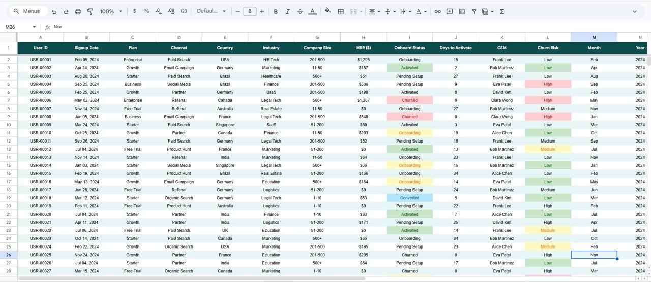
The Data sheet is the single input layer. Its columns are User ID, Signup Date, Plan, Channel, Country, Industry, Company Size, MRR ($), Onboard Status, Days to Activate, CSM, Churn Risk, Month and Year. Add your user records in this structure and the charts, slicers and KPI cards refresh — no formula editing or range adjustments needed.
How to Use It With Your Own Data
- After purchase, open the PDF guide and use the link to make your own copy in Google Drive.
- Export users from your CRM or billing tool to CSV.
- Paste them into the Data sheet in the same column order, replacing the sample rows. Use the same status names (Pending Setup, Onboarding, Activated, Converted, Churned) and churn risk levels (Low, Medium, High).
- Fill Month and Year for each signup so monthly charts and Year slicers work.
- Open the Overview page, check the KPI cards, then drill into Acquisition, Onboarding and Retention with the slicers.
Google Sheets Dashboard vs. Excel Dashboard vs. Paid SaaS Analytics
| Feature | SaaS Onboarding Dashboard in Google Sheets | Microsoft Excel Dashboard | Paid SaaS analytics tool |
|---|---|---|---|
| Pricing model | One-time purchase | One-time purchase (needs Excel) | Monthly subscription |
| Platform | Browser (Google Sheets) | Windows / Mac desktop | Proprietary cloud app |
| Setup | Make a copy and paste data | Open the file and paste data | Integrations or event tracking |
| Real-time collaboration | ✅ Native Google sharing | File-based | ✅ Built-in |
| Customizable fields | ✅ Full control | ✅ Full control | Limited by platform schema |
| Automatic data sync | ❌ Manual or CSV import | ❌ Manual or CSV import | ✅ Usually included |
| Funnel visibility | ✅ Acquisition → Onboarding → Retention | Depends on the template | ✅ Usually built in |
For teams that want onboarding funnel visibility without paying for a dedicated analytics platform, and are happy to import data themselves, this Google Sheets dashboard fits well.
Who Should Use This Template
A good fit for:
- SaaS founders and COOs tracking MRR, churn and activation for roughly 10–5,000 users
- Customer success managers who need CSM workload visibility and onboarding status by plan
- Growth and marketing teams comparing acquisition channels and industries
- Early-stage teams that want structured reporting before committing to a BI tool
- SaaS consultants running dashboards for several portfolio companies from Google Drive
Not a fit if:
- You need automated real-time CRM sync (this template uses manual or export-based data entry)
- Your company restricts the use of Google Workspace for customer data
- You manage 50,000+ user records, where spreadsheet performance may become a bottleneck
Real-World Use Cases
A customer success lead at a B2B SaaS startup can review the Onboarding page weekly to balance CSM workloads, track activations by plan and pull up high-risk users on the Retention page — without waiting for an engineer to run a report.
A growth lead at a seed-stage SaaS can use the Acquisition page each quarter to compare MRR and signups by channel and industry, then shift budget toward the segments that actually activate and stay.
A SaaS operations consultant can keep a separate copy for each client and share a view-only link before weekly check-ins, replacing ad hoc tables and slide decks with one consistent format.
Advantages of the SaaS Onboarding Dashboard in Google Sheets
- Full-funnel visibility in one place — acquisition, activation and retention in a single Google Sheet
- No infrastructure required — no API integrations or warehouse connections; update from any CRM or billing CSV export
- Shareable in one click — give stakeholders a view-only Google link
- No subscription — a one-time purchase instead of a monthly analytics bill
- Slicers and the Search sheet let CSMs answer their own questions without analyst support
Limitations to Know
- Data entry is manual — there is no direct connector to Stripe, HubSpot or Mixpanel, so larger teams will want to automate their export-to-sheet step.
- Google Sheets can slow down with very large datasets; at that scale, a dedicated BI tool is a better fit.
- Charts cannot send alerts or trigger workflows — churn intervention still needs a person to review the Retention page.
- The dashboard does not store historical snapshots; keep dated exports if you want period-over-period comparisons.
Best Practices
- Set a weekly update cadence — export from your CRM or billing platform every Monday and paste into the Data sheet.
- Use the Retention page slicers to isolate your highest-value plans first, then focus CSM time on High churn-risk users in those plans.
- Share a view-only link with leadership so they always see the latest numbers without touching the source data.
- Keep plan, channel and status names consistent so every chart groups correctly. Google’s official Google Sheets Help documentation covers slicers and pivot tables if you want to extend the file.
Related Templates and Guides
The same dashboard is also available as the SaaS Onboarding Dashboard in Excel and the SaaS Onboarding Dashboard in Power BI.
On NeoTech Navigators, these related guides pair well with it: the SaaS Customer Success Dashboard in Google Sheets, the Customer Onboarding Dashboard in Google Sheets, the SaaS Metrics Dashboard in Google Sheets, the SaaS MRR & Churn Tracker in Google Sheets and the Customer Churn KPI Dashboard in Google Sheets.
If you want to build reports like this yourself, the Excel Pivot Tables & Dashboards course on NextGenTemplates Academy covers pivot-based dashboards step by step.
Frequently Asked Questions
What KPIs does the SaaS Onboarding Dashboard in Google Sheets track?
It has 16 KPI cards across four pages: Total MRR, Total Signups, Activated Users and Churn Rate (Overview); Total Signups, Organic Share, Paid Search MRR and Referral Signups (Acquisition); Activated Users, Avg Days to Activate, Pending Onboarding and Activation Rate (Onboarding); and High Churn Risk, At-Risk MRR, Churned Users and Retention Rate (Retention).
Does this template work on Mac?
Yes. It runs in a web browser, so it works on Mac, Windows, Linux and Chromebook with no installation. You only need a free Google account to make your editable copy.
How long does it take to set up?
The product page puts setup at under 10 minutes: open the PDF guide, make your Google Sheets copy and replace the sample rows in the Data sheet with your own users.
How is this different from a paid SaaS analytics tool?
Paid tools charge monthly and connect to your product or billing system automatically. This dashboard is a one-time purchase that needs no integrations — you populate it from any CRM or billing CSV export — which suits teams not yet ready for dedicated analytics infrastructure.
Can I share the dashboard with investors or leadership?
Yes. Because it lives in Google Drive, you can share a view-only link so recipients see every chart and KPI card without being able to edit the data.
Can I add custom columns or metrics?
Yes. The Data sheet is a standard table you can extend with new columns, and you can add pivot tables or adjust chart ranges with basic Google Sheets knowledge.
About the Author
Built by PK — Microsoft Certified Professional with 15+ years of Excel, Google Sheets and Power BI experience and founder of NextGenTemplates. Every template is hand-built and tested before release. Follow the @NeoTechNavigators YouTube channel for Google Sheets dashboard walkthroughs.
Wrapping Up
SaaS teams that watch the full onboarding funnel — from acquisition channel through activation to churn risk — can act on problems while they are still small. The SaaS Onboarding Dashboard in Google Sheets gives you 4 interactive pages, 16 KPI cards, 16 charts, native slicers and a user search sheet as a one-time purchase. Start by exporting your current user list, paste it into the Data sheet and check your activation rate this week.
Get the SaaS Onboarding Dashboard in Google Sheets
📅 Last updated: October 2026