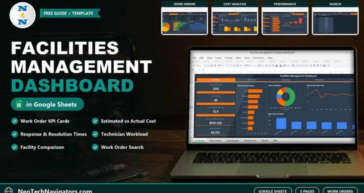
The Facilities Management Analysis Dashboard in Google Sheets turns a work order log into a five-page report on volume, cost and service performance across your buildings. It shows how many work orders are open, how fast the team responds, how actual maintenance spend compares with estimates, and which technicians and facilities carry the most load.
It is built for facilities managers, property and campus operations teams and maintenance supervisors who already record work orders in a spreadsheet and want analysis without a CMMS licence. The workbook has six sheets: Overview, Work Orders, Cost Analysis, Performance, Search and a Data sheet that feeds them all.
Below, each page is explained using the template’s sample data (500 work orders across six facilities in 2024), including how the headline numbers tie together.
🎥 Watch the Video Tutorial
Get the Facilities Management Analysis Dashboard
What Problem Does It Solve?
Most facilities teams can tell you how many work orders came in last month. Fewer can say quickly whether HVAC jobs cost more than planned, which building generates the most requests, or whether response times are improving. When the data sits in one long sheet, those answers take an afternoon of filtering.
This dashboard reads that same work order list and summarises it four ways — overview, work orders, cost and performance — with a lookup page for single orders. You keep adding rows to the Data sheet; the pages recalculate.
Facilities Management Analysis Dashboard in Google Sheets: Page by Page
A navigation bar across the top of every page (Overview, Work Orders, Cost Analysis, Performance, Search) lets you move between views.
1. Overview
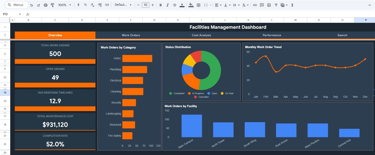
Five KPI cards run down the left side: Total Work Orders (500), Open Orders (49), Avg Response Time (HRS) (12.9), Total Maintenance Cost ($931,120) and Completion Rate (52.0%).
Four charts fill the rest of the page:
- Work Orders by Category — HVAC, Plumbing, Electrical, Cleaning, Security, Landscaping, Structural and Fire Safety, with HVAC the largest in the sample.
- Status Distribution — Completed, In Progress, Open, On Hold and Cancelled.
- Monthly Work Order Trend — January to December.
- Work Orders by Facility — Main Campus, North Tower, South Wing, East Annex, West Pavilion and Central Hub, with Main Campus the busiest.
2. Work Orders
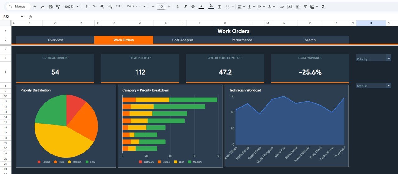
This page focuses on urgency and workload. Its cards show Critical Orders (54), High Priority (112), Avg Resolution (HRS) (47.2) and Cost Variance (−25.6%). Priority and Status dropdowns on the right filter the view.
The charts are Priority Distribution (Critical, High, Medium, Low), a Category × Priority Breakdown stacked bar, and Technician Workload across ten technicians: James Wilson, Maria Garcia, Robert Chen, Linda Thompson, David Kim, Sarah Miller, Ahmed Hassan, Emily Davis, Carlos Rivera and Priya Patel.
3. Cost Analysis
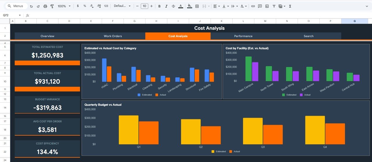
The cost page compares planned and actual spend. Cards show Total Estimated Cost ($1,250,983), Total Actual Cost ($931,120), Budget Variance (−$319,863), Avg Cost Per Order ($3,581) and Cost Efficiency (134.4%).
Three charts break this down: Estimated vs Actual Cost by Category, Cost by Facility (Est. vs Actual) and Quarterly Budget vs Actual for Q1–Q4. In the sample, actual cost sits below the estimate in every quarter.
4. Performance
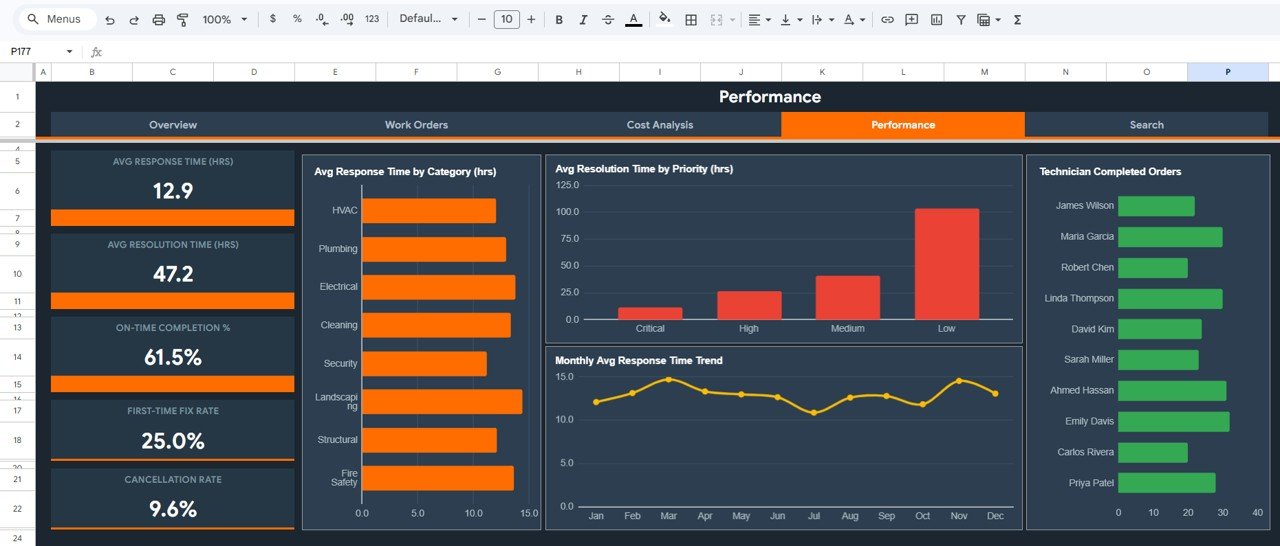
The Performance page measures service quality. Cards show Avg Response Time (HRS) (12.9), Avg Resolution Time (HRS) (47.2), On-Time Completion % (61.5%), First-Time Fix Rate (25.0%) and Cancellation Rate (9.6%).
Charts include Avg Response Time by Category (hrs), Avg Resolution Time by Priority (hrs), a Monthly Avg Response Time Trend and Technician Completed Orders. One useful detail in the sample: Low-priority jobs take far longer to resolve than Critical ones, which is what you would expect when urgent work is handled first.
5. Search
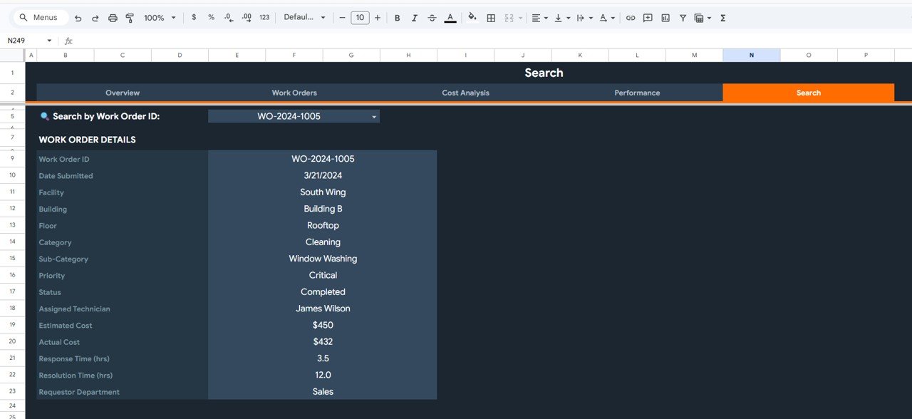
Choose an ID in Search by Work Order ID and the page lists every field for that order. For WO-2024-1005 it shows: submitted 3/21/2024, South Wing, Building B, Rooftop, Cleaning, Window Washing, Critical, Completed, James Wilson, estimated $450, actual $432, response 3.5 hrs, resolution 12.0 hrs, requested by Sales. It is handy in review meetings when someone asks about one specific job.
6. Data Sheet
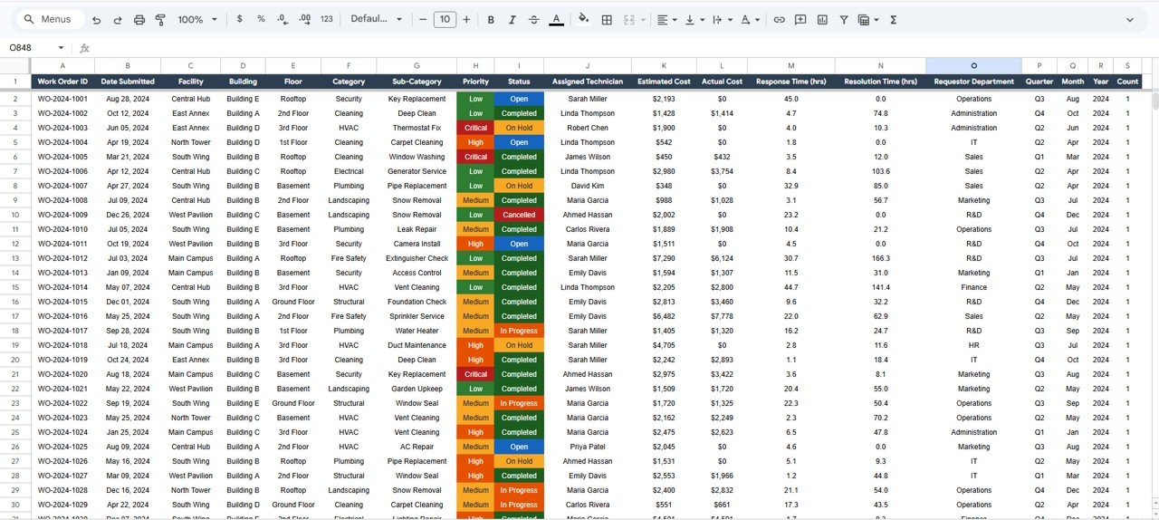
The Data sheet is the only place you type. Its columns are: Work Order ID, Date Submitted, Facility, Building, Floor, Category, Sub-Category, Priority, Status, Assigned Technician, Estimated Cost, Actual Cost, Response Time (hrs), Resolution Time (hrs), Requestor Department, Quarter, Month, Year and Count. Open and On Hold orders in the sample carry an Actual Cost of $0 until work is done.
KPI Reference: What Each Card Means
The cost cards reconcile exactly with each other, which makes them easy to trust and explain:
| KPI | What it measures | How the sample numbers tie out | Better when |
|---|---|---|---|
| Completion Rate | Share of work orders completed | 52.0% of 500 = 260 completed orders | Higher |
| Budget Variance | Actual cost minus estimated cost | $931,120 − $1,250,983 = −$319,863 | Lower (negative = under estimate) |
| Cost Variance | Budget variance as a % of estimate | −$319,863 ÷ $1,250,983 ≈ −25.6% | Lower |
| Cost Efficiency | Estimated cost relative to actual cost | $1,250,983 ÷ $931,120 ≈ 134.4% | Higher |
| Avg Cost Per Order | Average actual maintenance cost per order | $931,120 ÷ 260 completed orders ≈ $3,581 | Lower |
| Avg Response / Resolution Time | Average hours to respond and to resolve | 12.9 hrs and 47.2 hrs | Lower |
| Cancellation Rate | Share of work orders cancelled | 9.6% | Lower |
| On-Time Completion % / First-Time Fix Rate | Service-quality cards on the Performance page | 61.5% and 25.0% | Higher |
The screenshots do not show the exact rule behind On-Time Completion % and First-Time Fix Rate, so check those formulas in your copy and agree the definition with your team before reporting them to management.
If you want to reproduce the cost checks elsewhere in the workbook, the arithmetic is straightforward:
Budget Variance  = Total Actual Cost - Total Estimated Cost
Cost Variance %  = Budget Variance / Total Estimated Cost
Cost Efficiency  = Total Estimated Cost / Total Actual Cost
How to Use It With Your Own Data
- Make your own copy and open the Data sheet. Clear the sample rows but keep the header row.
- Paste or type your work orders using the same column order. Keep Facility, Category, Priority and Status values consistent, because the charts group on them.
- Check that Quarter, Month, Year and Count are filled for your rows in the same format as the sample (Q1, Jan, 2024, 1); the monthly and quarterly charts rely on them.
- Leave Actual Cost at $0 until a job is finished, as the sample does, so open work does not distort spend.
- Open Overview to confirm totals look right, then review Cost Analysis and Performance.
- Use the Priority and Status filters on Work Orders to focus on critical or open jobs.
- Use Search to pull up any single order during meetings or audits.
Real-World Use Cases
- Multi-building campus: compare Main Campus against smaller sites to decide where to station technicians.
- Property management company: show owners estimated vs actual maintenance spend by quarter and by building.
- In-house maintenance team: track response and resolution times monthly and balance technician workloads.
Best Practices
- Record response and resolution times in hours consistently; mixing minutes and hours will skew every average.
- Review Cost Analysis monthly and investigate categories where actual cost runs above estimate.
- Close or cancel stale Open and On Hold orders so Open Orders reflects real backlog.
- Protect the dashboard pages with Data > Protect sheets and ranges so only the Data sheet is edited.
- Use File > Version history before bulk-pasting a new month of data.
Limitations and Who Should Not Use It
This is an analysis dashboard, not a computerised maintenance management system (CMMS). It does not raise work orders, schedule preventive maintenance, manage spare parts or notify technicians. Data entry is manual or by paste from another system. Very large portfolios with tens of thousands of work orders a year, or teams that need mobile work order capture, will be better served by a dedicated CMMS — this dashboard can still sit on top of an export from one.
Related Dashboards and Trackers
For logging requests before they reach this dashboard, see the Work Order Request Tracker in Google Sheets. Related analysis views include the Work Order Dashboard, the Preventive Maintenance Dashboard, the Maintenance Performance Dashboard and the Building Utility Cost Dashboard in Google Sheets.
Working in another tool? See the Facilities Management Dashboard in Power BI.
To learn how multi-page dashboards like this are designed, the Pivot Tables & Dashboards course on NextGenTemplates Academy walks through summarising a data sheet into KPI cards and charts.
Frequently Asked Questions
What does the Facilities Management Analysis Dashboard track?
Work order volume and status, priority mix, technician workload, estimated vs actual maintenance cost, and service performance such as response time, resolution time, on-time completion, first-time fix rate and cancellation rate.
Can I compare estimated and actual maintenance costs?
Yes. The Cost Analysis page compares them by category, by facility and by quarter, with Budget Variance and Cost Efficiency cards.
How does the Search page work?
Select a Work Order ID from the dropdown and the page shows all of its fields, from facility and floor to technician, costs and response and resolution times.
Can I add more facilities or technicians?
Yes. Enter new names in the Facility or Assigned Technician columns of the Data sheet. Check the charts afterwards to make sure the new values appear.
Why does Avg Cost Per Order differ from total cost divided by 500?
In the sample, $3,581 equals total actual cost ($931,120) divided by the 260 completed orders rather than all 500 work orders. Open, On Hold and Cancelled orders carry an Actual Cost of $0, so counting them would pull the average down. Check the formula in your copy if you prefer a different basis.
Is it a replacement for a CMMS?
No. It analyses work order data; it does not schedule or dispatch work. Many teams use it alongside a simple request tracker or a CMMS export.
Wrapping Up
The Facilities Management Analysis Dashboard in Google Sheets gives you one place to see work order backlog, maintenance spend against estimate and team performance across every building. Load last quarter’s work orders into the Data sheet and use the Cost Analysis page to start your next budget conversation.
Get the Facilities Management Analysis Dashboard
📅 Last updated: October 2026