The Energy Consumption Analysis Dashboard in Google Sheets tracks 4 KPIs across 6 interactive pages, with pre-built charts for source-level, building-level, and monthly trend analysis. According to the International Energy Agency, commercial buildings account for roughly 30% of global energy consumption, yet most facility teams still rely on scattered spreadsheets and manual utility bill reviews to monitor usage. This Google Sheets dashboard template consolidates all your meter readings, energy sources, building-level consumption, and cost data into a single shareable file that updates automatically when you add new records.
The Energy Consumption Analysis Dashboard in Google Sheets includes 4 KPI cards (Total Consumption kWh, Total Energy Cost, Avg Rate $/kWh, Total Readings), 4 analysis pages covering source-level, building-level, and trend breakdowns, a record lookup Search Sheet, and a structured Data Sheet. Setup takes under 10 minutes — open the PDF guide, click the Google Sheets copy link, and paste your data. Available for $9.99 one-time at NextGenTemplates.
Key Features of Energy Consumption Analysis Dashboard in Google Sheets
📦 Click here to Purchase the Energy Consumption Analysis Dashboard in Google Sheets
The Energy Consumption Analysis Dashboard in Google Sheets delivers source-by-source and building-by-building energy visibility that facility managers, sustainability officers, and operations teams need for monthly reporting and cost optimization. Here are the features that set this template apart:
The dashboard tracks 4 headline KPIs — Total Consumption (kWh), Total Energy Cost, Avg Rate ($/kWh), and Total Readings — on the Overview page. These are the same metrics used in commercial building energy audits and ISO 50001 energy management system reviews. All values recalculate automatically when you update the Data Sheet.
Multiple charts across 6 analysis pages cover energy consumption by source (Electricity, Natural Gas, Solar, Wind), by building (Data Center, MFG Plant A, Corporate HQ), and by month. Each chart is formula-driven and updates without manual intervention. Dynamic slicers filter the entire dashboard by energy source, building, department, or peak/off-peak status in two clicks.
A dedicated Record Lookup (Search Sheet) lets users select a Record ID from a dropdown and instantly view all 12 fields for that meter reading — including Building, Energy Source, Department, Meter ID, Consumption (kWh), Cost ($), Rate ($/kWh), Peak/Off-Peak, and Status. This eliminates the need to scroll through hundreds of data rows. The Energy Consumption Analysis Dashboard in HTML offers a similar search-and-filter experience in a browser-based format.
Dashboard Pages Explanation
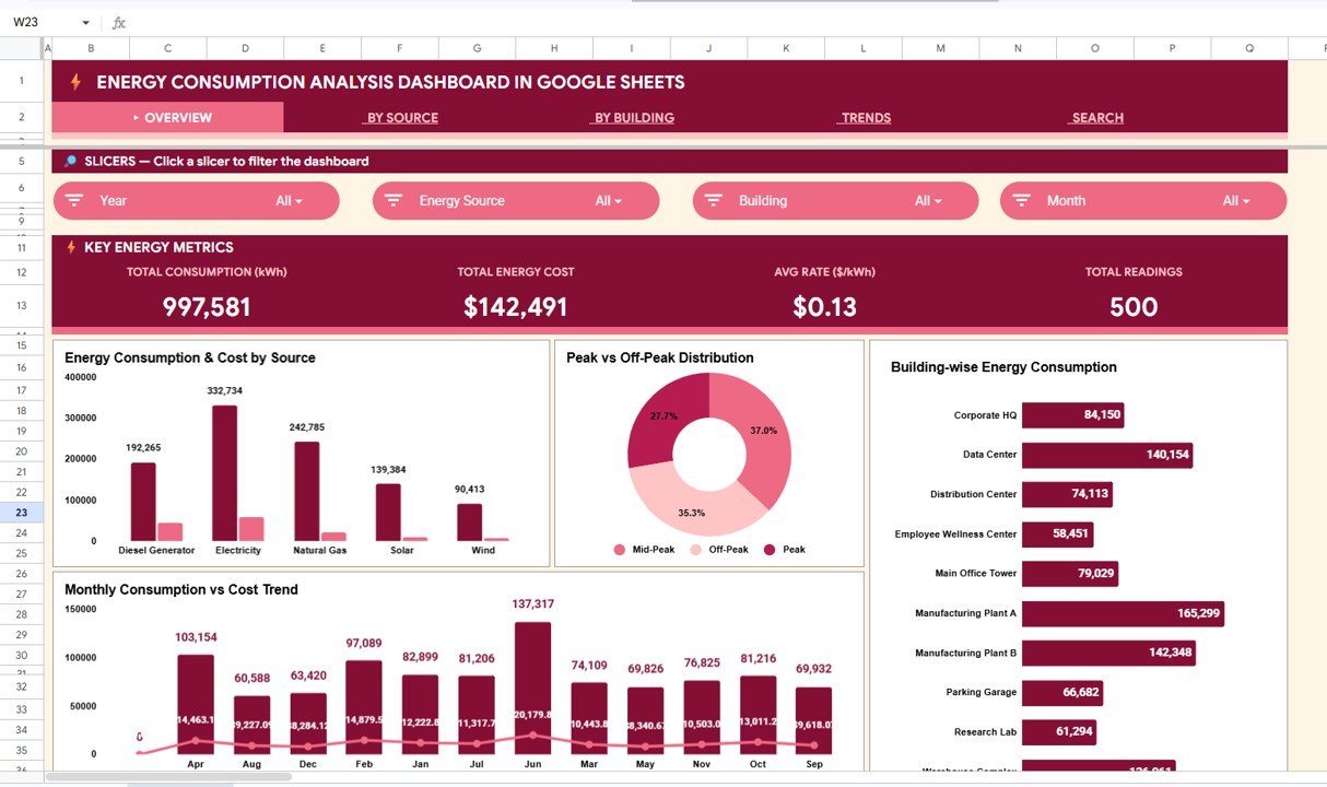
1 — Overview Page
📦 Click here to Purchase the Energy Consumption Analysis Dashboard in Google Sheets
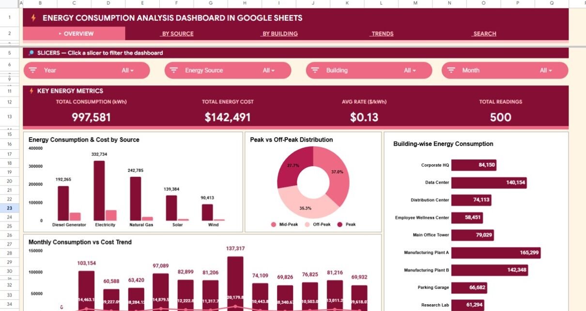
The Overview page is your energy command center. At the top, 4 KPI cards display Total Consumption (kWh), Total Energy Cost, Avg Rate ($/kWh), and Total Readings. Below, charts show Energy Consumption & Cost by Source for a side-by-side comparison of electricity, gas, solar, and wind usage. Peak vs Off-Peak Distribution helps you identify when your buildings consume the most energy. Building-wise Energy Consumption compares each facility’s kWh footprint. Monthly Consumption vs Cost Trend tracks spending patterns over time. Multiple slicers let you filter every chart simultaneously.
Overview Page
2 — By Source Analysis
This page breaks down energy data by source type. KPI-style cards show consumption for Electricity (kWh), Natural Gas (kWh), Solar (kWh), and Wind (kWh). Charts include Cost Distribution by Energy Source, Consumption & Cost by Source, and Monthly Consumption by Source — making it straightforward to identify which sources are the most cost-effective and which are driving the highest bills. If your organization is evaluating renewable energy adoption, this page provides the data foundation for that analysis.
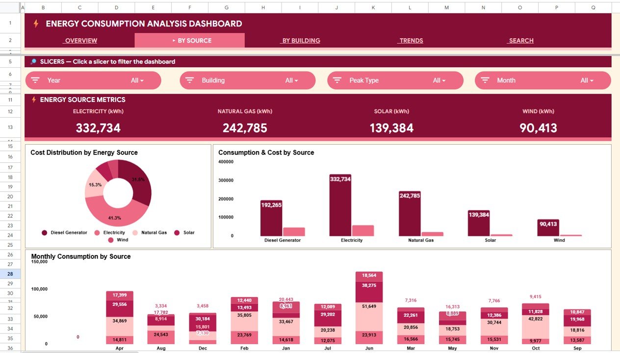
By Source Analysis
3 — By Building Analysis
The By Building Analysis page compares energy consumption across your facilities. Cards show Data Center (kWh), MFG Plant A (kWh), Corporate HQ (kWh), and Highest Single Cost. Charts display Building Consumption & Cost, Department Energy Usage & Cost, and Building Energy Mix by Source. Facility managers can pinpoint which buildings and departments are the largest energy consumers and allocate budgets accordingly. For teams that also track building automation metrics, the Building Automation Dashboard in Excel is a useful companion template.
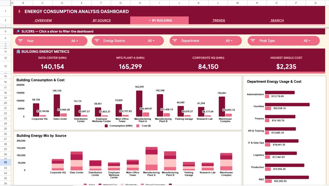
By Building Analysis
4 — Trends Analysis
The Trends Analysis page tracks Monthly Energy Consumption & Cost and Monthly Source Breakdown over time. Use this page to spot seasonal consumption patterns (summer AC loads, winter heating spikes), identify month-over-month cost anomalies, and forecast future energy budgets based on historical data.
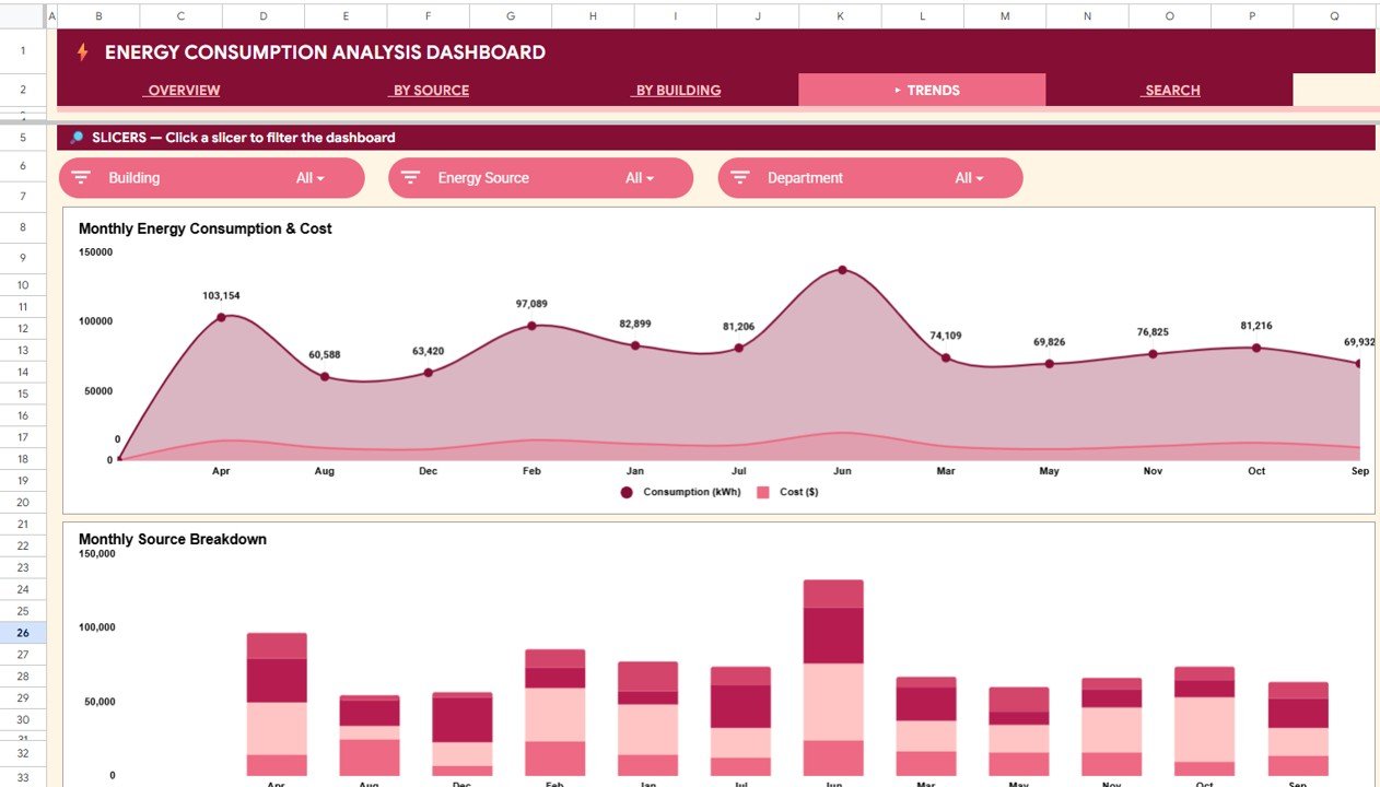
Trends Analysis
5 — Search Sheet
The Search Sheet provides an Energy Record Lookup feature. Select any Record ID (e.g., ENG-0001) from the dropdown and the dashboard instantly pulls every detail for that meter reading: Record ID, Date, Building, Energy Source, Department, Meter ID, Description, Consumption (kWh), Cost ($), Rate ($/kWh), Peak/Off-Peak, and Status. This is helpful when auditing individual readings or responding to ad-hoc queries from leadership.
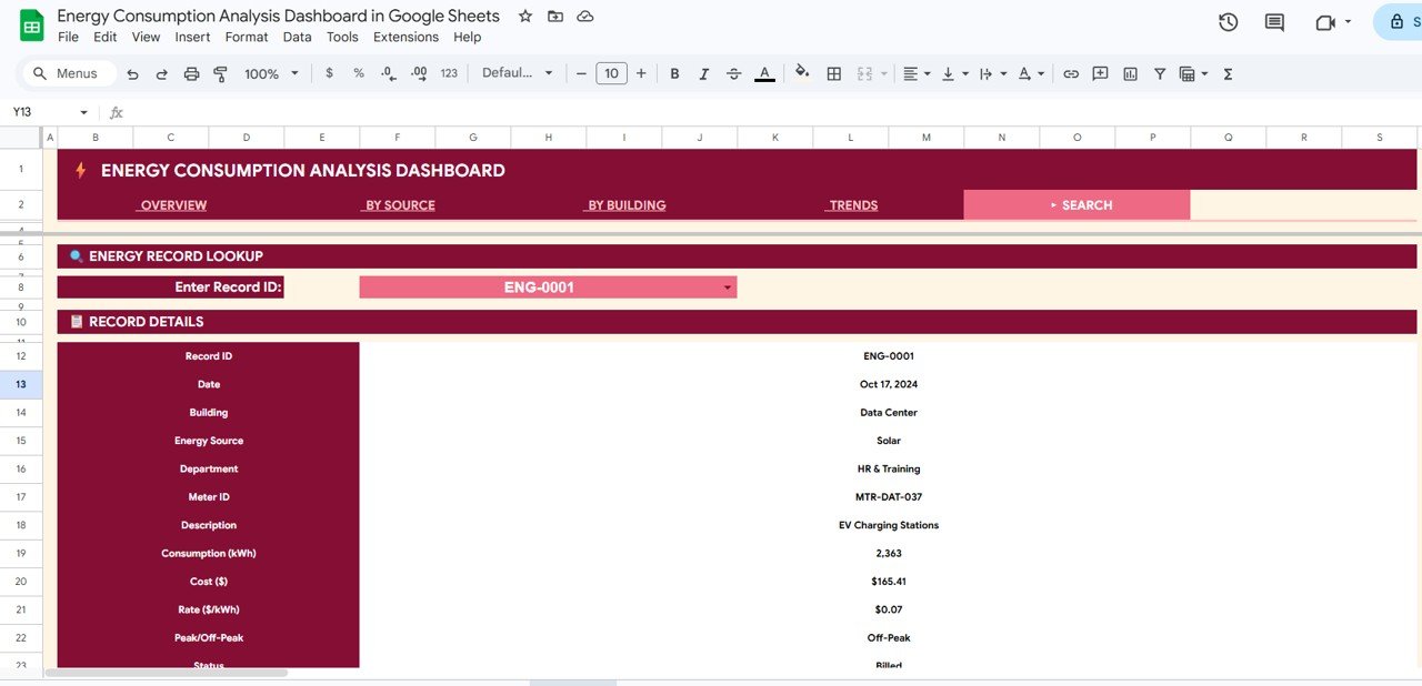
Search Sheet
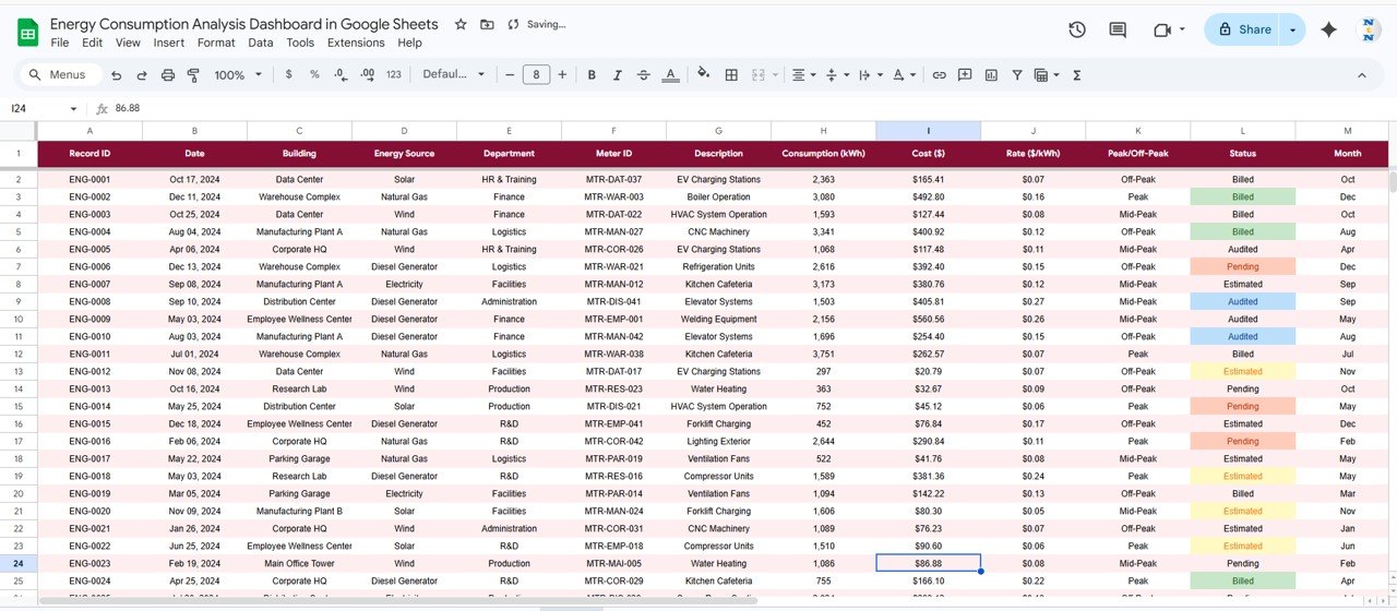
6 — Data Sheet
The Data Sheet is the single input table for the entire dashboard. Replace the sample meter readings with your own records — keeping the same column structure — and every chart, card, and analysis page updates automatically.
Data Sheet
Energy Consumption Analysis Dashboard in Google Sheets vs. Microsoft Excel vs. Paid Energy SaaS — Feature Comparison
| Feature | Energy Consumption Analysis Dashboard in Google Sheets | Microsoft Excel Dashboard | Paid Energy SaaS (EnergyCAP / Wattics) |
|---|---|---|---|
| Cost | $9.99 one-time | $17.99 one-time | $50–$500 / user / month |
| Platform | Google Sheets (any browser) | Microsoft Excel (desktop + web) | Cloud SaaS only |
| Setup time | Under 10 minutes | Under 10 minutes | 4–12 weeks onboarding |
| Real-time team collaboration | ✅ Built-in | ⚠️ OneDrive only | ✅ Paid seat per viewer |
| Mobile access | ✅ Google Sheets app | ⚠️ Limited | ✅ |
| Share with link | ✅ One-click | ⚠️ File attachment | ✅ Paid seat per viewer |
| Source + building analysis | ✅ Out of the box | ✅ | ⚠️ Higher tier only |
| Year-1 cost at 5 users | $9.99 | $17.99 | $3,000–$30,000 |
For facility teams that want building-level and source-level energy visibility without paying $3K–$30K a year for an enterprise tool, the Energy Consumption Analysis Dashboard in Google Sheets sits in the sweet spot.
Who Should Use This Template
📦 Click here to Purchase the Energy Consumption Analysis Dashboard in Google Sheets
Perfect for:
- Facility managers at commercial buildings and campuses tracking energy usage across 2–20 buildings
- Sustainability officers preparing monthly or quarterly energy reports for leadership and ESG disclosures
- Operations teams comparing electricity, natural gas, solar, and wind consumption to optimize the energy mix
- Energy consulting firms building client-ready consumption analysis reports
- Building owners tracking peak vs off-peak patterns to negotiate better utility rates
Not a fit if:
- You need real-time SCADA integration with live meter feeds — that requires an enterprise energy management system
- You need SOC 2-audited, SSO-gated cloud access for hundreds of users — a dedicated SaaS platform would be more appropriate
- You need automated utility bill OCR and parsing from scanned invoices — this dashboard works with structured data you enter manually
Real-World Use Cases
Ravi manages facilities for a 5-building corporate campus in Bangalore. He uses the Energy Consumption Analysis Dashboard in Google Sheets to track monthly kWh across the Data Center, two office towers, a cafeteria, and the parking structure. The By Building Analysis page helps him flag any building that exceeds its quarterly energy budget, and the Trends page shows seasonal AC load patterns — all shared with the CFO via a single Google Sheets link.
Emily is a sustainability analyst at a mid-sized manufacturing firm in Ohio. She tracks electricity, natural gas, and solar output using the By Source Analysis page. Each month she updates 300+ meter readings in the Data Sheet, and the Overview cards show total consumption, cost, and average rate per kWh automatically. She shares the same file with her ESG reporting team, who pair it with the ESG Environmental Dashboard in Excel for full environmental reporting.
Carlos runs an energy consulting practice serving 8 commercial property clients. He duplicates the Google Sheet for each client, drops in their utility data, and walks building owners through peak vs off-peak distribution patterns during quarterly reviews — replacing an $89/user/month energy management SaaS with a one-time $9.99 purchase.
Advantages of Energy Consumption Analysis Dashboard in Google Sheets
📦 Click here to Purchase the Energy Consumption Analysis Dashboard in Google Sheets
The template saves an estimated 4–6 hours per month of manual reporting time for a typical 5-building portfolio. Because it runs on Google Sheets, every team member can access the same live file without version-control issues or email attachments. The By Source Analysis page gives energy procurement teams the data they need to renegotiate utility contracts based on actual consumption mix rather than estimates. At $9.99 one-time, the dashboard pays for itself in the first reporting cycle compared to even the cheapest SaaS alternatives.
Opportunities for Improvement
The dashboard does not pull data automatically from smart meters or utility APIs — meter readings must be entered manually or imported via copy-paste. There is no built-in carbon emissions calculator; teams tracking Scope 1/2/3 emissions would need to pair this with a dedicated ESG Environmental Dashboard in Power BI or a carbon accounting tool. The slicer-based filtering works well for 5–20 buildings, but organizations with 50+ facilities may find the Google Sheets performance slower than a dedicated BI tool like Power BI or Tableau.
Best Practices
Update the Data Sheet at the same cadence as your utility billing cycle — monthly updates keep the Trends Analysis accurate. Use the slicers on the Overview page to create filtered views for different stakeholders (the CFO sees cost trends, the sustainability team sees source-level analysis). Duplicate the entire Google Sheet at the end of each fiscal year to maintain a clean historical archive. Pair this dashboard with the Energy Consumption Analysis Dashboard in Excel if your finance team prefers working in Microsoft Excel.
Explore Relevant Templates
⚡ Energy Consumption Analysis Dashboard in Excel — the Excel version with pivot tables and slicers for teams on the Microsoft stack.
📊 Energy Consumption Analysis Dashboard in Power BI — the Power BI version for organizations standardized on Power BI Service.
🌐 Energy Consumption Analysis Dashboard in HTML — browser-based version with no spreadsheet software needed.
☀️ Solar Energy Dashboard in Excel — companion template for solar-generation-side tracking.
Browse more Google Sheets Dashboard Templates or explore the full NextGenTemplates shop.
Frequently Asked Questions
📦 Click here to Purchase the Energy Consumption Analysis Dashboard in Google Sheets
What KPIs does the Energy Consumption Analysis Dashboard in Google Sheets track?
The Energy Consumption Analysis Dashboard in Google Sheets tracks 4 headline KPIs — Total Consumption (kWh), Total Energy Cost, Avg Rate ($/kWh), and Total Readings — plus source-level, building-level, department-level, and monthly trend breakdowns across 6 interactive pages.
How long does setup take?
Setup takes under 10 minutes. Open the PDF guide, click the Google Sheets copy link, paste your meter readings into the Data Sheet, and every KPI card, chart, and slicer updates automatically. No formulas to write or charts to build.
Which energy sources does this dashboard track?
The By Source Analysis page tracks Electricity, Natural Gas, Solar, and Wind consumption in kWh, along with cost distribution and monthly source-level trends. You can add or rename sources in the Data Sheet to match your facilities.
How does this compare to paid energy management SaaS like EnergyCAP?
EnergyCAP and similar tools typically cost $50–$500 per user per month with multi-week onboarding. The Energy Consumption Analysis Dashboard in Google Sheets is $9.99 one-time, sets up in under 10 minutes, and covers the reporting layer most facility teams actually need — without per-user fees or contracts.
Can I customize the buildings, departments, and energy sources?
Yes. Every field in the Data Sheet is fully editable. Add new buildings, rename departments, or introduce additional energy sources — the dashboard charts and KPI cards pick up the changes automatically.
Does this dashboard work on mobile devices?
Yes. Google Sheets works on the mobile app for iOS and Android. The dashboard is accessible and functional on tablets and smartphones, though the full desktop browser experience provides the most complete view.
Do I get future updates?
Yes. Every NextGenTemplates purchase includes free updates to the same template file when improvements are released.
About the Author
Built by PK — Microsoft Certified Professional with 15+ years of Excel, Google Sheets, and Power BI experience. Founder of NextGenTemplates, reaching 300K+ subscribers across YouTube channels. Every template is hand-built and tested before release.
Conclusion
The Energy Consumption Analysis Dashboard in Google Sheets gives facility managers, sustainability officers, and energy analysts a single, shareable file to monitor kWh consumption, energy cost, source-level distribution, and building-level usage — without paid software or per-user fees.
📦 Click here to Purchase the Energy Consumption Analysis Dashboard in Google Sheets
✅ Instant download · One-time payment · No subscription
👉 YouTube.com/@NeoTechNavigators