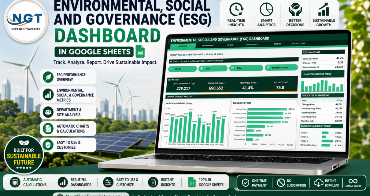
Most ESG data does not live in one place. Emissions sit with the plant engineers, training hours with HR, safety incidents with EHS, and community spend with whoever signed the cheque. Pulling them together for a quarterly review usually means a week of copy-paste. The Environmental, Social, and Governance (ESG) Dashboard in Google Sheets is built to end that: one data sheet with 16 columns, six linked pages, and every chart driven by a real pivot table. The sample build carries 500 ESG submissions across 10 sites, 4 regions, 7 departments and 12 ESG categories – 229,217 tCO2e of emissions, 690,652 MWh of energy, 105,572 training hours and $4,224,363 of community investment – and it recalculates the moment you replace those rows with your own.ESG Dashboard in Google Sheets
Get the ESG Dashboard in Google Sheets
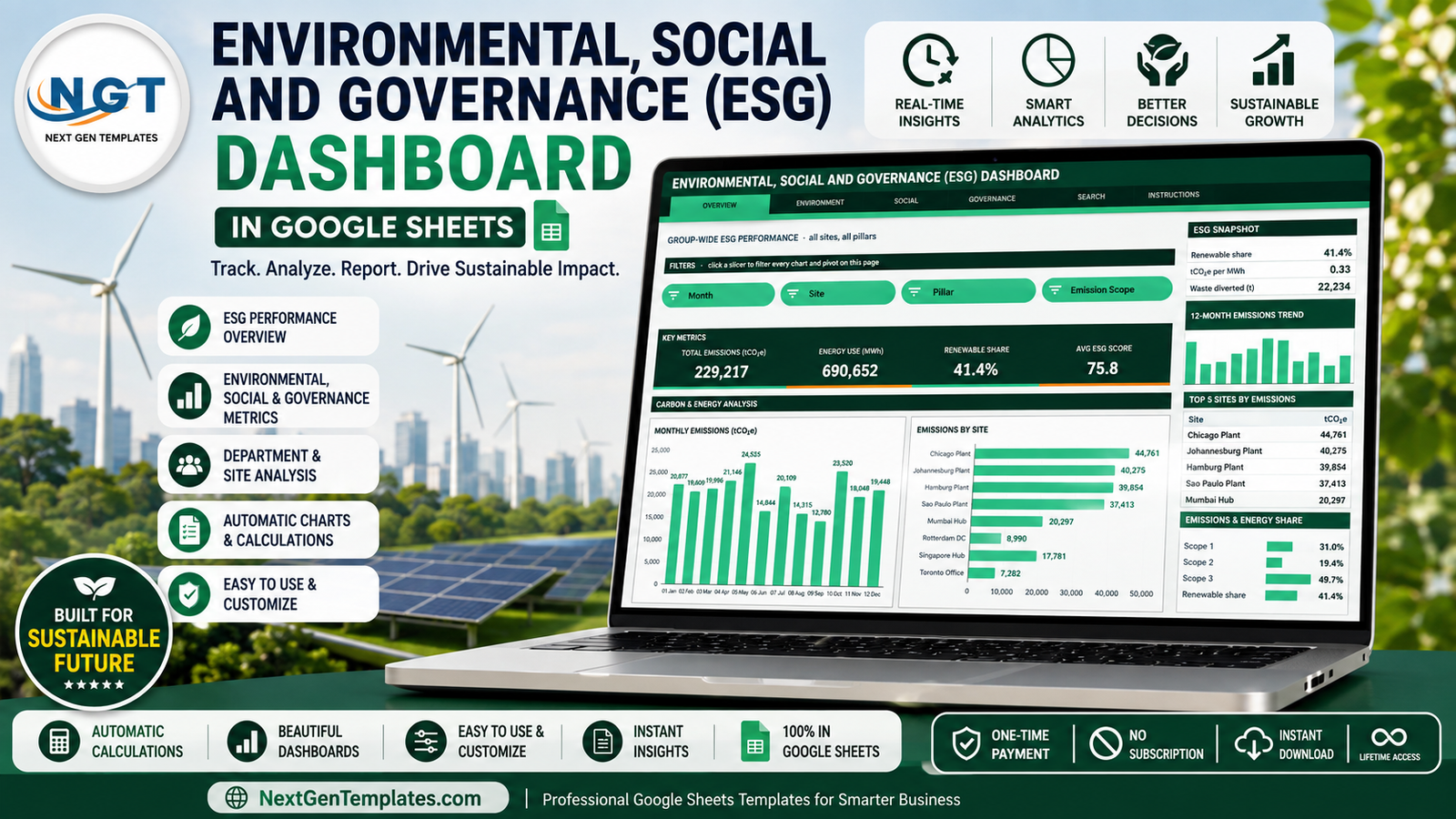
One thing to be clear about before anything else: this is a tracking and reporting tool. It organises and visualises the ESG figures you already collect. It does not produce, certify, assure or file a disclosure under any reporting framework, and nothing here should be read as compliance advice. Use it as an internal management view, and take framework and assurance questions to your own advisers.ESG Dashboard in Google Sheets
Key Features of the ESG Dashboard in Google Sheets
- Six pages behind one navigation strip. Overview, Environment, Social, Governance, Search and Instructions, each reachable in a click from the header of any page.
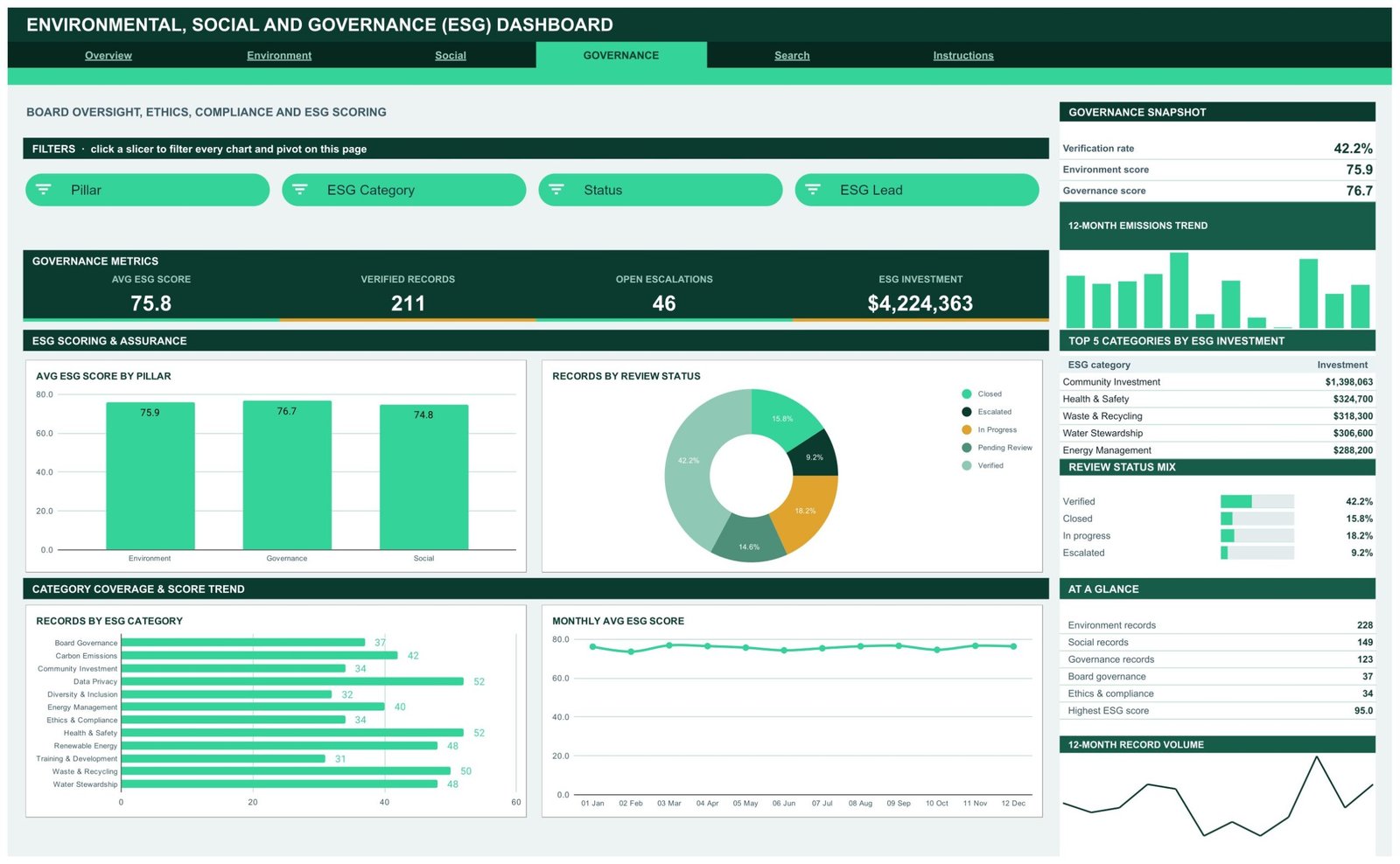
- Four slicers per analysis page. Every slicer drives every pivot on its page, so all four charts and the sidebar Top 5 panel move together.ESG Dashboard in Google Sheets
- 16 KPI cards. Four on each analysis page, covering emissions, energy, renewable share, waste, training, incidents, community investment, ESG score, verified records and open escalations.
- 16 pivot-driven charts. Column, bar, stacked column, donut, area, line and dual-axis combo. Each one reads a pivot parked to the right of its page, so the numbers behind any visual are two scrolls away.ESG Dashboard in Google Sheets
- Scope 1, 2 and 3 breakdown. Emissions split by scope, site, region and month, including a stacked column that puts all three scopes on one bar per site.
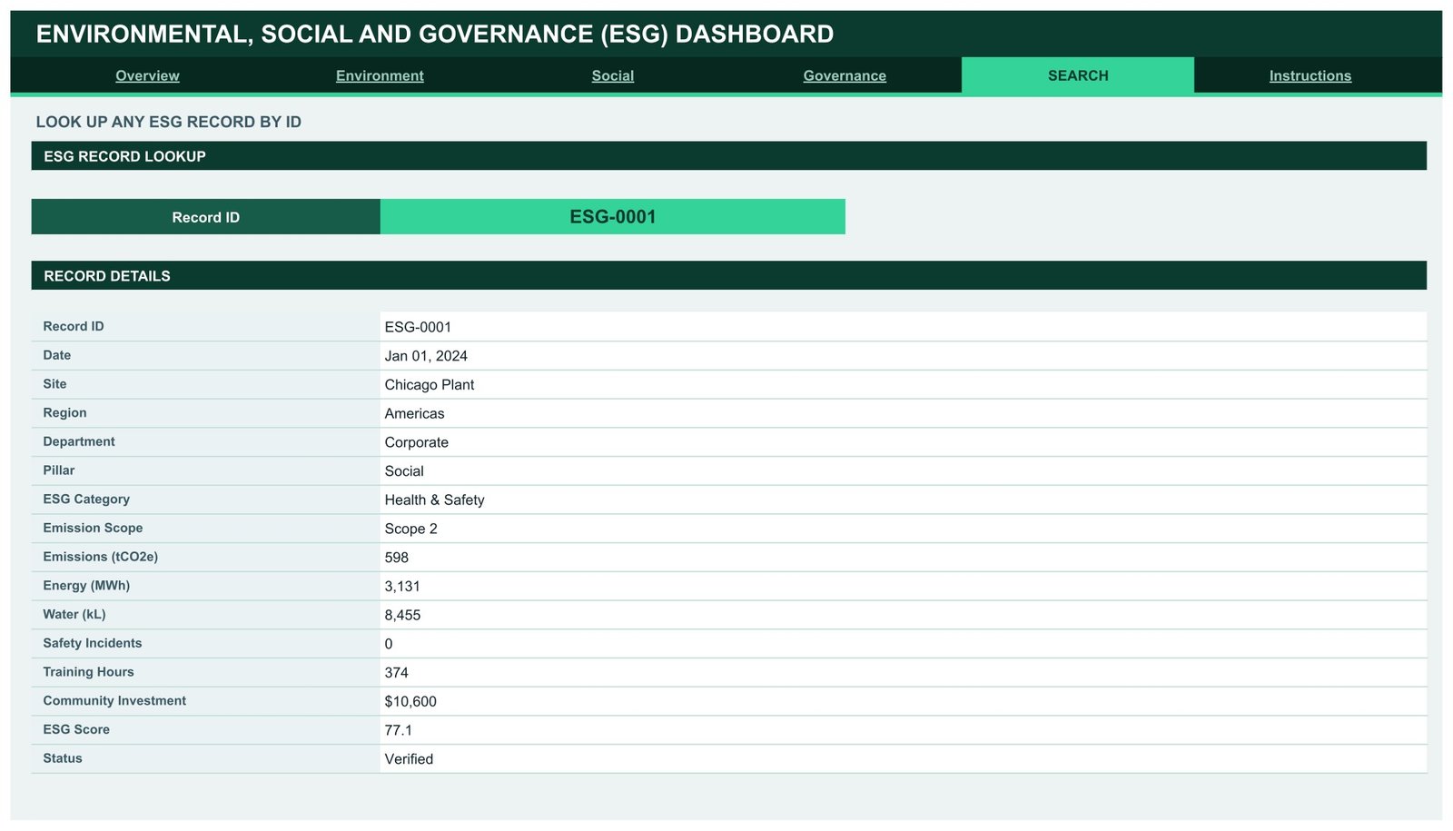
- Record-level lookup. Type any Record ID on the Search page and read all 16 fields for that submission.ESG Dashboard in Google Sheets
- 1,000-row auto-expand. Pivots, slicers and formulas already reach row 1001. Paste new rows anywhere inside that range and nothing needs re-pointing.ESG Dashboard in Google Sheets
- One-block theme. Ink #0B3B2E, accent #34D399 and gold #E0A32E are defined once at the top of the bundled Apps Script, so rebranding is a three-value edit and a re-run.
Dashboard Pages Explanation
Overview – Group-Wide ESG Performance
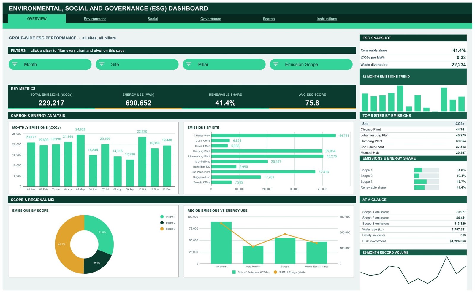
The landing page reports all sites and all three pillars at once. Total Emissions (tCO2e), Energy Use (MWh), Renewable Share and Avg ESG Score sit across the top. Below them, Monthly Emissions tracks the twelve-month carbon curve, Emissions by Site ranks all ten locations, Emissions by Scope splits the total three ways, and Region Emissions vs Energy Use puts carbon and consumption on a dual axis so you can see where the two diverge. The right-hand rail carries an ESG Snapshot, a 12-month emissions trend, Top 5 Sites by Emissions, an Emissions and Energy Share bar set, and an At a Glance list ending with total ESG investment.ESG Dashboard in Google Sheets
Environment – Carbon, Energy, Water and Waste by Site
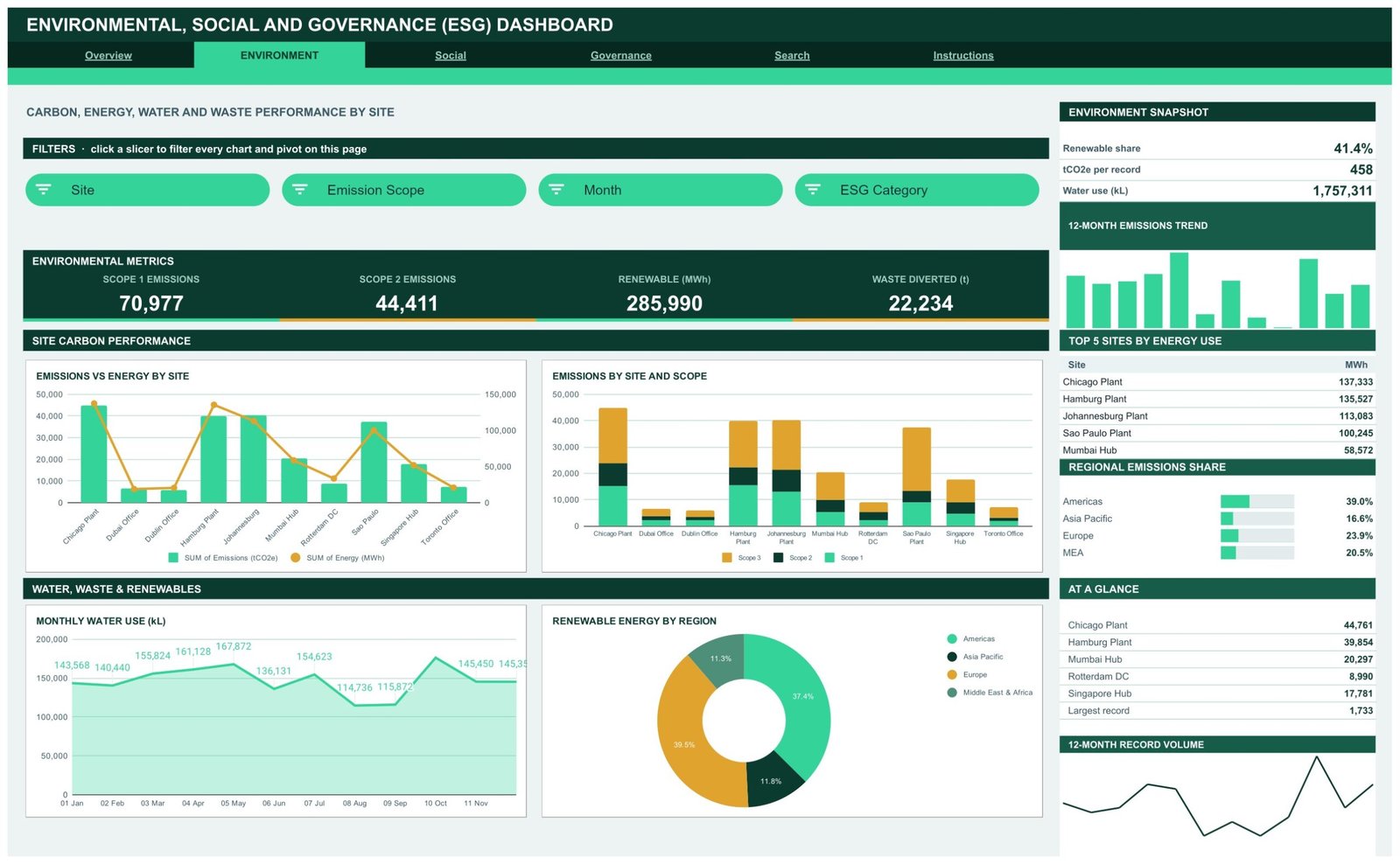
The environmental pillar broken out. Scope 1 Emissions, Scope 2 Emissions, Renewable MWh and Waste Diverted head the page. Emissions vs Energy by Site is the chart most people stop on, because it exposes sites whose energy use is high but whose carbon is not – or the reverse. Emissions by Site and Scope stacks the three scopes per location, Monthly Water Use tracks consumption as an area chart, and Renewable Energy by Region shows which geographies are carrying the renewable share. The sidebar ranks the Top 5 Sites by Energy Use alongside each region’s share of group emissions.ESG Dashboard in Google Sheets
Social – Workforce, Safety, Training and Community Impact
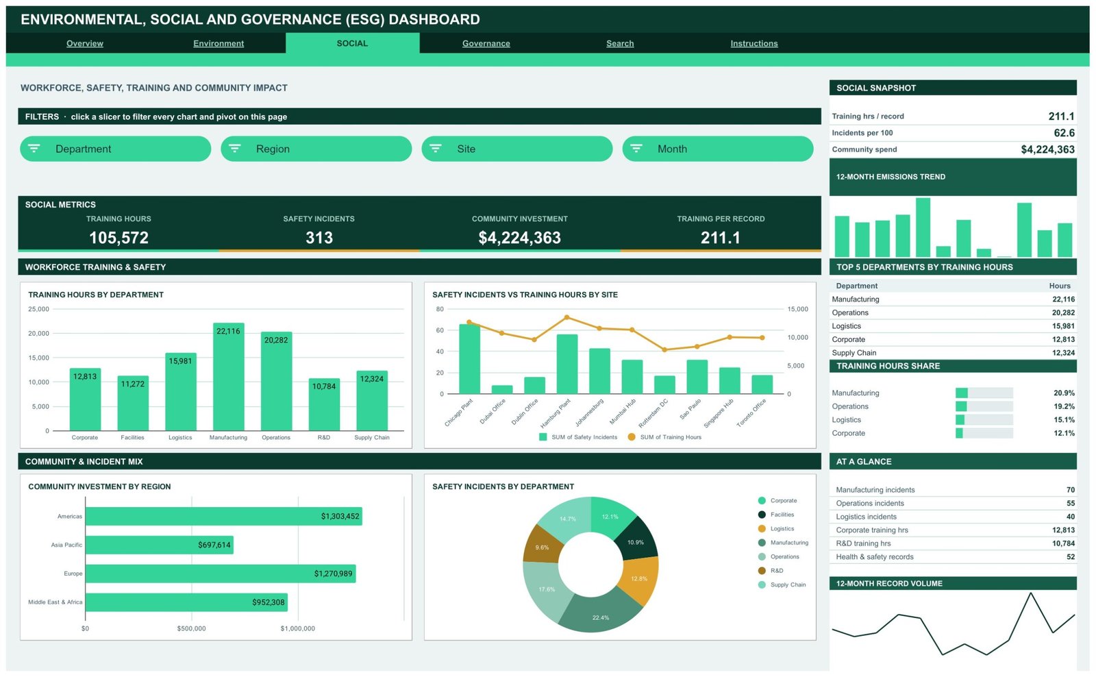
Training Hours, Safety Incidents, Community Investment and Training per Record open the page. Training Hours by Department compares all seven departments, Safety Incidents vs Training Hours by Site is the combo chart that shows where incidents and training investment are out of step, Community Investment by Region breaks the spend down geographically, and Safety Incidents by Department shows which functions carry the incident load. The sidebar ranks the Top 5 Departments by Training Hours and gives each one’s share of the total.ESG Dashboard in Google Sheets
Governance – Board Oversight, Ethics and ESG Scoring
Avg ESG Score, Verified Records, Open Escalations and ESG Investment sit at the top, and the slicers here are different in kind – Pillar, ESG Category, Status and ESG Lead, so you can filter to one reviewer’s queue. Avg ESG Score by Pillar compares Environment, Governance and Social side by side. Records by Review Status splits the pipeline into verified, closed, in progress, pending review and escalated. Records by ESG Category ranks all twelve categories from Board Governance through to Water Stewardship. Monthly Avg ESG Score watches the score across the year. The sidebar adds Top 5 Categories by ESG Investment and a Review Status Mix bar set.ESG Dashboard in Google Sheets
Search – ESG Record Lookup
A single-record view. Pick a Record ID and the page prints date, site, region, department, pillar, ESG category, emission scope, emissions, energy, water, safety incidents, training hours, community investment, ESG score and review status. This is the page you open when a chart shows an outlier and somebody asks which submission caused it.ESG Dashboard in Google Sheets
Instructions – How the Dashboard Works
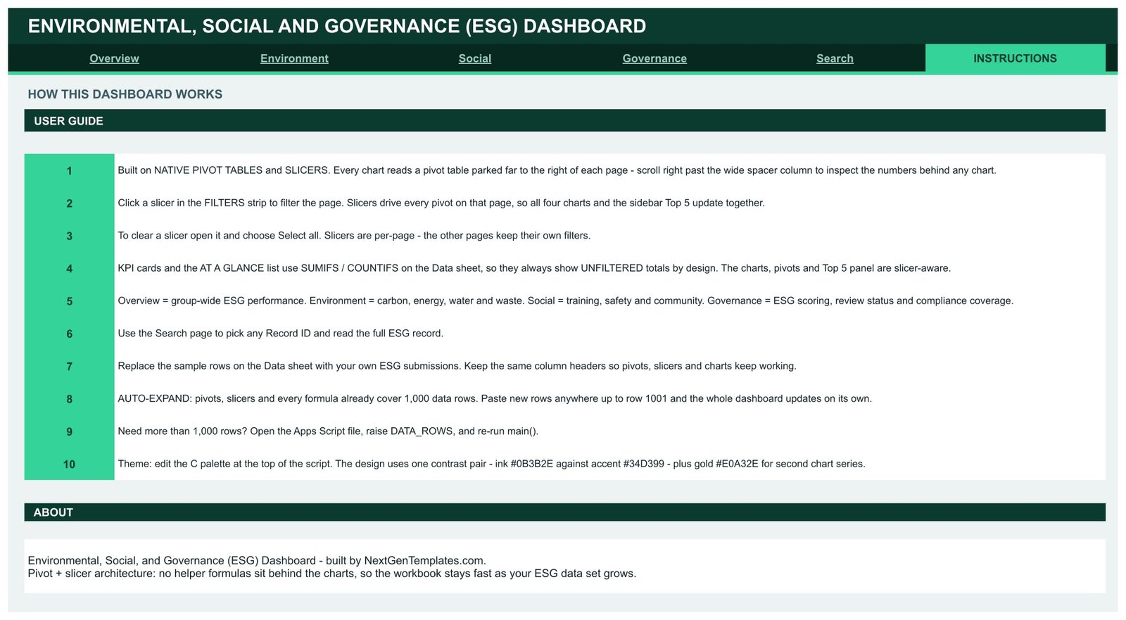
Ten numbered steps that explain the architecture rather than just the buttons: where the pivots are parked, how to clear a slicer, why the KPI cards stay unfiltered on purpose, what each of the four analysis pages covers, how to swap in your own rows, and how to raise the row ceiling past 1,000.ESG Dashboard in Google Sheets
ESG Dashboard in Google Sheets vs. Excel vs. Paid ESG Software – Feature Comparison
| This template (Google Sheets) | Excel ESG workbook | Paid ESG platform (Workiva, Sphera) | |
|---|---|---|---|
| Cost | $9.99 one time | $20-$40 one time, plus Microsoft 365 | $15,000-$100,000+ per year |
| Platform | Any browser, Google Sheets | Desktop Excel | Vendor web app |
| Setup time | Under 10 minutes | 15-30 minutes | 6-16 weeks with a consultant |
| Real-time team collaboration | Yes, native | Only via OneDrive co-authoring | Yes |
| Mobile access | Yes, Sheets app | Limited | Yes |
| Customisable fields | Yes, edit the Data sheet | Yes | Vendor-controlled |
| Share with a link | Yes | No, files are emailed | Yes, seat-based |
| Year-1 cost at 5 users | $9.99 | $40 plus licences | $25,000+ |
| Scope 1/2/3 breakdown | Yes, by site, region and month | Depends on the workbook | Yes |
| Framework-specific disclosure exports | No – tracking and reporting only | No | Yes |
Who Should Use This Template
Sustainability and ESG leads at multi-site organisations get the most from it, because the whole design assumes several locations reporting the same measures each month. HR and EHS managers use the Social page to keep training hours and safety incidents in the same view instead of two separate reports. Finance and corporate-affairs teams use the Governance page to build an internal ESG pack for the board. Consultants and small advisory firms use it as a per-client starting layout – copy the sheet, drop in the client’s data, rename the sites and categories, done.ESG Dashboard in Google Sheets
It is not the right tool if you need automated feeds from meters or an ERP, if you want emission factors calculated from activity data, if your data set runs into hundreds of thousands of rows, or if what you actually need is an assured, framework-specific disclosure. Those are software-and-consultant problems, not spreadsheet problems.
Real-World Use Cases
A five-plant manufacturer. Plant teams paste their monthly rows into the shared Data sheet. The group sustainability manager filters the Environment page by site before each quarterly review and can see immediately which plant is pulling the group renewable share down.ESG Dashboard in Google Sheets
An EHS and training function. The Safety Incidents vs Training Hours by Site combo chart becomes the standing item at the operations meeting. Sites where incident counts are high and training hours are low stand out without anyone building a separate analysis.ESG Dashboard in Google Sheets
A listed mid-cap preparing a board pack. Corporate affairs runs the Governance page – average score by pillar, how many records are still pending review, and where ESG investment actually went – then exports the page to PDF and drops it into the deck.ESG Dashboard in Google Sheets
An ESG consultant with a dozen clients. One copy of the sheet per client, each with its own sites, departments and categories. The layout stays constant, so every client report reads the same way.ESG Dashboard in Google Sheets
Advantages of the ESG Dashboard in Google Sheets
- Pivot-and-slicer architecture, not formula spaghetti. No helper columns sit behind the charts, so the file stays quick as the record count grows. If you have not used them before, Google documents both pivot tables and slicers in the Docs Editors Help.
- All three pillars in one file. Environment, Social and Governance share a single data sheet, so nobody has to reconcile three separate workbooks.
- Nothing to install. No add-ons, no macros, no subscription. It opens in any browser and shares by link.
- Genuinely editable. Sites, regions, departments and ESG categories are just values in the Data sheet – rename them and the slicers follow.
- Auditable numbers. Every chart traces back to a visible pivot table, and every record can be pulled up in full on the Search page.
Opportunities for Improvement
Worth knowing before you buy. The KPI cards and the At a Glance panel use SUMIFS and COUNTIFS against the Data sheet, so they deliberately stay unfiltered when you click a slicer – only the charts, pivots and Top 5 panels are slicer-aware. That is a design decision, but it does surprise people the first time. Slicer selections are also per-page rather than global, so filtering the Environment page does not filter Social. The row ceiling is 1,000 out of the box; going beyond that means opening the bundled Apps Script and raising DATA_ROWS. And there is no data entry form – rows are pasted or typed straight into the Data sheet, which works fine for monthly batch reporting but less well for continuous capture from many contributors.
Best Practices
- Agree the column definitions once, in writing, before anyone submits data. Half of all ESG reporting arguments are really definition arguments.
- Keep the 16 headers exactly as shipped. Rename the values underneath them freely; renaming the headers is what breaks pivots.
- Use one row per site per month per ESG category. Consistent granularity is what makes the pivots comparable.
- Put a named ESG Lead on every record. The Governance page can then filter to one reviewer’s queue, which makes chasing open escalations trivial.
- Review the Records by Review Status donut before the pack goes out. If pending review is large, the scores are not ready to present.
- Share view-only links to stakeholders and edit access only to data owners.
- Take a dated copy of the sheet at each quarter-end so you keep a fixed snapshot of what was reported at the time.
Explore Relevant Templates
- Environmental, Social, and Governance (ESG) Dashboard in Google Sheets – the template covered in this article.
- Sustainability and ESG Dashboard in Google Sheets – broader programme-level sustainability tracking.
- ESG Environmental Dashboard in Google Sheets – environment-only, for carbon, energy and waste teams.
- Audit & Internal Controls Dashboard in Google Sheets – the natural companion to the Governance page.
- Diversity & Inclusion Dashboard in Google Sheets – deeper coverage of the workforce side of the Social pillar.
- Investor Relations Dashboard in Google Sheets – for teams fielding ESG questions from shareholders.
Get the ESG Dashboard in Google Sheets
Building reporting views like this is a learnable skill. The Excel Pivot Tables & Dashboards course on NextGenTemplates Academy covers pivots, slicers and dashboard layout, with practice files.
Frequently Asked Questions
Does this dashboard make my reporting compliant with a standard?
No. It is a tracking and reporting dashboard. It organises and charts the ESG data you enter, and it does not generate, certify or assure a disclosure under any framework. Treat it as an internal management view.
Do I need a paid Google account?
No. A free Google account is enough. The download is a PDF containing the copy link; clicking it puts an editable copy in your own Drive.
Can I change the sites, departments and ESG categories?
Yes. They are ordinary values in the Data sheet. Type your own and the pivots and slicers pick them up.
Why don’t the KPI cards respond to the slicers?
By design. The cards and the At a Glance list use SUMIFS and COUNTIFS so they always show group totals. The charts, pivots and Top 5 panels are the slicer-aware parts.
How many records can it hold?
1,000 rows out of the box. To go further, open the bundled Apps Script, raise DATA_ROWS and re-run main().
Does it calculate emissions for me?
No. You supply emissions, energy, water and the other measures. The dashboard aggregates, splits and charts them; it does not convert activity data into carbon figures.
Can several people use it at the same time?
Yes – it is a normal Google Sheet. Bear in mind slicer selections are shared within a copy, so if two people want independent filtering, give each their own copy.
About the Author
Built by PK – Microsoft Certified Professional with 15+ years of Excel, Google Sheets, and Power BI experience. Founder of NextGenTemplates, reaching 300K+ subscribers across YouTube channels. Every template is hand-built and tested before release.
Conclusion
ESG reporting gets hard not because the numbers are complicated but because they are scattered. This dashboard fixes the scattering: one 16-column data sheet, three pillar pages, a record lookup and a built-in guide, all wired together with native pivot tables and slicers so nothing breaks as the data grows. It will not file a disclosure for you and it does not pretend to – but for the internal view that sits behind every ESG conversation, it takes a week of assembly down to an afternoon.
Get the Environmental, Social, and Governance (ESG) Dashboard in Google Sheets for $9.99 (regular $16.99) – instant download, lifetime access, free updates.