The Solar Energy Dashboard in Google Sheets tracks 4 headline KPIs and 14 interactive charts across 6 connected tabs, with native slicers that filter every page in one click. Setup takes under 10 minutes: make your own copy, paste your plant records into the Data tab, and every card, chart, and slicer recalculates automatically. There is no Apps Script to deploy and no add-on to install.
Solar operators usually face a hard choice between expensive monitoring platforms that bill per site and messy spreadsheets that nobody trusts. This Google Sheets solar dashboard sits in the middle: it gives you portfolio-level reporting on energy generation, installed capacity, performance ratio, and CO2 saved, while keeping your data in a sheet you fully own. Below is a full walkthrough of every tab so you know exactly what you get before you buy.
Key Features of the Solar Energy Dashboard in Google Sheets
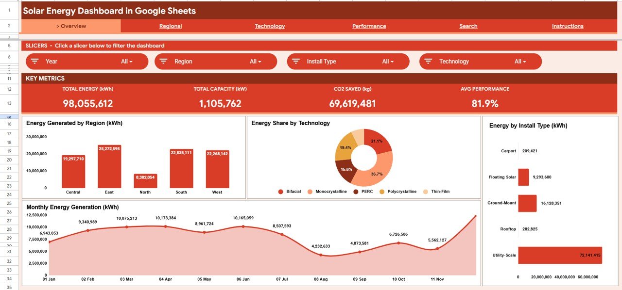
- 🔹 4 KPI cards summarize the whole portfolio: Total Energy (kWh), Total Capacity (kW), CO2 Saved (kg), and Average Performance Ratio.
- 🔹 14 auto-updating charts span energy by region, technology share, install type, operational status, and monthly generation trends.
- 🔹 Native Google Sheets slicers let you filter the entire dashboard by region, technology, or install type without touching a single formula.
- 🔹 A dedicated Plant ID search tab returns the full profile of any solar site — region, technology, operator, capacity, performance ratio, CO2 saved, status, and month.
- 🔹 CO2 savings tracking is built in, so you can quantify environmental impact by region and by install type for ESG and stakeholder reports.
The dashboard is built entirely on native Google Sheets pivot tables, slicers, and SUMIFS-style logic. That means it runs in any browser, on any device, and updates the moment you add a new row to the Data tab.
Dashboard Pages Explanation
Click here to purchase the Solar Energy Dashboard in Google Sheets
1. Overview Page
The Overview tab opens with the four KPI cards — Total Energy (kWh), Total Capacity (kW), CO2 Saved (kg), and Average Performance — followed by four charts: Energy Generated by Region, Energy Share by Technology, Energy by Install Type, and Monthly Energy Generation. Slicers across the top filter all of these at once for instant, focused views.
2. Regional Analysis
This tab drills into geography with Energy Generated by Region, Installed Capacity by Region, and Monthly Energy Generation by Region. It shows you which regions carry your portfolio and how their output trends month over month.

3. Technology Analysis
The Technology tab compares panel and system types through Energy Share by Technology, Installed Capacity by Technology, and Monthly Energy Generation by Technology. Use it to see which technologies deliver the most energy per kW installed.

4. Performance Analysis
Click here to purchase the Solar Energy Dashboard in Google Sheets
The Performance tab focuses on health and impact with Sites by Operational Status, Average Monthly Performance Ratio, CO2 Saved by Install Type, and CO2 Saved by Region. It pairs reliability metrics with environmental outcomes on one screen.

5. Search Sheet
Enter any Plant ID and the Search tab instantly returns that site’s complete record: region, install type, technology, operator, description, energy generated, capacity, performance ratio, CO2 saved, status, and month. It is the fastest way to answer a question about a single asset.

6. Data Sheet
Click here to purchase the Solar Energy Dashboard in Google Sheets
The Data tab is your single source of truth. Add your solar plant records in the same column format used by the sample data, and every KPI, chart, slicer, and search result across the dashboard updates automatically.

Solar Energy Dashboard in Google Sheets vs. Excel vs. Paid Solar Monitoring — Feature Comparison
| Feature | Solar Energy Dashboard (Google Sheets) | Microsoft Excel Dashboard | Paid Solar Monitoring (Solar-Log / Aurora) |
|---|---|---|---|
| Cost | $9.99 one-time | $10–$30 one-time | $300–$2,000+ / year |
| Platform | Browser-based Google Sheets | Desktop Excel | Vendor cloud / hardware |
| Setup time | Under 10 minutes | Under 10 minutes | Days (hardware + onboarding) |
| Real-time team collaboration | ✅ Built in | Limited | ✅ |
| Mobile access | ✅ Any browser | App required | ✅ |
| Editable / customizable fields | ✅ Fully open | ✅ | ❌ Locked to vendor schema |
| Share with a link | ✅ Native | Manual file sharing | ✅ |
| Year-1 cost at 5 users | $9.99 total | $10–$30 total | $1,500–$10,000+ |
| Works without hardware/sensors | ✅ Manual or imported data | ✅ | ❌ Needs loggers |
For teams that want portfolio-level solar reporting without paying for per-site monitoring contracts, the Solar Energy Dashboard in Google Sheets sits in the sweet spot.
Who Should Use This Template
Perfect for:
- Solar EPC firms and O&M teams managing 5–500 sites who need fast portfolio reporting.
- Renewable energy consultants who present generation and CO2 impact to clients.
- Facility and sustainability managers tracking rooftop or ground-mount arrays for ESG reports.
Not a fit if:
- You need live, second-by-second telemetry straight from inverters and data loggers.
- You require automated fault alarms or SCADA-grade control — this is a reporting layer, not a monitoring controller.
Real-World Use Cases
Click here to purchase the Solar Energy Dashboard in Google Sheets
Priya runs O&M for a 60-site rooftop solar portfolio. Every Monday she pastes the weekly generation export into the Data tab, uses the region slicer to spot underperforming clusters on the Performance tab, and sends leadership a one-page view of energy, performance ratio, and CO2 saved — without logging into three vendor portals.
Daniel is a renewable energy consultant. He uses the Technology Analysis tab to show a client how monocrystalline arrays outproduce thin-film per installed kW, then uses the Search tab to pull a specific plant’s full profile live during the meeting.
Aisha manages sustainability reporting for a manufacturer. She relies on CO2 Saved by Region and by Install Type to populate the renewable energy section of the company’s annual ESG report in minutes rather than days.
Advantages of the Solar Energy Dashboard in Google Sheets
The biggest advantage is cost and ownership: a one-time $9.99 purchase replaces recurring monitoring fees that can run into thousands per year. Because it is native Google Sheets, your team collaborates in real time, shares a link instead of emailing files, and works from any device. The slicer-driven design also means non-technical users can filter and explore data without breaking a single formula.
Opportunities for Improvement
Click here to purchase the Solar Energy Dashboard in Google Sheets
This template is a reporting and analysis layer, not a live monitoring system. It does not pull data automatically from inverters, so you (or a scheduled import) need to refresh the Data tab. Very large portfolios with hundreds of thousands of rows may prefer a database-backed tool. For most small and mid-size solar operators, though, manual or scheduled imports are more than enough.
Best Practices
- Keep the Data tab column order identical to the sample so pivots and the search tab keep working.
- Standardize region, technology, and install-type labels (use a dropdown list) so slicers group cleanly.
- Duplicate the file each month or quarter to keep a clean historical snapshot for audits.
- Learn the basics of Google Sheets pivot tables and slicers to customize charts confidently.
Explore Relevant Templates
If you manage more than solar assets, these Google Sheets dashboards use the same slicer-driven design:
- Contract Manufacturing Dashboard in Google Sheets
- Security Company Dashboard in Google Sheets
- Landscaping Dashboard in Google Sheets
Also available as: prefer Microsoft’s BI stack? Get the Solar Energy Dashboard in Power BI, or explore the Clean Tech Dashboard in Excel.
Frequently Asked Questions
Click here to purchase the Solar Energy Dashboard in Google Sheets
What KPIs does the Solar Energy Dashboard in Google Sheets track?
The Solar Energy Dashboard in Google Sheets tracks four headline KPIs — Total Energy (kWh), Total Capacity (kW), CO2 Saved (kg), and Average Performance Ratio — plus 14 charts covering region, technology, install type, status, and monthly trends. All metrics update automatically from the Data tab.
How long does setup take?
Setup takes under 10 minutes. Make your own copy of the Solar Energy Dashboard in Google Sheets, paste your plant records into the Data tab in the same format as the sample, and every KPI, chart, slicer, and search result refreshes automatically.
Do I need Apps Script or any add-on?
No. The Solar Energy Dashboard in Google Sheets is built on native pivot tables and slicers, so there is nothing to deploy or install. It works in any browser on any device with a Google account.
How does this compare to paid solar monitoring software?
Paid monitoring platforms like Solar-Log or Aurora bill per site or per year and require hardware. The Solar Energy Dashboard in Google Sheets is a one-time $9.99 reporting layer you fully own — ideal when you already have generation data and just need clean portfolio analysis.
Can I use the Search tab to look up a single plant?
Yes. Type any Plant ID into the Search tab and the Solar Energy Dashboard in Google Sheets returns that site’s full record, including region, technology, operator, capacity, performance ratio, CO2 saved, status, and month.
Can I customize the charts and add my own regions or technologies?
Absolutely. Because the Solar Energy Dashboard in Google Sheets is fully open, you can add regions, technologies, and install types directly in the Data tab, and the slicers and charts will pick them up automatically.
About the Author
Built by PK — Microsoft Certified Professional with 15+ years of Excel, Google Sheets, and Power BI experience. Founder of NextGenTemplates, reaching 300K+ subscribers across YouTube channels. Every template is hand-built and tested before release.
Conclusion
The Solar Energy Dashboard in Google Sheets gives solar operators, consultants, and sustainability teams a clean, slicer-driven view of energy, capacity, performance, and CO2 impact — without recurring software fees. Click here to purchase the Solar Energy Dashboard in Google Sheets.
Instant download · One-time payment · No subscription. For step-by-step video tutorials, visit YouTube.com/@NeoTechNavigators.
Last updated: June 2026