In times of crisis—be it a cybersecurity threat, natural disaster, or internal system failure—organizations need to act quickly and strategically. However, fast decisions without proper data often lead to bigger problems. That’s why tracking the right KPIs is essential.Crisis Management KPI Dashboard in Google Sheets
The Crisis Management KPI Dashboard in Google Sheets provides a simple, real-time, and effective way to measure response performance, manage resources, and continuously improve crisis handling.
This ready-to-use dashboard helps teams monitor month-to-date (MTD) and year-to-date (YTD) data for all key crisis-related KPIs—ensuring the organization stays informed, aligned, and resilient under pressure.Crisis Management KPI Dashboard in Google Sheets
What Is the Crisis Management KPI Dashboard?
The Crisis Management KPI Dashboard is a Google Sheets-based tracking tool that centralizes all critical KPIs related to how your organization handles emergencies. From initial response times to resolution success, the dashboard provides full visibility into team performance and preparedness.
It includes six key worksheet tabs and is built for simplicity, collaboration, and quick analysis—making it ideal for incident response teams, risk managers, and executives.
Key Features of the Dashboard
The dashboard is structured across six worksheets, each serving a specific function in the KPI monitoring process:
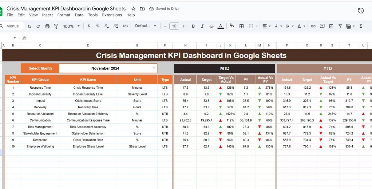
1. Dashboard Sheet Tab
This is the main visualization tab of the dashboard. It includes:
-
A dropdown (cell D3) to select the desired month
-
Automatically updates MTD and YTD figures
-
Displays Actual, Target, and Previous Year values
-
Target vs. Actual and Previous Year vs. Actual comparisons
-
Conditional formatting with up/down arrows for trend analysis

Click to buy Crisis Management KPI Dashboard in Google Sheets
2. KPI Trend Sheet Tab
This tab allows you to review the performance of a single KPI over time. After selecting a KPI in cell C3, the sheet displays:
-
KPI Group
-
Unit of measurement
-
Type (Upper the Better or Lower the Better)
-
Formula
-
Definition

Click to buy Crisis Management KPI Dashboard in Google Sheets
3. Actual Numbers Sheet Tab
Use this sheet to enter your actual performance data for each KPI:
-
MTD and YTD inputs
-
Month selection at cell E1
-
Source for dashboard calculations

4. Target Sheet Tab
In this sheet, input your goal or target values for each KPI. This includes both:
-
MTD target values
-
YTD target values

5. Previous Year Numbers Sheet Tab
Use this tab to enter last year’s MTD and YTD values for each KPI, allowing easy comparison and historical performance tracking.

6. KPI Definition Sheet Tab
This sheet stores the following details for every KPI:
-
KPI Name
-
KPI Group
-
Unit
-
Formula
-
Definition
-
Type (UTB or LTB)
This ensures everyone understands what’s being measured and how performance is calculated.

Advantages of Using the Crisis Management KPI Dashboard
Click to buy Crisis Management KPI Dashboard in Google Sheets
-
Enables quick, informed decision-making with real-time data
-
Helps identify gaps in response, communication, or resource allocation
-
Provides a historical performance view for future preparedness
-
Offers an affordable and accessible alternative to complex software
-
Enhances team accountability by tracking ownership and results
-
Easy to update and share across departments or emergency teams
-
Visualizes trends for better strategic planning and response improvement
Opportunities to Improve the Dashboard
-
Add automated alerts when KPIs fall below defined thresholds
-
Integrate the dashboard with Google Forms for instant incident reporting
-
Include risk severity ratings to prioritize high-impact issues
-
Add a cost analysis sheet for financial impact of different crisis types
-
Use charts for weekly performance tracking, not just monthly
-
Create filters to view KPI data by department, location, or incident type
Best Practices for Using the Dashboard
Click to buy Crisis Management KPI Dashboard in Google Sheets
-
Update the actual numbers monthly for both MTD and YTD to maintain accuracy
-
Assign KPI ownership so each metric has someone responsible for monitoring
-
Regularly review the KPI Trend tab to identify long-term performance changes
-
Align targets with crisis response protocols or regulatory standards
-
Share the dashboard during monthly risk and incident review meetings
-
Protect sensitive sheets with permissions and restrict editing access
-
Use visual indicators (conditional formatting) to highlight critical issues
Conclusion
A crisis is not the time to guess. The Crisis Management KPI Dashboard in Google Sheets empowers your organization with the tools to track what truly matters during emergencies. With six structured worksheet tabs, real-time calculations, and trend visualizations, this dashboard helps you prepare, act, and recover with confidence.
By tracking KPIs like detection time, resolution rate, communication speed, and stakeholder engagement, your team can build a reliable, data-driven crisis response system—without needing expensive software or complex tools.
Whether you’re managing IT outages, reputational threats, or operational disruptions, this dashboard ensures your crisis response is measurable, manageable, and constantly improving.
Frequently Asked Questions (FAQs)
Click to buy Crisis Management KPI Dashboard in Google Sheets
Q1. Can I add more KPIs to the dashboard?
Yes, simply update the KPI Definition sheet and corresponding data in the Actual, Target, and Previous Year tabs.
Q2. How do I compare this year’s performance with last year?
Enter previous year data in the “Previous Year Numbers” tab. The dashboard automatically compares current and past performance.
Q3. Can this dashboard be used across departments or business units?
Yes, you can add filters or a column for departments and analyze KPIs by unit.
Q4. How often should I update the dashboard?
At a minimum, update it monthly. For active crisis management, weekly updates are ideal.
Q5. Is this dashboard suitable for non-technical users?
Yes. It is built in Google Sheets, so anyone familiar with spreadsheets can use and maintain it.
Visit our YouTube channel to learn step-by-step video tutorials
Youtube.com/@NeotechNavigators
Watch the step-by-step video Demo:
Click to buy Crisis Management KPI Dashboard in Google Sheets