The Museum Dashboard in Google Sheets gives museum, gallery, and cultural institution teams a practical way to review visitor activity, revenue, satisfaction, ticket performance, and record-level details in one collaborative spreadsheet. The template includes 6 sheet tabs, 4 KPI cards, and 18 analysis views covering overview performance, attendance, revenue, experience, search lookup, and the source data table.
Many museums manage reporting from ticketing exports, front-desk logs, online sales reports, and visitor surveys. That creates delays when directors need a board-ready view of attendance, gallery usage, revenue by ticket type, or satisfaction trends. This Google Sheets dashboard is designed to reduce that manual reporting work: add records in the Data Sheet tab, then use slicers, charts, and page tabs to review the museum story quickly.
Click here to get the Museum Dashboard in Google Sheets.
Museum Dashboard in Google Sheets
Key Features of Museum Dashboard in Google Sheets
- 6 connected tabs: Overview, Attendance, Revenue, Experience, Search, and Data Sheet.
- 4 high-level cards: Total Visitors, Total Revenue, Avg Satisfaction, and Avg Ticket Price.
- 18 analytical views: Visitor, revenue, gallery, ticket, channel, duration, satisfaction, and lookup analysis.
- Google Sheets collaboration: Share the dashboard with approved team members through Google Drive permissions.
- Interactive slicers: Filter the dashboard quickly without rebuilding formulas or charts.
- Ticket ID lookup: Review details for a selected ticket record from the Search tab.
- Editable data table: Keep the same format and add your own museum records.
Dashboard Pages Explanation
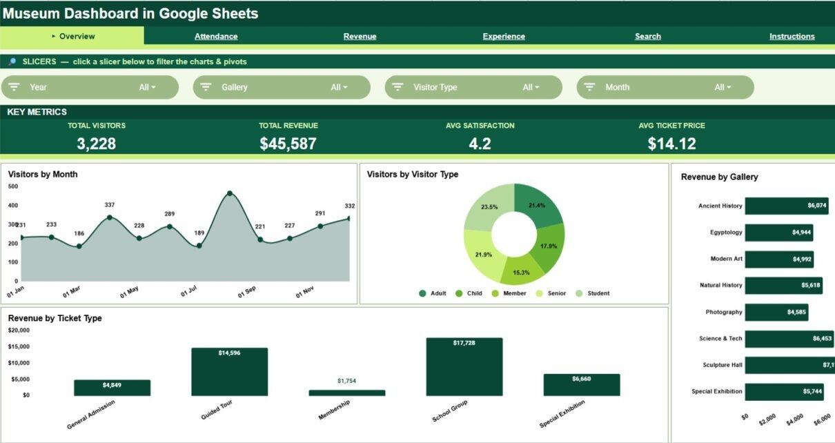
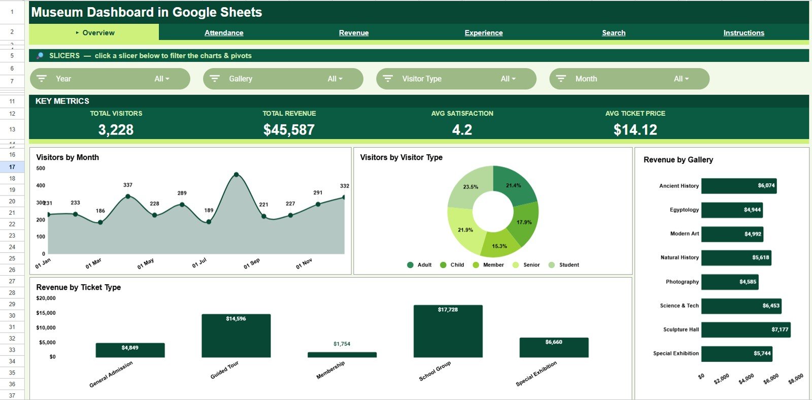
1 – Overview Page
The Overview page is the leadership view. It brings Total Visitors, Total Revenue, Avg Satisfaction, and Avg Ticket Price into KPI cards at the top, then shows four charts for a fast monthly performance read.
Visitors by Month: This chart shows attendance movement across months. It helps teams identify seasonal peaks, slow periods, and the best months for exhibit launches or education programs.
Visitors by Visitor Type: This view explains the mix of members, students, families, adults, seniors, tourists, or other visitor groups. It helps teams align pricing, guided tours, and outreach programs to the audience they actually serve.
Revenue by Gallery: This chart compares revenue contribution by gallery or exhibit area. It helps leaders understand which spaces are drawing financial value and which may need stronger promotion, interpretation, or programming.
Revenue by Ticket Type: This chart breaks revenue into ticket categories such as general admission, student, member, group, or premium tickets. It supports pricing review and makes ticket-mix performance easier to discuss.
Overview Page
2 – Attendance
The Attendance tab focuses on visitor volume and movement. It is useful for operations, marketing, tourism partnership, school program, and staffing discussions.
Visitors by Origin: This chart shows where visitors come from, such as local, domestic, international, school, or partner groups. It helps museums see which audiences are responding to outreach and which segments may need targeted campaigns.
Visitors by Month: This monthly chart highlights attendance seasonality. It supports guide scheduling, gallery coverage, workshop planning, and promotional calendars.
Visitors by Channel: This view compares attendance by booking or marketing channel. It helps teams see whether walk-ins, online bookings, school groups, partner referrals, or campaigns are driving footfall.
Visitors by Gallery: This chart compares visitor count across galleries. It helps identify high-traffic areas, underused spaces, and potential crowd-management needs.
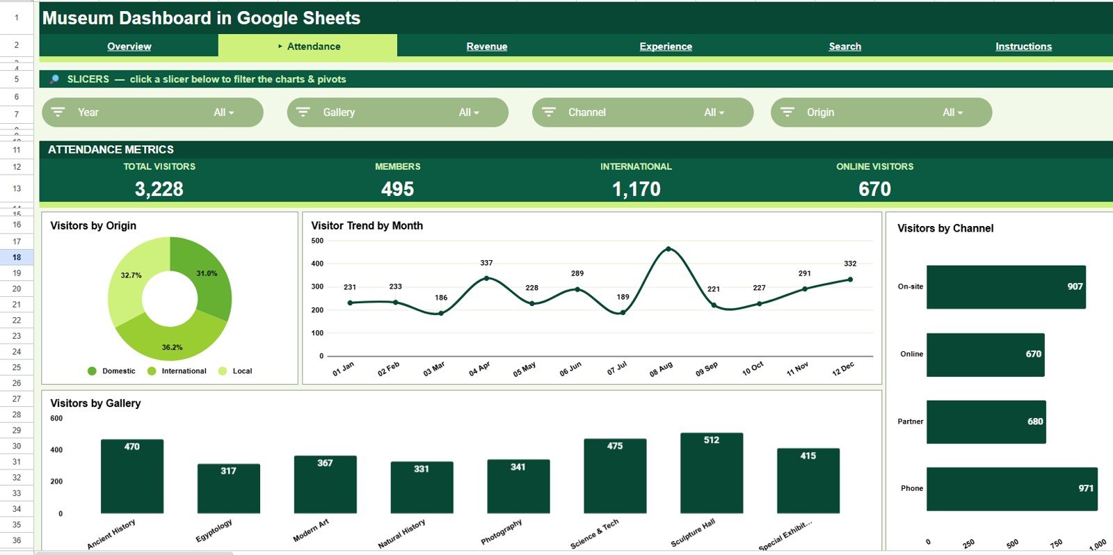
Attendance
3 – Revenue
The Revenue tab is built for finance and management review. It explains where income comes from, how ticket volume relates to revenue, and which channels or ticket types deserve attention.
Revenue by Gallery: This chart ranks galleries by revenue contribution. It helps compare the financial side of exhibit performance with the attendance insights shown elsewhere.
Revenue and Ticket Volume by Month: This combo view compares dollars and ticket count in the same monthly lens. It helps distinguish true attendance growth from price-mix changes.
Revenue by Ticket Type: This chart shows income by ticket category. It supports discount review, group ticket strategy, member benefit analysis, and premium-ticket decisions.
Revenue by Channel: This view compares direct, online, walk-in, partner, or campaign revenue. It helps teams decide where to invest marketing effort and which channels may carry commission or conversion issues.
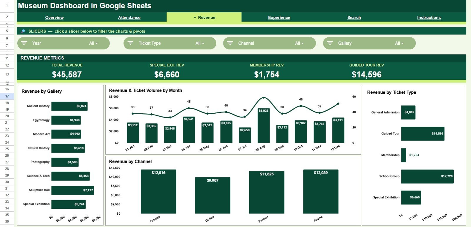
Revenue
4 – Experience
The Experience tab connects visitor quality signals with gallery and ticket behavior. It is especially useful for guest experience, curatorial, education, and front-of-house teams.
Avg Satisfaction by Gallery: This chart compares visitor satisfaction by gallery. It helps identify exhibits that perform well and gallery areas where interpretation, signage, or staffing may need improvement.
Avg Duration by Gallery: This chart shows how long visitors spend in each gallery. It helps teams understand dwell time, engagement depth, and possible layout issues.
Avg Satisfaction by Visitor Type: This view compares satisfaction across audience groups. It helps museums understand whether members, school groups, families, tourists, or general visitors have different experience patterns.
Avg Duration by Ticket Type: This chart compares visit duration by ticket category. It helps teams evaluate whether premium, group, member, or general tickets align with expected visit behavior.
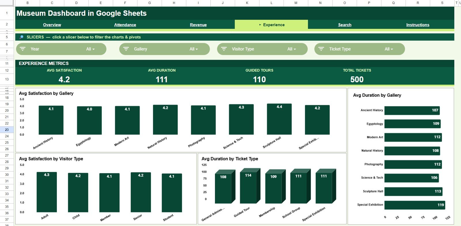
Experience
5 – Search
The Search tab supports record-level lookup. It is useful when a team member needs to review one ticket without scrolling through the raw table.
Record Lookup by Ticket ID: Select or enter a Ticket ID to locate the matching transaction. This is helpful for front-office questions, quick audits, and reconciliation checks.
Ticket Details by Selected Ticket ID: The selected record returns the relevant ticket information in a readable layout. It helps teams check visitor type, gallery, ticket type, channel, revenue, satisfaction, and other linked details.
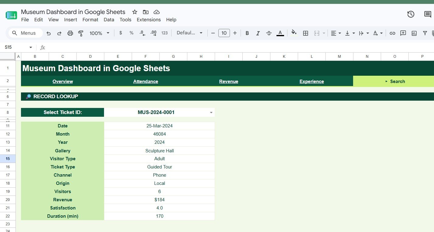
Search
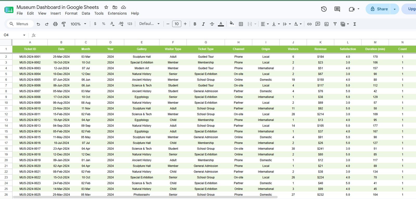
6 – Data Sheet Tab
The Data Sheet tab is the input table. Add museum records in the same format so cards, charts, slicers, and lookup formulas continue to work. Keep one row per ticket or visit record for cleaner analysis.
Data Sheet tab
Museum Dashboard in Google Sheets vs. Microsoft Excel Dashboard vs. Paid CRM/SaaS – Feature Comparison
| Feature | Museum Dashboard in Google Sheets | Microsoft Excel dashboard | Paid museum SaaS |
|---|---|---|---|
| Cost | $9.99 one-time | Template cost plus any Microsoft license | Monthly or annual subscription |
| Platform | Google Sheets in browser | Excel desktop or web | Vendor-hosted web app |
| Setup time | Copy sheet, add records, review charts | Open workbook, add data, refresh | Implementation and migration |
| Real-time collaboration | Yes, through Google Drive sharing | Best with Microsoft 365 | Usually included |
| Mobile access | Google Sheets app or browser | Workbook layout may limit mobile use | Usually included |
| Customizable fields | Editable sheet structure | Editable workbook structure | Depends on vendor controls |
| Share with link | Yes, based on Google permissions | Depends on storage setup | Login controlled |
| Year-1 cost at 5 users | $9.99 plus Google account access | Template cost plus software licensing | Often hundreds or thousands |
| Best fit | Lightweight reporting and team review | Offline spreadsheet reporting | Ticketing, CRM, donor, membership, and operational workflows |
Who Should Use This Template
This template is a good fit for museum directors, gallery managers, visitor-experience teams, curators, education teams, ticketing supervisors, finance staff, and small cultural institutions that need a clear reporting layer in Google Sheets.
It is also useful for consultants building a quick reporting pack for a museum client, or for nonprofit teams that need to report attendance, revenue, and satisfaction without buying a full museum-management system.
Real-World Use Cases
Marina, museum operations director: reviews the Overview and Attendance pages before monthly trustee meetings. She uses visitor trends and gallery volume to explain staffing needs and exhibit demand.
Daniel, visitor-experience manager: checks satisfaction and average duration by gallery after a new exhibit launch. He uses the Experience tab to recommend signage and guided-tour improvements.
Priya, ticketing and finance lead: reviews Revenue by Ticket Type and Revenue by Channel before month-end close. When a transaction needs review, she uses the Search tab to look up the Ticket ID.
Advantages of Museum Dashboard in Google Sheets
The main advantage is speed. Google Sheets lets the team collaborate in the same file, while the dashboard tabs keep analysis separate from the raw input table. It is easier than rebuilding charts every month and lighter than implementing full SaaS when your immediate need is reporting.
The dashboard also keeps analysis familiar. Users can edit labels, adjust charts, add rows, and share access through Google Drive. Google provides official guidance on spreadsheet slicers in the Google Docs Editors Help slicer documentation, which is the kind of native feature this template uses for quick filtering.
Opportunities for Improvement
This template is not a replacement for a live ticketing platform, CRM, donor database, or access-control system. It does not automatically scan tickets, collect payments, send donor emails, or manage memberships.
For larger museums, the next improvement would be connecting the Data Sheet tab to a controlled import process from ticketing or POS exports. Teams with strict governance may also want protected ranges, named editors, and a monthly backup process.
Best Practices
- Keep one row per ticket or visitor record in the Data Sheet tab.
- Do not change column names unless you also update the formulas and charts.
- Use consistent names for galleries, visitor types, channels, and ticket types.
- Review the Search tab after importing new data to confirm Ticket IDs are unique.
- Use Google Drive sharing permissions carefully so only approved editors can change source data.
- Make a monthly copy before major edits or structure changes.
Explore Relevant Templates
Related templates on NextGenTemplates include Museum Dashboard in Excel, Museum Dashboard in Power BI, Museums & Cultural Centres KPI Dashboard in Power BI, Arts and Culture Dashboard in Power BI, and Heritage Tourism KPI Dashboard in Power BI.
You can also browse more Google Sheets dashboard templates.
Frequently Asked Questions
What does the Museum Dashboard in Google Sheets track?
It tracks visitors, revenue, satisfaction, average ticket price, visitor type, origin, gallery, ticket type, channel, duration, and ticket-level lookup details.
How many sheet tabs are included?
The template includes 6 tabs: Overview, Attendance, Revenue, Experience, Search, and Data Sheet.
Do I need Excel?
No. The template is made for Google Sheets and runs in a browser with a Google account.
Can I share it with my team?
Yes. You can share the Google Sheet through Google Drive permissions and control who can view or edit it.
Is this a full museum management system?
No. It is a reporting dashboard. It does not replace ticketing, donor CRM, access control, or payment collection software.
Can I customize the dashboard?
Yes. After making your own copy, you can edit charts, colors, labels, formulas, fields, and slicers.
About the Author
Built by PK – Microsoft Certified Professional with 15+ years of Excel, Google Sheets, and Power BI experience. Founder of NextGenTemplates, reaching 300K+ subscribers across YouTube channels. Every template is hand-built and tested before release.
Conclusion
The Museum Dashboard in Google Sheets is a focused reporting template for museum teams that want a practical way to monitor visitors, revenue, gallery performance, ticket mix, satisfaction, and lookup records in one shared spreadsheet. It is lightweight, editable, and built for teams that need reporting clarity without a monthly subscription.
Click here to download the Museum Dashboard in Google Sheets.
For step-by-step video tutorials, visit YouTube.com/@NeoTechNavigators.
Last updated: July 5, 2026