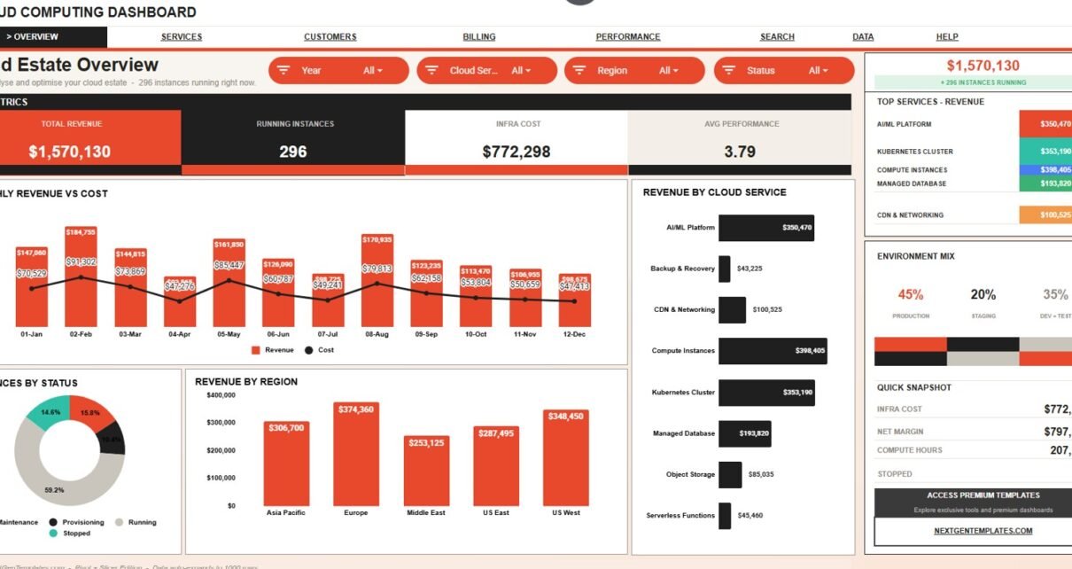
Cloud Computing Dashboard in Google Sheets is a ready-to-use reporting template for cloud operations, IT, finance, MSP, and SaaS teams that need a clearer view of cloud revenue, running instances, infrastructure cost, and performance.
The dashboard includes 7 sheet tabs, 4 high-level KPI cards, 20 chart views, multiple slicers, an Instance ID lookup sheet, and an editable Data sheet. It is built for teams that want to analyze cloud service activity by month, region, environment, customer segment, plan, engineer, status, cost, compute hours, and performance score.
Google Sheets also fits shared reporting workflows because Google Workspace supports real-time editing, and Google Drive provides file sharing controls. That makes this template practical when several stakeholders need to review one cloud performance file.
Get the Cloud Computing Dashboard in Google Sheets from NextGenTemplates.
Key Features of Cloud Computing Dashboard in Google Sheets
- 7 sheet tabs: Overview, Service Performance, Customer Analysis, Billing & Margin, Platform Performance, Search, and Data.
- 4 KPI cards: Total Revenue, Running Instances, Infra Cost, and Avg Performance.
- 20 chart views: Review revenue, cost, instances, regions, services, plans, customer segments, engineers, compute hours, and performance.
- Native slicers: Filter dashboard pages quickly without changing formulas or rebuilding charts.
- Instance ID search: Select one Instance ID and instantly see the full instance record.
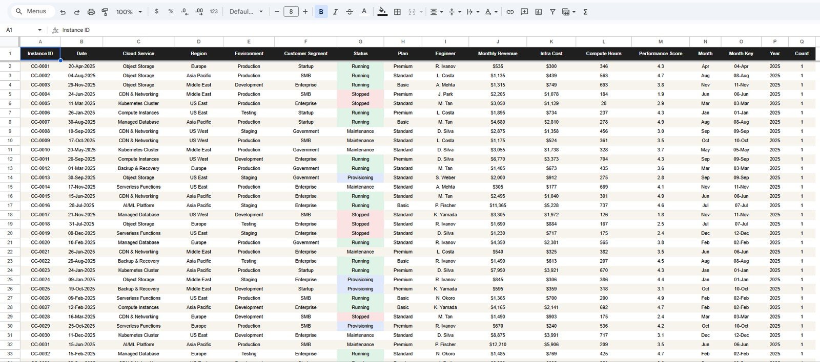
- Editable data structure: Add your own data in the same format on the Data sheet.
- Google Sheets format: Share, review, and update the file in Google Drive.
Dashboard Pages Explanation
1. Overview Page
The Overview Page gives a quick executive summary of cloud activity. The top cards show Total Revenue, Running Instances, Infra Cost, and Avg Performance so users can check the most important cloud metrics before moving into detailed analysis.
Revenue by Month: This chart shows how cloud revenue changes month by month. It helps teams identify growth periods, slowdowns, or revenue spikes that need a closer look.
Infra Cost by Month: This chart tracks infrastructure cost movement across the same monthly timeline. It helps compare spending patterns against revenue trends and operational activity.
Instances by Status: This chart breaks cloud instances into statuses such as running, stopped, pending, or terminated depending on the data structure. It helps teams understand the current operational mix at a glance.
Revenue by Region: This chart compares cloud revenue across regions. It is useful for spotting high-performing regions and identifying markets where cloud usage is lower.
Revenue by Cloud Service: This chart shows which cloud services contribute the most revenue. It helps teams understand which services are driving commercial value.
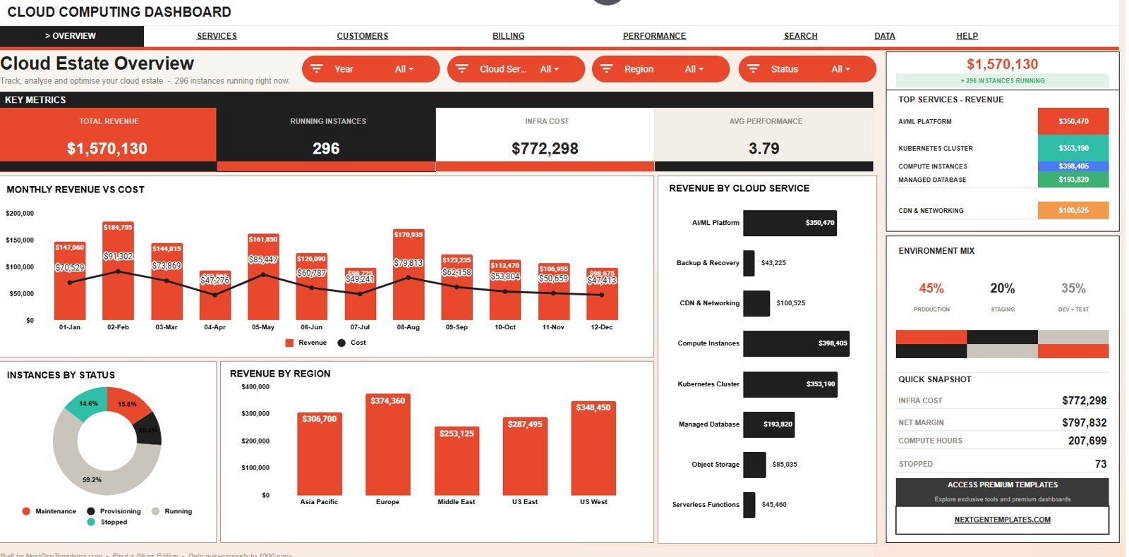
Cloud Computing Dashboard in Google Sheets
2. Service Performance
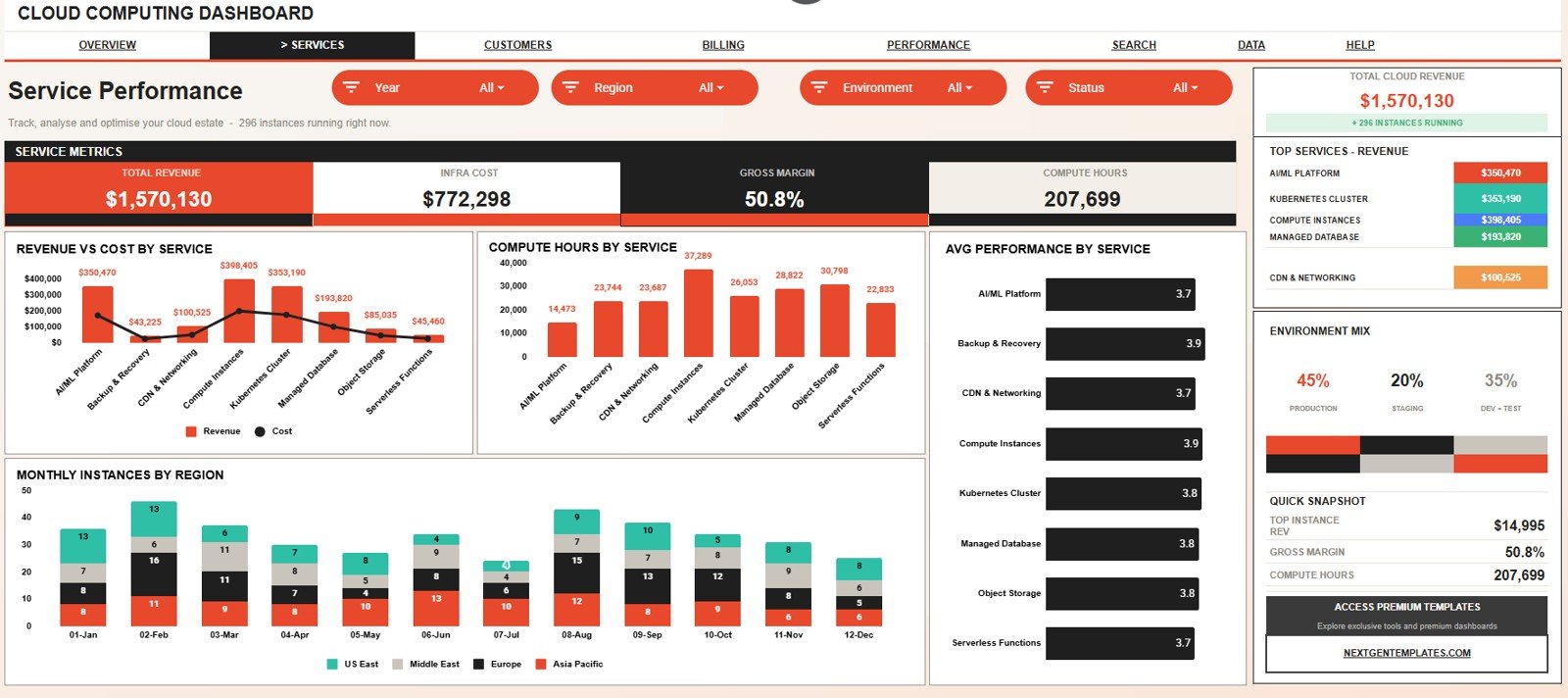
The Service Performance tab focuses on how each cloud service performs financially and operationally. It gives a service-level view of revenue, infrastructure cost, compute hours, performance score, and regional instance movement.
Revenue by Cloud Service: This chart compares revenue generated by each cloud service. It helps identify the services that matter most to the business model.
Infra Cost by Cloud Service: This chart shows how infrastructure cost is distributed across cloud services. It helps teams see which services consume the most budget.
Compute Hours by Cloud Service: This chart compares compute hour usage by service. It helps reveal which services are heavy usage drivers even when revenue does not move at the same rate.
Avg Performance by Cloud Service: This chart compares average performance score across cloud services. It helps teams detect services that may need tuning, monitoring, or architecture review.
Monthly Instances by Region: This chart shows instance counts by month and region. It helps teams understand whether growth is concentrated in specific regions or spread across the environment.
3. Customer Analysis
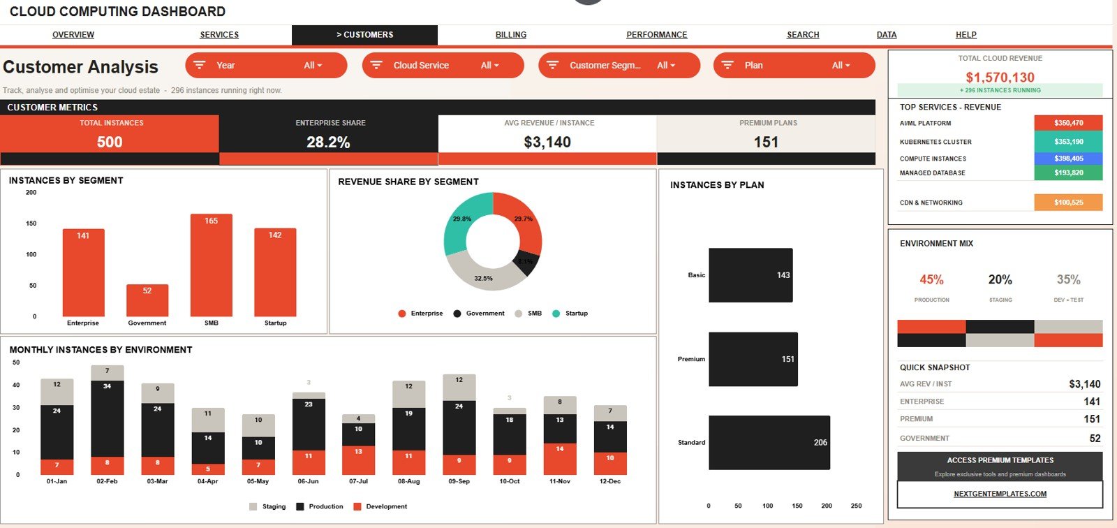
The Customer Analysis tab explains cloud usage and revenue from the customer side. It helps teams compare instance counts, revenue share, plan distribution, and environment activity across customer groups.
Instances by Customer Segment: This chart shows how many instances belong to each customer segment. It helps identify which customer groups create the most operational volume.
Revenue Share by Customer Segment: This chart compares how much revenue each customer segment contributes. It helps teams understand whether high-volume segments are also high-value segments.
Instances by Plan: This chart compares instance distribution by plan. It helps sales, finance, and operations teams see which plans are most commonly used.
Monthly Instances by Environment: This chart tracks instance movement by environment over time. It helps separate production, staging, testing, and other environment patterns when those fields are used in the data.
4. Billing & Margin
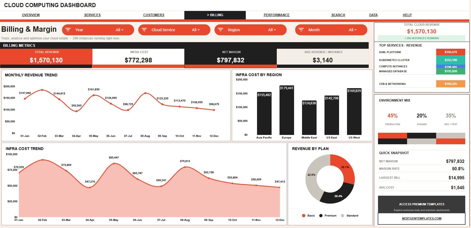
The Billing & Margin tab is built for financial review of cloud activity. It combines revenue and infrastructure cost analysis so teams can connect billing performance with operating spend.
Revenue by Month: This chart shows the monthly revenue trend for the cloud environment. It helps finance teams compare recent revenue against earlier periods.
Infra Cost by Region: This chart compares infrastructure cost across regions. It helps identify locations where operating cost may need review.
Infra Cost by Month: This chart shows how infrastructure cost changes over time. It helps teams monitor spend increases before they become recurring budget issues.
Revenue by Plan: This chart compares revenue by customer plan. It helps teams understand which plans contribute the most to cloud revenue.
5. Platform Performance
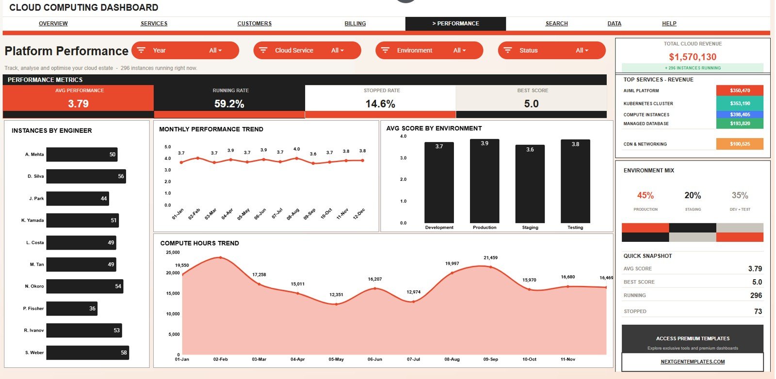
The Platform Performance tab focuses on engineering ownership and operational quality. It helps teams review instance counts, performance scores, environment averages, and compute hour trends.
Instances by Engineer: This chart shows how instances are distributed across engineers. It helps managers understand workload visibility and ownership patterns.
Avg Performance Score by Month: This chart shows how average performance score changes over time. It helps teams spot whether platform health is improving or slipping.
Avg Score by Environment: This chart compares performance score by environment. It helps reveal whether production, staging, or testing environments need different levels of attention.
Compute Hours by Month: This chart tracks compute hour usage across months. It helps teams see whether usage growth is aligned with revenue and instance activity.
6. Search Sheet Tab
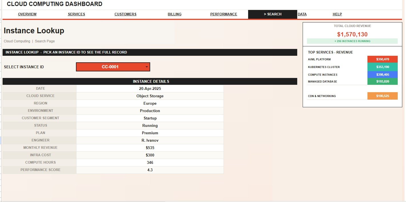
The Search sheet is used for quick instance-level lookup. Users can select an Instance ID and instantly view the full record, including date, cloud service, region, environment, customer segment, status, plan, engineer, monthly revenue, infra cost, compute hours, and performance score.
7. Data Sheet Tab
The Data sheet is where the source records are stored. Users should add new cloud data in the same format so the dashboard pages, cards, charts, slicers, and search logic continue working correctly.
Cloud Computing Dashboard in Google Sheets vs. Microsoft Excel Dashboard vs. Paid Cloud SaaS – Feature Comparison
| Feature | Google Sheets Dashboard | Microsoft Excel Dashboard | Paid Cloud SaaS |
|---|---|---|---|
| Setup speed | Copy the template, add data, and start filtering. | Open the workbook and configure sharing or storage. | Often requires connectors, roles, onboarding, or analyst setup. |
| Cost model | One-time template purchase. | Template purchase plus Excel or Microsoft 365 access. | Usually monthly or annual subscription. |
| Collaboration | Works naturally with Google Drive sharing. | Works well through OneDrive or SharePoint. | Depends on paid user seats and permissions. |
| Cloud reporting focus | Built around services, regions, environments, instances, plans, engineers, revenue, and cost. | Can be strong if the workbook is built for the same fields. | Can be deeper, especially with live integrations. |
| Instance lookup | Included with a Search sheet and Instance ID selector. | May require formulas, filters, or custom setup. | Available only if the data model supports it. |
| Customization | Easy to edit inside Google Sheets. | Easy to edit inside Excel. | Often restricted by vendor configuration. |
| Best fit | Lightweight shared cloud reporting. | Desktop or Microsoft-centric reporting. | Enterprise monitoring, automation, and live data pipelines. |
Who Should Use This Template
This template is useful for IT managers, cloud operations analysts, finance teams, DevOps leads, infrastructure managers, SaaS founders, MSPs, agencies, consultants, and business analysts who need a spreadsheet-based cloud dashboard.
It is especially helpful when the team already exports cloud billing, instance, service, or performance data and wants a faster way to present that information in Google Sheets.
Real-World Use Cases
- Monthly cloud performance review: Use the Overview and Platform Performance pages to review revenue, active instances, cost, performance score, compute hours, and engineer ownership.
- Cloud cost review: Use Billing & Margin to compare infrastructure cost by region and month alongside revenue trends.
- Service portfolio analysis: Use Service Performance to compare revenue, cost, compute hours, and average performance by cloud service.
- Customer segment reporting: Use Customer Analysis to compare instance counts, revenue share, plan mix, and environment usage.
- Instance investigation: Use the Search sheet to quickly find one Instance ID and review the full record without scanning the full data table.
Advantages of Cloud Computing Dashboard in Google Sheets
- Fast to deploy: You can copy the file, replace sample data, and start using the dashboard structure quickly.
- Easy to share: Google Sheets works well for collaborative review and lightweight team reporting.
- Business-friendly layout: The template combines finance, service, customer, billing, and engineering views in one file.
- Lower cost: A one-time dashboard template can be more practical than subscribing to a heavy reporting platform for simple spreadsheet reporting.
- Flexible data entry: The Data sheet keeps the structure visible so teams can maintain the report without hidden systems.
Opportunities for Improvement
This dashboard is designed as a Google Sheets reporting template, not a live cloud monitoring platform. Teams that need live AWS, Azure, or Google Cloud API connections, automated alerts, uptime checks, incident response workflows, or detailed permission logs may need a custom integration or dedicated cloud monitoring platform.
For advanced use, the template can be extended with Apps Script, scheduled imports, connected sheets, or custom formulas. Those additions depend on the team’s cloud export format, security rules, and reporting process.
Best Practices
- Keep the Data sheet column structure consistent when replacing sample records.
- Use controlled values for cloud service, region, environment, customer segment, plan, status, and engineer names.
- Review revenue, infra cost, compute hours, and performance score together instead of judging one metric alone.
- Use slicers during meetings so stakeholders can quickly switch between regions, services, environments, and customer groups.
- Check the Search sheet after loading new data to confirm Instance ID lookup still returns complete records.
- Create a backup copy before major formula, chart, or slicer changes.
Explore Relevant Templates
- Cloud Computing Dashboard in Google Sheets – the template covered in this guide.
- Cloud Computing KPI Dashboard in Google Sheets – useful when the focus is KPI target tracking.
- Cloud Computing Dashboard in Power BI – useful for teams that prefer Power BI reporting.
- Cybersecurity Dashboard in Google Sheets – helpful for IT and security reporting workflows.
- Browse Google Sheets dashboard templates for more ready-to-use dashboards.
Frequently Asked Questions
What is included in the Cloud Computing Dashboard in Google Sheets?
It includes 7 sheet tabs, 4 KPI cards, 20 chart views, slicers, a Search sheet, and a Data sheet for cloud reporting.
What cards are shown on the Overview Page?
The Overview Page shows Total Revenue, Running Instances, Infra Cost, and Avg Performance.
Can I use this dashboard with my own cloud data?
Yes. Replace the sample records in the Data sheet using the same format and the dashboard will use the updated data structure.
Does the template connect directly to AWS, Azure, or Google Cloud?
No. It is a Google Sheets reporting template for exported or manually entered cloud data. Direct cloud platform integration would require separate setup.
What does the Search Sheet tab do?
The Search Sheet lets you select an Instance ID and view the full instance record, including date, cloud service, region, environment, customer segment, status, plan, engineer, revenue, cost, compute hours, and performance score.
Is this template good for cloud cost management?
Yes. It includes infrastructure cost by month, cost by region, cost by cloud service, and revenue views that help teams review cloud spend alongside business output.
Is this a one-time purchase?
Yes. It is sold as a one-time dashboard template from NextGenTemplates.
About the Author
Built by PK – Microsoft Certified Professional with 15+ years of Excel, Google Sheets, and Power BI experience. Founder of NextGenTemplates, reaching 300K+ subscribers across YouTube channels. Every template is hand-built and tested before release.
Conclusion
The Cloud Computing Dashboard in Google Sheets gives teams a practical way to review cloud revenue, running instances, infrastructure cost, services, regions, customer segments, plans, engineers, compute hours, and performance scores in one editable reporting file.
Use it when you need a clear cloud reporting structure without starting from a blank spreadsheet or paying for a larger SaaS reporting system. Visit our YouTube channel for more technology dashboard ideas and workflow tutorials.Cloud Computing Dashboard in Google Sheets