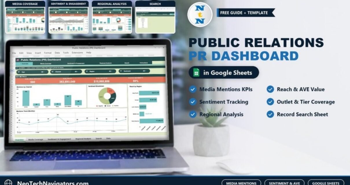
Public relations teams are under pressure to prove which stories, channels, outlets and regions actually move brand visibility forward. A simple media list is no longer enough. The Public Relations (PR) Dashboard in Google Sheets shows total media mentions, reach, sentiment, AVE value, engagement and outlet performance in one place, and lets you filter it by year, month, channel, region, sentiment and media tier.
The need for better PR reporting is a recurring theme in current media research. Cision’s 2026 State of the Media Report, built on input from more than 1,800 journalists, looks at what reporters want from PR teams and how AI is changing outreach. Muck Rack’s 2026 State of Journalism research also highlights how newsroom pressure, AI adoption and trust issues are changing how journalists evaluate pitches and sources.
This template is built for that reality. It gives PR managers, agencies, communications teams and brand marketers a clean Google Sheets dashboard for monitoring coverage without building charts from scratch.
🎥 Watch the Video Tutorial
Get the PR Dashboard in Google Sheets
Key Features of the Public Relations (PR) Dashboard in Google Sheets
- Ready-to-use Google Sheets dashboard: track PR performance in a familiar spreadsheet that is easy to copy, edit and share.
- Four dashboard pages: Overview, Media Coverage, Sentiment & Engagement and Regional Analysis, each with four KPI cards and four charts.
- Slicers on every page: each page has four slicers drawn from Year, Month, Channel, Region, Sentiment and Tier.
- Visual PR analytics: charts for channel mix, top outlets, monthly trends, reach, AVE, tier coverage, engagement and sentiment.
- Search sheet included: look up a single media mention by Record ID and review the full record instantly.
- Editable data sheet: add your own media coverage data in the same format to keep the dashboard updated, with an Instructions tab for reference.
Dashboard Pages Explanation
1. Overview Page
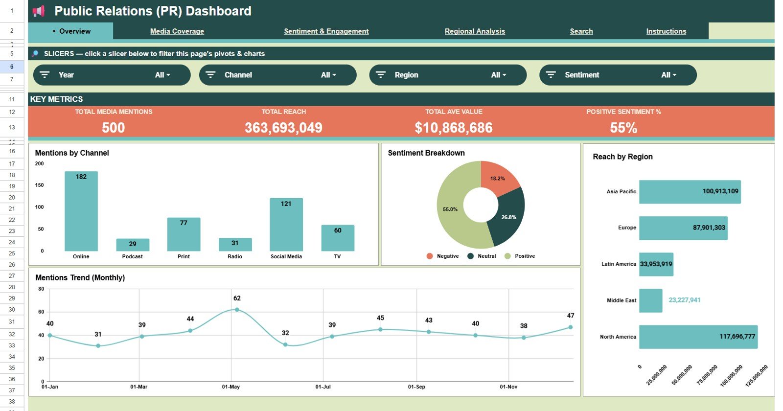
The Overview page is designed for quick executive reporting. Its slicers are Year, Channel, Region and Sentiment, and four KPI cards summarise the main PR outcomes: Total Media Mentions (500 in the sample), Total Reach (363,693,049), Total AVE Value ($10,868,686) and Positive Sentiment % (55%).
- Mentions by Channel: compares mentions across the six channels in the data: Online, Podcast, Print, Radio, Social Media and TV. In the sample, Online leads with 182 mentions, followed by Social Media with 121.
- Sentiment Breakdown: a donut that splits coverage into Positive, Neutral and Negative, a fast way to spot reputation risk.
- Reach by Region: audience reach for Asia Pacific, Europe, Latin America, Middle East and North America.
- Mentions Trend (Monthly): shows how mentions change month by month, so spikes can be linked to launches, events, announcements or crisis response.
2. Media Coverage
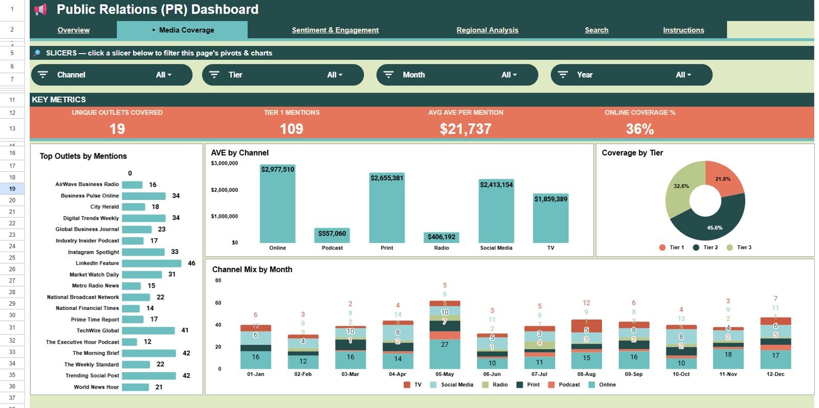
The Media Coverage page focuses on where coverage comes from and how much value each outlet, channel and tier contributes. Its slicers are Channel, Tier, Month and Year, and its KPI cards are Unique Outlets Covered (19), Tier 1 Mentions (109), Avg AVE per Mention ($21,737) and Online Coverage % (36%).
- Top Outlets by Mentions: ranks outlets by the number of mentions, showing which publications cover your campaigns repeatedly.
- AVE by Channel: compares advertising value equivalent by channel. Treat AVE as a directional benchmark and read it alongside reach, sentiment and engagement.
- Coverage by Tier: splits coverage into Tier 1, Tier 2 and Tier 3, so leadership can see whether activity produces high-authority placements.
- Channel Mix by Month: a stacked chart showing whether coverage is becoming more balanced or overly dependent on one channel.
3. Sentiment & Engagement
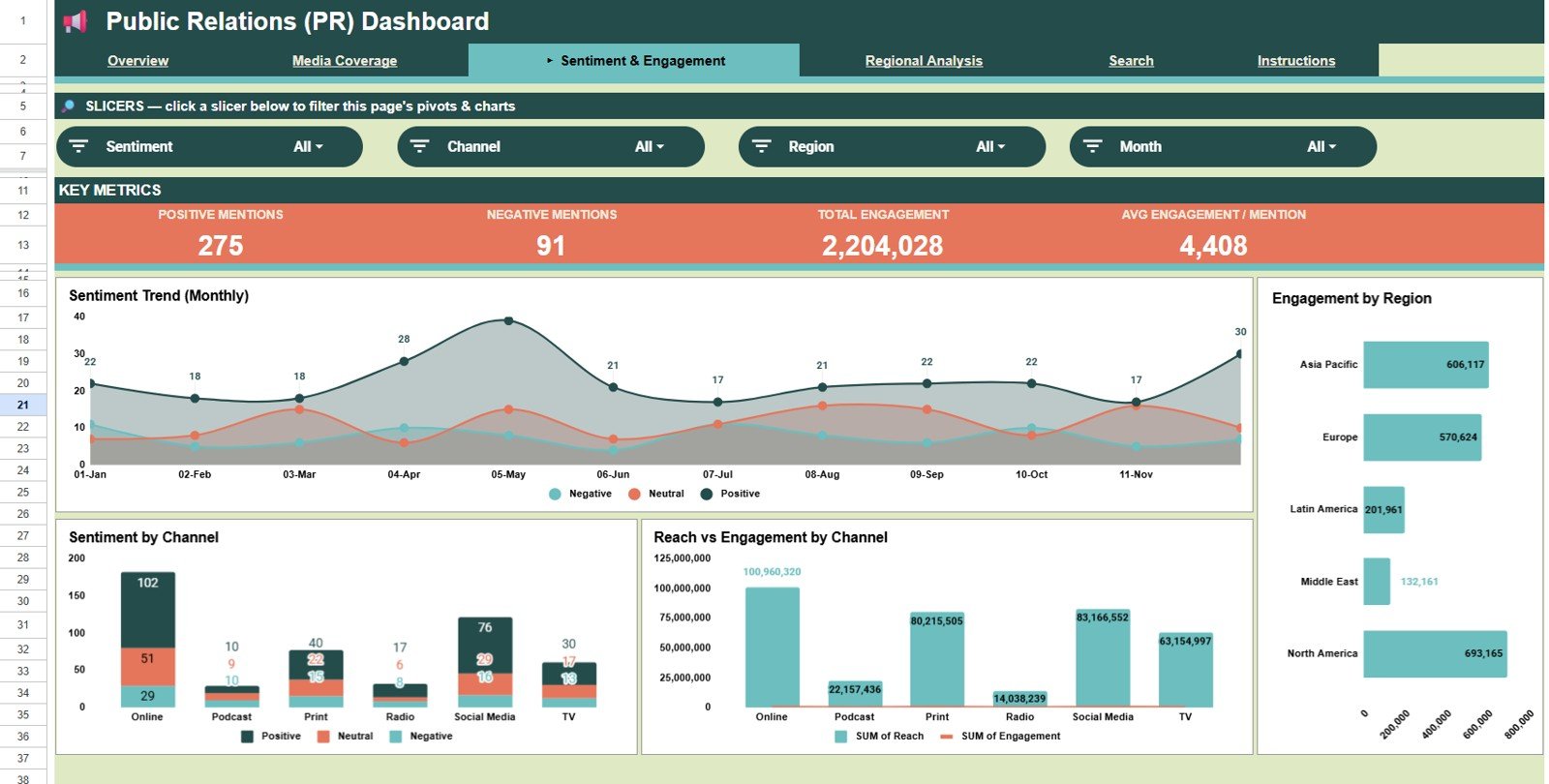
This page connects the tone of coverage with the audience reaction it generates. Its slicers are Sentiment, Channel, Region and Month, and the KPI cards are Positive Mentions (275), Negative Mentions (91), Total Engagement (2,204,028) and Avg Engagement / Mention (4,408).
- Sentiment Trend (Monthly): tracks positive, neutral and negative mentions over time to reveal reputation shifts after launches, reviews or issues.
- Engagement by Region: compares where audiences react, share and comment most.
- Sentiment by Channel: shows whether one channel drives stronger positive coverage while another needs closer message control.
- Reach vs Engagement by Channel: compares audience size with interaction so you do not judge performance by reach alone.
4. Regional Analysis
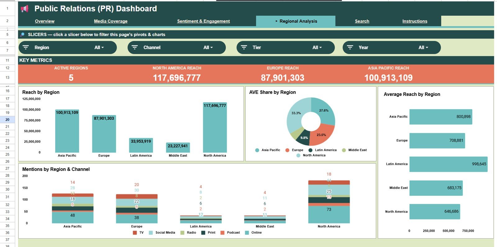
The Regional Analysis page compares PR performance across the five regions in the data. Its slicers are Region, Channel, Tier and Year, and its KPI cards are Active Regions (5), North America Reach, Europe Reach and Asia Pacific Reach.
- Reach by Region: total reach for each region.
- AVE Share by Region: whether PR value is concentrated in a few markets or spread across the footprint.
- Average Reach by Region: average reach per mention, showing whether fewer mentions still produce strong exposure (Latin America has the highest average in the sample).
- Mentions by Region & Channel: which channels work best in each region, supporting smarter local planning.
5. Search Sheet Tab
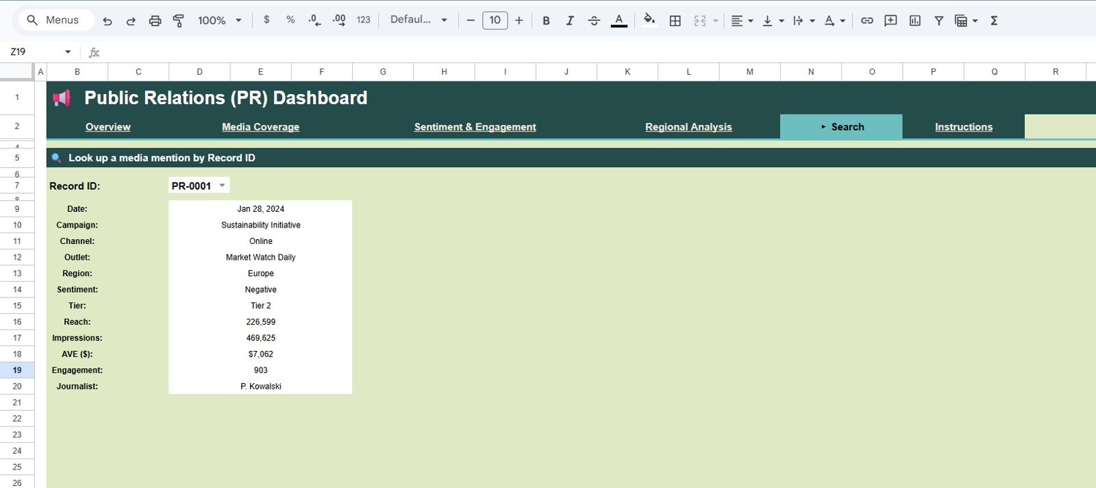
The Search sheet lets you look up a media mention by Record ID (for example PR-0001) and review its Date, Campaign, Channel, Outlet, Region, Sentiment, Tier, Reach, Impressions, AVE ($), Engagement and Journalist. It is useful for quick record checks during meetings.
6. Data Sheet Tab
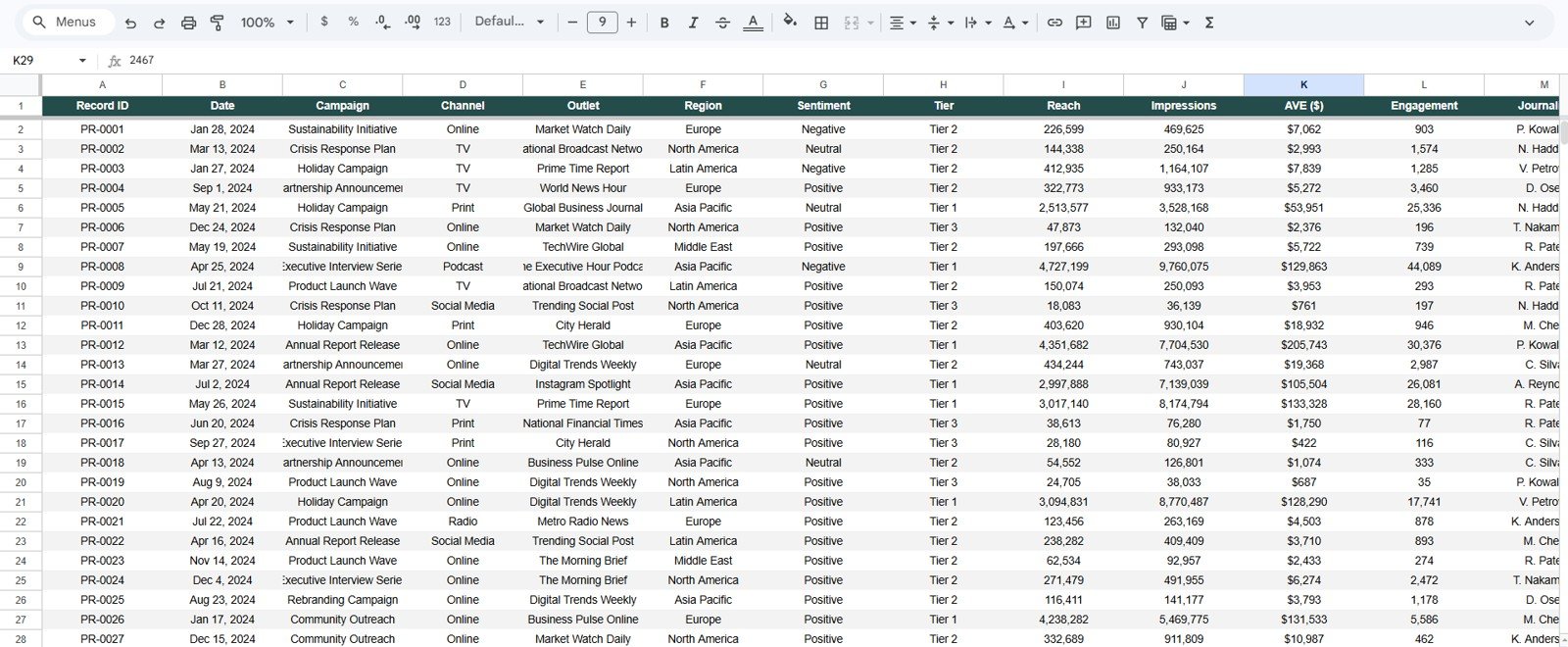
The Data sheet holds one row per media mention with these columns: Record ID, Date, Campaign, Channel, Outlet, Region, Sentiment, Tier, Reach, Impressions, AVE ($), Engagement and Journalist. Enter your data in the same column structure, review the dashboard, and use the slicers to analyse coverage from different angles. Keeping this sheet consistent is the key to reliable charts.
PR Dashboard KPIs at a Glance
The table lists the KPI cards shown in the screenshots, with the sample values and how each one relates to the data. Ratios are worked out from the sample numbers so you can check them yourself.
| KPI | Page | What it shows | Sample value / check |
|---|---|---|---|
| Total Media Mentions | Overview | Number of coverage records | 500 |
| Total Reach | Overview | Sum of Reach | 363,693,049 |
| Total AVE Value | Overview | Sum of AVE ($) | $10,868,686 |
| Positive Sentiment % | Overview | Positive mentions ÷ all mentions | 275 ÷ 500 = 55% |
| Unique Outlets Covered | Media Coverage | Distinct outlets in the data | 19 |
| Tier 1 Mentions | Media Coverage | Mentions in Tier 1 outlets | 109 (21.8% of 500) |
| Avg AVE per Mention | Media Coverage | Total AVE ÷ mentions | 10,868,686 ÷ 500 ≈ $21,737 |
| Online Coverage % | Media Coverage | Online mentions ÷ all mentions | 182 ÷ 500 ≈ 36% |
| Positive / Negative Mentions | Sentiment & Engagement | Count of each sentiment | 275 / 91 |
| Total Engagement | Sentiment & Engagement | Sum of Engagement | 2,204,028 |
| Avg Engagement / Mention | Sentiment & Engagement | Total Engagement ÷ mentions | 2,204,028 ÷ 500 ≈ 4,408 |
| Active Regions | Regional Analysis | Regions with coverage | 5 |
| North America / Europe / Asia Pacific Reach | Regional Analysis | Sum of Reach for that region | 117,696,777 / 87,901,303 / 100,913,109 |
Why Use Google Sheets for PR Reporting?
Many PR reports are still created manually in slide decks after the campaign ends. That works for storytelling, but it makes trend tracking, filtering and repeatable reporting harder. A Google Sheets dashboard gives teams a shared source of truth that can be updated regularly and reviewed from any browser. Google’s guidance on sharing files from Google Drive makes agency-client collaboration straightforward.
| Option | Best for | Limitations |
|---|---|---|
| Manual PR report | One-time campaign recap | Slow to update and difficult to filter |
| Enterprise PR platform | Large teams with platform budgets | Higher cost and heavier setup |
| Google Sheets PR dashboard | Agencies, small teams, consultants and startups | Requires consistent data entry |
Who Should Use This Dashboard?
It suits PR agencies managing several clients, in-house communications teams reporting to leadership, startup founders tracking earned media, marketing teams monitoring brand awareness, and consultants who need a polished reporting format. Nonprofits, event teams and product launch teams can also use it to see which media activities produce attention and engagement.
If you need a KPI-focused view with targets and month-to-date figures, read our guide to the Public Relations KPI Dashboard in Google Sheets. To plan pitches before coverage lands, the PR Outreach Calendar in Google Sheets pairs well with this dashboard.
Real-World Use Cases
- Campaign reporting: summarise coverage, regional reach, sentiment and outlet performance after a campaign; the Campaign field is visible on every record in the Search sheet.
- Monthly PR review: use the Month and Year slicers to track mentions and explain what changed during the period.
- Agency-client updates: share a clean dashboard that clients can review without extra software.
- Reputation monitoring: spot increases in negative sentiment and inspect the records behind them by Record ID.
- Regional planning: compare markets by reach, AVE share and engagement before allocating the next budget.
Advantages of the Public Relations Dashboard
The main advantage is speed. Instead of building a new spreadsheet every time you prepare a PR report, you enter records into the data sheet and review the charts immediately. Structured fields such as campaign, channel, outlet, region, sentiment, tier, reach, impressions, AVE, engagement and journalist also encourage better measurement discipline.
Another advantage is transparency. Stakeholders can see the source data behind the charts, search individual records and filter results without waiting for a new report version.
Limitations and Opportunities for Improvement
No PR dashboard replaces strategic judgment. AVE should not be the only measure of PR value, and reach should be reviewed alongside sentiment and engagement. The slicers cover year, month, channel, region, sentiment and tier; campaign appears in the data and in the Search sheet, so to compare campaigns you would filter the Data sheet or add your own slicer. Teams can also extend the data with campaign goals, earned backlinks, message pull-through, share of voice or conversion fields if those metrics matter to their reporting. For social-led campaigns, the Social Media Influencer Tracking Dashboard and the Media Planning KPI Dashboard cover the paid and creator side.
Best Practices for Using the Dashboard
- Use consistent campaign, channel, region and outlet names so slicers and charts group cleanly.
- Update the data sheet weekly or monthly instead of waiting until the end of the quarter.
- Define clear rules for positive, neutral and negative sentiment before anyone starts tagging.
- Use AVE as a directional reference, not as the only measure of PR impact.
- Keep a short note of major events that explain unusual spikes or drops.
If you want to learn how dashboards like this are built, the Pivot Tables & Dashboards course on NextGenTemplates Academy covers KPI cards, charts and slicers step by step.
Explore Relevant Templates
To extend your communications reporting, see the Public Relations KPI Dashboard in Google Sheets and the Public Relations (PR) Dashboard in Power BI.
Frequently Asked Questions
Is this Public Relations Dashboard editable?
Yes. It is built in Google Sheets, so you can copy the template, edit the data sheet, adjust labels and customise it for your own PR reporting.
What metrics are included in the dashboard?
Sixteen KPI cards across four pages, including Total Media Mentions, Total Reach, Total AVE Value, Positive Sentiment %, Tier 1 Mentions, Avg AVE per Mention, Total Engagement and regional reach. The data also holds impressions, outlet, campaign and journalist for every mention.
Can I use this dashboard for agency clients?
Yes. Agencies can use it for client reporting, campaign reviews, monthly updates and internal coverage analysis. Make a separate copy per client to keep data apart.
Does the dashboard require paid software?
No. You only need a Google account with access to Google Sheets and your own media coverage data.
Can I filter the PR dashboard?
Yes. Each dashboard page has four slicers, drawn from Year, Month, Channel, Region, Sentiment and Tier.
About the Author
PK creates practical spreadsheet templates, dashboards and business tools for NextGenTemplates.com. The focus is on ready-to-use systems that help teams organise data, monitor performance and make clearer decisions without expensive software.
Wrapping Up
The Public Relations (PR) Dashboard in Google Sheets gives PR and communications teams a structured way to track media coverage, sentiment, reach, AVE, engagement, outlets, channels and regional performance. Load last month’s coverage into the Data sheet, review the Overview page with your team, and use the Search sheet whenever a number needs explaining.
Get the Public Relations (PR) Dashboard
📅 Last updated: October 2026