Have you ever wondered how to make your data look snappy without clogging your spreadsheet with bulky charts? Well, Sparklines in Google Sheets are your go-to solution! These tiny, powerful mini-charts sit neatly in a single cell, showcasing trends and variations with ease. Google Sheets has made it incredibly simple for anyone to add and customize sparklines, transforming dull data into captivating visual insights.
Why Should You Use Sparklines in Google Sheets
So, why opt for sparklines? Here’s the scoop:
- Visual Simplicity: Sparklines turn complex data trends into straightforward visuals. This means you can get the gist of your data with just a quick glance.
Space Efficiency: These little guys are space savers! Occupying just one cell, they’re perfect for sleek dashboards and tight reports.
Immediate Insights: Sparklines offer real-time insights, helping you make swift decisions without sifting through rows and columns of numbers.
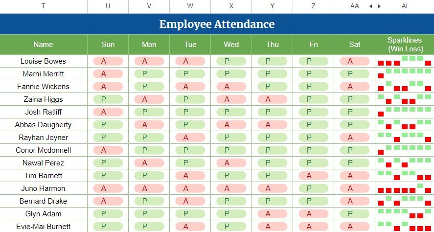
Employee Wise Attendance

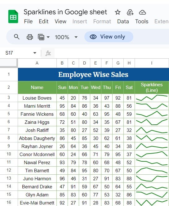
Employee Wise Sales

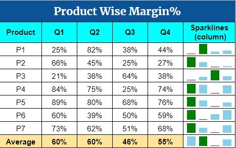
Employee Wise Margin%

How to Create Sparklines in Google Sheets
Getting sparklines up and running in Google Sheets is a breeze. Let’s walk through it together:
Step 1: Select Your Data
First off, pick the data you want to represent. Want to see how your sales are doing daily? Highlight those sales figures!
Step 2: Insert a Sparkline
Next, head to the cell where you want your sparkline to shine. Pop in this formula:
=SPARKLINE(data _range)
Just swap data_ range with your actual data cells.
Step 3: Customize Your Sparkline
Now for the fun part—making it your own! Google Sheets lets you jazz up your sparklines. Fancy a blue sparkline? Here’s how:
=SPARKLINE(data _range, {"color", "blue"})
Or maybe switch from a line to a column chart? Easy peasy:
=SPARKLINE(data_range, {"type", "column"})
Advantages of Sparklines in Google Sheets
- Efficient Data Presentation: Quick peeks at data trends? Check!
- Enhanced Dashboard Aesthetics: They really spruce up your reports and dashboards.
- Fully Customizable: Match them to your document’s style or theme effortlessly.
Room for Improvement?
Even though sparklines rock, there’s always room to grow:
- More Chart Types: How about adding smoothed lines or area charts for deeper analysis?
- Interactive Features: Imagine hovering over a sparkline to see detailed data points or clicking for more info. That would be handy!
Best Practices for Sparklines
- Keep It Simple: Stick to essential data to avoid clutter.
- Consistency is Key: Maintain a uniform style for a clean, professional look.
- Use Wisely: Sparklines are great, but only add them where they truly enhance understanding.
Wrapping Up
Sparklines in Google Sheets are a compact and mighty tool for anyone looking to elevate their data visuals. They help you spot trends quickly and make informed decisions effortlessly.
Frequently Asked Questions
Q1: Can I create sparklines for non-adjacent cells?
Absolutely! Just include multiple data ranges separated by semi-colons in your formula.
Q2: Are sparklines available in all versions of Google Sheets?
Yes, sparklines are a staple in all versions, whether you’re on web or mobile.
Q3: How do I delete a sparkline?
Just clear the cell content where the sparkline is, and it’s gone!
By embracing these tips and tapping into the full potential of sparklines, your Google Sheets will not only look better but also provide sharper insights.
Visit our YouTube channel to learn step-by-step video tutorials
Watch the step-by-step video tutorial:
Click here to Make the copy of this Template
