Hospital Patient Flow Dashboard in HTML is a comprehensive, browser-based analytics solution built for hospital administrators, healthcare analysts, clinical quality teams, and operations managers who need to monitor patient flow, treatment costs, wait times, satisfaction scores, and readmission rates across departments from a single interactive interface. This powerful HTML dashboard template transforms raw hospital patient data into meaningful visual insights that support faster, smarter decision-making across every level of your healthcare organization.
Whether you manage a small community hospital or a large multi-department medical center, this dashboard provides a premium, SaaS-quality analytics experience right in your browser. No software installation is needed — just open the HTML file, upload your Excel data, and start exploring patient flow metrics across five dedicated analysis pages instantly.
Click here to Purchase the Hospital Patient Flow Dashboard in HTML
Key Features of the Hospital Patient Flow Dashboard in HTML
This Hospital Patient Flow Dashboard in HTML comes packed with features designed for real-world hospital analytics. The dashboard offers multi-page interactive analytics with a modern sidebar navigation that lets you switch seamlessly between Overview, Department Analysis, Patient Demographics, Capacity and Flow, and Data View pages.
At the top of the Overview page, dynamic KPI cards display Total Patients, Average Length of Stay, Average Wait Time, Total Treatment Cost, Average Satisfaction Score, and Readmission Rate — giving you an instant operational snapshot of your entire hospital. The dashboard includes global filters and slicers that allow you to filter the entire dashboard by department, admission type, date range, and other dimensions for focused analysis.
Interactive chart visualizations including bar charts, line trends, donut charts, and grouped comparisons update dynamically based on your filter selections. A built-in light and dark theme toggle ensures comfortable viewing in any environment. The Excel file upload feature lets you replace demo data with your own hospital data instantly, while the CSV export function on the Data View page enables you to download filtered data for external reporting.
Dashboard Pages Explained
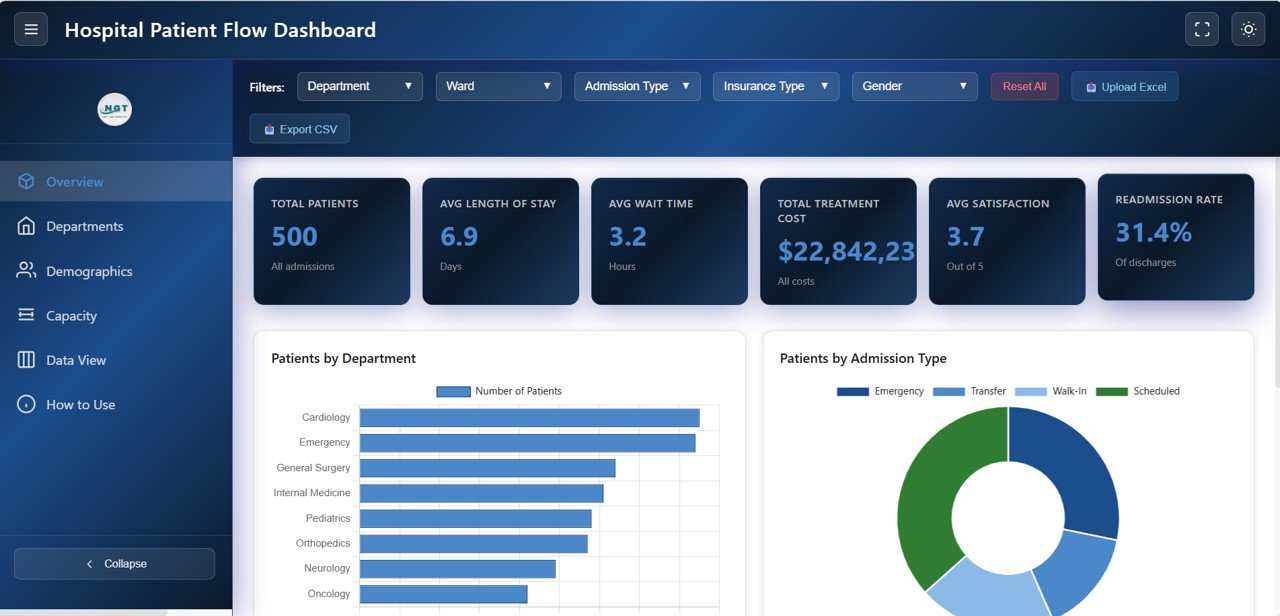
1. Overview Page
The Overview page serves as your command center for hospital patient flow operations. At the top, six high-level KPI cards display Total Patients, Average Length of Stay, Average Wait Time, Total Treatment Cost, Average Satisfaction Score, and Readmission Rate. These cards provide an immediate snapshot of your entire hospital’s health and performance status.
Below the KPI cards, you will find a rich collection of interactive charts. Patients by Department breaks down patient volume across different clinical departments. Patients by Admission Type shows the distribution between emergency, elective, urgent, and other admission categories. Monthly Patient Admissions reveals seasonal admission patterns and volume trends over time. Discharge Status Distribution visualizes how patients exit the hospital system. Multiple slicers are available to apply filters and see the filtered dashboard quickly.
Hospital Patient Flow Dashboard Overview
2. Department Analysis
The Department Analysis page dives deep into each hospital department’s performance across multiple dimensions. Treatment Cost by Department reveals which departments generate the highest expenses, helping administrators identify cost optimization opportunities. Average Length of Stay by Department shows how long patients remain in each department, enabling better bed management and discharge planning.
Average Wait Time by Department highlights operational bottlenecks where patients face the longest waits before receiving care. Satisfaction Score by Department measures patient experience quality across clinical units. Readmission Rate by Department identifies departments with the highest readmission percentages, signaling potential care quality issues that need attention. Together, these analyses provide a 360-degree view of departmental performance.
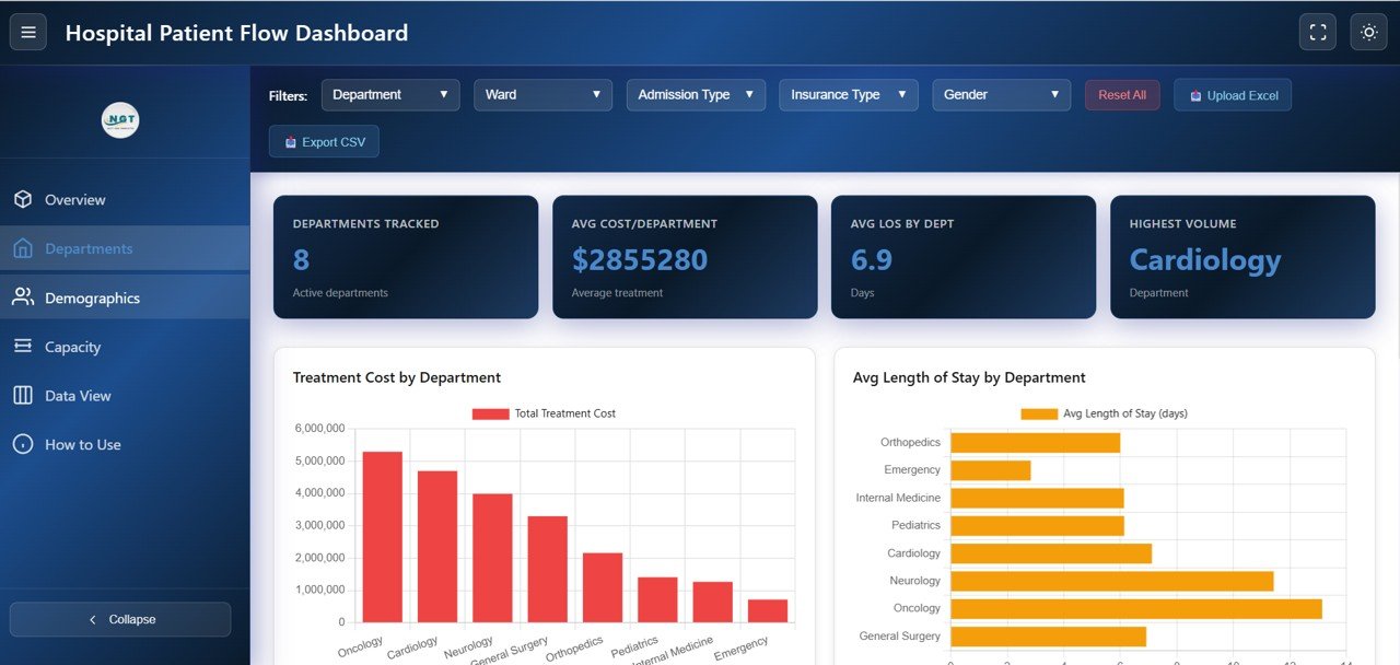
Department Analysis
3. Patient Demographics
The Patient Demographics page helps you understand the composition of your patient population across multiple dimensions. Patients by Gender provides a breakdown of male and female patient volumes. Patients by Age Group segments patients into age brackets to understand which populations your hospital serves most frequently.
Patients by Insurance Type shows the distribution across different insurance providers, helping with revenue forecasting and payer mix analysis. Patients by Diagnosis Category reveals the most common medical conditions treated at your hospital, supporting clinical resource planning and specialty staffing decisions.

Patient Demographics
4. Capacity and Flow
The Capacity and Flow page is essential for hospital bed management and operational efficiency. Patients by Ward shows the distribution of patients across different hospital wards, helping you identify overcrowded or underutilized areas. Patients by Bed Type breaks down utilization across general, ICU, semi-private, and other bed categories.
Average Wait Time by Admission Type compares how long patients wait depending on whether they arrive through emergency, elective, or urgent pathways. Length of Stay Distribution provides a histogram showing how patient stays cluster across different duration ranges, enabling better discharge planning and capacity forecasting.
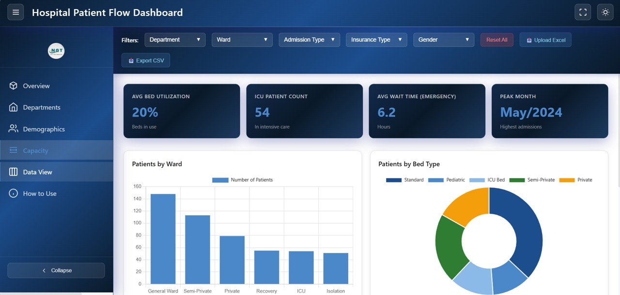
Capacity and Flow
5. Data View
The Data View page is a detailed data table that displays all records from your hospital patient flow dataset. This page features search functionality to quickly find specific patient records, column sorting for organizing data by any field, and pagination for navigating through large datasets efficiently. You can also export the filtered data to CSV format for use in external reports, regulatory filings, or further analysis in other tools like Excel or other analytics dashboards.
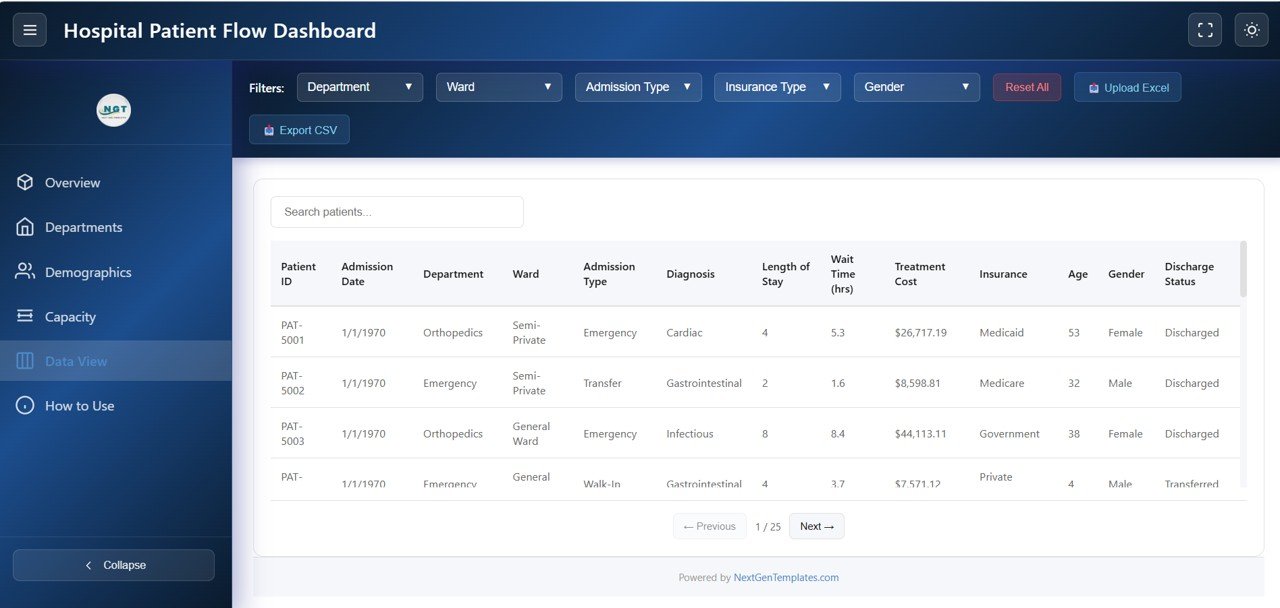
Data View
Advantages of the Hospital Patient Flow Dashboard in HTML
This dashboard offers several significant advantages for healthcare professionals. First, it requires zero software installation — simply open the HTML file in any modern browser and you are ready to analyze. This makes it ideal for hospital teams that need quick access to analytics without IT overhead or licensing costs.
The multi-page structure with dedicated analysis pages for department performance, patient demographics, capacity management, and raw data ensures that different stakeholders can find the insights most relevant to their role. The global filter system means that a single selection cascades across all charts and metrics, saving time and ensuring consistency in analysis.
The Excel upload feature makes this dashboard reusable — upload a new data file each month, quarter, or year and instantly see updated analytics without rebuilding anything. The light and dark theme toggle, CSV export, and responsive design add professional polish that makes this suitable for boardroom presentations and daily operational monitoring alike.
Opportunities for Improvement
While this dashboard provides excellent coverage of hospital patient flow analytics, there are areas where users might consider enhancements. Adding predictive analytics or forecasting models for admission volumes and bed occupancy could help with long-term capacity planning. Integration with real-time data feeds from electronic health records (EHR) systems would enable live monitoring rather than periodic data uploads.
A dedicated financial analysis page tracking treatment costs versus revenue, insurance claim processing times, and department-level profitability would add a financial dimension to the operational data. Additionally, role-based access controls and scheduled report generation would benefit larger hospitals with multiple stakeholder groups needing different views of the same data.
Best Practices for Using the Hospital Patient Flow Dashboard
To get the most out of this Hospital Patient Flow Dashboard in HTML, follow these recommended practices. Update your data regularly — monthly uploads ensure that your KPIs and trend analyses reflect current operational reality. Use the global filters strategically to isolate specific departments, admission types, or time periods when investigating performance anomalies.
Start each analysis session on the Overview page to get a high-level pulse check, then drill into the specific analysis page that addresses your current question. Leverage the Department Analysis page for quarterly performance reviews and quality improvement meetings. Use the Data View export feature to create backup datasets and feed data into complementary tools like Excel pivot tables or other HTML dashboard templates.
Share the dashboard file with team members via email or shared drives — since it is a standalone HTML file, anyone with a browser can open and explore the data independently. For additional guidance, check the official MDN Web Docs on HTML for customization tips.
Explore Relevant Templates
If you found this Hospital Patient Flow Dashboard useful, you may also be interested in these related templates from our collection:
- Healthcare Analytics Dashboard in HTML — Track admissions, revenue, patient outcomes, and hospital KPIs with interactive analytics.
- Hospital Patient Flow Dashboard in Excel — The Excel version with pivot tables, charts, and automated formulas for patient flow tracking.
- Blood Banks Dashboard in Power BI — Monitor blood bank operations, inventory, and donor analytics with Power BI.
- Dental Practice Dashboard in Excel — Track dental clinic performance, patient visits, and revenue analytics.
- Hospital Operations KPI Scorecard in Google Sheets — Monitor hospital KPIs with a Google Sheets-based scorecard template.
Frequently Asked Questions
What KPIs does the Hospital Patient Flow Dashboard in HTML track?
The Hospital Patient Flow Dashboard in HTML tracks 6 key performance indicators including Total Patients, Average Length of Stay, Average Wait Time, Total Treatment Cost, Average Satisfaction Score, and Readmission Rate. It also provides department-level breakdowns and patient demographics analysis across 5 interactive pages.
Do I need any special software to use this HTML dashboard?
No special software or installation is required. Simply open the HTML file in any modern web browser such as Google Chrome, Microsoft Edge, Firefox, or Safari. The dashboard runs entirely in your browser using built-in JavaScript chart libraries.
Can I customize the charts and KPI cards in this dashboard?
Yes, since this is an HTML-based dashboard, anyone with basic knowledge of HTML, CSS, and JavaScript can customize the charts, colors, KPI metrics, and layout to match their specific hospital’s requirements and branding.
What analysis pages are included in this dashboard?
The dashboard includes 5 dedicated pages: Overview (high-level KPIs and charts with filters), Department Analysis (treatment cost, wait time, satisfaction, readmission by department), Patient Demographics (gender, age group, insurance type, diagnosis category), Capacity and Flow (ward utilization, bed type, wait time distribution, length of stay), and Data View (searchable patient records with CSV export).
Can I export data from the dashboard for use in other tools?
Yes, the Data View page includes a CSV export feature that lets you download the filtered dataset. You can then use this exported data in Excel, Power BI, Google Sheets, or any other analytics tool for further analysis or reporting.
Is this dashboard suitable for tracking patient readmission rates?
Absolutely. The dashboard prominently displays the Readmission Rate as a KPI card on the Overview page and provides department-level readmission analysis on the Department Analysis page, making it an excellent tool for hospitals focused on reducing preventable readmissions and improving care quality outcomes.
Conclusion
The Hospital Patient Flow Dashboard in HTML is a powerful, ready-to-use analytics tool that brings clarity to complex hospital operations. With five dedicated analysis pages covering patient flow overview, department performance, demographics profiling, capacity management, and detailed data exploration, this dashboard equips healthcare professionals with the insights they need to optimize patient care, reduce wait times, control treatment costs, and make data-driven operational decisions.
Whether you are a hospital administrator tracking patient volumes, a quality improvement officer monitoring readmission rates, or an operations analyst benchmarking departmental performance, this HTML dashboard delivers professional-grade analytics with zero installation and maximum flexibility.
Click here to Purchase the Hospital Patient Flow Dashboard in HTML
Visit our YouTube channel for step-by-step video tutorials and dashboard walkthroughs: