The Distribution KPI Scorecard in Google Sheets tracks 10+ distribution KPIs across 4 structured worksheets, with MTD and YTD trend charts, color-coded performance indicators, and dropdown-driven filtering. According to a 2025 Gartner supply chain survey, 67% of mid-market distribution teams still rely on spreadsheets for KPI tracking — yet fewer than 20% use a structured scorecard format that separates definitions, input data, and visual analysis.
This ready-to-use scorecard template solves that gap. It gives distribution managers a pre-built KPI framework with automatic MTD/YTD calculations, trend charts comparing Actual vs Target vs Previous Year, and color-coded conditional formatting — all in a free, browser-based Google Sheets environment with real-time team collaboration built in.
Key Features of Distribution KPI Scorecard in Google Sheets
👉 Click here to Purchase the Distribution KPI Scorecard in Google Sheets
The Distribution KPI Scorecard in Google Sheets includes 4 worksheets: Scorecard, KPI Trend, Input Data, and KPI Definition. It tracks 10+ distribution-specific KPIs including on-time delivery rate, order fill rate, distribution cost per unit, warehouse utilization, fleet efficiency, and returns processing time. All metrics recalculate automatically when you update the Input Data sheet with new actual values.
The scorecard uses dropdown menus for month selection and supports three analysis views: individual month, Month-to-Date (MTD), and Year-to-Date (YTD). Color-coded conditional formatting flags underperforming KPIs instantly — no manual formatting or formula editing needed. The KPI Definition sheet serves as a master reference, feeding all labels, units, and formulas throughout the scorecard.
Every KPI includes its group classification, measurement unit, type designation (Lower the Better or Upper the Better), calculation formula, and plain-language definition. This structured approach ensures consistency across reporting periods and makes onboarding new team members faster.
Scorecard Sheets Explanation
👉 Click here to Purchase the Distribution KPI Scorecard in Google Sheets
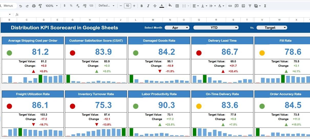
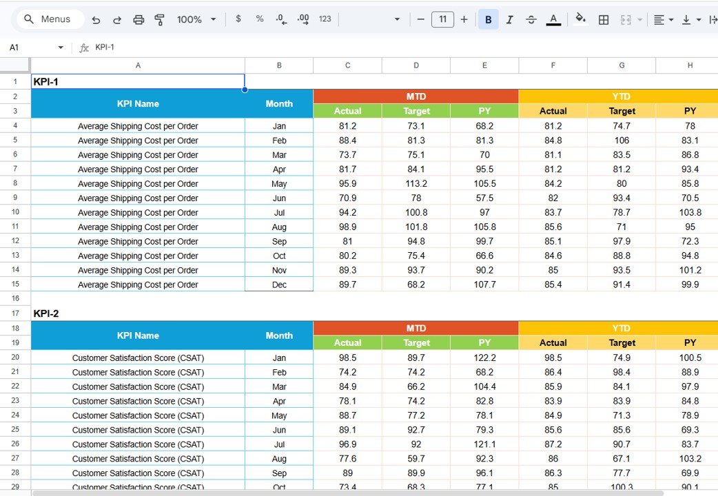
1. Scorecard Sheet (Main Interface)
The Scorecard sheet is the primary view where all KPI performance is displayed in a single consolidated layout. Select the month, MTD, or YTD using dropdown menus at the top. The sheet compares actual values against targets with color-coded visual indicators that flag underperforming metrics instantly.
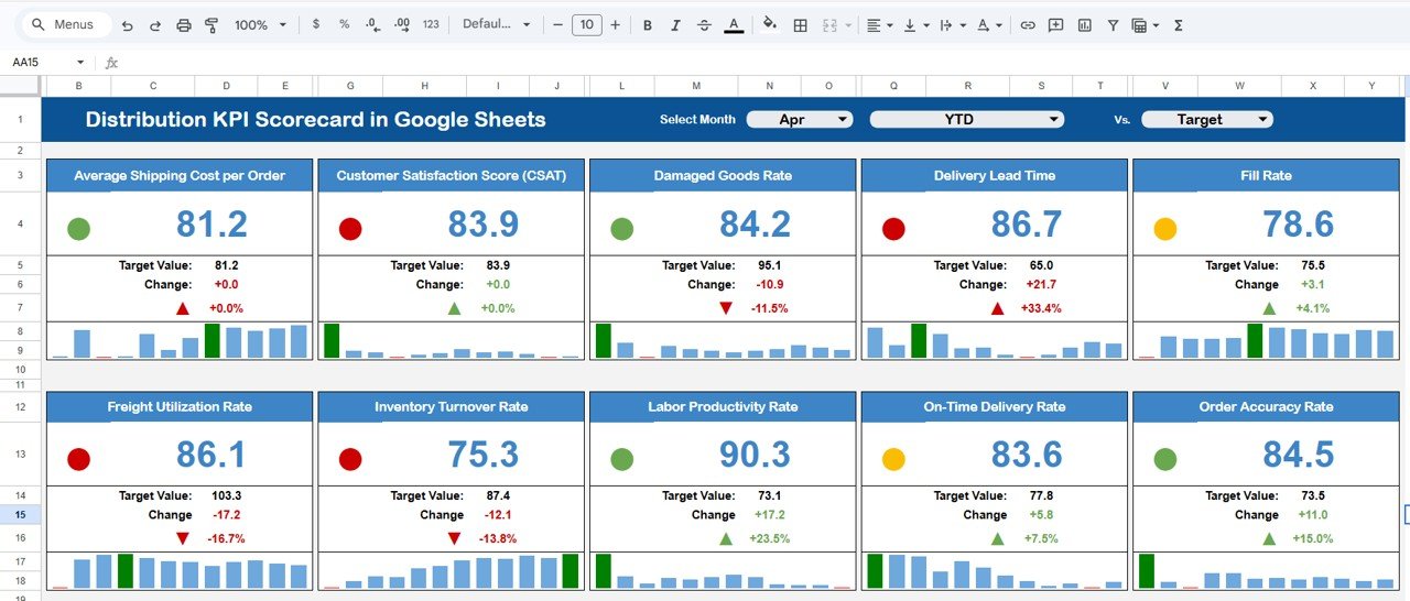
Distribution KPI Scorecard in Google Sheets
The scorecard displays all relevant KPI information including actual values, target values, variance, and performance status. Each KPI row is formatted to highlight whether the metric is on track, needs attention, or is underperforming — giving distribution managers a complete performance snapshot at a glance.
2. KPI Trend Sheet
The KPI Trend sheet lets you analyze any individual KPI over time. Select a KPI name from the dropdown available on cell C3. The sheet displays the KPI Group, Unit, Type (Lower the Better or Upper the Better), Formula, and Definition alongside the trend data.
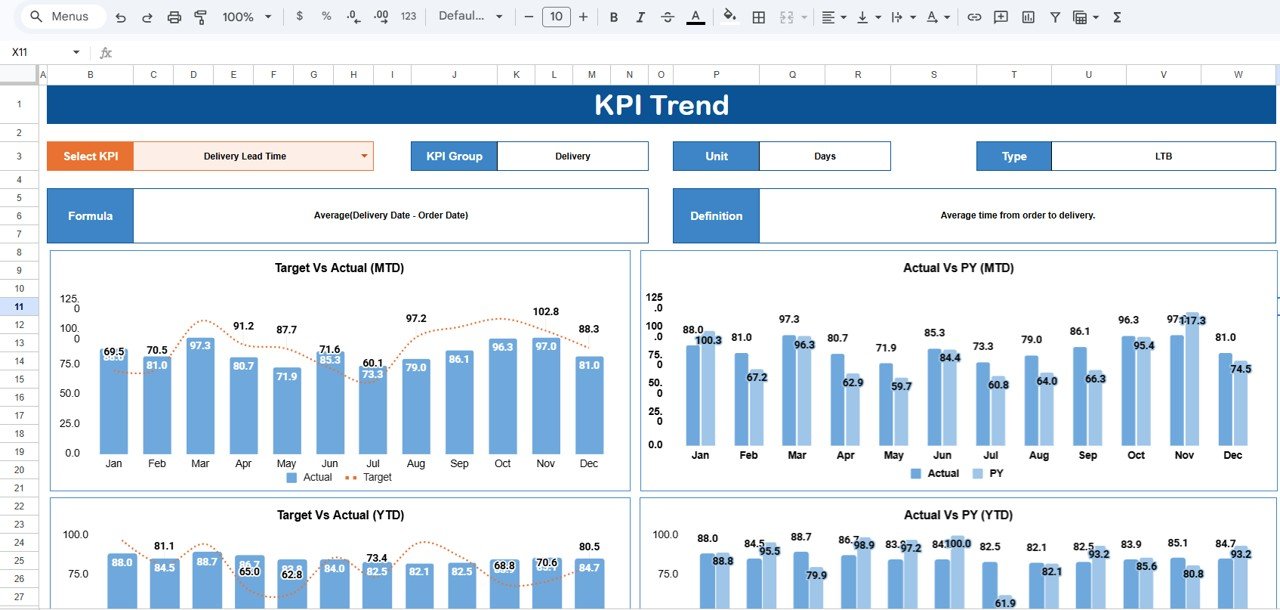
KPI Trend Sheet
MTD and YTD trend charts compare Actual, Target, and Previous Year (PY) numbers visually, making it easy to identify seasonal patterns, spot deteriorating trends early, and compare current performance against the same period last year.
3. Input Data Sheet
The Input Data sheet is where you enter all KPI data. Record actual values, targets, and other metrics for each KPI on a monthly basis. The sheet is designed for straightforward data entry — update it as new results become available and the entire scorecard recalculates automatically.
Input Data Sheet
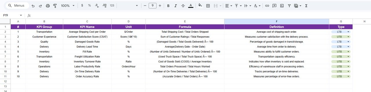
4. KPI Definition Sheet
The KPI Definition sheet is the master configuration layer. Enter the KPI Name, KPI Group, Unit, Formula, and KPI Definition for each metric. This sheet feeds all dropdown menus, labels, and reference information across the Scorecard and KPI Trend sheets.
KPI Definition Sheet
You can customize this sheet to match your organization’s specific distribution KPIs. Add new rows, modify formulas, or change group classifications — the rest of the scorecard adapts automatically.
Distribution KPI Scorecard in Google Sheets vs. Microsoft Excel Scorecard vs. Paid Logistics SaaS — Feature Comparison
| Feature | Distribution KPI Scorecard in Google Sheets | Microsoft Excel Scorecard | Zoho Inventory / NetSuite ERP |
|---|---|---|---|
| Cost | $8.99 one-time | $10-$20 one-time (template) | $25-$150 / user / month |
| Platform | Google Sheets (free, browser-based) | Microsoft Excel (license required) | Web-based SaaS |
| Setup Time | Under 10 minutes | 10-15 minutes | 2-6 weeks onboarding |
| Real-Time Team Collaboration | ✅ Yes — built into Google Sheets | ❌ No (file sharing only) | ✅ Yes |
| Mobile Access | ✅ Yes — Google Sheets app | Limited (Excel mobile) | ✅ Yes |
| Customizable KPIs | ✅ Fully editable definitions, formulas, groups | ✅ Editable with Excel skills | Partial — vendor-defined metrics |
| Share with Link | ✅ One click | ❌ Requires email attachment | ✅ Role-based access |
| Year-1 Cost at 5 Users | $8.99 total | $10-$20 + Excel licenses | $1,500-$9,000 |
| MTD/YTD Trend Charts | ✅ Built-in with Actual, Target, PY | ✅ Available | ✅ Available |
For distribution teams that want KPI tracking with real-time collaboration without paying $100+ per user per month, the Distribution KPI Scorecard in Google Sheets sits in the sweet spot.
Who Should Use This Template
✅ Perfect for:
- Distribution managers at small to mid-sized companies (10-500 employees) tracking delivery, logistics, and warehouse KPIs monthly
- Supply chain coordinators who need a shared, real-time scorecard for performance reviews with leadership
- Operations leads at e-commerce, FMCG, or retail businesses monitoring distribution efficiency without SaaS overhead
- Logistics consultants who need a reusable KPI framework for client engagements
❌ Not a fit if:
- You need ERP integration with automated data feeds from WMS or TMS systems — this scorecard uses manual data entry
- Your enterprise requires SOC 2 compliance, IoT sensor integration, or real-time GPS fleet tracking built into the scorecard
- You need 50+ simultaneous editors with granular role-based permissions beyond Google Sheets’ standard sharing
Real-World Use Cases
👉 Click here to Purchase the Distribution KPI Scorecard in Google Sheets
Ankit manages distribution at a 200-person FMCG company in Mumbai. He uses the Distribution KPI Scorecard in Google Sheets to track on-time delivery rate, order fill rate, and distribution cost per unit across 8 regional warehouses. Every Monday, he shares the live scorecard link with his leadership team — no email attachments, no version confusion, and no $150/month SaaS subscription. The YTD trend charts helped him identify a 12% drop in on-time delivery during monsoon season, leading to proactive carrier adjustments.
Maria runs logistics for an e-commerce brand shipping 5,000 orders per month from three US fulfillment centers. She replaced her manual Excel tracker with this Google Sheets scorecard to get real-time collaboration with warehouse supervisors. The MTD vs YTD trend charts help her spot seasonal spikes in returns processing time and negotiate better carrier rates quarterly.
David coordinates supply chain operations for a mid-sized electronics distributor. He tracks fleet efficiency, returns processing time, and warehouse utilization in the scorecard. The KPI Definition sheet lets him add custom metrics specific to his electronics distribution workflow without hiring a developer or buying a $9,000/year logistics platform.
Advantages of Distribution KPI Scorecard in Google Sheets
The biggest advantage is zero software cost beyond the template itself. Google Sheets is free, runs in any browser, and works on iOS and Android. Your entire team accesses the same live scorecard — no file versioning headaches, no Excel license requirements, no SaaS onboarding delays.
The separated architecture (Scorecard + Trend + Input + Definition sheets) keeps data entry clean and analysis views uncluttered. Most teams that build their own scorecards cram everything into one sheet, making updates error-prone. This template eliminates that problem by design.
The MTD/YTD/PY trend comparison is rarely found in free or low-cost scorecard templates. Seeing actual performance against targets and the same period last year gives distribution managers the context they need for informed decisions — not just raw numbers.
Opportunities for Improvement
👉 Click here to Purchase the Distribution KPI Scorecard in Google Sheets
The scorecard relies on manual data entry in the Input Data sheet. Teams with high-volume data from WMS or TMS systems may prefer an automated pipeline using Google Apps Script or Zapier integrations to reduce entry time. The template does not include these automations out of the box.
Chart customization is limited to what Google Sheets offers natively. Teams needing interactive drill-downs, geographic heat maps, or advanced visualization should consider pairing this scorecard with Google Sheets charting documentation or a dedicated BI tool like Power BI for deeper analysis.
The template does not include automated email alerts for KPIs that fall below threshold. Distribution managers who need real-time notifications when a metric drops below target would need to add Google Apps Script triggers manually.
Best Practices
Update the Input Data sheet at the same cadence — weekly or monthly — to maintain consistent trend analysis. Inconsistent update frequencies create misleading MTD/YTD comparisons that undermine decision-making.
Start with the KPI Definition sheet before entering any data. Well-defined KPI names, formulas, and group classifications prevent confusion later when multiple team members reference the scorecard. Use the Type field (Lower the Better / Upper the Better) consistently so the color-coded indicators work correctly.
Share the scorecard link with “Viewer” access for leadership and “Editor” access only for team members who enter data. This prevents accidental formula changes while keeping the scorecard transparent across the organization.
Review the KPI Trend sheet during monthly distribution reviews. The Previous Year comparison helps identify whether changes are seasonal patterns or actual performance shifts — a distinction that raw monthly numbers alone cannot reveal.
Explore Relevant Templates
📌 Warehouse Management KPI Scorecard in Google Sheets — Track warehouse efficiency, inventory accuracy, picking speed, and receiving performance across your distribution centers.
📌 Supply Chain – Logistics KPI Scorecard in Google Sheets — Monitor end-to-end supply chain performance including procurement lead time, transportation costs, and supplier quality metrics.
📌 Project Management KPI Scorecard in Google Sheets — Track project milestones, budget adherence, resource utilization, and team productivity KPIs.
📌 Procurement Management Dashboard in Google Sheets — Analyze procurement spend, supplier performance, and purchase order cycle times.
Browse all Google Sheets Dashboard Templates →
Frequently Asked Questions
👉 Click here to Purchase the Distribution KPI Scorecard in Google Sheets
What KPIs does the Distribution KPI Scorecard in Google Sheets track?
The Distribution KPI Scorecard in Google Sheets tracks 10+ distribution KPIs including on-time delivery rate, order fill rate, distribution cost per unit, warehouse utilization, fleet efficiency, and returns processing time. All metrics update automatically when you replace the sample data.
How long does setup take for the Distribution KPI Scorecard?
Setup takes under 10 minutes. Click the copy link in the included PDF, open the KPI Definition sheet to customize your KPIs, enter your actual values in the Input Data sheet, and the scorecard calculates everything automatically.
Can I add my own custom distribution KPIs?
Yes. The KPI Definition sheet lets you add, remove, or modify any KPI — including the name, group, unit, formula, and definition. The scorecard, trend charts, and dropdown menus update automatically to reflect your changes.
Does the Distribution KPI Scorecard work on mobile devices?
Yes. Since it runs in Google Sheets, you can view and edit the Distribution KPI Scorecard from any device using the free Google Sheets mobile app for iOS and Android.
How does this compare to Zoho Inventory or NetSuite for KPI tracking?
Zoho Inventory starts at $29/user/month and NetSuite ERP costs $99+/user/month. The Distribution KPI Scorecard in Google Sheets costs $8.99 one-time with no per-user fees, no subscription, and lifetime access — saving teams thousands annually on distribution KPI tracking.
Can multiple team members edit the scorecard simultaneously?
Yes. Google Sheets supports real-time collaboration. Share the scorecard link with your team and everyone can view or edit simultaneously — with changes visible instantly across all devices.
What is the difference between MTD and YTD views in the scorecard?
MTD (Month-to-Date) shows cumulative performance from the start of the current month. YTD (Year-to-Date) shows cumulative performance from January through the selected month. Both views compare Actual, Target, and Previous Year numbers in trend charts.
About the Author
Built by PK — Microsoft Certified Professional with 15+ years of Excel, Google Sheets, and Power BI experience. Founder of NextGenTemplates, reaching 300K+ subscribers across YouTube channels. Every template is hand-built and tested before release.
Conclusion
The Distribution KPI Scorecard in Google Sheets gives distribution teams a structured, collaborative KPI tracking framework at a fraction of the cost of logistics SaaS platforms. With 4 worksheets, 10+ pre-built KPIs, MTD/YTD trend analysis, and color-coded performance indicators, it’s ready to use in under 10 minutes.
✅ Instant download · One-time payment · No subscription · Lifetime access
👉 Click here to Purchase the Distribution KPI Scorecard in Google Sheets
Visit our YouTube channel for step-by-step tutorials: YouTube.com/@NeoTechNavigators