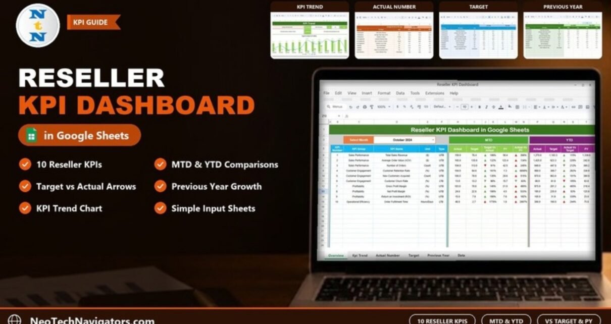
The Reseller KPI Dashboard in Google Sheets tracks ten reseller performance measures, including Total Sales Revenue, Average Order Value, Customer Churn Rate and Order Fulfillment Time, in a single table. You pick a month, and it shows MTD and YTD figures against target and against the previous year.
It is meant for channel managers, sales heads and small business owners who sell through resellers and want one monthly view instead of a pile of separate reports. The file has six sheets: Dashboard, KPI Trend, Actual Number, Target, Previous Year Number and KPI Definition. The comparisons and arrows are already built in, so all you do each month is type numbers into the input sheets.
This guide walks through each sheet, lists the ten KPIs with their formulas, works through a real example from the sample data, and says plainly where the template stops being the right tool.
🎥 Watch the Video Tutorial
Get the Reseller KPI Dashboard
Why Reseller Performance Is Hard to Track
When you sell through a reseller network, the numbers you care about come from several places: order exports, finance reports, customer lists and delivery logs. Each month someone copies them into a spreadsheet, and each month the layout changes slightly. Comparing this October with last October, or this month with target, ends up being a manual job.
A KPI dashboard fixes the structure once. Actuals, targets and last year’s figures go into three input sheets with the same layout, and the dashboard reads from all three. The comparison is then always the same calculation, done the same way, every month.
The 10 KPIs in the Reseller KPI Dashboard in Google Sheets
These are the KPIs as listed on the template’s KPI Definition sheet. UTB means Upper the Better; LTB means Lower the Better.
| KPI | KPI Group | Unit | Formula (from the template) | Better when |
|---|---|---|---|---|
| Total Sales Revenue | Sales Performance | ($) | SUM(Sales Amount) | Higher (UTB) |
| Average Order Value (AOV) | Sales Performance | ($) | Total Sales Revenue / Number of Orders | Higher (UTB) |
| Number of Orders | Sales Performance | Count | COUNT(Orders) | Higher (UTB) |
| Customer Retention Rate | Customer Engagement | (%) | ((Repeat Customers / Total Customers) * 100) | Higher (UTB) |
| New Customers Acquired | Customer Engagement | Count | COUNT(New Customers) | Higher (UTB) |
| Customer Churn Rate | Customer Engagement | (%) | (Lost Customers / Total Customers) * 100 | Lower (LTB) |
| Gross Profit Margin | Profitability | (%) | ((Revenue – Cost of Goods Sold) / Revenue) * 100 | Higher (UTB) |
| Net Profit Margin | Profitability | (%) | (Net Profit / Revenue) * 100 | Higher (UTB) |
| Return on Investment (ROI) | Profitability | (%) | ((Net Profit – Cost of Investment) / Cost of Investment) * 100 | Higher (UTB) |
| Order Fulfillment Time | Operational Efficiency | Hours/Days | Delivery Date – Order Date | Lower (LTB) |
Sheet-by-Sheet Walkthrough
1. Dashboard Sheet
The main sheet has a Select Month dropdown in cell D3 (October 2024 in the sample). Below it, one row per KPI shows the KPI Number, KPI Group, KPI Name, Unit and Type, followed by two blocks:
- MTD: Actual, Target, Target Vs Actual, PY, Actual Vs PY
- YTD: Actual, Target, Actual Vs Target, PY, Actual Vs PY
The comparison columns are percentages with up or down arrows. In the Target Vs Actual column the arrow colour respects the KPI type, so a value below target on Customer Churn Rate shows green, while the same on Number of Orders shows red.

2. KPI Trend Sheet
Choose a KPI in the Select KPI dropdown in cell C3. The sheet shows its KPI Group, Unit, Type, Formula and Definition, then plots a month-by-month chart titled Target Vs Actual Vs PY (MTD), with actuals and PY as columns and target as a line. In the sample, Average Order Value (AOV) is selected: Sales Performance group, unit ($), type UTB, formula Total Sales Revenue / Number of Orders.

3. Actual Number Sheet
This is where current-year actuals go. Each KPI is a row, and each month has an MTD and a YTD column. Cell E1 holds the first month of your financial year (“Change the first of the year”), and the month headers follow from it, so you can run a January or an April year.

4. Target Sheet
The Target sheet uses the same layout: the ten KPIs down the side and two columns for each month (Jan-2024, Feb-2024 and so on), matching the MTD and YTD pair on the Actual Number sheet. Keeping the layouts identical is what lets the dashboard line up actual and target without any extra mapping.

5. Previous Year Number Sheet
Last year’s MTD and YTD figures go here, starting from Jan-2023 in the sample. These feed the PY and Actual Vs PY columns on the dashboard, so you can see growth even when targets were set too high or too low.

6. KPI Definition Sheet
The definition sheet lists every KPI with its KPI Group, Unit, Formula, Definition and Type (UTB or LTB, picked from a dropdown). Edit a row here and the KPI Trend sheet shows the updated details.

Worked Example: Reading One Row
Take Total Sales Revenue for October 2024 in the MTD block of the dashboard:
MTD Actual        = 150.0
MTD Target        = 76.4
Target Vs Actual  = Actual / Target = 150.0 / 76.4 = 196%
MTD PY            = 56.4
Actual Vs PY      = Actual / PY     = 150.0 / 56.4 = 266%
Revenue came in at almost twice its target and more than two and a half times last year’s figure. On a UTB KPI, the Target Vs Actual arrow is green and points up.
Now Number of Orders in the same month: 104.0 against a target of 113.9 gives 91%, so the arrow is red and points down. Customer Churn Rate is the opposite case. Actual 13.0 against a target of 13.2 is 98%, and because churn is Lower the Better, being under target earns a green arrow.
The useful habit is to read the percentage as “how much of the comparison did we achieve”, then check the KPI type to decide whether that is good news.
How to Use It With Your Own Data
- Review the KPI Definition sheet. Keep, rename or replace KPIs, and set each Type to UTB or LTB.
- In Actual Number, set cell E1 to the first month of your financial year.
- Enter this year’s monthly MTD values and the matching YTD running totals for each KPI.
- Fill the Target sheet with your MTD and YTD targets in the same layout.
- Fill the Previous Year Number sheet with last year’s MTD and YTD values.
- Open the Dashboard, choose the month in D3, and review the arrows. Use KPI Trend to look at any KPI that is off target.
Three Real-World Use Cases
A software vendor with regional resellers
The channel manager reviews Total Sales Revenue, New Customers Acquired and Customer Churn Rate each month, then uses Actual Vs PY to see whether the reseller programme is growing year on year.
An electronics distributor reviewing margins
Finance focuses on Gross Profit Margin, Net Profit Margin and ROI in the YTD block, so short-term discounts in one month do not hide the full-year picture.
A consumer brand checking fulfilment
Operations watch Order Fulfillment Time and Number of Orders together. A rising order count with a longer fulfilment time is a sign the reseller’s logistics need attention.
Best Practices
- Write down how each KPI is calculated before anyone enters data, and keep it in the definition sheet.
- Enter data on the same day each month, after the books close.
- For ratio KPIs such as AOV or margins, decide whether YTD should be a running average or a recalculated ratio, and stay consistent.
- Watch the two LTB KPIs, Customer Churn Rate and Order Fulfillment Time, closely. They tend to move before revenue does.
- Set targets you would defend in a review. A 1,778% “Target Vs Actual” usually means the target was entered in the wrong unit.
Limitations and Who Should Not Use It
This dashboard works on monthly totals for the reseller channel as a whole. It does not rank individual resellers or show one reseller against another, so if you need a league table by partner, you will need a separate data sheet or a different template. It has no live connection to your CRM or accounting system; numbers are typed or pasted in. Teams managing hundreds of partners with daily data will outgrow a spreadsheet and should look at a BI tool.
Related Templates and Guides
For a wider channel view, compare this with the Distributor Performance KPI Dashboard and the Channel Sales KPI Dashboard. Automotive and wholesale businesses may prefer the Dealer Network KPI Dashboard or the Wholesale KPI Dashboard. If you want a card-style layout, see the Sales KPI Scorecard in Google Sheets.
Related template: there is also a Reseller KPI Dashboard in Excel.
If you want to build reporting like this yourself, the Excel Pivot Tables & Dashboards course on NextGenTemplates Academy covers the dashboard techniques in structured lessons.
Frequently Asked Questions
What KPIs does the Reseller KPI Dashboard track?
Ten: Total Sales Revenue, Average Order Value (AOV), Number of Orders, Customer Retention Rate, New Customers Acquired, Customer Churn Rate, Gross Profit Margin, Net Profit Margin, Return on Investment (ROI) and Order Fulfillment Time.
How is “Target Vs Actual” calculated?
It is actual divided by target, shown as a percentage. In the sample, October 2024 MTD revenue of 150.0 against a target of 76.4 shows 196%.
What do UTB and LTB mean?
UTB is Upper the Better, where a higher number is good. LTB is Lower the Better, used here for Customer Churn Rate and Order Fulfillment Time. The type decides whether the Target Vs Actual arrow is green or red.
Can I start my year in April instead of January?
Yes. Change cell E1 on the Actual Number sheet to the first month of your financial year, and the month headers follow it.
Can I add more KPIs?
The definition sheet and the dashboard table both have empty rows below the ten KPIs. If you add one, fill the same row in the Actual Number, Target and Previous Year Number sheets, and check that the dashboard picks it up before you rely on it. Replacing an existing KPI is the simplest option.
Can my team use it together?
Yes. It is a Google Sheets file, so you can share it with edit or view access and everyone works from the same version.
Get the Reseller KPI Dashboard in Google Sheets
Wrapping Up
The Reseller KPI Dashboard in Google Sheets gives you one table that answers the three questions every channel review asks: how did we do, against what we planned, and against last year. Load one quarter of your own data first, check that the arrows match what you already know about your resellers, and then make it part of your monthly review.
📅 Last updated: October 2026