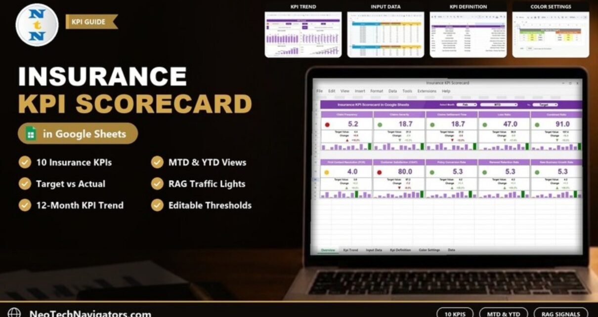
The Insurance KPI Scorecard in Google Sheets puts ten core insurance KPIs on one screen: claims, underwriting, customer service and sales. Pick a month, switch between MTD and YTD, and every KPI card updates with its actual value, target, change and a traffic-light signal. You don’t need to rebuild a report each month.
It is built for insurance operations managers, claims leads, agency owners and finance analysts who track performance monthly and want a shared, cloud-based view instead of scattered spreadsheets. Inside you get five tabs: Scorecard, KPI Trend, Input Data, KPI Definition and Color Settings.
This guide covers each tab, the full KPI list with formulas, a worked example straight from the sample data, setup steps and some honest limits.
🎥 Watch the Video Tutorial
Get the Insurance KPI Scorecard
What Problem Does an Insurance KPI Scorecard Solve?
Insurance teams usually keep their numbers in different places. Claims data sits in one file, underwriting ratios in another and customer-service metrics in a third. At month end, someone copies everything into a summary, and by the time leadership reads it the numbers are already stale.
A KPI scorecard fixes this by keeping one structure for every KPI:
- the actual value for the month or year to date
- the target it should hit
- the previous-year (PY) value for context
- a direction, since some KPIs are better when lower (Loss Ratio) and others are better when higher (Renewal Retention Rate)
Once that structure exists, the colours, arrows and charts follow automatically.
Inside the Insurance KPI Scorecard in Google Sheets: Sheet by Sheet
1. Scorecard
The Scorecard is the main view. The header holds three selectors: Select Month (for example Feb), a period selector (MTD or YTD) and a Vs. selector, which is set to Target in the sample. Below the header are ten KPI cards in two rows of five. Each card shows:
- a traffic-light dot (red, amber or green)
- the actual value in large type
- Target Value and Change (the absolute gap)
- an up or down arrow with the percentage change
- a small 12-month bar chart, with the highest month shown in green and the lowest in red

2. KPI Trend
Pick a KPI from the Select KPI dropdown in cell C3. The sheet then shows that KPI’s KPI Group, Unit, Type (UTB or LTB), Formula and Definition, along with four charts:
- Target Vs Actual (MTD)
- Actual Vs PY (MTD)
- Target Vs Actual (YTD)
- Actual Vs PY (YTD)
In the screenshot, Claims Settlement Time is selected. It belongs to the Claims Management group, is measured in Days and is LTB.

3. Input Data
This is where you enter the monthly numbers. Each KPI has its own block (KPI-1, KPI-2 and so on) with twelve rows, Jan to Dec. For each month you enter six numbers:
- MTD: Actual, Target, PY
- YTD: Actual, Target, PY
For example, Claim Frequency for Feb has an MTD Actual of 5.2, a Target of 4.4 and a PY of 6.1.

4. KPI Definition
This is the master list. Each row holds the #, KPI Group, KPI Name, Unit, Formula, Definition and Type (UTB or LTB). The Scorecard and KPI Trend tabs read their labels and direction from here.

5. Color Settings
This tab holds the RAG Table for Change%, which sets when a card turns red, amber or green. There are separate thresholds for Upper the Better and Lower the Better KPIs:
- Upper the Better: change ≤ 0% is Red, ≤ 10% is Amber and > 10% is Green
- Lower the Better: change > 10% is Red, ≤ 10% is Amber and ≤ 0% is Green
To make the scorecard stricter or more lenient, change the yellow threshold cells.

The 10 Insurance KPIs in the Scorecard
These are the exact KPIs, formulas and directions from the template’s KPI Definition sheet.
| KPI | Group | What it measures | Formula | Better when |
|---|---|---|---|---|
| Claim Frequency | Claims Management | Claims made per policy (risk exposure) | (Number of Claims / Number of Policies) * 100 | Lower |
| Claims Severity | Claims Management | Average cost per claim | Total Claim Costs / Number of Claims | Lower |
| Claims Settlement Time | Claims Management | Average days to settle a claim | Total Time to Settle Claims / Number of Claims | Lower |
| Loss Ratio | Underwriting | Claims paid versus premiums earned | (Incurred Claims / Earned Premiums) * 100 | Lower |
| Combined Ratio | Underwriting | Losses plus expenses relative to premiums | (Incurred Losses + Expenses) / Earned Premiums | Lower |
| First Contact Resolution (FCR) | Customer Service | Issues solved on the first contact | (Resolved on First Contact / Total Interactions) * 100 | Higher |
| Customer Satisfaction (CSAT) | Customer Service | Satisfaction from post-service surveys | (Positive Surveys / Total Surveys) * 100 | Higher |
| Policy Conversion Rate | Sales Performance | Leads that become policies | (Number of Policies Sold / Total Leads) * 100 | Higher |
| Renewal Retention Rate | Sales Performance | Policies renewed out of those due | (Renewed Policies / Policies Up for Renewal) * 100 | Higher |
| New Business Growth Rate | Sales Performance | Growth in new policies versus last year | (New Policies – Previous Year Policies) / Previous Year Policies * 100 | Higher |
Worked Example: Reading One KPI Card
Here is the Claim Frequency card for Feb, MTD, Vs. Target from the sample data:
- Actual = 5.2 and Target = 4.4 (both taken from the Input Data sheet)
- Change = 5.2 − 4.4 = +0.8
- Change % = 0.8 ÷ 4.4 = +18.2%
Change   = Actual - Target            → 5.2 - 4.4 = 0.8
Change % = (Actual - Target) / Target → 0.8 / 4.4 = 18.2%
Claim Frequency is a Lower the Better KPI, and +18.2% is above the 10% red threshold, so the dot turns red.
Two more cards from the same screenshot show how the rules work:
- First Contact Resolution: 4.0 against 3.8 is +5.3%. That sits within the 0–10% band for an Upper the Better KPI, so the dot is amber.
- Policy Conversion Rate: +26.2% is green.
How to Use It With Your Own Data
- Open the template in Google Sheets. After purchase, open the file in Google Sheets and work in your own copy saved to your Google Drive, so the original stays untouched.
- Review the KPI Definition sheet. Keep the ten KPIs or rename them to match your reporting, and confirm each KPI’s Type (UTB or LTB). An LTB KPI marked as UTB will show the wrong colours.
- Enter twelve months in Input Data. For each KPI block, fill in MTD Actual, Target and PY, then YTD Actual, Target and PY. Clear any sample values you don’t replace.
- Set your RAG thresholds. On Color Settings, adjust the percentage cells if a 10% band is too wide or too narrow for your business.
- Read the Scorecard. Choose the month, MTD or YTD, and what to compare against. Then open KPI Trend for any red card to see whether it is a one-off or a pattern.
- Share it. Use Google Sheets sharing so managers can view the file and only data owners can edit Input Data.
Real-World Use Cases
- Monthly claims review: A claims manager checks Claim Frequency, Claims Severity and Claims Settlement Time each month, then uses KPI Trend to see whether slower settlements are seasonal.
- Underwriting check-in: Finance and underwriting look at Loss Ratio and Combined Ratio in YTD mode before re-pricing a product line.
- Agency growth meeting: A small agency tracks Policy Conversion Rate, Renewal Retention Rate and New Business Growth Rate against targets with its sales team.
Best Practices
- Use one source per number. Agree where each actual comes from (claims system, CRM, finance ledger) so the same value doesn’t get entered two different ways.
- Keep YTD consistent. YTD values are entered, not derived, so decide whether YTD means a running average or a running total for each KPI and stick to it.
- Watch the LTB KPIs closely. Loss Ratio, Combined Ratio and Claims Settlement Time can quietly erode profit when they drift.
- Don’t edit the Scorecard formulas. Change inputs, definitions and thresholds only.
- Look at trend before reacting. A single red month matters less than three in a row.
Limitations: Who Should Not Use It
- It does not connect to policy-admin or claims systems. You enter or paste monthly values yourself.
- It is designed for ten KPIs and twelve months. Large carriers that need product, region or branch drill-downs will be better served by a BI tool.
- It works with summary numbers, not individual claims or policies, so it is not a claims-management system.
Related Templates and Guides
For a dashboard-style layout of the same topic, see the Insurance KPI Dashboard in Google Sheets. Claims teams may also like the Claim Settlement KPI Dashboard, and reinsurers can compare the Reinsurance KPI Dashboard. For a similar scorecard layout in other finance areas, see the Banking KPI Scorecard and the Finance KPI Scorecard.
If you work in Excel, there is also an Excel version: the Insurance KPI Scorecard in Excel.
If you want to build scorecards and dashboards like this from scratch, the Excel Pivot Tables & Dashboards course on NextGenTemplates Academy covers the reporting techniques step by step.
Frequently Asked Questions
Which KPIs are included in the Insurance KPI Scorecard?
There are ten: Claim Frequency, Claims Severity, Claims Settlement Time, Loss Ratio, Combined Ratio, First Contact Resolution, Customer Satisfaction, Policy Conversion Rate, Renewal Retention Rate and New Business Growth Rate.
What do UTB and LTB mean?
UTB means Upper the Better: a higher value is good, as with Renewal Retention Rate. LTB means Lower the Better: a lower value is good, as with Loss Ratio. The Type column on the KPI Definition sheet controls how each card is coloured.
How are the red, amber and green signals decided?
They come from the change percentage against your chosen comparison and the thresholds on the Color Settings tab. By default, an LTB KPI more than 10% above target turns red, and a UTB KPI more than 10% above target turns green.
Can I switch between monthly and yearly views?
Yes. Use the MTD/YTD selector on the Scorecard. Every card then reads the matching MTD or YTD columns from the Input Data sheet.
Can I change or replace the KPIs?
Yes. Edit the KPI Name, Group, Unit, Formula, Definition and Type on the KPI Definition sheet, then enter matching values in the Input Data blocks.
Does it work for a small insurance agency?
Yes. It only needs monthly summary numbers, which suits small agencies and individual departments. Larger insurers usually need deeper drill-downs than one sheet can give.
Wrapping Up
The Insurance KPI Scorecard in Google Sheets gives you one place to see claims, underwriting, service and sales KPIs against target, with clear colours that follow rules you control. Start by checking the KPI Definition sheet, load twelve months of data, and review red cards with the KPI Trend tab each month.
Get the Insurance KPI Scorecard in Google Sheets
📅 Last updated: October 2026