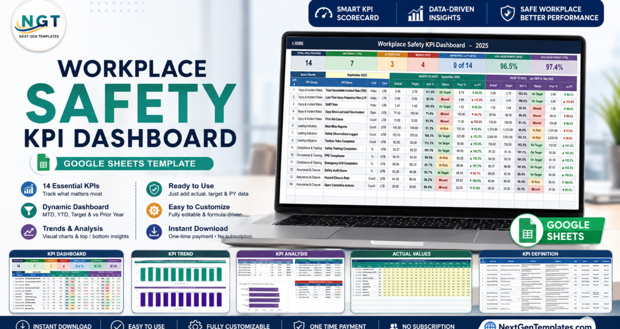
Most safety reporting dies in the same place: a spreadsheet with twelve columns of numbers that nobody outside the EHS team can read. The numbers are right. The story is invisible. The Workplace Safety KPI Dashboard in Google Sheets fixes that by putting 14 safety KPIs on a single colour-coded scorecard with month-to-date and year-to-date performance side by side, a month dropdown that drives every page, and a 12-month trend view for any KPI you pick. It is 100% formula-driven – no add-ons, no Apps Script, nothing to install.Workplace Safety KPI Dashboard in Google Sheets
Get the Workplace Safety KPI Dashboard in Google Sheets
Before we start, one honest note. This template is a manual tracking and visualisation tool. You type the numbers in; it charts them. It is not a compliance system, not an incident-management or investigation system, and it produces no regulatory submission of any kind. It makes no OSHA, RIDDOR or ISO 45001 claim, the KPI formulas shipped inside it are editable plain-language descriptions rather than legally authoritative definitions, and nothing here is safety advice. Check every definition against your own organisation’s reporting rules, and talk to a qualified safety professional about your obligations.
Which family is this? This is the KPI scorecard line – month picker, traffic lights, KPI Trend and KPI Analysis pages. It is a different product from the analytical Workplace Safety & Incident Management Dashboard in Google Sheets, which slices a record-level dataset with filters and charts. If you want to know “are we hitting target this month?”, you want this one.
Key Features of the Workplace Safety KPI Dashboard
- 14 workplace safety KPIs in four groups. Injury & Incident Rates (5 KPIs), Leading Indicators (3), Compliance & Training (3) and Assurance & Closure (3).Workplace Safety KPI Dashboard in Google Sheets
- One month dropdown drives the whole workbook. Change it on the KPI Dashboard sheet and the scorecard, the header dates and the entire KPI Analysis page recalculate. No refresh, no query, no script.Workplace Safety KPI Dashboard in Google Sheets
- MTD and YTD in the same row. For every KPI you get Actual, Target, Achievement %, status, Prior Year and a vs-PY arrow twice – once for the selected month, once for the year to date.Workplace Safety KPI Dashboard in Google Sheets
- Upper-the-better and lower-the-better logic. Achievement is Actual ÷ Target for UTB metrics and Target ÷ Actual for LTB metrics, so a falling incident rate correctly scores above 100% instead of looking like a failure.Workplace Safety KPI Dashboard in Google Sheets
- Editable traffic-light bands. Shipped as On Target at 100%+, At Risk 95-99%, Missed below 95% – all ordinary Status formulas you can rewrite.Workplace Safety KPI Dashboard in Google Sheets
- A master KPI list. Add, rename or delete KPIs on one sheet and every other sheet, chart and roll-up follows automatically.Workplace Safety KPI Dashboard in Google Sheets
- Ten sheets, zero dependencies. Google Sheets formulas only.
Dashboard Pages Explanation
Home
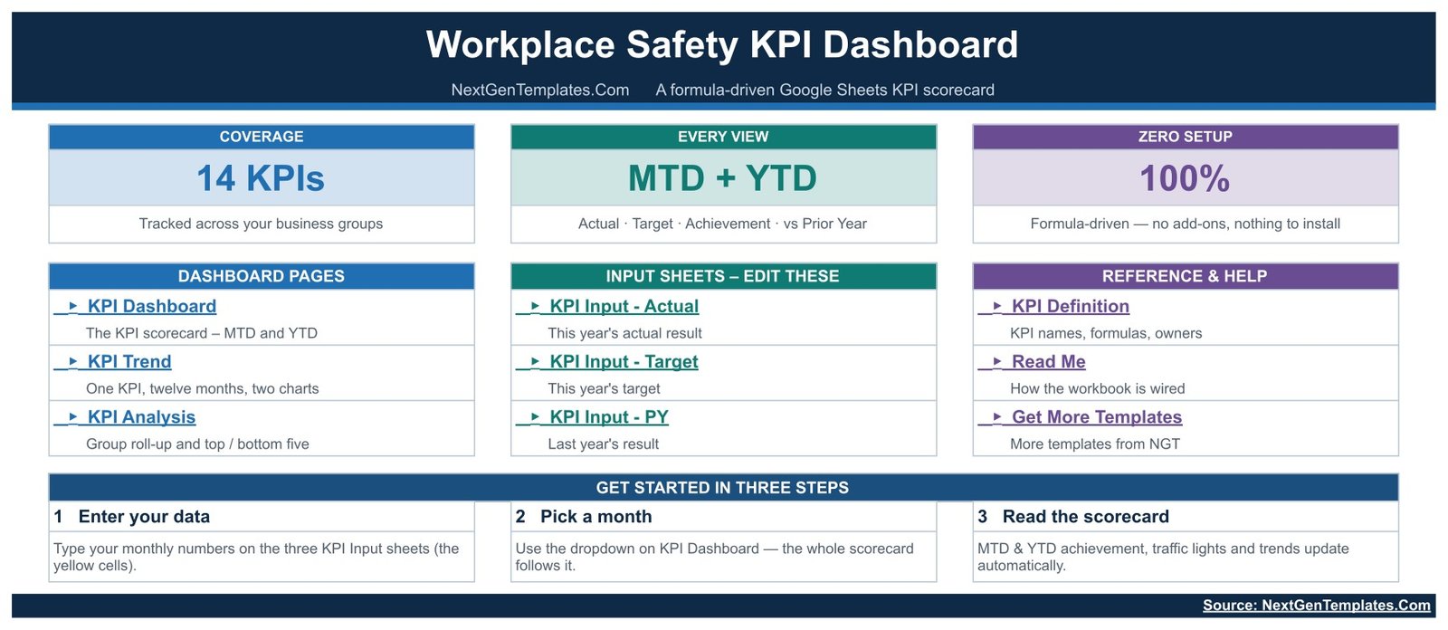
A navigation page with three summary cards (14 KPIs, MTD + YTD, 100% formula-driven) and one-click links grouped into Dashboard Pages, Input Sheets and Reference & Help. A three-step strip at the bottom tells a first-time user exactly what to do: enter your data, pick a month, read the scorecard.Workplace Safety KPI Dashboard in Google Sheets
KPI Dashboard
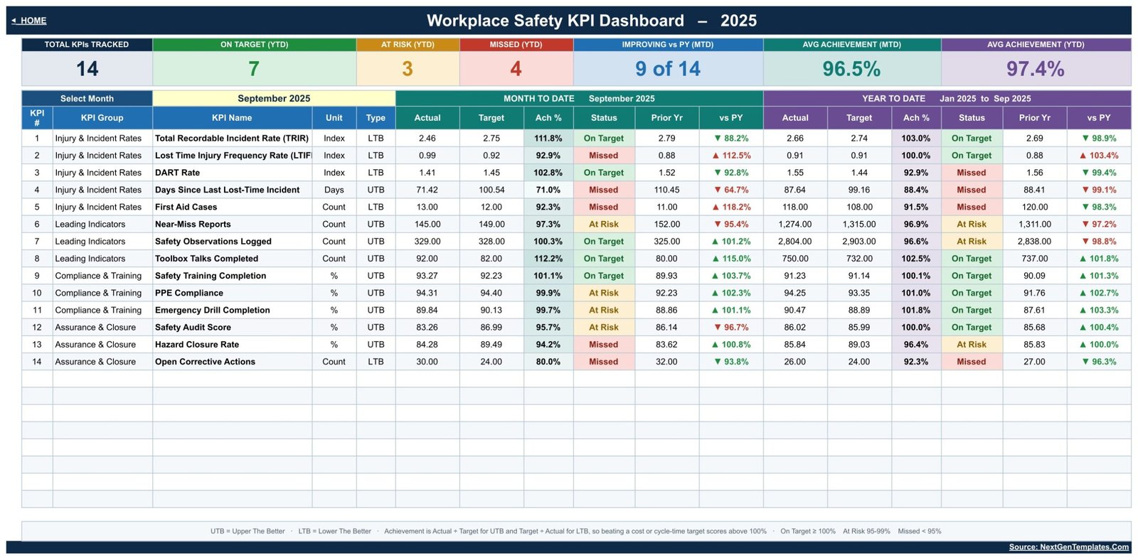
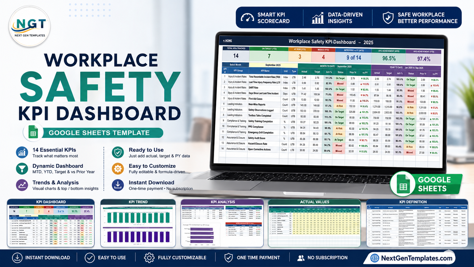
The scorecard itself. Seven summary cards run across the top – Total KPIs Tracked, On Target (YTD), At Risk (YTD), Missed (YTD), Improving vs PY (MTD), Avg Achievement (MTD) and Avg Achievement (YTD). Beneath them, one row per KPI with KPI Group, Unit, Type, then a Month-To-Date block and a Year-To-Date block, each carrying Actual, Target, Ach %, Status, Prior Yr and vs PY.Workplace Safety KPI Dashboard in Google Sheets
In the shipped demo month of September 2025 the sample numbers read 14 KPIs tracked, 7 On Target, 3 At Risk, 4 Missed on a YTD basis, 9 of 14 improving versus prior year, and average achievement of 96.5% MTD against 97.4% YTD. Those are generated demonstration figures, not real safety data – clear them and type in your own.
KPI Trend
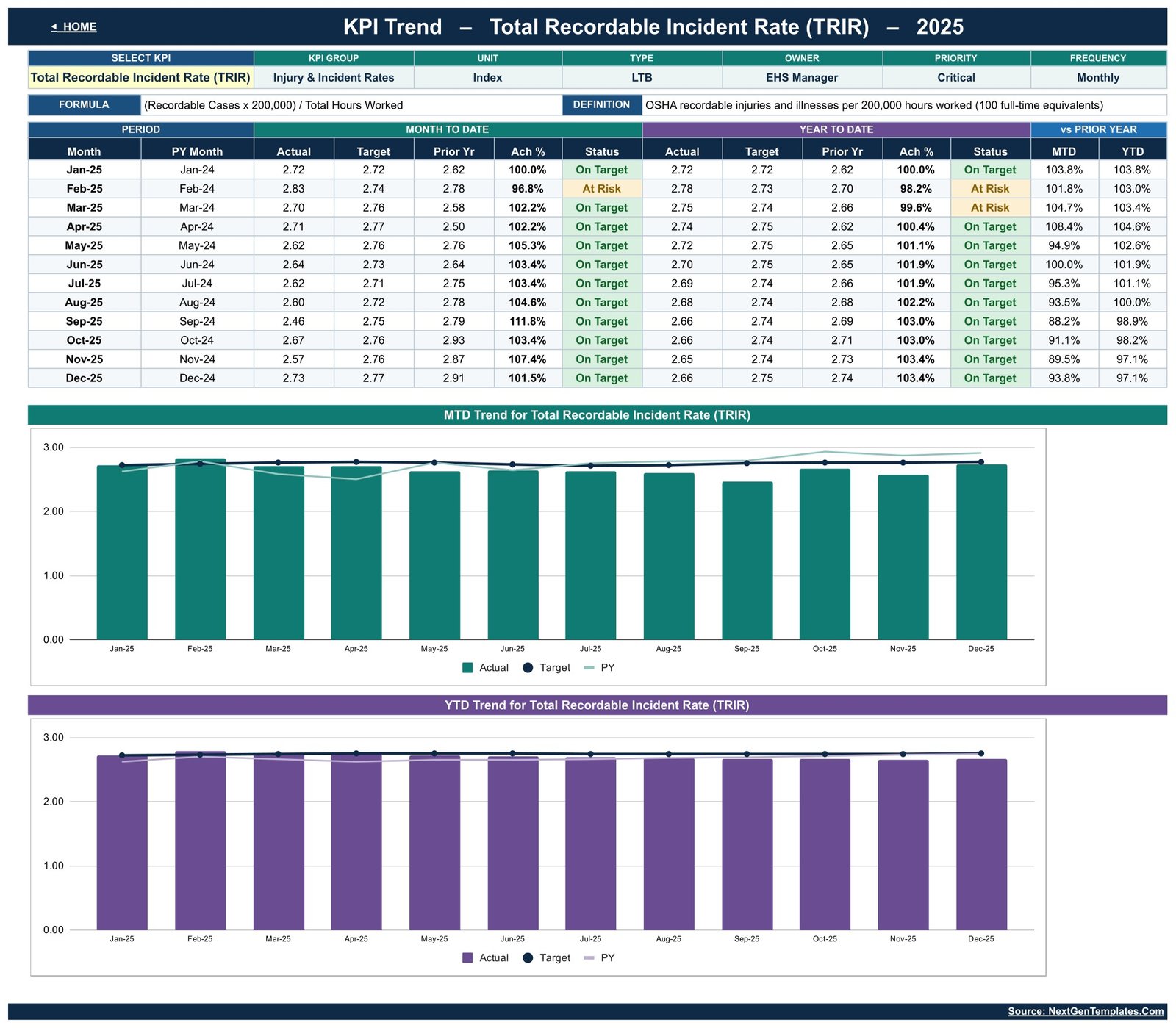
Choose any one of the 14 KPIs from a dropdown. The header fills in its Group, Unit, Type, Owner, Priority, Frequency, Formula and Definition automatically from the master list. Below that, all twelve months at once: MTD Actual, Target, Prior Yr, Ach % and Status, then the same block for YTD, then vs-PY percentages for both. Two charts follow – an MTD Trend and a YTD Trend – each plotting Actual as columns against Target and Prior Year as lines.Workplace Safety KPI Dashboard in Google Sheets
KPI Analysis
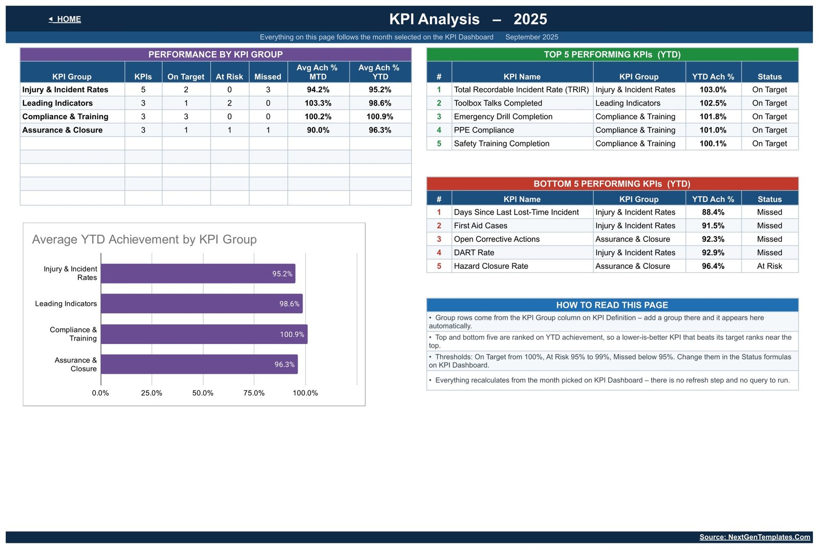
The management view. A Performance by KPI Group table counts KPIs, On Target, At Risk and Missed per group and averages MTD and YTD achievement. An Average YTD Achievement by KPI Group bar chart sits underneath it. To the right, Top 5 Performing KPIs and Bottom 5 Performing KPIs rank automatically on YTD achievement, and a “How to read this page” panel explains the thresholds and the ranking so a director reading it for the first time is not guessing.
KPI Input – Actual, Target and PY
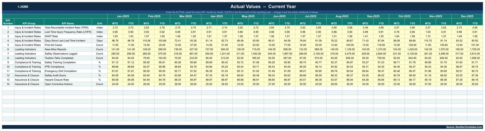
Three matching grids – this year’s actuals, this year’s targets, last year’s results. Twelve months across, one KPI per row, MTD and YTD columns per month. You only type the MTD figure; the YTD beside it is calculated as a running sum or a running average depending on how the KPI is defined. Cell E3 on the Actual sheet sets the first month of the reporting year and re-bases every other sheet.
KPI Definition
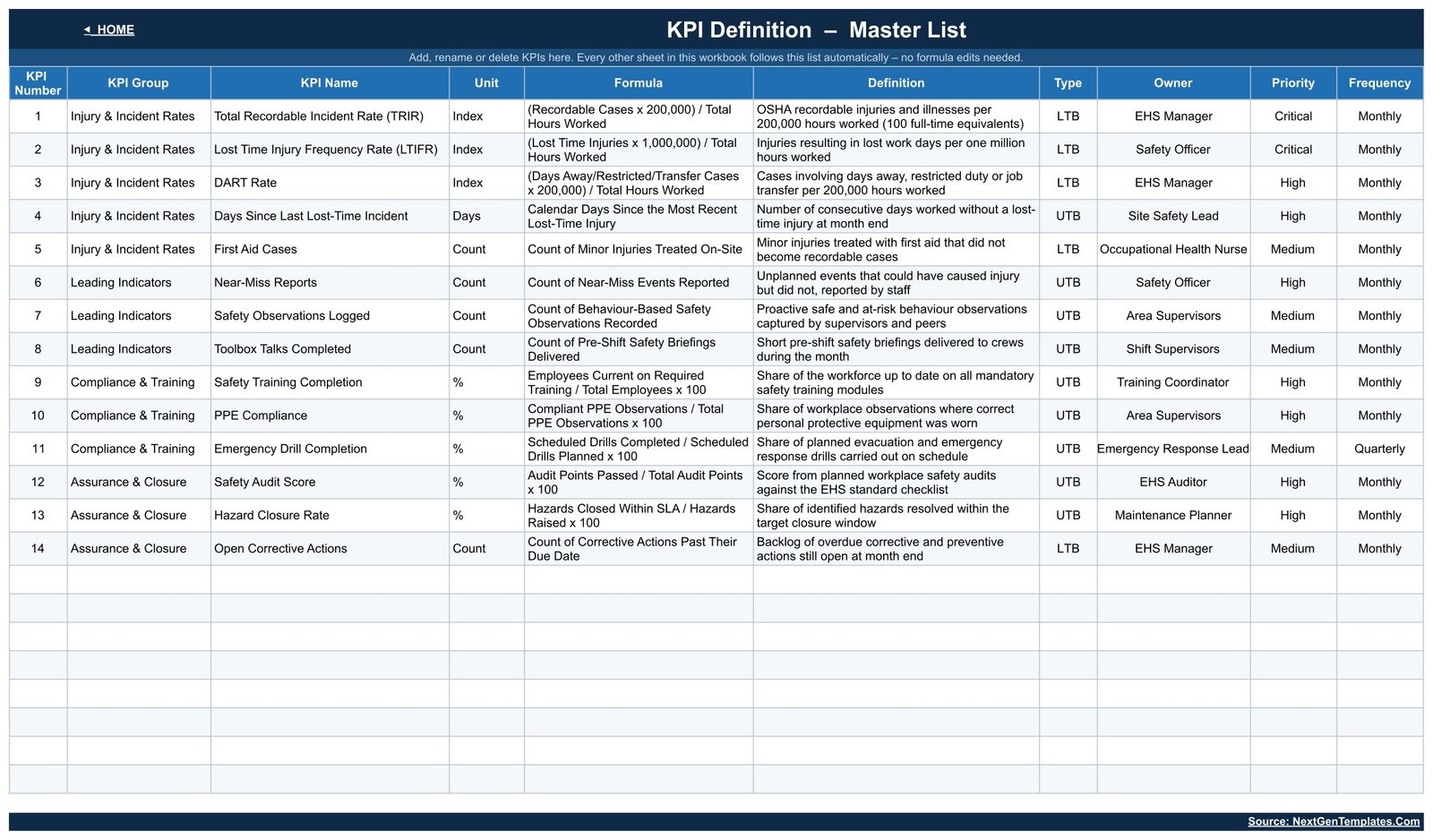
The master list, and the sheet that makes this template flexible: KPI Number, Group, Name, Unit, Formula, Definition, Type, Owner, Priority and Frequency for all 14 KPIs. The shipped set runs Total Recordable Incident Rate (TRIR), Lost Time Injury Frequency Rate (LTIFR), DART Rate, Days Since Last Lost-Time Incident and First Aid Cases; then Near-Miss Reports, Safety Observations Logged and Toolbox Talks Completed; then Safety Training Completion, PPE Compliance and Emergency Drill Completion; then Safety Audit Score, Hazard Closure Rate and Open Corrective Actions. Owners range from EHS Manager to Occupational Health Nurse to Maintenance Planner, and every one of those fields is yours to edit.
Two more sheets – Read Me and Get More Templates – round the workbook out at ten tabs.
Google Sheets vs. Excel vs. Paid EHS Software – Feature Comparison
| This template (Google Sheets) | Excel KPI template | Paid EHS software | |
|---|---|---|---|
| Cost | $8.99 one time | $12-$20 one time | Per-user subscription, varies by vendor |
| Platform | Any browser | Desktop Excel | Vendor web app |
| Setup time | Make a copy, then type your numbers | Download and open | Implementation project |
| Real-time collaboration | Yes, native | Only via OneDrive co-authoring | Yes |
| Mobile access | Yes, Google Sheets app | Limited | Usually a dedicated app |
| Customisable KPI list | Yes – edit one master sheet | Usually yes | Often fixed to the vendor’s model |
| Share with a link | Yes | No | Seat-based access |
| Year-1 cost at 5 users | $8.99 total | One file, shared manually | Recurring, scales with seats |
| Incident case management and workflow | No – monthly summary numbers only | No | Yes |
| Regulatory submission and certification | No | No | Vendor dependent |
Who Should Use This Template
EHS managers, safety officers, site safety leads, plant and operations managers, HR business partners and small-business owners who already assemble monthly safety numbers and want them presented as a scorecard rather than a raw grid. It fits organisations reporting roughly 12 to 20 safety metrics a month across a handful of sites or departments.
It is the wrong tool if you need an incident-reporting portal, near-miss submission forms, investigation records, employee-level medical data, automatic feeds from an ERP or maintenance system, or anything that files to a regulator. Those need dedicated EHS software – and this dashboard works perfectly well alongside one as the monthly management summary.
Real-World Use Cases
A 400-person manufacturing site. The EHS manager reports monthly to an HSE committee. TRIR, LTIFR and DART carry the injury story; the Leading Indicators group – near-miss reports, safety observations, toolbox talks – shows that reporting culture is improving even in a month where a recordable case occurred. The KPI Analysis page goes straight into the meeting pack as an image.
A 60-person warehouse business with no EHS system. The operations manager types eight numbers into the input sheets on the first working day of each month, switches the month dropdown, and shares a view-only link with the owner. The traffic lights are the whole conversation.
An HR business partner covering three depots. She only reports Compliance & Training. She deleted the other three groups from the KPI Definition sheet, and the roll-up table, the bar chart and the top-five tables reshaped themselves without a single formula edit.
Advantages of the Workplace Safety KPI Dashboard
- Nothing to install or authorise. Native formulas only, so it still works in organisations that block Google Workspace add-ons.
- Adding a KPI is a one-sheet job. Type it on KPI Definition and the scorecard, charts, group roll-up and rankings absorb it.
- Direction-aware achievement. The UTB/LTB switch means lower-is-better safety metrics do not need a separate table or a mental inversion.
- Two audiences, one file. The KPI Dashboard is the detail; KPI Analysis is the two-minute leadership version.
- Genuinely collaborative. Share a link, set the safety officer to editor and the leadership team to viewer, done.
Opportunities for Improvement
Honest limitations worth knowing before you buy:
- One entity per copy. There is no site or department dimension. Multiple plants means multiple copies, or KPIs named per site.
- Manual data entry. Nothing pulls from an incident register or an ERP. If your numbers already live in a system, you are re-typing a summary each month.
- A column-width defect in the shipped screenshots. On the KPI Dashboard sheet the KPI Name column clips “Lost Time Injury Frequency Rate (LTIFR)” to “…(LTIF”. Widening the column in your own copy fixes it in two seconds; we mention it because you will see it in the preview images.
- Twelve months at a time. The workbook is built around one reporting year. Multi-year comparison means the Prior Year input sheet, not a rolling history.
- Charts are Google Sheets charts. Clean and readable, but not the interactive drill-down you would get from Power BI.
Best Practices
- Fix your KPI list before you enter a single number. Renaming a KPI later is fine; deciding halfway through the year that you want three more is more work.
- Set the Type column carefully. UTB versus LTB is what makes the achievement percentage meaningful. TRIR, LTIFR, DART, First Aid Cases and Open Corrective Actions are lower-the-better; the rest are upper-the-better.
- Fill the Prior Year sheet. The vs-PY columns and half the summary cards are dead without it.
- Agree the thresholds with your leadership team. The 100% / 95% bands are a starting point, not a standard. Write down what you chose.
- Use the Owner column. A KPI with a named owner gets chased; an unowned one drifts.
- Lock the calculated sheets. Use Google Sheets protected ranges so only the yellow input cells are editable, then share widely without fear.
- Leave future months blank. Zeros are read as real results and will drag your averages down.
Explore Relevant Templates
- Workplace Safety KPI Dashboard in Google Sheets – the template covered in this post.
- Warehouse Safety KPI Dashboard in Google Sheets – the same scorecard scoped to warehousing.
- Industrial Safety KPI Dashboard in Google Sheets and Mining Safety KPI Dashboard in Google Sheets – sector variants.
- Workplace Safety & Incident Management Dashboard in Google Sheets – the analytical, record-level companion.
- Employee Benefits Utilization KPI Dashboard in Google Sheets, Leadership Development KPI Dashboard in Google Sheets and Internal Communications KPI Dashboard in Google Sheets – the same scorecard engine for other people-side topics.
To get comfortable with the reporting techniques behind scorecards like this, the Excel Pivot Tables & Dashboards course on NextGenTemplates Academy covers them with practice files you can work through at your own pace.
Get the Workplace Safety KPI Dashboard in Google Sheets
Frequently Asked Questions
Does this dashboard make my organisation compliant with OSHA, RIDDOR or ISO 45001?
No. It is a spreadsheet that charts numbers you type in. It performs no regulatory calculation, generates no statutory form and is certified against no standard. The formula and definition text on the KPI Definition sheet is editable plain-language description, not a legally authoritative statement. Confirm your reporting obligations with a qualified safety professional.
Is it an incident management system?
No. There are no case records, investigations, corrective-action workflow or evidence storage. It works entirely on monthly summary figures – one number per KPI per month.
Do I need add-ons, Apps Script or macros?
No. Every calculation is a native Google Sheets formula. Nothing to install, nothing to authorise.
Can I use my own KPIs instead of the 14 shipped?
Yes. Edit the KPI Definition sheet – add rows, rename them, delete what you do not report. Every other sheet follows.
What do I actually download when I buy it?
A PDF containing the Google Sheets link. Open it, then use File > Make a copy to create your own editable copy in Google Drive. There is no .xlsx and no zip, because a Google Sheets template is delivered as a copy link.
Is the sample data real safety data?
No. The 2025 figures are generated demonstration numbers used to fill the charts. Replace them with your own.
Can I use it on a phone?
Data entry and reading the scorecard work in the Google Sheets mobile app. The wide MTD/YTD table and the trend charts are far easier on a laptop.
About the Author
Built by PK – Microsoft Certified Professional with 15+ years of Excel, Google Sheets, and Power BI experience. Founder of NextGenTemplates, reaching 300K+ subscribers across YouTube channels. Every template is hand-built and tested before release.
Conclusion
Safety reporting fails when the numbers are correct but unreadable. The Workplace Safety KPI Dashboard in Google Sheets takes 14 metrics you already collect, sorts them into four groups, and renders them as a month-by-month scorecard with traffic lights, trend charts and an automatic top-and-bottom-five – all from formulas, all editable, all shareable with a link. It will not investigate an incident or file anything with a regulator, and it does not pretend to. What it does is make the monthly safety conversation take two minutes instead of twenty.
Get the Workplace Safety KPI Dashboard in Google Sheets – instant download, one-time payment, no subscription.
This template is a manual tracking and visualisation tool. It is not a compliance, incident-management or regulatory-reporting system and it does not provide safety advice.