In today’s fast-paced hiring environment, tracking the progress of candidates through your recruitment pipeline is crucial for making data-driven decisions and improving your hiring processes. Using Google Sheets to create a Recruitment Pipeline Dashboard is a smart and efficient way to monitor the stages of recruitment. In this article, we’ll walk you through how to create an effective Recruitment Pipeline Dashboard in Google Sheets. You’ll learn how to set up multiple tabs, create charts, and automate data collection for seamless tracking.
Introduction to the Recruitment Pipeline Dashboard
A Recruitment Pipeline Dashboard provides a comprehensive overview of your hiring process, from the initial application to the final hiring stage. It helps recruiters and HR professionals monitor the number of candidates at each stage, track hiring progress, and identify potential bottlenecks. By using Google Sheets, you can build a flexible and customizable dashboard that updates in real-time as you enter new data.
In this guide, we will explore the three main tabs that make up the Recruitment Pipeline Dashboard in Google Sheets. These tabs include the Dashboard Sheet, the Quick Search Sheet, and the Data Sheet.
Setting Up the Dashboard Sheet
The Dashboard Sheet serves as the central hub for visualizing all relevant recruitment data. It uses various charts and cards to present key metrics. Let’s break down the essential components of this tab:
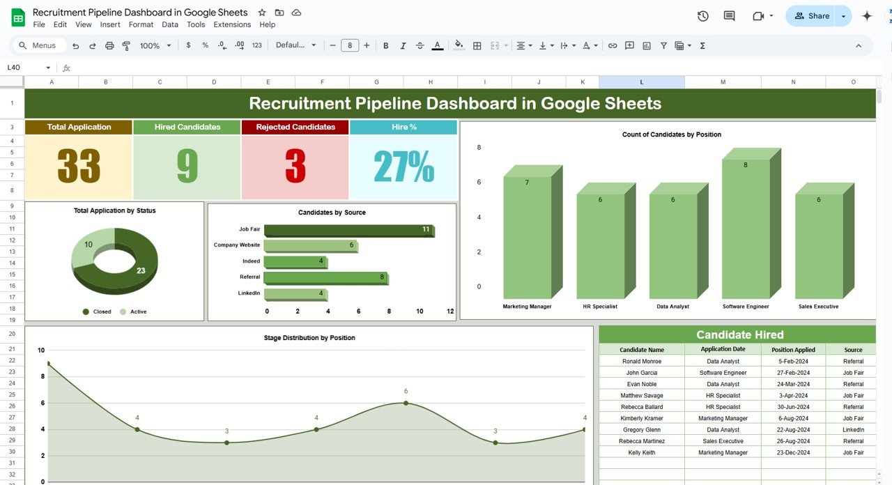
Cards in the Dashboard Sheet
The cards give a high-level overview of important metrics:
-
Total Applications: Displays the total number of applications received.
-
Hired Candidates: Shows how many candidates have been successfully hired.
-
Rejected Candidates: Tracks the number of candidates rejected during the recruitment process.
-
Hire Percentage: Calculates the percentage of candidates hired in relation to the total applications.
These cards help you monitor key performance indicators (KPIs) for the recruitment process.
Charts in the Dashboard Sheet
Charts provide a deeper analysis of candidate data. Here are the key charts used in the dashboard:
-
Count of Candidates by Position (Column Chart): This chart shows the number of candidates applying for each position. It helps recruiters understand which positions are attracting more applications.
-
Total Applications by Status (Donut Chart): This chart breaks down applications based on their current status (e.g., active, closed, or rejected).
-
Candidates by Source (Bar Chart): This bar chart shows the sources from which candidates are applying, such as job fairs, referrals, LinkedIn, etc. It helps recruiters identify the most effective sourcing channels.
-
Stage Distribution by Position (Area Chart): This area chart visualizes how candidates are distributed across different stages of the recruitment process for each position.
-
Candidate Hired (Table View): This table presents a detailed view of all hired candidates, including their position, interviewers, and status.
By using these charts, you can quickly assess the overall health of your recruitment process.
Click to buy Recruitment Pipeline Dashboard in Google Sheets
Using the Quick Search Sheet
The Quick Search Sheet provides a way to filter and search through your candidate data. This tab allows you to quickly find specific candidates based on certain criteria, such as candidate ID, name, position applied for, and current stage. It serves as a search engine to find candidates and view detailed information in a more organized format.
Key Fields in the Quick Search Sheet
Search Fields: This section allows you to search for candidates using keywords like the position applied for or the candidate’s name.
Candidate Information: This section provides all the necessary information about each candidate, including:
- Candidate ID
- Candidate Name
- Position Applied
- Stage (e.g., interview, offer, hired)
- Application Date
- Source (e.g., Job Fair, Referral, LinkedIn)
- Interviewer
- Status (e.g., active, closed)
By entering the search criteria, you can narrow down the list of candidates and find the specific information you need in seconds.

Click to buy Recruitment Pipeline Dashboard in Google Sheets
Setting Up the Data Sheet
The Data Sheet is where all the candidate information is entered. This tab is essential for tracking detailed recruitment data and serves as the backbone of the dashboard.

Click to buy Recruitment Pipeline Dashboard in Google Sheets
Key Features of the Data Sheet
-
Data Input: The Data Sheet allows you to input information for each candidate, including their name, position, interviewers, application date, hiring status, salary offered, and more.
-
Structured Data: The data is structured in a table format, making it easy to update and filter by different fields. This ensures that all data is well-organized and ready for analysis.
-
Automated Updates: By linking the Data Sheet to the Dashboard and Quick Search Sheets, any changes in candidate status or new entries will automatically update the relevant charts and tables, providing you with real-time insights.
Advantages of a Recruitment Pipeline Dashboard
A well-structured Recruitment Pipeline Dashboard offers numerous benefits for HR teams and hiring managers:
-
Streamlined Data Tracking: You can track the entire recruitment process in one place, making it easier to monitor progress and identify issues.
-
Real-Time Insights: The dashboard updates in real-time, providing you with up-to-date information about the status of each candidate.
-
Improved Decision-Making: With visual charts and key metrics at your fingertips, you can make data-driven decisions to improve your hiring process.
-
Time Efficiency: Automating the process of updating candidate data saves time and minimizes errors compared to manual tracking.
-
Transparency: The dashboard makes it easy to communicate recruitment progress with other team members and management.
Opportunities for Improvement in the Recruitment Pipeline Dashboard
Click to buy Recruitment Pipeline Dashboard in Google Sheets
While the Recruitment Pipeline Dashboard is an incredibly powerful tool, there is always room for improvement. Here are some areas where you can enhance its effectiveness:
-
Customization: Depending on the specific needs of your organization, you may want to customize the dashboard further by adding additional filters or KPIs that are unique to your hiring process.
-
Integration with Other Tools: Consider integrating the dashboard with your applicant tracking system (ATS) or other HR tools to automatically pull in candidate data.
-
Automation of Reports: Set up automated email reports that can send weekly or monthly summaries of your recruitment progress to stakeholders.
-
Mobile Accessibility: Optimize the dashboard for mobile devices to ensure recruiters and hiring managers can access it while on the go.
Best Practices for Using a Recruitment Pipeline Dashboard
To get the most out of your Recruitment Pipeline Dashboard, here are some best practices to follow:
-
Update Candidate Data Regularly: Make sure that candidate information is updated frequently to ensure accurate reporting.
-
Use Clear Labels and Consistent Formatting: Ensure that all fields, charts, and tables are clearly labeled and formatted consistently for easy interpretation.
-
Leverage Conditional Formatting: Use color-coding and conditional formatting to highlight critical data points, such as candidates who are near the end of the process or those who have been waiting for a long time.
-
Collaborate with Team Members: Use Google Sheets’ sharing and collaboration features to keep all team members on the same page. Multiple users can edit the data and contribute to the dashboard.
-
Monitor Key Metrics: Regularly monitor metrics like hire percentage, time-to-hire, and source effectiveness to continuously improve your recruitment strategy.
Conclusion
Click to buy Recruitment Pipeline Dashboard in Google Sheets
The Recruitment Pipeline Dashboard in Google Sheets is an invaluable tool for organizing and tracking the hiring process. By setting up the Dashboard, Quick Search, and Data Sheets, you can gain complete visibility into your recruitment efforts and ensure a more efficient and data-driven hiring process. With the right customizations, automation, and best practices, you can make the dashboard an even more powerful tool for streamlining your recruitment operations.
Frequently Asked Questions (FAQs)
What is a Recruitment Pipeline Dashboard?
A Recruitment Pipeline Dashboard is a tool that helps track candidates through various stages of the hiring process. It provides a visual representation of metrics such as total applications, hired candidates, and hiring percentages.
How do I create a Recruitment Pipeline Dashboard in Google Sheets?
To create a Recruitment Pipeline Dashboard, set up three key sheets: the Dashboard Sheet (for visualizing data), the Quick Search Sheet (for searching and filtering candidates), and the Data Sheet (for inputting and updating candidate information).
What charts are included in the Recruitment Pipeline Dashboard?
The dashboard includes charts such as a column chart for candidates by position, a donut chart for total applications by status, a bar chart for candidates by source, and an area chart for stage distribution by position.
Can I automate the data entry process in the Recruitment Pipeline Dashboard?
Yes, you can automate data entry by integrating the dashboard with your applicant tracking system (ATS) or using Google Sheets functions like IMPORTRANGE to pull data from other sources.
What are the advantages of using a Recruitment Pipeline Dashboard?
The dashboard streamlines data tracking, provides real-time insights, enhances decision-making, and saves time by automating data updates.
Visit our YouTube channel to learn step-by-step video tutorials
Youtube.com/@NeotechNavigators
Watch the step-by-step video tutorial:
Click to buy Recruitment Pipeline Dashboard in Google Sheets