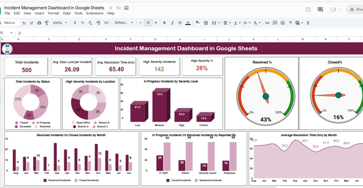
In every organization, incidents—whether technical, operational, or safety-related—are inevitable. What truly defines operational excellence is how efficiently these incidents are reported, analyzed, and resolved. The Incident Management Dashboard in Google Sheets offers a powerful yet simple solution for tracking, monitoring, and managing incidents in real time.Incident Management Dashboard in Google Sheets
This ready-to-use dashboard gives decision-makers a complete overview of incident trends, severity levels, and response efficiency. Built in Google Sheets, it allows instant visualization, dynamic filtering, and performance monitoring without needing any specialized software.Incident Management Dashboard in Google Sheets
What Is an Incident Management Dashboard in Google Sheets?
An Incident Management Dashboard is an interactive visual tool designed to track incidents reported across teams, departments, or locations. It consolidates key metrics—like total incidents, response time, and severity levels—into one centralized view.Incident Management Dashboard in Google Sheets
With this dashboard, you can:Incident Management Dashboard in Google Sheets
-
Monitor the number and type of incidents across your organization.
-
Track average response and resolution times.
-
Evaluate severity and prioritize critical issues.
-
Identify patterns, delays, and recurring problem areas.
By automating calculations and visual updates, the dashboard makes incident monitoring simple, transparent, and data-driven.Incident Management Dashboard in Google Sheets
Dashboard Structure
Click to Buy Incident Management Dashboard in Google Sheets
This dashboard is designed with a structured layout that ensures clarity and usability. It includes the following key components:Incident Management Dashboard in Google Sheets
1️⃣ Dashboard Sheet Tab (Main Interface)
The main sheet displays all the KPIs and charts that summarize your organization’s incident data.
KPI Cards
At the top, the dashboard shows five critical performance cards:
-
Total Incidents: Total number of incidents reported during the selected period.
-
Avg. Response Time (hrs): Average time taken to respond after an incident is reported.
-
Avg. Resolution Time (hrs): Average time taken to resolve incidents.
-
High Severity %: Percentage of total incidents classified as high severity.
-
High Severity Incidents: Count of incidents categorized as high severity.
These cards provide at-a-glance insights into overall performance and responsiveness.
2️⃣ Charts and Visual Analysis
The dashboard includes several dynamic charts that offer deeper analytical insights:
📊 Total Incidents by Status
Displays incidents categorized as In Progress, Resolved, or Closed.
Helps visualize the current stage distribution of incidents.
🔥 High Severity Incidents by Location
Shows where critical incidents are most frequent, allowing for location-based risk assessment.
⚠️ In Progress Incidents by Severity Level
Illustrates ongoing issues by severity — helping prioritize responses efficiently.
✅ Resolved % and Closed %
Two donut or pie charts showing the percentage of incidents resolved versus those closed.
📅 Resolved Incidents Vs Closed Incidents by Month
Compares monthly resolution and closure rates to assess workflow efficiency.
👥 In Progress Incidents Vs Resolved Incidents by Reported By
Tracks performance by employees or teams reporting incidents, highlighting contribution and activity.
⏱️ Average Resolution Time (hrs) by Month
Analyzes how long incidents take to resolve over time, indicating process improvements or delays.
These charts update dynamically as data is entered or filtered, providing real-time visual insights

Click to Buy Incident Management Dashboard in Google Sheets
3️⃣ Search Functionality
The Search Tab lets you quickly find and filter incidents based on keywords or field names.
You can search by:
-
Incident ID
-
Location
-
Incident Type
-
Severity Level
-
Status
-
Reported By
This makes it easier for managers to pinpoint specific records without scrolling through large datasets.

Click to Buy Incident Management Dashboard in Google Sheets
4️⃣ Data Sheet Tab (Input Data Source)
The Data Sheet Tab is the foundation of the dashboard. It contains all the raw information used to calculate KPIs and generate charts.
Typical columns include:

Advantages of the Incident Management Dashboard
-
Centralized Monitoring: Manage all incidents from one sheet.
-
Real-Time Updates: Instant metric and chart updates when data changes.
-
Visual Alerts: Color-coded KPIs help highlight critical trends.
-
Improved Efficiency: Tracks response and resolution times for process optimization.
-
Data Transparency: Easy access for all stakeholders through Google Sheets.
-
Customizable: Add more KPIs, departments, or filters as needed.
-
Historical Insights: Compare month-over-month and severity-based performance.
Opportunities for Improvement
Click to Buy Incident Management Dashboard in Google Sheets
You can enhance this dashboard’s performance and automation through:
-
Google Form Integration: Collect incident reports directly from teams.
-
Automated Alerts: Notify managers for high-severity or delayed incidents.
-
Geo Mapping: Visualize incidents on Google Maps based on location.
-
Root Cause Analysis Add-on: Add a section for RCA tracking.
-
SLA Breach Tracker: Flag incidents exceeding defined SLA limits.
Best Practices for Using the Dashboard
-
Standardize Severity Levels: Define clear Low, Medium, and High criteria.
-
Set SLA Targets: Establish response and resolution time goals.
-
Keep Data Updated: Enter incidents immediately for real-time accuracy.
-
Validate Entries: Check for missing or incorrect data regularly.
-
Automate Where Possible: Use Google Apps Script for data cleanup or alerts.
-
Review Monthly: Use monthly charts to identify recurring patterns.
Conclusion
Click to Buy Incident Management Dashboard in Google Sheets
The Incident Management Dashboard in Google Sheets provides a structured and data-driven approach to track and analyze incidents efficiently. With its clean visual layout, automated KPIs, and interactive charts, it empowers organizations to improve response times, reduce recurrence, and enhance operational reliability.
It’s an essential tool for safety teams, IT departments, and business operations managers who want full visibility into incident performance — all within the simplicity of Google Sheets.
Frequently Asked Questions (FAQ)
1. Can I customize the severity levels?
Yes, you can define your own severity labels like “Critical,” “Major,” or “Minor.”
2. Can I use this dashboard for IT incidents?
Absolutely. It’s flexible enough to track IT, facility, or operational incidents.
3. Does it support multiple locations?
Yes, the “High Severity by Location” chart is designed for multi-location analysis.
4. Can I automate incident reporting?
Yes, integrate with Google Forms to automatically log new incidents.
5. Can I measure SLA compliance?
Yes, by adding SLA target columns and conditional formatting rules.
Visit our YouTube channel to learn step-by-step video tutorials
Youtube.com/@NeotechNavigators