Business disruptions can happen at any time. System outages, cyber incidents, natural disasters, or operational failures can impact productivity, revenue, and customer trust. Therefore, organizations must track incidents, recovery performance, downtime costs, and test results in one centralized system. That is exactly where a Business Continuity Dashboard in Google Sheets becomes essential.
This ready-to-use dashboard helps organizations monitor business continuity performance, measure recovery effectiveness, and identify risks early. Because it is built in Google Sheets, it remains easy to use, collaborative, and accessible without expensive tools.
In this article, we explain how the Business Continuity Dashboard in Google Sheets works, what insights it provides, and how each chart and section supports smarter continuity planning.
What Is a Business Continuity Dashboard in Google Sheets?
Click to Buy Business Continuity Dashboard in Google Sheets
A Business Continuity Dashboard is a reporting and monitoring tool that tracks incidents, recovery time, downtime costs, and test outcomes across the organization. It converts raw incident data into structured metrics and visual insights.
With this dashboard, teams can:
-
Monitor business continuity incidents in real time
-
Track recovery performance and RTO/RPO metrics
-
Measure financial impact due to downtime
-
Analyze test results across departments and incident types
-
Identify areas that need immediate improvement
Since the dashboard runs in Google Sheets, teams can collaborate easily, update data quickly, and share insights securely.
Key Features of the Business Continuity Dashboard
Click to Buy Business Continuity Dashboard in Google Sheets
This dashboard is a ready-to-use solution that includes:
-
An interactive Overview Sheet
-
Multiple analysis sections by department, incident type, and test result
-
Clear KPI cards for quick decision-making
-
Trend analysis for monthly performance
-
A powerful search feature for fast data access
Let’s walk through each section in detail.
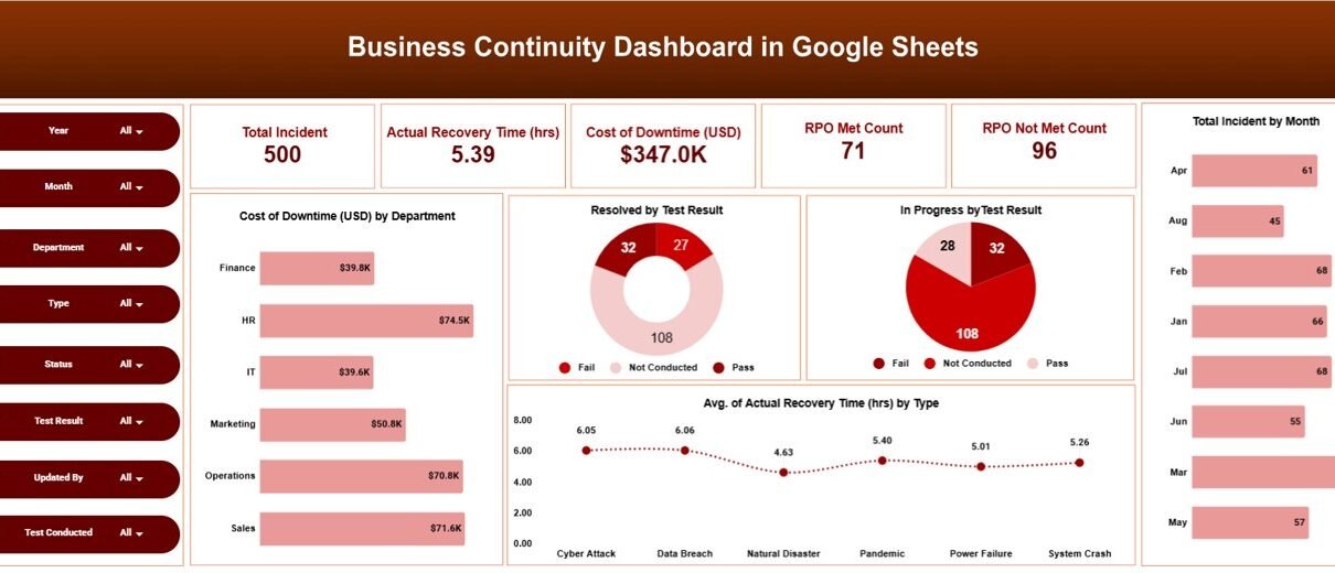
Overview Sheet Tab
The Overview Sheet gives leadership a high-level snapshot of business continuity performance.
Key KPI Cards
The dashboard displays the following cards at the top:
-
Total Incident – Total number of continuity-related incidents logged
-
Actual Recovery Time (hrs) – Average or total recovery time across incidents
-
Cost of Downtime (USD) – Financial impact caused by downtime
-
RPO Met Count – Number of incidents where Recovery Point Objective was met
-
RPO Not Met Count – Number of incidents where RPO was missed
These cards allow stakeholders to understand the overall risk and resilience posture instantly.
Overview Charts
The overview section includes several powerful charts:
Cost of Downtime (USD) by Department
Shows which departments incur the highest downtime costs, helping prioritize resilience investments.
Resolved by Test Result
Displays how many incidents were resolved successfully based on continuity test outcomes.
In Progress by Test Result
Highlights unresolved or ongoing issues grouped by test result.
Average Actual Recovery Time (hrs) by Type
Compares recovery performance across different incident types, such as IT failures or operational disruptions.

Click to Buy Business Continuity Dashboard in Google Sheets
Department Analysis
This section helps organizations understand continuity performance at the departmental level.
Charts Included
-
Cost of Downtime (USD) by Department
-
Average Actual Recovery Time (hrs) by Department
-
Test Pass vs Test Fail by Department
These visuals help management identify which departments need better preparedness, training, or infrastructure support.

Incident Type Analysis
Different incidents create different levels of risk. This section focuses on performance by incident category.
Charts Included
-
Cost of Downtime (USD) by Incident Type
-
Test Pass vs Test Fail by Incident Type
-
Average Actual Recovery Time (hrs) by Incident Type
-
Resolved vs Open by Incident Type
With this analysis, teams can understand which incident types cause the most disruption and where mitigation strategies should improve.

Click to Buy Business Continuity Dashboard in Google Sheets
Test Result Analysis
Testing plays a critical role in business continuity. This section evaluates how well continuity plans perform during tests.
Charts Included
-
Cost of Downtime (USD) by Test Result
-
In Progress by Test Result
-
Resolved vs Open by Test Result
-
Average Actual Recovery Time (hrs) by Test Result
This analysis helps organizations assess the effectiveness of their continuity drills and corrective actions.

Monthly Trends
Trends reveal long-term performance patterns. The monthly trend section helps track improvements or emerging risks over time.
Charts Included
-
Cost of Downtime (USD) by Month
-
In Progress by Month
-
Resolved vs Open by Month
-
Average Actual Recovery Time (hrs) by Month
By reviewing monthly trends, leadership can measure whether continuity maturity improves or declines over time.

Click to Buy Business Continuity Dashboard in Google Sheets
Why Organizations Need a Business Continuity Dashboard
Without structured reporting, continuity data remains scattered and difficult to analyze. This dashboard solves that problem by:
-
Centralizing continuity data
-
Improving visibility into risks
-
Supporting faster recovery decisions
-
Enhancing compliance and audit readiness
-
Reducing downtime impact
It supports IT teams, risk managers, compliance officers, and senior leadership.
Advantages of the Business Continuity Dashboard
Click to Buy Business Continuity Dashboard in Google Sheets
-
Real-time visibility into incidents and recovery
-
Data-driven decisions for continuity planning
-
Improved accountability across departments
-
Better test performance tracking
-
Cost awareness of downtime impact
-
Easy collaboration through Google Sheets
Opportunities for Improvement
Organizations can further enhance the dashboard by:
-
Adding automated alerts for high recovery time
-
Including SLA or RTO breach indicators
-
Integrating risk severity scoring
-
Automating data imports from incident systems
-
Adding executive summary PDFs
These enhancements make continuity management even stronger.
Best Practices for Using the Dashboard
Click to Buy Business Continuity Dashboard in Google Sheets
-
Update incident data promptly
-
Review downtime cost trends monthly
-
Analyze failed tests immediately
-
Compare departments regularly
-
Use recovery time insights to improve response plans
-
Secure access to sensitive data
Conclusion
A Business Continuity Dashboard in Google Sheets provides a clear, structured, and actionable view of organizational resilience. It helps teams track incidents, manage recovery time, control downtime costs, and improve testing outcomes. Because it is simple, collaborative, and visual, it becomes a powerful tool for strengthening business continuity planning.
Visit our YouTube channel to learn step-by-step video tutorials
Youtube.com/@NeotechNavigators
Watch the step-by-step video tutorial: