In today’s fast-paced business environment, maintaining an efficient IT infrastructure is crucial for organizational success. Whether you are managing a small business or a large corporation, tracking the performance of your IT infrastructure is essential. This is where a KPI Dashboard (Key Performance Indicator Dashboard) comes into play. In this article, we will explore how to create an IT Infrastructure KPI Dashboard in Google Sheets, a tool that provides real-time insights into the health and performance of your IT infrastructure.
A well-structured IT Infrastructure KPI Dashboard helps IT teams monitor critical metrics, identify issues quickly, and make data-driven decisions to optimize performance. Google Sheets, with its ease of use and cloud-based accessibility, is an excellent platform for building such dashboards.
What is an IT Infrastructure KPI Dashboard?
An IT Infrastructure KPI Dashboard is a visual tool that helps monitor and manage the key metrics related to an organization’s IT operations. These KPIs help evaluate the efficiency of servers, networks, storage, and other IT components. With the use of a Google Sheets-based dashboard, IT professionals can track and analyze data such as system uptime, response times, and other infrastructure health indicators.
Why Use Google Sheets for IT Infrastructure Dashboards?
Google Sheets offers several advantages:
-
Cloud-based Access: You can access your data from anywhere, at any time.
-
Collaboration: Multiple users can collaborate in real-time, making it easier to track and update metrics.
-
Cost-effective: Unlike other dashboard tools, Google Sheets is free and easy to set up.
-
Ease of Use: Google Sheets is intuitive and user-friendly, allowing IT teams to focus on analyzing data rather than spending time on complicated setups.
Key Features of the IT Infrastructure KPI Dashboard in Google Sheets
Our IT Infrastructure KPI Dashboard in Google Sheets comes with the following key features that streamline your data analysis process:
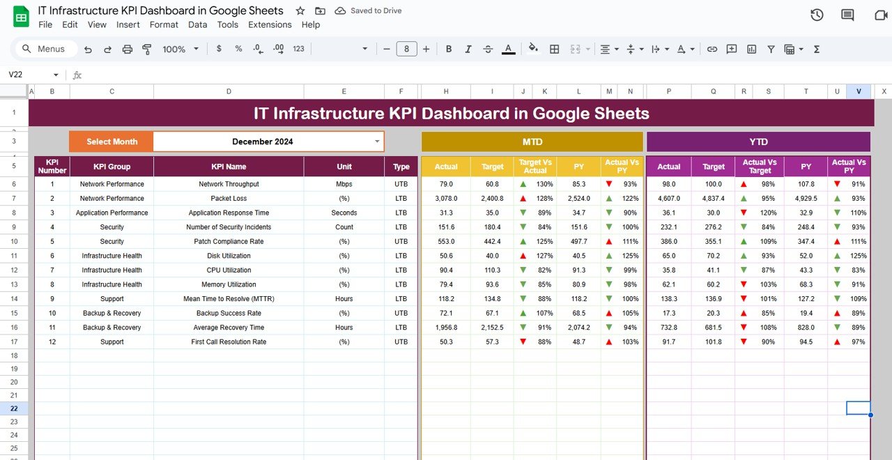
1. Dashboard Sheet Tab
The Dashboard Sheet is the main sheet that displays all the KPIs. It gives a quick snapshot of key performance indicators, such as MTD (Month-to-Date), YTD (Year-to-Date), and Previous Year data.
-
Select the Month: The user can select the month from a dropdown menu in Range D3, and the dashboard will update with the latest data.
-
Comparative Analysis: View data comparisons like Target vs Actual and Previous Year vs Actual, with the help of conditional formatting. The color-coded up and down arrows make it easy to spot performance trends.

Click to buy IT Infrastructure KPI Dashboard in Google Sheets
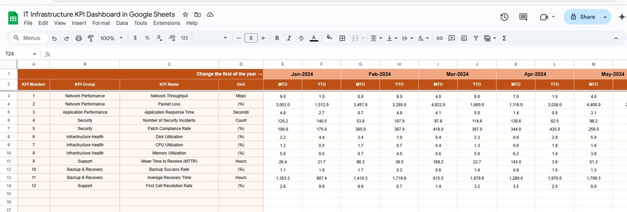
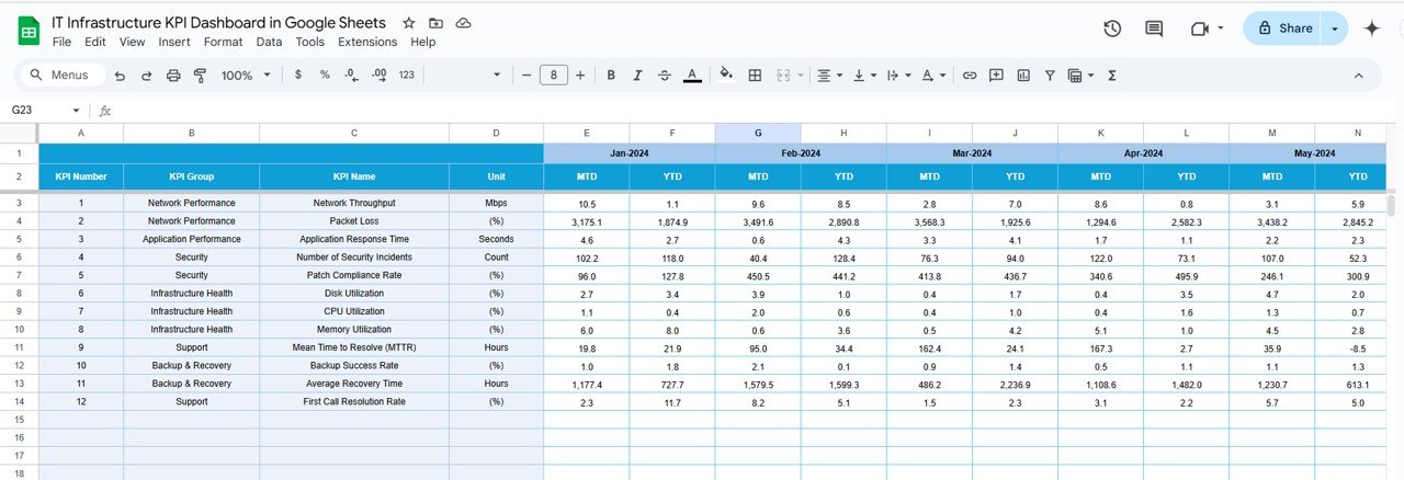
2. KPI Trend Sheet Tab
The KPI Trend Sheet displays the trend of each KPI over time, providing a historical view of performance.
-
Dropdown Selection: Select the KPI name from Range C3 to display its group, unit, formula, and definition.
-
KPI Information: This sheet provides detailed insights, such as whether the KPI is Lower the Better or Upper the Better. This helps in interpreting the results effectively.

Click to buy IT Infrastructure KPI Dashboard in Google Sheets
3. Actual Number Sheet Tab
This sheet allows you to input the Actual Numbers for MTD and YTD for a particular month. You can select the desired month from Range E1, and the data will automatically update.
-
Track Actual Performance: Enter actual data to compare against your target numbers and previous year’s performance.
4. Target Sheet Tab
In the Target Sheet, you can set monthly and yearly target values for each KPI.
-
Target Setting: Enter target numbers for each KPI, both MTD and YTD, to assess if you are meeting your performance goals.
Click to buy IT Infrastructure KPI Dashboard in Google Sheets
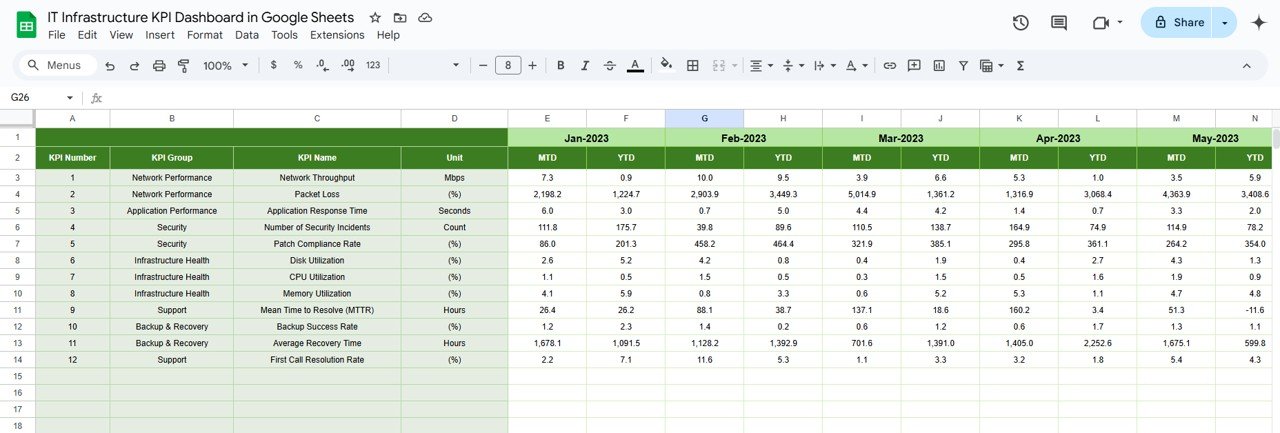
5. Previous Year Numbers Sheet Tab
Here, you will enter the Previous Year’s Data for comparison. This historical data allows you to gauge whether performance has improved, stayed consistent, or declined.
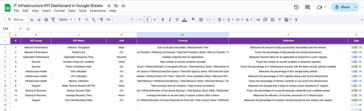
6. KPI Definition Sheet Tab
This sheet contains all the definitions, formulas, and KPI groups. It ensures that the entire team understands how each KPI is calculated and what the targets mean.
Advantages of Using an IT Infrastructure KPI Dashboard
- Real-time Monitoring: The dashboard allows you to monitor your IT infrastructure in real-time, helping to quickly identify any performance bottlenecks or issues before they become critical problems.
- Data-driven Decisions: With visual comparisons of actual performance against targets and historical data, decision-makers can make more informed and effective choices regarding infrastructure management.
- Streamlined Reporting: Instead of manually compiling performance data, the dashboard automates reporting, saving time and reducing the potential for errors.
- Improved Team Collaboration: Google Sheets makes collaboration easy, allowing team members to update and access data simultaneously, ensuring that everyone is on the same page.
Opportunities for Improvement in IT Infrastructure KPI Dashboard
- Integrating Automation for Data Updates: While Google Sheets offers an easy-to-use platform, integrating automation tools like Google Apps Script can further improve the dashboard’s efficiency. This will help update data automatically, reducing manual data entry.
- Incorporating Advanced Data Visualization: For even clearer insights, you can integrate more sophisticated data visualization tools like charts and graphs that can highlight trends more effectively than tables alone.
- Incorporating Predictive Analytics: As your data grows, you can use advanced techniques like predictive analytics to forecast trends and help with proactive decision-making.
- Mobile Access Optimization: While Google Sheets is cloud-based, optimizing the dashboard for mobile use can help teams access data on the go, ensuring they can always monitor the infrastructure performance.
Best Practices for Using the IT Infrastructure KPI Dashboard
1. Keep KPIs Relevant
Ensure that the KPIs you are tracking are directly related to your business goals and IT infrastructure health. Avoid cluttering the dashboard with irrelevant metrics that don’t provide actionable insights.
2. Set Realistic Targets
While setting targets for your KPIs, make sure they are challenging yet achievable. Unrealistic targets can demotivate your team and lead to frustration.
3. Regularly Update Data
To ensure accurate decision-making, it’s crucial that your KPI data is updated regularly. Establish a routine for updating the actual, target, and previous year data.
4. Use Conditional Formatting Wisely
Leverage conditional formatting to visually differentiate performance levels. Green, yellow, and red indicators can quickly communicate whether a KPI is on track, underperforming, or overachieving.
5. Secure Your Dashboard
Since the dashboard contains valuable performance data, ensure that it is properly secured. Use Google Sheets’ built-in sharing permissions to restrict access and prevent unauthorized edits.
Frequently Asked Questions (FAQs)
What KPIs Should Be Included in the IT Infrastructure Dashboard?
The KPIs should focus on the performance and health of key infrastructure components, such as server uptime, network latency, storage usage, response time, and incident resolution time.
How Do I Update the Data in the Dashboard?
The dashboard can be updated manually by entering the latest data in the relevant sheets: Actual Numbers, Target, and Previous Year Numbers.
Can I Automate Data Entry in Google Sheets?
Yes, you can automate data entry by using Google Apps Script or integrating external data sources, such as system logs or monitoring tools, with Google Sheets.
How Do I Interpret the Data in the Dashboard?
By comparing MTD (Month-to-Date) and YTD (Year-to-Date) performance with target and previous year values, you can identify trends and performance gaps. Green indicators show that KPIs are on track, while red indicates areas for improvement.
Is the IT Infrastructure KPI Dashboard Customizable?
Yes, the Google Sheets-based IT Infrastructure KPI Dashboard is fully customizable. You can add or remove KPIs, change the layout, and integrate advanced data visualization features to better suit your needs.
Conclusion
An IT Infrastructure KPI Dashboard in Google Sheets is an essential tool for IT professionals looking to streamline infrastructure management and decision-making. It provides real-time insights into the performance of IT components, allowing you to quickly spot issues and take corrective actions. By following the best practices and continuously improving the dashboard, you can ensure your IT infrastructure is running smoothly and efficiently.
Visit our YouTube channel to learn step-by-step video tutorials
Youtube.com/@NeotechNavigators
Watch the step-by-step video Demo: