Managing order cycle time is one of the most important responsibilities in supply chain operations. When you measure order cycle time correctly, you understand how fast your business processes customer orders, how well your team handles delays, and how efficiently your supply chain performs from end to end. Today, many companies still track cycle times manually or in scattered spreadsheets. This often leads to errors, confusion, slower decisions, and poor visibility.Order Cycle Time KPI Dashboard in Google Sheets
To solve these challenges, the Order Cycle Time KPI Dashboard in Google Sheets provides an easy-to-use, automated, and visually appealing solution. It helps supply chain teams track, visualize, and improve order processing speed and overall fulfillment performance. This article explains how the dashboard works, what each page contains, the KPI list, the formulas, and the best practices for using it.Order Cycle Time KPI Dashboard in Google Sheets
What Is an Order Cycle Time KPI Dashboard in Google Sheets?
An Order Cycle Time KPI Dashboard in Google Sheets is a ready-to-use performance tracking tool that measures how long it takes a business to complete an order from the moment the customer places it until the moment the customer receives it. This dashboard helps supply chain teams track the full cycle:
- Order entry
- Order processing
- Picking
- Packing
- Shipping
- Delivery
It allows you to monitor Month-to-Date (MTD) and Year-to-Date (YTD) performance of all KPIs related to order cycle time. The dashboard also displays targets, previous year comparisons, and trend charts so you can easily identify performance gaps and improvement opportunities.
Key Features of the Order Cycle Time KPI Dashboard in Google Sheets
Click to Buy Order Cycle Time KPI Dashboard in Google Sheets
This dashboard includes 6 powerful worksheet tabs, each designed to streamline order performance management.
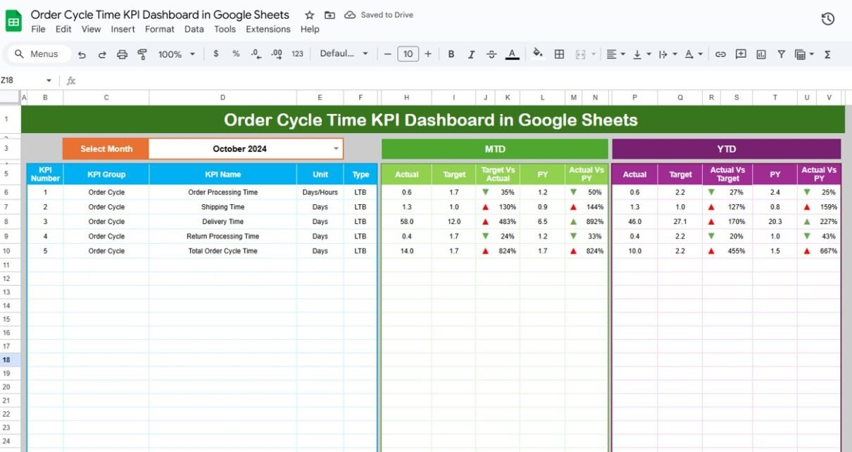
Dashboard Sheet Tab – Main Visualization Page
This is the heart of the entire tool.
Here, you see all KPI information in a single view. At the top right, you can select the month from the drop-down available in Range D3. When you select a month, the entire dashboard updates automatically.
The dashboard displays the following for each KPI:
- MTD Actual
- MTD Target
- MTD Previous Year
- MTD Target vs Actual
- MTD PY vs Actual
- YTD Actual
- YTD Target
- YTD Previous Year
- YTD Target vs Actual
- YTD PY vs Actual
The visuals include conditional formatting and up/down arrows to make performance gaps easy to understand.
You can instantly compare monthly performance versus targets and previous year results. This helps teams identify delays, inefficiencies, and improvement needs.

Click to Buy Order Cycle Time KPI Dashboard in Google Sheets
KPI Trend Sheet Tab
This page helps users analyze KPI performance trends over time.
You can select any KPI from the dropdown in Range C3. After selecting a KPI, the page displays:
-
KPI Group
-
KPI Unit
-
KPI Type (LTB / UTB)
-
KPI Formula
-
KPI Definition
-
Trend Chart for 12 months
It helps supply chain managers understand whether the KPI is improving, declining, or fluctuating throughout the year.

Click to Buy Order Cycle Time KPI Dashboard in Google Sheets
Actual Number Sheet Tab
This page allows users to enter the actual performance numbers for each KPI.
-
You can change the month from Range E1.
-
Enter both MTD and YTD values for each KPI for the chosen month.
-
You only need to enter the first month in Range E1; the sheet automatically adjusts the remaining months.
This structure ensures accuracy and reduces the chances of data-entry mistakes.

Target Sheet Tab
This worksheet contains the target values for each KPI, both MTD and YTD.
Users must enter the expected target values for all KPIs for every month. These values help measure performance against goals and identify where you need improvements.

Click to Buy Order Cycle Time KPI Dashboard in Google Sheets
Previous Year Number Sheet Tab
This sheet is used to input previous year performance. It has fields for all KPIs for both MTD and YTD, just like the Actual and Target sheets.
Previous year comparison helps managers identify long-term improvement trends.
KPI Definition Sheet Tab
This page stores the master list of KPIs used in the dashboard. For each KPI, it contains:
-
KPI Name
-
KPI Group
-
KPI Unit
-
KPI Formula
-
KPI Definition
-
KPI Type (Lower the Better / Upper the Better)
This sheet acts as the foundation for the entire dashboard.

Click to Buy Order Cycle Time KPI Dashboard in Google Sheets
Advantages of the Order Cycle Time KPI Dashboard in Google Sheets
- Easy to Use; You work in Google Sheets, so there is no need for advanced tools or complex training.
- Real-Time Collaboration: Multiple team members can update data at the same time.
- Automated KPI Calculations: All formulas refresh when you update data. This reduces manual errors.
- Full Visibility of Order Cycle Time: You see delays and improvement opportunities in each part of the order cycle.
- Simple Monthly Reporting: With a single click, you can switch months and see updated numbers instantly.
- Trend Analysis: You can track improvement or decline over 12 months.
- Target vs Actual Comparison; You can compare actual performance against targets and previous year numbers.
Best Practices for Using the Order Cycle Time KPI Dashboard
- Update Actual Data Regularly; Enter MTD and YTD data daily or weekly to keep the dashboard accurate.
- Review Trends Each Month: Use the trend sheet to catch early signs of delays.
- Set Realistic Targets: Base your targets on historical performance, industry standards, and team capacity.
- Analyze LTB and UTB KPIs Separately: Lower-the-better KPIs show efficiency.
Upper-the-better KPIs show quality and accuracy. - Use Previous Year Data for Benchmarking; This helps identify long-term improvement opportunities.
- Hold Monthly Review Meetings: Use dashboard visuals to discuss performance with your team.
- Avoid Complex Data Entry; Keep inputs simple to reduce data-entry mistakes.
Conclusion
Click to Buy Order Cycle Time KPI Dashboard in Google Sheets
The Order Cycle Time KPI Dashboard in Google Sheets is one of the most efficient ways to track, analyze, and improve order fulfillment performance. It helps teams understand each stage of the order cycle, identify delays, measure accuracy, and improve customer satisfaction. Because it is easy to use, cloud-based, and automated, the dashboard supports continuous improvement in any supply chain or e-commerce business.
When you use the dashboard regularly, you gain full visibility into your supply chain and improve overall operational speed.
Frequently Asked Questions (FAQs)
1. What is order cycle time?
Order cycle time is the total time a business takes to process and deliver an order from the moment the customer places it until final delivery.
2. Why should I track order cycle time?
Tracking cycle time helps reduce delays, improve customer satisfaction, and increase supply chain efficiency.
3. Can I customize the KPI dashboard?
Yes. You can add KPIs, rename columns, modify formulas, and customize visuals as needed.
4. Do I need advanced Excel or Google Sheets skills?
No. The dashboard is simple and does not require advanced technical knowledge.
Watch the step-by-step video Demo:
Visit our YouTube channel to learn step-by-step video tutorials
Youtube.com/@NeotechNavigators
Click to Buy Order Cycle Time KPI Dashboard in Google Sheets