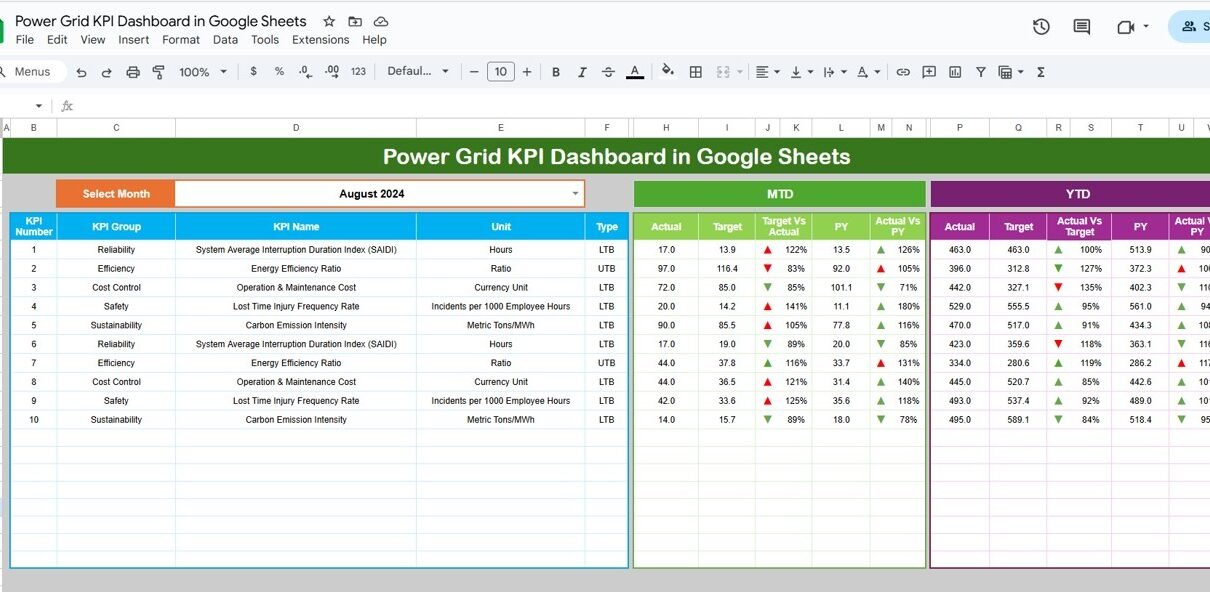
Power grid operations demand extremely high reliability, efficient transmission, minimal outages, and safety. To achieve this, power grid companies must monitor critical KPIs (Key Performance Indicators) that reflect system performance, quality of supply, load management, and operational efficiency.Power Grid KPI Dashboard in Google Sheets
The Power Grid KPI Dashboard in Google Sheets is a ready-to-use, automated, professional reporting tool designed for grid operators, transmission companies, and energy regulators. It helps track both monthly (MTD) and year-to-date (YTD) performance with real-time comparisons using targets and previous year benchmarks.Power Grid KPI Dashboard in Google Sheets
What Is a Power Grid KPI Dashboard in Google Sheets?
A Power Grid KPI Dashboard is a specialized Google Sheets–based monitoring system that visualizes transmission performance, line reliability, transformer efficiency, load factors, frequency stability, and grid availability.
The dashboard includes:
✔ MTD Actual vs Target vs Previous Year
✔ YTD Actual vs Target vs Previous Year
✔ Conditional formatting (arrows, color indicators)
✔ KPI trend graphs
✔ Detailed KPI definitions and formulas
It helps energy teams take quick decisions during grid disturbances, outages, overload events, or operational inefficiencies.
Click to Buy Power Grid KPI Dashboard in Google Sheets
Dashboard Structure
Your dashboard contains the following sheets:
Dashboard Sheet Tab
The main visual dashboard where users can select the month using the dropdown in cell D3.
Displayed for each KPI:
-
MTD Actual
-
MTD Target
-
MTD Previous Year
-
YTD Actual
-
YTD Target
-
YTD Previous Year
Conditional formatting shows:
-
Up/Down Arrows
-
Indicator Colors
for performance comparison.

Click to Buy Power Grid KPI Dashboard in Google Sheets
KPI Trend Sheet Tab
Users select any KPI from the dropdown (Cell C3) and see:
-
KPI Group
-
Unit
-
KPI Type (Lower the Better / Upper the Better)
-
Formula
-
KPI Definition
-
Trend Chart for MTD & YTD

Click to Buy Power Grid KPI Dashboard in Google Sheets
Actual Number Sheet Tab
You enter MTD and YTD Actual values here.
Cell E1 allows selecting the starting month of the year.

Target Number Sheet Tab
Enter MTD & YTD Target values for every KPI.
The dashboard uses them for performance comparisons.

Click to Buy Power Grid KPI Dashboard in Google Sheets
Previous Year Number Sheet Tab
Enter MTD & YTD values from the previous year for YOY comparison.

KPI Definition Sheet Tab
Contains full details for all KPIs:
-
KPI Name
-
KPI Group
-
Unit
-
Formula
-
Definition
-
KPI Type (UTB / LTB)

Click to Buy Power Grid KPI Dashboard in Google Sheets
Advantages of Power Grid KPI Dashboard
-
Full visibility into grid reliability
-
Improves outage management and service continuity
-
Reduces transmission losses using data-driven monitoring
-
Enhances safety and reduces incident risks
-
Supports regulatory reporting and audits
-
Helps forecast load and manage peak demand
-
Highlights maintenance gaps and asset performance trends
Opportunities for Improvement
Click to Buy Power Grid KPI Dashboard in Google Sheets
You can enhance the dashboard by adding:
-
Real-time data integration from SCADA
-
Automatic email alerts for overload or faults
-
Region-wise dashboards for decentralization
-
Predictive maintenance indicators
-
Load forecasting heatmaps
Best Practices for Using This Dashboard
-
Update actual numbers monthly (or weekly if needed)
-
Regularly review reliability KPIs like SAIDI, SAIFI, CAIDI
-
Look for rising trends in transmission loss and overload
-
Compare YTD with previous year to spot long-term issues
-
Keep KPI definitions consistent with regulatory standards
Conclusion
Click to Buy Power Grid KPI Dashboard in Google Sheets
The Power Grid KPI Dashboard in Google Sheets provides a complete, data-driven view of grid reliability, operational efficiency, and performance. With MTD/YTD tracking, target comparisons, KPI definitions, and trend charts, this dashboard helps grid teams improve reliability, reduce outages, optimize asset performance, and ensure safe, efficient electricity distribution.
Visit our YouTube channel to learn step-by-step video tutorials
Youtube.com/@NeotechNavigators
Watch the step-by-step video Demo: