Startup Burn Rate Dashboard in HTML — A Complete Browser-Based Financial Analytics Solution
Startup Burn Rate Dashboard in HTML is a ready-to-use, browser-based interactive analytics template designed for startup founders, CFOs, finance managers, investors, and accelerator programs who need instant visibility into cash burn, runway, revenue growth, expense breakdown, and department-level spending. This dashboard delivers 5 interactive pages, 6 executive-level KPI cards, and over 12 dynamic charts — all running directly in your web browser without any software installation.
Whether you are preparing for a board meeting, building an investor report, or conducting a quarterly financial review, this template gives you a professional startup financial command center in seconds. Simply unzip the file, open index.html, and start analyzing. No Excel, no Power BI, no coding required. If you are looking for more browser-based analytics solutions, explore the full collection of HTML Dashboard Templates from NextGenTemplates.
Click here to Purchase Startup Burn Rate Dashboard in HTML
Startup Burn Rate Dashboard in HTML
Key Features of Startup Burn Rate Dashboard in HTML
This template is packed with features that make startup financial analysis fast and intuitive:
- 5 Interactive Dashboard Pages — Overview, Expense Breakdown, Department View, Runway & Growth, and Data View tabs provide 360-degree visibility into your startup’s financial health
- 6 Executive KPI Cards — Total Burn, Monthly Burn Rate, Cash Balance, Runway, Average MRR, and Net Customers displayed prominently on the Overview page
- 12+ Dynamic Charts — Monthly Burn by Revenue, Actual Spend by Expense Category, Actual Spend by Department, Invoice Count by Status, and many more visualizations across all pages
- Smart Slicers and Filters — Filter the entire dashboard by department, expense category, vendor, region, funding stage, and time period instantly
- Searchable Data Table — Full data view with search, sort, pagination, and CSV export for further analysis
- Zero Software Dependencies — Works in Chrome, Edge, Firefox, and Safari with no installation or plugins required
- Plug and Play — Replace sample data with your own startup metrics and all charts and KPIs auto-update
Dashboard Pages Explained
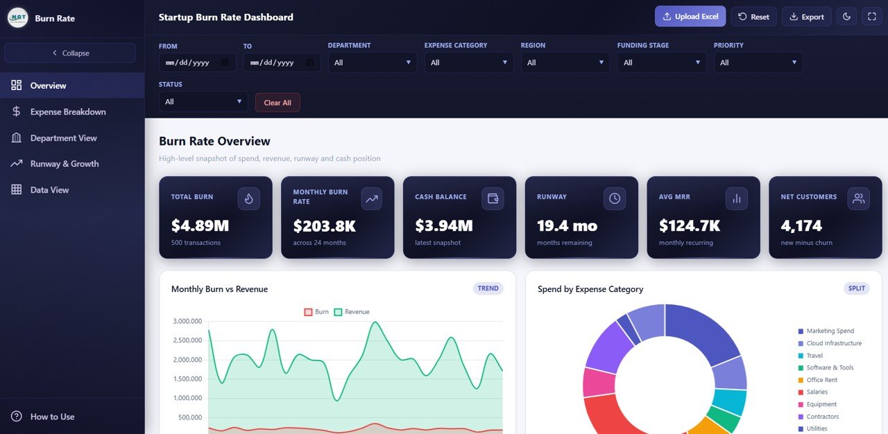
1. Overview Page
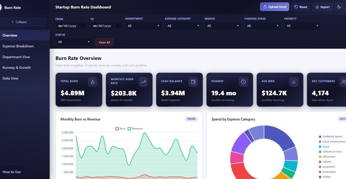
The Overview page is your startup financial command center. At the top, 6 KPI cards display the most critical startup metrics: Total Burn, Monthly Burn Rate, Cash Balance, Runway, Average MRR, and Net Customers. These cards give founders and CFOs an instant snapshot of financial health and how much time the company has before funds run out.
Below the cards, four strategic charts break down your startup’s performance: Monthly Burn by Revenue compares your cash burn against incoming revenue month over month, helping you see whether the gap is narrowing or widening. Actual Spend by Expense Category breaks down where your money is going across categories like payroll, marketing, infrastructure, and operations. Actual Spend by Department shows which teams consume the most budget, enabling targeted cost optimization. Invoice Count by Status reveals the distribution of pending, paid, and overdue invoices so you can manage cash flow proactively. Multiple slicers sit above the charts, enabling you to filter the entire dashboard by various dimensions with a single click.
Overview Page
Click here to Purchase Startup Burn Rate Dashboard in HTML
2. Expense Breakdown
The Expense Breakdown page provides a deep-dive into your startup’s spending patterns through five focused analytical charts. Actual Spend by Expense Category identifies which cost categories consume the largest portion of your budget, helping you spot areas for optimization. Actual Spend by Vendor shows spending concentration across your vendor base — critical for negotiating better terms with high-volume vendors. Actual Spend by Payment Method reveals payment channel preferences across your organization. Budget by Expense Category compares planned versus allocated budgets so you can see where overspending occurs. Actual Spend by Priority helps you evaluate whether high-priority expenses align with your strategic goals or if low-priority spending is eating into your runway.
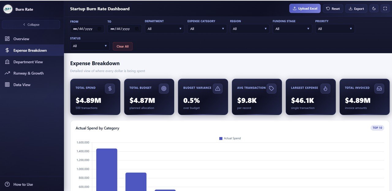
Expense Breakdown
3. Department View
The Department View page evaluates financial performance at the team level through five insightful charts. Budget by Department compares allocated budgets across teams, instantly highlighting which departments receive the most resources. Actual Spend by Department tracks real spending against those budgets, revealing which teams are over or under budget. Actual Spend by Region breaks down costs geographically for startups with distributed teams or multi-location operations. Average Employee Count by Department provides headcount context for spend analysis — a department might spend more simply because it has more people. Revenue by Department identifies which teams generate the most income, helping you make informed decisions about resource allocation and hiring. For broader financial tracking, the Small Business CFO Dashboard in HTML is an excellent companion template.
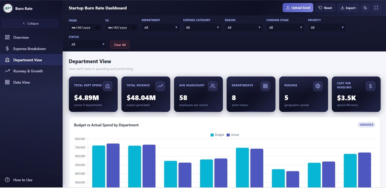
Department View
Click here to Purchase Startup Burn Rate Dashboard in HTML
4. Runway and Growth
The Runway and Growth page focuses on the metrics that matter most for startup survival and scaling — the numbers investors care about most. Cash Balance by Month tracks your remaining cash over time, giving you a visual trajectory of your financial runway. MRR by Month monitors monthly recurring revenue growth, the most important metric for subscription-based startups. New Customers by Month measures acquisition velocity, showing whether your growth engine is accelerating or slowing down. Churn Count by Month reveals customer retention trends — high churn can silently erode your runway even when acquisition looks healthy. Actual Spend by Funding Stage shows how spending patterns shift across seed, Series A, and later stages, providing context for burn rate changes. For additional SaaS-specific tracking, check out the SaaS Financial Model Dashboard in HTML blog post.
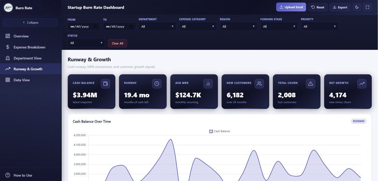
Runway and Growth
5. Data View
The Data View page is a detailed data table that displays all underlying records powering the dashboard. It includes search functionality to find specific entries, column sorting to organize data by any field, pagination to navigate through large datasets, and a CSV export button to download filtered data for offline analysis or presentations. This page makes the dashboard fully transparent — every chart and KPI can be traced back to its source data. It is particularly useful for auditing individual transactions and preparing detailed financial reports for investors or board members.
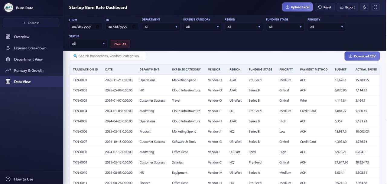
Data View
Advantages of Startup Burn Rate Dashboard in HTML
This template offers several compelling advantages over building a burn rate dashboard from scratch or using traditional spreadsheet tools:
- Instant Setup — No database, no server, no configuration. Unzip and open in your browser.
- Cross-Platform Compatibility — Works identically on Windows, Mac, Linux, and even mobile browsers.
- Shareable — Send the HTML file to investors, board members, or colleagues. They open it and see the dashboard instantly.
- Investor-Ready Design — Professional dark-theme SaaS-style design with clean typography and intuitive navigation that impresses stakeholders.
- Comprehensive Coverage — Five pages covering burn rate, expenses, departments, runway, and raw data in a single template.
- No Recurring Costs — Unlike SaaS analytics tools that charge monthly, this is a one-time purchase you own forever.
For a collaborative spreadsheet version of financial tracking, check out the Small Business CFO Dashboard in Google Sheets which offers real-time team collaboration via Google Drive.
Opportunities for Improvement
While this dashboard covers the core startup financial metrics comprehensively, there are areas where you can extend it further:
- Scenario Modeling — Adding a “what-if” module to simulate different burn rate scenarios would help founders plan for best-case and worst-case outcomes
- Fundraising Tracker — Integrating a fundraising pipeline view showing investor outreach, term sheets, and closing timelines would connect burn rate to fundraising urgency
- Unit Economics — Adding CAC, LTV, and LTV:CAC ratio calculations would round out the financial model for investor presentations
- API Integration — Connecting to accounting software APIs like QuickBooks, Xero, or Stripe could automate data refresh for real-time monitoring
Best Practices for Using This Startup Burn Rate Dashboard
- Update data monthly — Refresh your metrics at the start of each month to track burn rate trends accurately
- Monitor runway weekly — Check the Cash Balance by Month chart regularly to ensure you have enough runway before the next fundraise
- Use filters strategically — Isolate specific departments or expense categories to identify cost reduction opportunities
- Share with stakeholders — Export the HTML file or filtered data before board meetings for focused financial discussions
- Compare MRR vs Burn — Track the ratio between Monthly Burn Rate and Average MRR to measure your path to profitability
- Combine with other templates — Pair this with the Sales and Revenue Command Center Dashboard in HTML for end-to-end revenue and cost visibility
Explore Relevant Templates
If you found this Startup Burn Rate Dashboard useful, explore these related templates from NextGenTemplates:
- SaaS Financial Model Dashboard in HTML — Track MRR, ARR, churn, NPS, and gross margin across 5 interactive SaaS analytics pages
- Small Business CFO Dashboard in HTML — Monitor revenue, expenses, cash flow, budget variance, and vendor payments
- SaaS Metrics Dashboard in HTML — Track MRR, churn risk, NPS, and CSAT with interactive analytics
- Sales and Revenue Command Center Dashboard in HTML — Track total revenue, deals, win rates, pipeline value, and team performance
Frequently Asked Questions
What KPIs does the Startup Burn Rate Dashboard in HTML track?
The Startup Burn Rate Dashboard in HTML tracks 6 key performance indicators: Total Burn, Monthly Burn Rate, Cash Balance, Runway, Average MRR, and Net Customers. Beyond the KPI cards, it visualizes over 12 chart-based metrics covering expense breakdown by category and vendor, department spending and revenue, cash balance trends, MRR growth, customer acquisition, churn, and spending by funding stage.
Do I need any special software to use this HTML dashboard?
No. This dashboard runs entirely in your web browser. Simply unzip the downloaded file and open index.html in Chrome, Edge, Firefox, or Safari. There is no need for Microsoft Excel, Power BI, or any other software installation.
Can I customize this template with my own startup data?
Yes. The template includes a structured data file where you can replace the sample data with your own financial records. Once updated, all 6 KPI cards and 12+ charts refresh automatically to reflect your real business data.
What is the best dashboard template for tracking startup burn rate?
The Startup Burn Rate Dashboard in HTML from NextGenTemplates is purpose-built for startup financial analysis. It covers burn rate, runway, MRR, churn, expense breakdown, and department spending across 5 interactive pages — all accessible instantly in any web browser without software dependencies.
How do I track startup runway using this dashboard?
The Runway and Growth page includes a Cash Balance by Month chart that visually tracks your remaining cash over time. Combined with the Monthly Burn Rate KPI card on the Overview page, you can calculate and monitor your startup’s financial runway directly from the dashboard without any external tools.
Who should use this Startup Burn Rate Dashboard?
This template is ideal for startup founders and CEOs, CFOs preparing board reports, investors reviewing portfolio company health, revenue operations managers, accelerator programs tracking cohort spending, and financial consultants who need a professional burn rate analysis tool without building one from scratch.
Conclusion
The Startup Burn Rate Dashboard in HTML is the fastest way to get a professional, interactive startup financial analytics dashboard without any software dependencies. With 5 purpose-built pages covering burn rate, expenses, departments, runway, and raw data — plus 6 KPI cards and 12+ dynamic charts — this template gives startup teams and investors everything they need to make data-driven financial decisions.
Click here to Purchase Startup Burn Rate Dashboard in HTML
Visit our YouTube channel for step-by-step video tutorials on how to use this and other dashboard templates:
👉 Youtube.com/@NeoTechNavigators