In today’s highly competitive telecommunications industry, measuring performance is crucial for making data-driven decisions. One of the most effective ways to track performance is through a Telecommunications KPI Dashboard. By using a Telecommunications KPI Dashboard in Google Sheets, companies can efficiently monitor their Key Performance Indicators (KPIs) and ensure they are on track to meet their goals.
In this article, we will explore how to create and use a Telecommunications KPI Dashboard in Google Sheets, its key features, advantages, opportunities for improvement, and best practices for maximizing its effectiveness. We will also provide a list of common KPIs used in the telecommunications industry, along with their units, formulas, definitions, and whether they follow a “Lower the Better” (LTB) or “Upper the Better” (UTB) approach.
What is a Telecommunications KPI Dashboard in Google Sheets?
A Telecommunications KPI Dashboard in Google Sheets is a powerful tool that helps organizations in the telecommunications sector track and visualize their KPIs. The dashboard aggregates and displays data for various performance metrics, allowing companies to monitor their performance in real-time, identify trends, and make informed decisions.
The Telecommunications KPI Dashboard typically includes several worksheets that allow users to manage different aspects of the data, from inputting actual numbers and targets to tracking trends and comparing year-over-year performance.
Key Features of the Telecommunications KPI Dashboard in Google Sheets
Click to buy Telecommunications KPI Dashboard in Google Sheets
The Telecommunications KPI Dashboard in Google Sheets consists of six primary worksheets, each serving a unique purpose. Let’s take a closer look at these worksheets and their functionalities.
1. Dashboard Sheet Tab
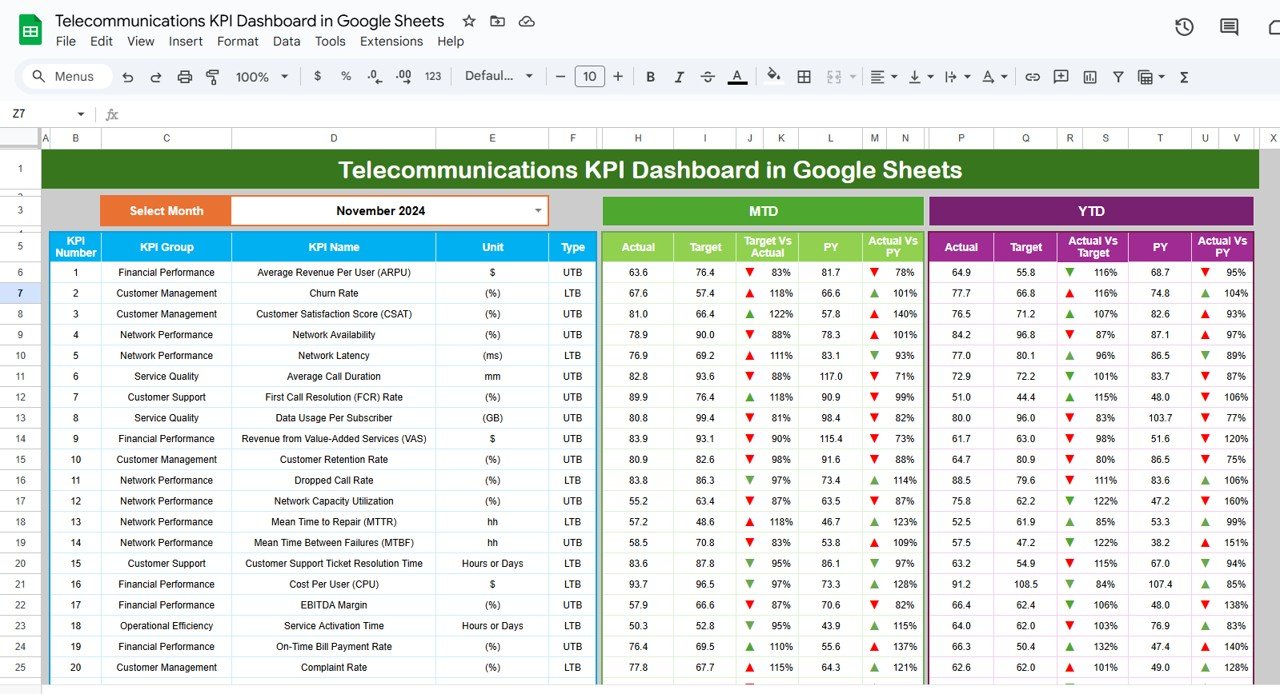
The Dashboard Sheet Tab is the main page of the KPI dashboard. Here, all the relevant KPI information is displayed in an organized format. This page includes:
Month Selector: A drop-down menu in Range D3 allows you to select the month for which you want to view the data. The entire dashboard will automatically update with the relevant data for that month.
MTD and YTD Metrics:
- MTD (Month-to-Date) Actual: Displays the actual values for the selected month.
- MTD Target: Shows the target values for the selected month.
- Previous Year Data: Compares the current month’s data with the same month in the previous year.
- Target vs Actual: Shows the comparison between the target and actual values for the month, with conditional formatting using up and down arrows (▲ or ▼).
- YTD (Year-to-Date) Actual: Displays the cumulative values for the year.
- YTD Target: Shows the YTD targets for the selected period.
- Previous Year Data: Compares the current year’s YTD data with the previous year’s YTD data.
- Target vs Actual for YTD: The percentage difference between the target and actual YTD values.
This worksheet gives a clear overview of how the KPIs are performing, with the help of visual cues such as color-coded arrows for quick insights.
Click to buy Telecommunications KPI Dashboard in Google Sheets
2. KPI Trend Sheet Tab
The KPI Trend Sheet Tab allows users to dive deeper into the trends of specific KPIs. In this tab, you can:
-
Select KPI: Choose the KPI from the drop-down menu available in Range C3.
-
Display KPI Group: See the group to which the KPI belongs (e.g., network performance, customer satisfaction, etc.).
-
Unit and Type: View the unit of measurement and whether the KPI follows “Lower the Better” (LTB) or “Upper the Better” (UTB).
-
Formula and Definition: View the formula used to calculate the KPI and its detailed definition.
This sheet is particularly useful for understanding the methodology behind each KPI and how its performance is measured.

Click to buy Telecommunications KPI Dashboard in Google Sheets
3. Actual Number Sheet Tab
The Actual Number Sheet Tab is where you input the actual data for each KPI for both MTD and YTD. Key features of this tab include:
-
Month Selection: Change the month in Range E1 to update the data accordingly.
-
Actual MTD and YTD: Input the actual performance data for the selected month and year-to-date figures.
This sheet serves as the data entry point, allowing users to manually input their actual values based on real-world performance.

4. Target Sheet Tab
The Target Sheet Tab allows you to enter the target values for each KPI. The targets can be set for both MTD and YTD metrics. The key features of this tab include:

Click to buy Telecommunications KPI Dashboard in Google Sheets
-
Target MTD and YTD: Enter the target values for each KPI for both the current month and the year-to-date.
This sheet helps compare the actual performance against the set targets, enabling businesses to track their progress toward achieving their goals.
5. Previous Year Number Sheet Tab
The Previous Year Number Sheet Tab allows you to input data from the previous year for comparison. Key features include:
-
Previous Year MTD and YTD: Enter the previous year’s data for the same period, allowing for year-over-year comparisons.
This sheet helps visualize how performance has changed compared to the previous year, giving valuable insights into trends and growth.

6. KPI Definition Sheet Tab
The KPI Definition Sheet Tab is used to enter detailed information about each KPI, such as:
-
KPI Name, KPI Group, Unit, Formula, and Definition: This sheet helps maintain consistency in how KPIs are defined and calculated.
-
KPI Type: Specifies whether the KPI is a “Lower the Better” (LTB) or “Upper the Better” (UTB) metric.
This sheet ensures that all KPIs are clearly defined, making it easier to understand and interpret the data in the dashboard.

Click to buy Telecommunications KPI Dashboard in Google Sheets
Advantages of Using the Telecommunications KPI Dashboard in Google Sheets
The Telecommunications KPI Dashboard in Google Sheets provides several key advantages to businesses in the telecommunications industry. Let’s explore the main benefits:
- Real-Time Data Monitoring: With the ability to update the dashboard for any month, businesses can monitor their KPIs in real-time. The dashboard updates instantly when new data is inputted, allowing decision-makers to make quick, data-driven decisions.
- Centralized Performance Tracking: The dashboard brings all relevant KPI data into one centralized location, eliminating the need for multiple spreadsheets or manual tracking. This simplifies performance monitoring and ensures all stakeholders are on the same page.
- Comprehensive KPI Analysis: By combining MTD, YTD, and year-over-year data, the dashboard provides a comprehensive view of performance across various metrics. This allows businesses to identify trends, patterns, and areas that need attention.
- Customizable and Flexible: The dashboard can be easily customized to fit the specific needs of any telecommunications business. Users can adjust the KPIs, targets, and data inputs to reflect their unique goals and requirements.
- User-Friendly Interface: Google Sheets is an easy-to-use tool that most employees are already familiar with. The dashboard’s simple interface makes it accessible for team members without advanced technical skills.
Opportunities for Improvement in the Telecommunications KPI Dashboard
While the Telecommunications KPI Dashboard offers many advantages, there are still opportunities for improvement to make it even more powerful:
- Automated Data Integration: Currently, the dashboard relies on manual data input, which can be time-consuming and prone to errors. Automating the process of importing data from other systems (e.g., network monitoring tools, customer satisfaction surveys) could improve efficiency and accuracy.
- Advanced Analytics and Forecasting; Adding advanced analytics features, such as predictive analytics and forecasting, could help businesses anticipate future trends and prepare for upcoming challenges. This could involve incorporating machine learning models to predict future KPI values based on historical data.
- Real-Time Alerts and Notifications: Integrating real-time alerts or notifications could help teams respond faster to any issues or performance dips. For example, a notification could be triggered when a KPI falls below a certain threshold, prompting immediate action.
- Collaboration Features: While Google Sheets allows for basic collaboration, integrating more advanced collaboration tools could enhance team coordination. For example, adding comment sections or assigning tasks within the dashboard could help teams work more efficiently together.
Best Practices for Using the Telecommunications KPI Dashboard
To maximize the effectiveness of the Telecommunications KPI Dashboard, follow these best practices:
- Regularly Update Data: Make sure to update the dashboard regularly with accurate data to keep it relevant. Regular updates will ensure that the dashboard reflects the most current performance metrics and allows for timely decision-making.
- Set Realistic Targets: Ensure that the targets you set for each KPI are realistic and achievable. Setting overly ambitious targets can lead to frustration and demotivation, while too-easy targets may not provide meaningful insights.
- Review KPIs Periodically: Review the KPIs tracked in the dashboard periodically to ensure they still align with business goals. As your business evolves, your KPIs may need to be updated to reflect new priorities or objectives.
- Analyze Trends Over Time: Use the trend analysis features of the dashboard to examine how KPIs evolve over time. Identifying long-term trends can provide valuable insights into the effectiveness of your strategies and help guide future decisions.
- Encourage Team Collaboration: Encourage team members to actively use the dashboard and contribute to data input. Collaboration fosters accountability and ensures that everyone is working towards the same goals.
Frequently Asked Questions (FAQs)
1. How can I customize the Telecommunications KPI Dashboard to fit my business?
You can customize the dashboard by modifying the KPIs, targets, and data inputs. Simply update the data in the relevant sheets (e.g., Actual Number Sheet, Target Sheet, Previous Year Number Sheet) to reflect your business’s unique metrics.
2. Can I integrate the dashboard with other software tools?
Currently, the dashboard relies on manual data input. However, you can integrate it with other tools using Google Sheets’ built-in functions or third-party add-ons to automate data imports.
3. How do I interpret the up and down arrows in the dashboard?
The up (▲) and down (▼) arrows indicate whether a KPI has met or missed its target. Green arrows (▲) represent KPIs that have met or exceeded their targets, while red arrows (▼) indicate that the KPI has missed its target.
4. How often should I update the dashboard?
The dashboard should be updated at least once a month with the latest MTD and YTD data. More frequent updates can be made if necessary, especially if there are significant changes in performance.
5. Can I add more KPIs to the dashboard?
Yes, you can easily add more KPIs to the dashboard by modifying the KPI Definition Sheet and updating the data inputs in the relevant sheets.
Conclusion
The Telecommunications KPI Dashboard in Google Sheets is an invaluable tool for businesses in the telecommunications industry. It allows organizations to efficiently track and analyze key performance indicators, monitor progress toward goals, and make informed decisions based on real-time data. By following best practices, customizing the dashboard to fit specific needs, and continuously reviewing performance, businesses can leverage this tool to optimize their operations and drive success.
Visit our YouTube channel to learn step-by-step video tutorials
Youtube.com/@NeotechNavigators
Watch the step-by-step video Demo:
Click to buy Telecommunications KPI Dashboard in Google Sheets