Insurance underwriting teams spend an average of 6-8 hours per week compiling performance reports from scattered spreadsheets, email threads, and policy administration systems. The Underwriting Efficiency KPI Dashboard in Google Sheets eliminates that manual overhead by centralizing 15+ underwriting KPIs into a single interactive template with MTD and YTD trend tracking, conditional formatting arrows, and month-based filtering across 6 structured worksheets.Underwriting Efficiency KPI Dashboard in Google Sheets
Whether you manage property, casualty, health, or specialty lines, this Google Sheets KPI dashboard gives underwriting managers, actuarial analysts, and operations leads a structured analytical environment that updates in real time. No macros, no add-ons, no enterprise software license required.
Underwriting Efficiency KPI Dashboard in Google Sheets
Key Features of the Underwriting Efficiency KPI Dashboard in Google Sheets
Click here to Purchase the Underwriting Efficiency KPI Dashboard in Google Sheets
This dashboard is built for insurance professionals who need actionable underwriting insights without the cost and complexity of enterprise analytics platforms. Here are the features that set it apart:
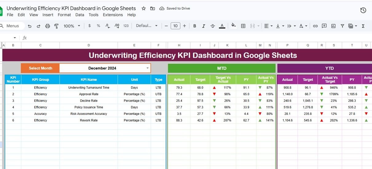
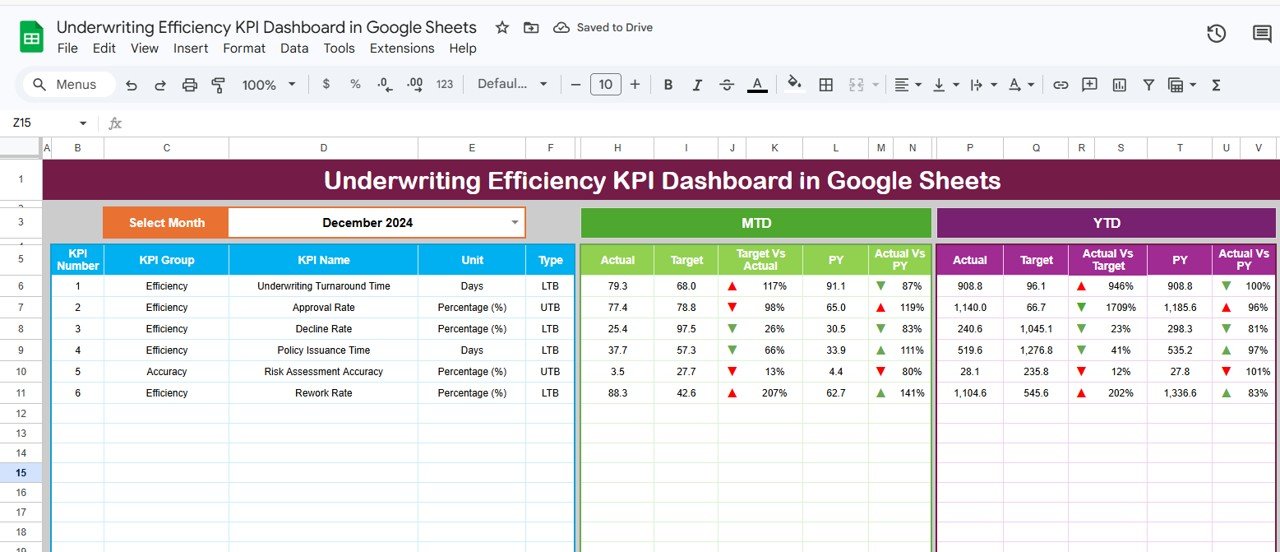
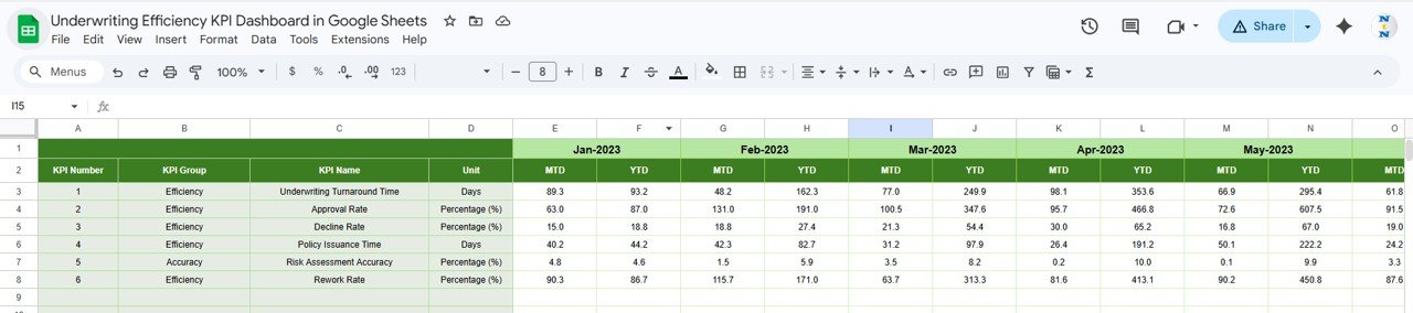
Month-Based Dynamic Filtering — Select any month from the dropdown on cell D3 and the entire dashboard refreshes. MTD Actual, Target, Previous Year, YTD Actual, Target, and PY columns all update to reflect the selected period. This means you can review January performance one moment and switch to September the next without rebuilding anything.
Conditional Formatting Arrows for Variance Analysis — Every KPI row displays directional arrows comparing Target vs Actual and Previous Year vs Actual. Green up arrows indicate favorable performance; red down arrows flag underperformance. This visual layer saves time during management reviews by surfacing problem areas immediately.Underwriting Efficiency KPI Dashboard in Google Sheets
MTD and YTD Trend Charts — The KPI Trend sheet plots three lines per KPI: Actual, Target, and Previous Year. Select any metric from the dropdown on cell C3 and view its full-year trajectory. This is particularly valuable for tracking seasonal patterns in loss ratios or premium volumes.Underwriting Efficiency KPI Dashboard in Google Sheets
Built-in KPI Definition Library — Each metric carries structured metadata including KPI Group, Unit of measurement, Formula, Definition, and Type (Lower the Better or Upper the Better). New team members can understand every metric without asking colleagues for context.Underwriting Efficiency KPI Dashboard in Google Sheets
Three Dedicated Input Sheets — Actual Numbers, Target Numbers, and Previous Year Numbers each have their own worksheet. This separation keeps data entry clean, reduces formula errors, and lets you adjust the fiscal year start month on cell E1.Underwriting Efficiency KPI Dashboard in Google Sheets
Real-Time Multi-User Collaboration — Because it runs in Google Sheets, multiple underwriters, analysts, and managers can view and edit simultaneously. No file locking, no version conflicts, no emailing attachments back and forth.Underwriting Efficiency KPI Dashboard in Google Sheets
Dashboard Pages Explanation
Click here to Purchase the Underwriting Efficiency KPI Dashboard in Google Sheets
1. Dashboard Sheet
This is the main command center. All KPIs are displayed in rows with columns for MTD Actual, MTD Target, MTD Previous Year, YTD Actual, YTD Target, and YTD Previous Year. On cell D3, select a month from the dropdown and every number on the page recalculates. Conditional formatting arrows appear next to Target vs Actual and PY vs Actual columns, giving you instant visual feedback on which KPIs are on track and which need attention.
Underwriting Efficiency KPI Dashboard in Google Sheets
2. KPI Trend Sheet
Select any KPI name from the dropdown on cell C3. The sheet displays the selected KPI’s Group, Unit, Type (LTB or UTB), Formula, and Definition. Below that, two trend charts plot MTD and YTD numbers for Actual, Target, and Previous Year across the fiscal year. This sheet is ideal for deep-dive analysis on individual metrics like loss ratio trends or quote-to-bind conversion patterns.Underwriting Efficiency KPI Dashboard in Google Sheets
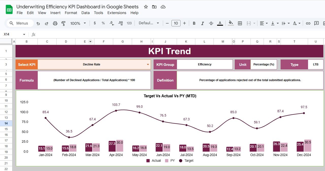
KPI Trend Sheet
3. Actual Numbers Input Sheet
Enter the actual MTD and YTD numbers for each KPI for every month. The starting month of the year can be changed on cell E1, making it easy to align with your organization’s fiscal calendar (January start, April start, or any other month). Just input the numbers and the Dashboard sheet pulls them automatically.
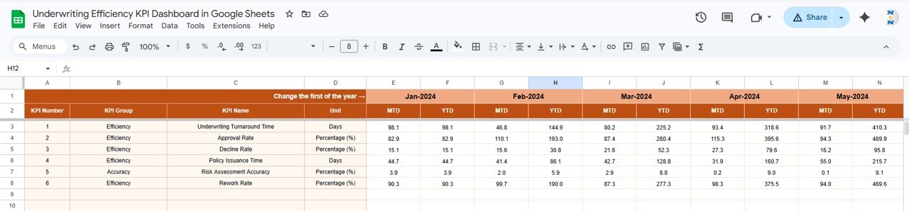
Actual Numbers Input Sheet
4. Target Number Input Sheet
Enter MTD and YTD target numbers for each KPI across all 12 months. These targets form the baseline against which actual performance is measured. The Dashboard sheet calculates Target vs Actual variance and applies conditional formatting arrows based on these inputs.Underwriting Efficiency KPI Dashboard in Google Sheets
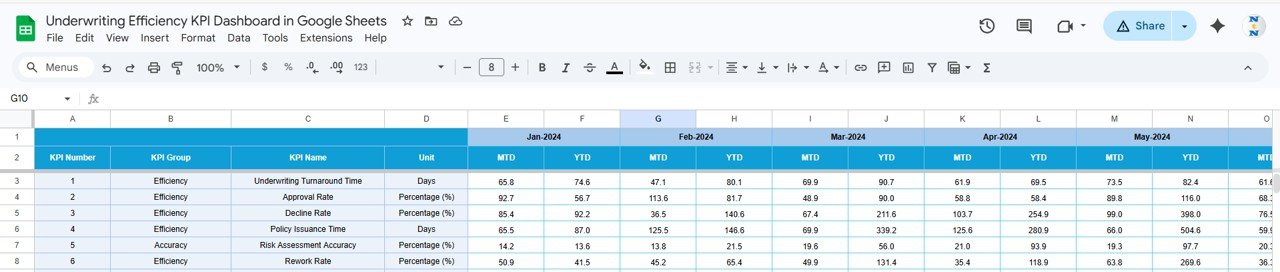
Target Number Input Sheet
5. Previous Year Number Sheet
Enter the previous year’s numbers in the same format as the current year’s actual and target data. This enables year-over-year comparison on the Dashboard sheet, where PY vs Actual arrows show whether you’re improving, declining, or holding steady against last year’s performance.
Previous Year Number Input Sheet
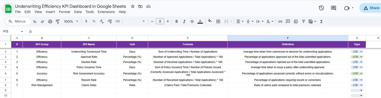
6. KPI Definition Sheet
Define each KPI’s Name, KPI Group, Unit, Formula, Definition, and Type. The Type column accepts LTB (Lower the Better, such as loss ratio or expense ratio) or UTB (Upper the Better, such as premium growth or policy count). This metadata feeds into the KPI Trend sheet so that anyone selecting a KPI from the dropdown sees its full context.
KPI Definition Sheet
Underwriting Efficiency KPI Dashboard vs. Microsoft Excel Dashboard vs. Guidewire InsuranceSuite — Feature Comparison
| Feature | Underwriting Efficiency KPI Dashboard (Google Sheets) | Microsoft Excel Dashboard | Guidewire InsuranceSuite |
|---|---|---|---|
| Cost | $8.99 one-time | Requires Excel license ($6.99+/mo) | $50,000+ annual enterprise license |
| Platform | Google Sheets (browser-based) | Desktop application | Cloud enterprise platform |
| Setup Time | Under 10 minutes | 30-60 minutes | 6-12 months implementation |
| Real-Time Team Collaboration | Yes — live multi-user editing | Limited (OneDrive co-authoring) | Yes |
| Mobile Access | Yes — Google Sheets app | Limited on mobile | Yes (enterprise app) |
| Customizable KPIs | Yes — add/edit any KPI | Yes (manual formula edits) | Requires IT configuration |
| Share with Link | One click | Email attachment or OneDrive | Role-based portal access |
| Year-1 Cost at 5 Users | $8.99 total | $420+ (5 × $6.99/mo × 12) | $50,000+ |
| Underwriting-Specific KPI Library | Yes — pre-built definitions | Build from scratch | Yes (enterprise-grade) |
For insurance teams that want underwriting KPI tracking without enterprise software costs, the Underwriting Efficiency KPI Dashboard in Google Sheets sits in the sweet spot.
Who Should Use This Template
Perfect for:
- Underwriting managers at small to mid-size insurance companies (10-500 employees) tracking team performance monthly
- Insurance operations leads who report underwriting KPIs to leadership quarterly
- Actuarial analysts comparing actual underwriting results against targets and previous year benchmarks
- Insurance startups and MGAs building a KPI framework without enterprise software budgets
- Brokerages and agencies tracking binding authority performance across multiple carriers
Not a fit if:
- You need API integration with policy administration systems like Guidewire, Majesco, or Duck Creek
- Your team requires real-time automated data feeds from underwriting platforms
- Your organization mandates SOC 2 compliance and audit trails on KPI data entry
Real-World Use Cases
Click here to Purchase the Underwriting Efficiency KPI Dashboard in Google Sheets
David manages underwriting at a regional property insurer with 45 employees. He uses the Underwriting Efficiency KPI Dashboard to track loss ratios, quote-to-bind ratios, and average premium per policy monthly. Every quarter, he presents YTD trends to the CEO — pulling the KPI Trend sheet on his laptop during board meetings — without paying for Guidewire analytics or hiring a BI developer to build custom Power BI reports.
Priya leads operations at an MGA handling specialty lines. Her team of 8 underwriters enters actual numbers into the Actual Numbers Input sheet weekly. She uses the conditional formatting arrows on the Dashboard sheet to spot which KPIs are falling below target mid-month. When the loss ratio arrow turns red in week two, she adjusts workflow assignments before month-end.
Carlos is an actuarial analyst at a health insurance startup. He uses the KPI Definition sheet to document each metric’s formula and type (LTB/UTB), ensuring every underwriter interprets loss ratios, expense ratios, and combined ratios consistently. When new analysts join, they reference the definition sheet instead of asking for a 30-minute explanation.
Advantages of the Underwriting Efficiency KPI Dashboard
Saves 6-8 hours per week — Instead of compiling KPI reports from multiple sources, all underwriting metrics live in one Google Sheet that updates with a dropdown selection.
$8.99 replaces $50,000+ enterprise tools — For small to mid-size insurance teams, this template delivers 80% of the KPI tracking functionality of Guidewire InsuranceSuite at a fraction of the cost.
Year-over-year comparison built in — The Previous Year Number sheet enables PY vs Actual analysis automatically, a feature most standalone dashboards skip.
Flexible fiscal year — Change the starting month on cell E1 to match your organization’s fiscal calendar, whether it starts in January, April, July, or October.
Zero learning curve — If you can use Google Sheets, you can use this dashboard. No formulas to write, no macros to enable, no software to install. Learn more about Google Sheets functions at Google Sheets Help Center.
Opportunities for Improvement
Click here to Purchase the Underwriting Efficiency KPI Dashboard in Google Sheets
Manual data entry — KPI numbers must be entered manually each month. Teams with policy administration APIs may prefer automated data pipelines, though manual entry keeps this template accessible to non-technical users.
No drill-down by policy type — The dashboard tracks KPIs at the aggregate level. Teams needing sub-segmentation by line of business, geography, or individual underwriter would need to add custom sheets or use a BI tool like Power BI.
Limited to Google Sheets ecosystem — Organizations standardized on Microsoft 365 may need to duplicate this in Excel. Check out the Health Insurance KPI Dashboard in Excel for an Excel-native alternative.
Best Practices
Update actual numbers by the 5th business day of each month to keep the dashboard current for leadership reviews.
Review the KPI Definition sheet quarterly to ensure formulas and definitions stay aligned with evolving underwriting standards and regulatory requirements.
Use the KPI Trend sheet during monthly reviews to identify emerging patterns before they become problems. A three-month upward trend in loss ratio is easier to address than a full-year surprise.
Set targets annually using the Target Number Input sheet, but revisit mid-year if market conditions shift significantly (new regulations, catastrophic events, or portfolio restructuring).
Share view-only access with executives and edit access only with data entry personnel to prevent accidental overwrites.
Explore Relevant Templates
📌 Policy Performance and Risk Analysis Dashboard in Google Sheets — Track policy performance, risk exposure, and financial metrics across your insurance portfolio with interactive slicers and charts.
📌 Insurance KPI Scorecard in Google Sheets — A traffic-light scorecard format for monitoring insurance KPIs with actual vs target comparisons and color-coded status indicators.
📌 Reinsurance KPI Dashboard in Google Sheets — Specialized KPI tracking for reinsurance operations including ceded premium ratios, treaty performance, and retention analysis.
📌 Health Insurance Dashboard in Excel — Also available in Excel for teams preferring desktop-based analytics with pivot tables and VBA automation.
📌 Browse all Google Sheets Dashboard Templates on NextGenTemplates.
Frequently Asked Questions
Click here to Purchase the Underwriting Efficiency KPI Dashboard in Google Sheets
What KPIs does the Underwriting Efficiency KPI Dashboard track?
The Underwriting Efficiency KPI Dashboard tracks 15+ underwriting metrics including loss ratio, combined ratio, quote-to-bind ratio, average premium per policy, expense ratio, and policy retention rate. All KPIs update automatically when you replace sample data with your own numbers.
Can I add custom KPIs to this template?
Yes. Open the KPI Definition sheet and add any new KPI with its name, group, unit, formula, definition, and type (LTB or UTB). The Dashboard and KPI Trend sheets pick up new metrics automatically through linked formulas.
Does this work on the Google Sheets mobile app?
Yes. The Underwriting Efficiency KPI Dashboard works on the Google Sheets mobile app for iOS and Android. You can view KPIs, check trend charts, and enter actual numbers directly from your phone or tablet while on the go.
How does this compare to Guidewire InsuranceSuite analytics?
Guidewire InsuranceSuite costs $50,000+ annually and requires 6-12 months of implementation. The Underwriting Efficiency KPI Dashboard costs $8.99 one-time, sets up in under 10 minutes, and covers the core KPI tracking needs of small to mid-size insurance teams.
Can multiple team members edit this simultaneously?
Yes. Google Sheets supports real-time multi-user editing. Your underwriting team, actuarial analysts, and managers can all work in the same dashboard simultaneously without file conflicts or version control issues.
How long does setup take?
Setup takes under 10 minutes. Make a copy in Google Drive, define your KPIs in the KPI Definition sheet, enter your target and actual numbers, and the Dashboard sheet displays your underwriting performance instantly with conditional formatting arrows.
Can I change the fiscal year start month?
Yes. On the Actual Numbers Input sheet, change the value on cell E1 to your fiscal year’s starting month. The Target and Previous Year sheets follow the same structure, so all three input sheets align with your organization’s fiscal calendar.
About the Author
Built by PK — Microsoft Certified Professional with 15+ years of Excel, Google Sheets, and Power BI experience. Founder of NextGenTemplates, reaching 300K+ subscribers across YouTube channels (@PK-AnExcelExpert, @NextGenTemplates, @NeoTechNavigators). Every template is hand-built and tested before release.
Conclusion
The Underwriting Efficiency KPI Dashboard in Google Sheets gives insurance underwriting teams a structured, collaborative, and affordable way to track 15+ KPIs with month-based filtering, trend charts, and year-over-year comparisons — all without enterprise software costs or IT dependencies.
Click here to Purchase the Underwriting Efficiency KPI Dashboard in Google Sheets
✅ Instant download · One-time payment · No subscription · Lifetime access
🎥 Visit our YouTube channel for step-by-step video tutorials: YouTube.com/@NeoTechNavigators