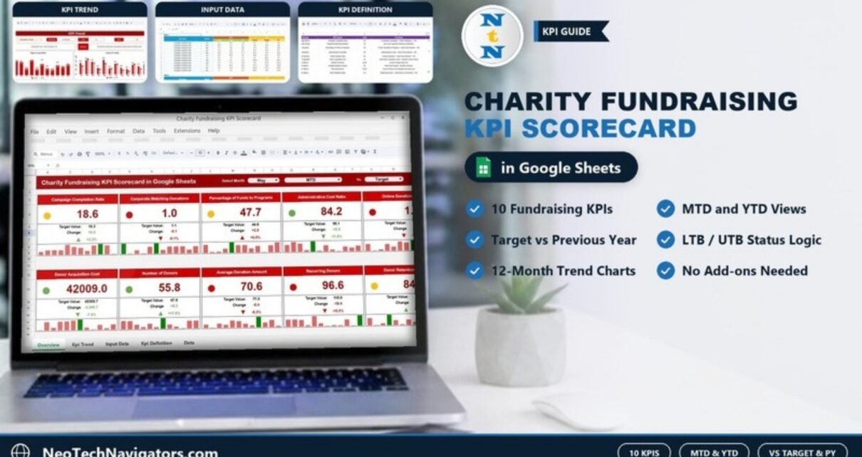
The Charity Fundraising KPI Scorecard in Google Sheets gives a fundraising team one page that shows how ten core fundraising KPIs are doing this month and year to date, compared with target or with the previous year. You pick a month, choose MTD or YTD, and every KPI card updates with its actual value, target, change and a colour-coded status.
It is built for small and mid-sized charities, NGOs and nonprofit development teams that report fundraising results to a director, board or funder every month but do not want to rebuild a report from scratch each time. Everything runs in Google Sheets with dropdowns, formulas and conditional formatting, so there are no add-ons or scripts to manage.
Below you will find what each of the four sheets does, the exact ten KPIs the template tracks (with their formulas), how to load your own numbers, and where this kind of scorecard fits and where it does not.
Get the Charity Fundraising KPI Scorecard
What the Charity Fundraising KPI Scorecard in Google Sheets Solves
Most charities collect fundraising numbers in several places: a donation export, an event spreadsheet, a finance report. The hard part is not the data, it is turning it into a consistent monthly view that answers three questions quickly:
- Are we on target this month and for the year so far?
- Are we doing better or worse than the same period last year?
- Which KPIs need attention before the next board or funder report?
The scorecard answers those questions with a fixed structure. Each KPI has a definition, a unit and a direction (higher is better or lower is better), so a falling cost ratio shows as good news and a falling donor count shows as a warning. That consistency is what makes a scorecard useful month after month.
The 4 Sheets Inside the Template
1. Scorecard Sheet
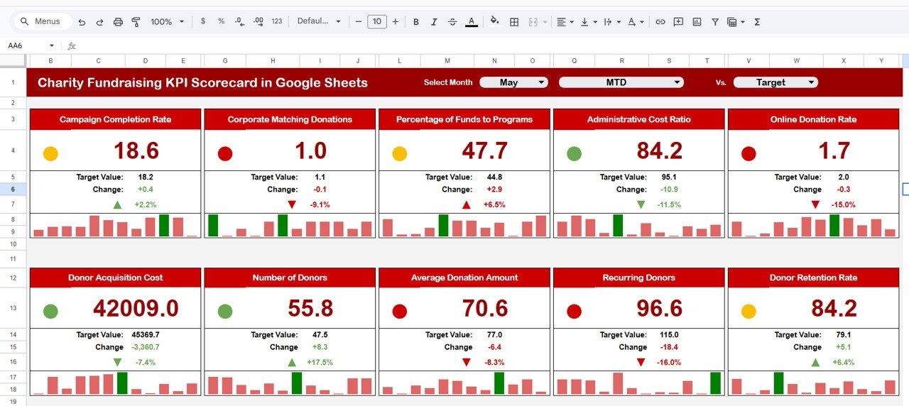
This is the page you present. Across the top are three dropdowns: Select Month, a period selector (MTD or YTD) and a Vs. selector to compare with Target or with the previous year (PY). Below are ten KPI cards in two rows of five.
Each card shows:
- The KPI name and its current value for the selected month and period
- A coloured status dot (green, amber or red)
- The comparison value (for example Target Value) and the absolute Change
- An up or down arrow with the percentage change
- A small 12-month bar strip so you can see the pattern behind the number
In the sample data for May MTD vs Target, Campaign Completion Rate is 18.6 against a target of 18.2, a change of +0.4 or +2.2%. Administrative Cost Ratio is 84.2 against 95.1, a change of -10.9 or -11.5%. Because that KPI is “lower the better”, the down arrow is shown in green rather than red.
2. KPI Trend Sheet
Select a KPI from the Select KPI dropdown and the sheet fills in its KPI Group, Unit, Type (LTB or UTB), Formula and Definition. Below that, the charts plot all twelve months: Target Vs Actual (MTD) as columns with a target line, and Actual Vs PY (MTD) as paired columns. According to the product page, the sheet also charts the YTD figures across the twelve months.
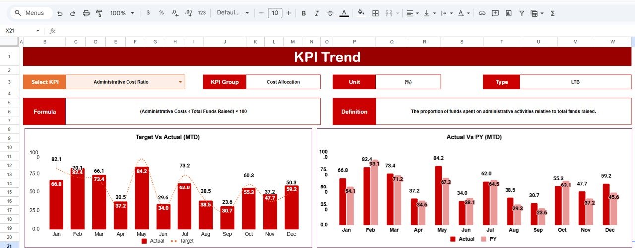
This is the sheet to open when someone asks “is that a one-off or a trend?” A single bad month looks very different from four months in a row below target.
3. Input Data Sheet
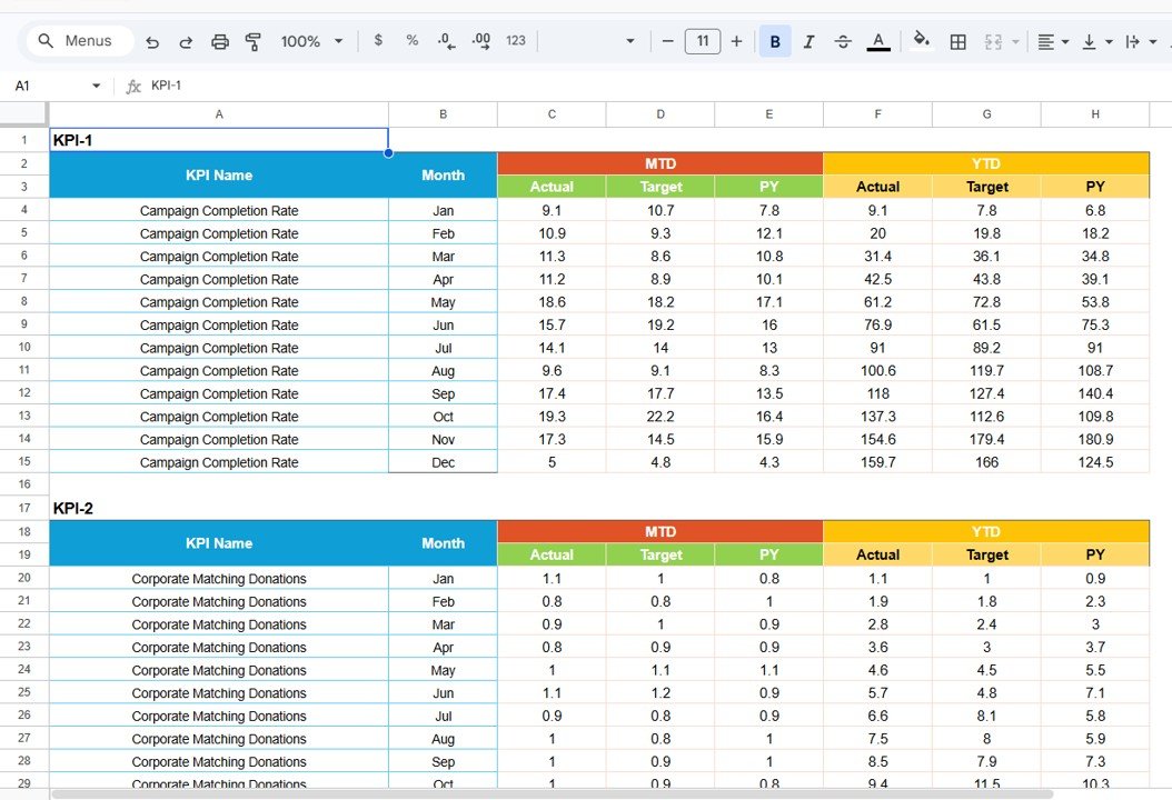
All numbers live here. Each KPI has its own block (KPI-1, KPI-2 and so on) with twelve rows, one per month from Jan to Dec. The columns are KPI Name, Month, then MTD Actual, Target and PY, and YTD Actual, Target and PY.
4. KPI Definition Sheet
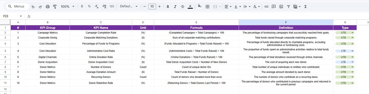
This sheet is the reference that keeps everyone reading the numbers the same way. It lists each KPI with #, KPI Group, KPI Name, Unit, Formula, Definition and Type (UTB or LTB, chosen from a dropdown).
The 10 Fundraising KPIs in the Scorecard
These are the KPIs exactly as they appear in the template’s KPI Definition sheet. “UTB” means upper the better (higher is good); “LTB” means lower the better.
| KPI | Group | What it measures | Formula | Better when |
|---|---|---|---|---|
| Campaign Completion Rate (%) | Campaign Metrics | Share of fundraising campaigns that reached their goals | (Completed Campaigns ÷ Total Campaigns) × 100 | Higher |
| Corporate Matching Donations ($) | Corporate Giving | Funds raised through corporate matching programs | Sum of all corporate matching contributions | Higher |
| Percentage of Funds to Programs (%) | Cost Allocation | Share of funds going directly to charitable programs | (Funds Allocated to Programs ÷ Total Funds Raised) × 100 | Higher |
| Administrative Cost Ratio (%) | Cost Allocation | Share of funds spent on administration | (Administrative Costs ÷ Total Funds Raised) × 100 | Lower |
| Online Donation Rate (%) | Digital Channels | Share of donations received online | (Online Donations ÷ Total Funds Raised) × 100 | Higher |
| Donor Acquisition Cost ($) | Donor Acquisition | Cost of acquiring each new donor | Total Donor Acquisition Costs ÷ Number of New Donors | Lower |
| Number of Donors (Count) | Donor Metrics | Unique individuals or entities who contributed | Count of unique donor IDs | Higher |
| Average Donation Amount ($) | Donor Metrics | Average amount given by each donor | Total Funds Raised ÷ Number of Donors | Higher |
| Recurring Donors (Count) | Donor Metrics | Donors who give on a recurring basis | Count of donors who donated more than once | Higher |
| Donor Retention Rate (%) | Donor Metrics | Previous donors who gave again in the current period | (Returning Donors ÷ Total Donors Last Period) × 100 | Higher |
A quick worked check of the comparison logic, using the sample May MTD figures: Number of Donors is 55.8 against a target of 47.5. The change is 55.8 − 47.5 = +8.3, and 8.3 ÷ 47.5 = +17.5%, which is exactly what the card shows. Donor Acquisition Cost is 42,009.0 against 45,369.7, a change of -3,360.7 or -7.4%; since it is LTB, that decrease counts as a good result.
How to Use the Scorecard With Your Own Data
- Make your copy. Open the copy link from the PDF guide included with the download and save the file to your own Google Drive.
- Review the KPI Definition sheet. Keep the ten KPIs as they are, or rename and redefine them to match how your organisation reports. Set each KPI’s Type to UTB or LTB so the arrows and colours read correctly.
- Enter targets and last year’s figures. In the Input Data sheet, fill the Target and PY columns for all twelve months at the start of the year.
- Add actuals each month. When the month closes, enter the MTD Actual (and YTD Actual) for every KPI.
- Pick the view. On the Scorecard sheet, choose the month, MTD or YTD, and whether to compare with Target or PY.
- Check the trend. For any KPI that is amber or red, open the KPI Trend sheet, select it and look at the twelve-month pattern before drawing conclusions.
- Share it. Use Share in Google Sheets to give board members or funders view-only access, and keep edit access for the people who enter data.
Real-World Use Cases
- Monthly board pack. A development manager sets the scorecard to the closing month and YTD vs Target, then screenshots the card grid into the board report. Red cards become agenda items.
- Funder and grant reporting. An executive director switches the comparison to PY to show year-on-year progress on Percentage of Funds to Programs and Administrative Cost Ratio, two numbers funders often ask about.
- Campaign retrospectives. After a giving season, the team opens KPI Trend for Online Donation Rate, Average Donation Amount and Donor Retention Rate to see whether the campaign moved the numbers or only matched last year.
Google Sheets Scorecard vs Building Your Own vs Donor Software
| Point | This scorecard template | Building one yourself | Donor management software |
|---|---|---|---|
| Purpose | Monthly KPI reporting vs target and PY | Whatever you design | Donor records, gifts, receipts, CRM |
| Setup effort | Enter your numbers into a ready structure | Hours of formulas, charts and formatting | Account setup, data migration, training |
| LTB / UTB direction per KPI | Built in | Must be written by hand | Depends on the product |
| Data entry | Manual monthly figures | Manual | Captured as gifts are processed |
| Cost model | One-time purchase | Your time | Usually a subscription |
Best Practices
- Agree the KPI definitions with finance before the first report, and record them in the KPI Definition sheet so the numbers are not argued about later.
- Enter targets for the whole year up front; changing targets mid-year makes YTD comparisons hard to trust.
- Update actuals on a fixed day each month so the scorecard always reflects a closed period.
- Keep units consistent: if Donor Acquisition Cost is in dollars one month, do not switch currency the next.
- At year end, make a copy of the file as an archive, then roll the current year’s actuals into the PY columns of the new file.
Limitations: Who Should Not Use It
- It is a reporting tool, not a donor database. It does not store donor records, process online gifts or issue tax receipts.
- Figures are entered manually each month; there is no automatic import from payment or donation platforms.
- Large organisations that need audit trails, granular permissions or dozens of KPIs across many programmes will outgrow a single Google Sheets file.
- If you only need a one-off chart of donations, a scorecard with targets and PY comparisons is more structure than you need.
Related Fundraising Templates and Guides
If you prefer Excel, there is a Charity Fundraising KPI Scorecard in Excel version of the same idea. For a chart-based view of the same topic, see the Charity Fundraising KPI Dashboard in Google Sheets. Teams running campaigns can compare it with the Fundraising Campaign KPI Dashboard in Google Sheets, and the Nonprofit Fundraising Dashboard in Google Sheets covers donation-level analysis. Grant-funded organisations may also find the Nonprofit Grant Dashboard in Google Sheets useful, and the Fundraising Event Calendar in Google Sheets helps plan the events that feed these KPIs.
If you want to learn how scorecards and dashboards like this are built, the Excel Pivot Tables and Dashboards course on NextGenTemplates Academy walks through the same reporting ideas step by step.
Frequently Asked Questions
Which KPIs does the Charity Fundraising KPI Scorecard track?
Ten KPIs: Campaign Completion Rate, Corporate Matching Donations, Percentage of Funds to Programs, Administrative Cost Ratio, Online Donation Rate, Donor Acquisition Cost, Number of Donors, Average Donation Amount, Recurring Donors and Donor Retention Rate.
What do LTB and UTB mean?
LTB stands for “lower the better” and UTB for “upper the better”. The template uses this setting so that, for example, a drop in Administrative Cost Ratio is shown as a positive result while a drop in Number of Donors is flagged as negative.
Can I compare with last year instead of target?
Yes. The Vs. dropdown on the Scorecard sheet switches the comparison between Target and the previous year (PY), for either MTD or YTD.
Can I change or replace the KPIs?
Yes. Edit the KPI names, formulas, definitions and types in the KPI Definition sheet and enter matching data blocks in the Input Data sheet. Keep the existing layout of each block so the scorecard can read it.
Do I need a paid Google Workspace account or add-ons?
No. The template runs in a standard Google account and uses only built-in Google Sheets features.
Does it connect to donation platforms automatically?
No. You enter monthly figures yourself, usually from your donation platform or finance reports. That keeps the file simple and works with any data source.
Wrapping Up
A fundraising scorecard is only useful if it is read the same way every month. This template gives you ten clearly defined charity KPIs, built-in direction logic, MTD and YTD views, target and previous-year comparisons, and a trend sheet for the follow-up questions. Start by agreeing your targets, load last year’s figures, and add one month of actuals; you will have a board-ready view after the first update.
Get the Charity Fundraising KPI Scorecard
📅 Last updated: October 2026